Blending Graphite and Charcoal for Extreme Contrast in Horror Art
Graphite whispers. Charcoal screams. On their own, both are useful. Together, they argue on the page in a way that is absolutely perfect for horror art.
Blending graphite and charcoal is not about subtlety or politeness. It is about contrast, tension, and making your drawing feel like it is emerging from darkness rather than politely sitting on the paper.
If your horror drawings sometimes feel a bit too soft, safe, or well-behaved, this technique is how you push them into much darker territory without losing control.
This guide is for artists who already understand basic shading and want to create heavier mood, stronger contrast, and that unsettling “pulled from the void” feeling.
If you want even more control over shadow depth before introducing charcoal, this guide on Layered Shadows for Extra Depth in Horror Drawings explains how to build shadows gradually.
What This Technique Is
Blending graphite and charcoal means giving each material a specific job instead of letting them fight for control.
- Graphite handles structure, detail, and mid-tones
- Charcoal is reserved for the deepest shadows and backgrounds
Graphite gives you precision and control. Charcoal gives you a depth of darkness that graphite simply cannot reach.
The key is that graphite does the planning, and charcoal delivers the impact. When used intentionally, this combination creates tension without chaos.
Why This Works So Well for Horror Art
Horror art thrives on contrast and imbalance.
Blending graphite and charcoal works especially well because it:
- Creates extreme value differences
- Makes light areas feel fragile and exposed
- Allows backgrounds to fall into heavy, oppressive darkness
- Adds emotional weight without cluttering the drawing
A graphite-only drawing can feel controlled and calm.
Charcoal disrupts that calm in a way that feels intentional and unsettling.
When to Use This Technique (And When Not To)
This is a powerful technique, but it is not meant for every drawing.
It works best for:
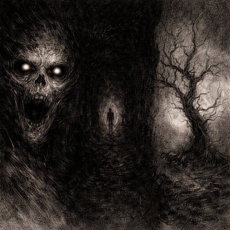
- Horror portraits and faces
- Figures emerging from darkness
- Empty or oppressive backgrounds
- Scenes where mood matters more than fine detail
Avoid using it when:
- You need crisp linework everywhere
- The subject relies on softness or delicate textures
- You are still learning basic value control
Think of this as an escalation tool. Use it when you want impact, not restraint.
Tools You Will Need:
You do not need an intimidating charcoal setup.
- Graphite pencils for structure and mid-tones
- Charcoal pencil or compressed charcoal for deep shadows
- Blending stump or tissue, used sparingly
- Kneaded eraser for lifting highlights
Charcoal is messy by nature. Accept this early, and the experience becomes much less stressful.
Step-by-Step: How to Blend Graphite and Charcoal
Step 1: Build the Drawing Fully in Graphite
Start by completing the entire drawing in graphite.
Focus on:
- Proportions
- Structure
- Light and shadow placement
At this stage, the drawing should already read clearly before charcoal ever touches the page. Graphite is your safety net.
Step 2: Identify the Deepest Shadows
Before adding charcoal, decide exactly where the darkest areas belong.
Common areas include:
- Pupils and deep eye sockets
- Corners and enclosed spaces
- Backgrounds
- Areas where forms fade into shadow
At this point, nothing on the page changes yet. The work happens in your head.
If you skip this step, charcoal will spread without purpose and overpower the drawing.
Step 3: Introduce Charcoal Gradually
Add charcoal only to the deepest shadow areas.
Start lightly. Charcoal darkens quickly, and it is far easier to add more than to remove it.
At this stage, allow graphite and charcoal to sit next to each other rather than blending immediately.
Step 4: Blend Only Where Necessary
Blend only where graphite and charcoal meet.
You are aiming for controlled transitions, not smooth gradients everywhere.
- Soften edges where forms fade
- Keep edges sharp where tension matters
Too much blending removes contrast, which defeats the purpose of this technique.
Step 5: Pull Highlights Back In
Once charcoal is in place, use a kneaded eraser to lift highlights.
This step restores balance and keeps the drawing readable. Light placed next to deep charcoal shadows instantly increases drama and focus.
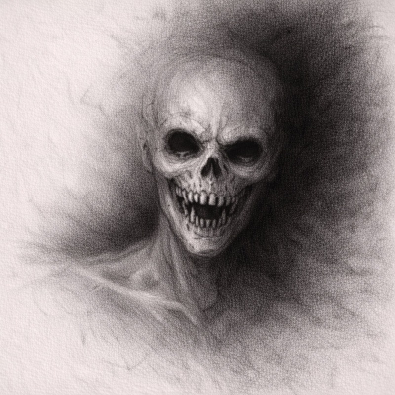
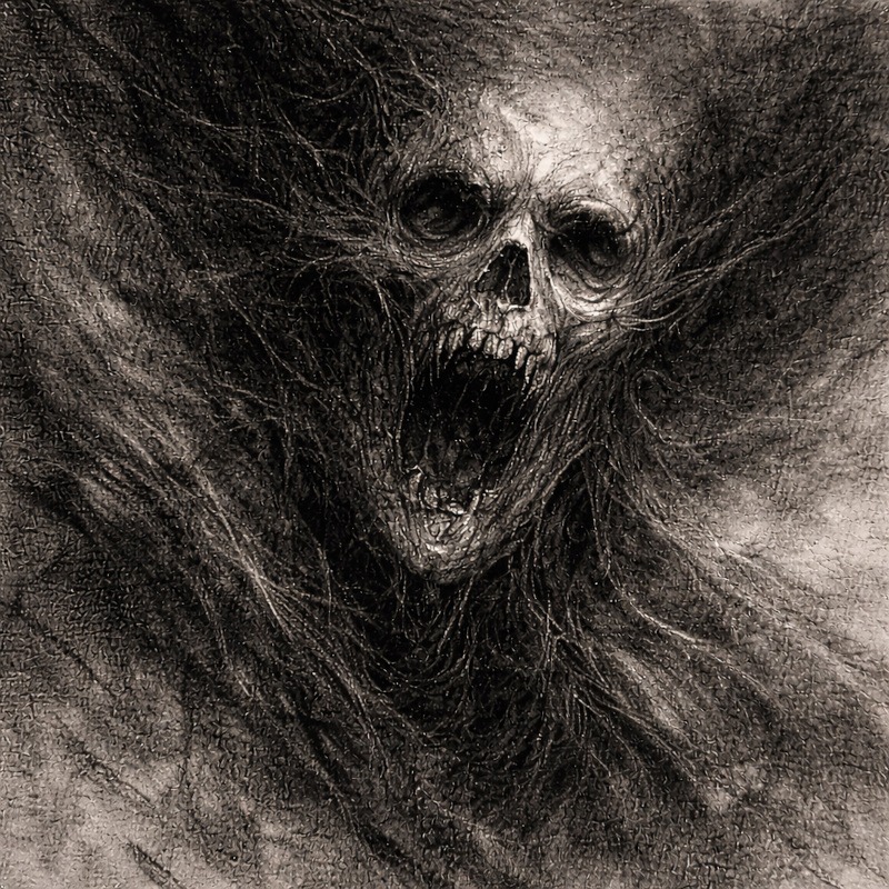
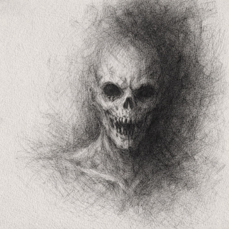
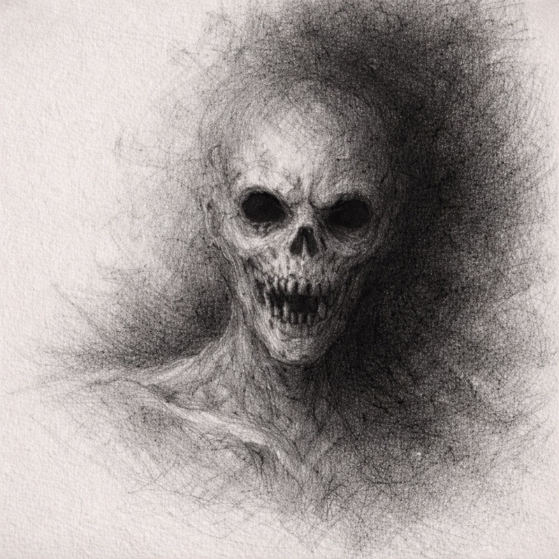
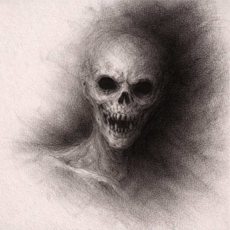
Horror Tip:
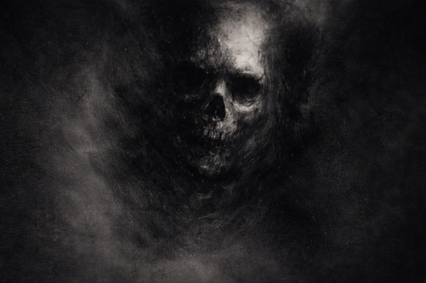
A face drawn in graphite against a charcoal-black background instantly feels like it is emerging from endless darkness. Simple, effective, and deeply unsettling.
Common Mistakes (And How to Fix Them)
1. Everything turns muddy:
You blended too much. Let graphite and charcoal sit beside each other before blending more often.
2. The charcoal takes over:
It was added too early. Re-establish structure with graphite before continuing.
3. It looks messy instead of dramatic:
Your darkest areas are too spread out. Concentrate them for a stronger impact.
Practice Exercise
This exercise teaches you how to let graphite handle the planning and structure while charcoal delivers the deepest shadows. Work small. This technique is powerful and easier to control on a miniature scale.
1. Draw a small head or object
Choose something simple:
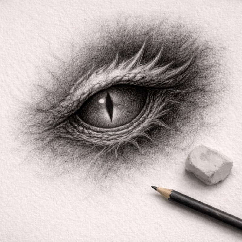
- An eye
- A skull fragment
- A mouth
- A small creature’s head
Keep the sketch light. You’re building the foundation for contrast, not diving into detail yet.
2. Complete the entire drawing in graphite first
Graphite handles:
- Shape
- Form
- Mid tones
- Structural shadows
Shade the whole drawing until it already reads clearly on its own.
Your darkest graphite shadows should still leave room for charcoal to take them further.
Goal: The drawing should look believable before any charcoal touches the page.
3. Add charcoal only to the background and deepest shadows
Charcoal goes where light fails completely:
- Behind the subject
- Under deep folds
- Inside eye sockets
- In the darkest corners
- Around shapes that need dramatic contrast
Never place charcoal on mid-tones. It will take over and flatten the form.
Add charcoal slowly in thin layers.
It is easier to build darkness than to pull it back.
4. Blend only at transition points
Use a blending stump or a soft brush to gently blend the graphite shadows with the charcoal shadows.
Blend only where the two values meet.
Do not blend charcoal across the entire drawing, or it will cloud everything.
Think of it as letting darkness creep in rather than stamping it everywhere.
5. Lift highlights at the end
When your darkest areas are fully developed:
- Use a kneaded eraser to pick out soft highlights
- Use a white pencil sparingly to add sharper accents
- Keep highlights small, so the contrast feels intense, not theatrical
This step makes the eye jump straight to the illuminated areas and gives the drawing that pulled-from-the-void mood.
6. Keep the drawing small
Charcoal is powerful.
A tiny drawing is enough to feel the full impact of graphite versus charcoal without needing a full-page commitment.
Small size also helps you stay in control.
Final Thoughts
Blending graphite and charcoal will feel fine right up until the moment it suddenly does not. That moment is normal.
Graphite eases you in. Everything looks controlled. Then charcoal appears, and within about three seconds, you’re thinking, “Okay, that got intense very fast.” That is exactly how this technique is supposed to work.
The trick is learning when to stop, not because the drawing is finished, but because it is about to go too far. Add charcoal slowly, keep it where you planned, and remember that darkness is very easy to add but much harder to politely ask to leave.
If everything feels heavier, darker, and a bit more intense than planned, that is the point. If you are wondering when exactly it all got so dramatic, the answer is usually “about five seconds after the charcoal touched the page.”
What You Learned:
- Graphite and charcoal serve different roles
- Graphite builds structure and mid-tones
- Charcoal pushes darkness and contrast
- Controlled blending keeps the drawing readable
- Extreme contrast strengthens the horror mood
Continue Exploring Advanced Shading Techniques
Blending graphite and charcoal is all about pushing contrast and atmosphere without losing control. If you want to refine that darkness and use it more intentionally, these techniques pair especially well with it:
- Layered Shadows for Extra Depth
Learn how gradual shadow layering creates a solid foundation before extreme contrast is introduced. - Textured Shading for Skin, Decay & Surfaces
Combine rough textures with deep charcoal shadows to suggest age, damage, and decay. - Negative Space Shading for Eerie, Ghostly Effects
Let heavy backgrounds and extreme contrast help figures emerge from darkness instead of being fully drawn. - Suggestion vs Detail in Horror Art
Discover how pulling back detail makes high-contrast areas feel more unsettling rather than overworked. - Strategic Highlights for Maximum Horror Impact
Use small, deliberate highlights to control focus and keep extreme contrast from becoming overwhelming.