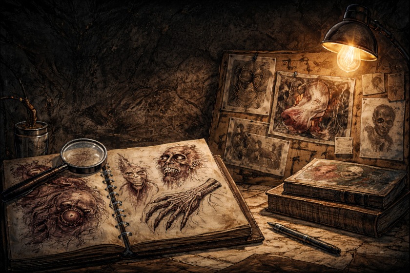
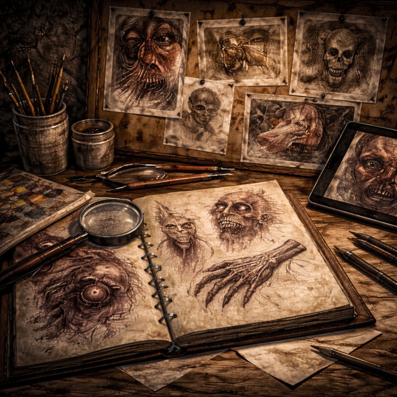
How to Use Art References Effectively (Without Killing Your Creativity)
If you’ve ever opened a reference image, felt guilty immediately, and then closed it again like it personally offended you… You’re not alone.
A lot of artists worry that using references means they’re “cheating,” not creative enough, or somehow doing art wrong. That fear can make drawing feel stiff, frustrating, or worse, like you’re constantly second-guessing yourself instead of actually enjoying the process.
The truth is, references aren’t the problem. How they’re used is.
This guide breaks down how to use art references in a way that actually helps you learn, strengthens your horror designs, and keeps your creativity alive. No tracing shame, no copy-paste monsters, and definitely no sad sketchbooks wondering where it all went wrong.
First things first: using references is not cheating
Let’s clear this up immediately.
Professional artists use references. Concept artists use references. Game studios use references. Film designers use references. Anyone who tells you “real artists draw everything from imagination” is either lying or hasn’t drawn hands recently.
References exist to help you understand:
- Structure
- Proportions
- Lighting
- Texture
- Movement
They’re tools, not a crutch. And like any tool, they work best when you know how to use them.
The mindset that actually works
Think of references as training wheels, not handcuffs.
You use them to learn how something works, then you slowly rely on them less as your understanding improves. The goal isn’t to memorise images. The goal is to build visual knowledge you can reuse later.
If your drawing feels stiff or lifeless, it’s usually not because you used a reference. It’s because you used it too literally.
How to break down a reference image properly
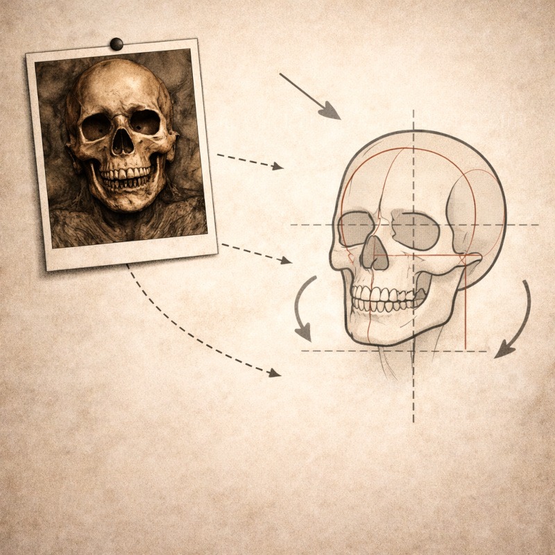
Instead of copying what you see line for line, focus on the fundamentals underneath.
When looking at a reference, ask yourself:
- What are the main shapes?
- Where is the weight sitting?
- How is the light hitting the form?
- Which details actually matter?
Ignore tiny surface details at first. Nail the big structure, then add texture and detail later. Horror art especially relies on strong foundations before exaggeration works.
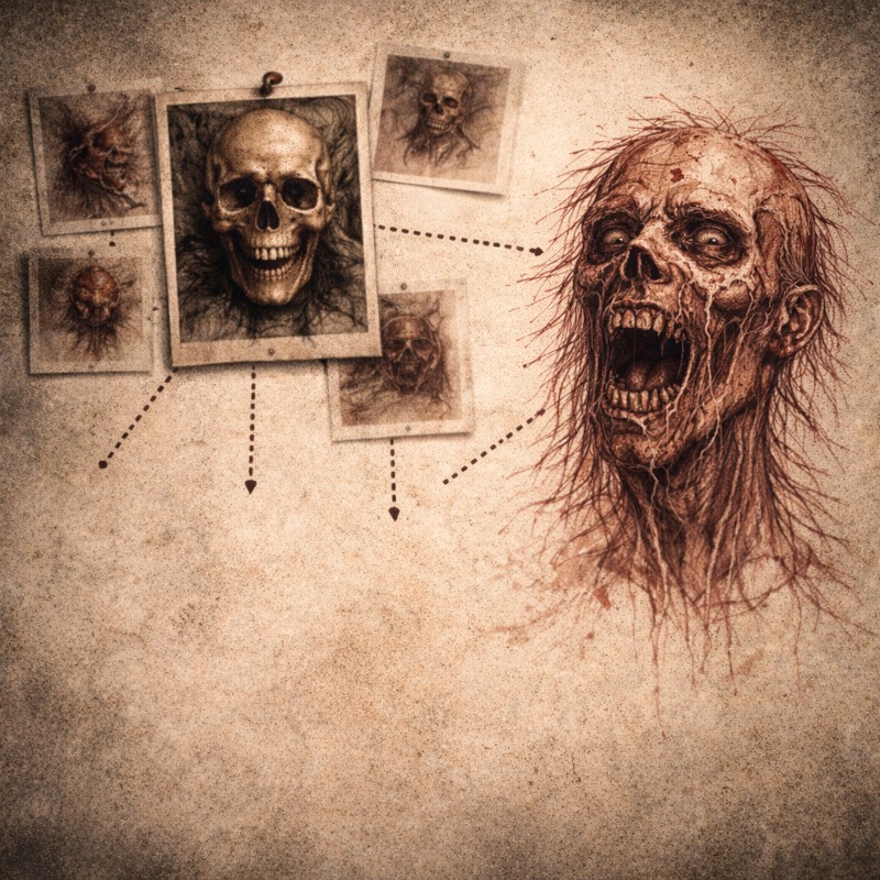
Use more than one reference (seriously)
One reference is how you accidentally redraw someone else’s work.
Two references are better.
Three or more is where originality starts to happen.
For example:
- Anatomy from one image
- Lighting from another
- Mood or texture from something completely different
Mixing references forces your brain to make decisions instead of copying. That’s where your style starts creeping in, whether you like it or not.
Combine real-world and fictional references
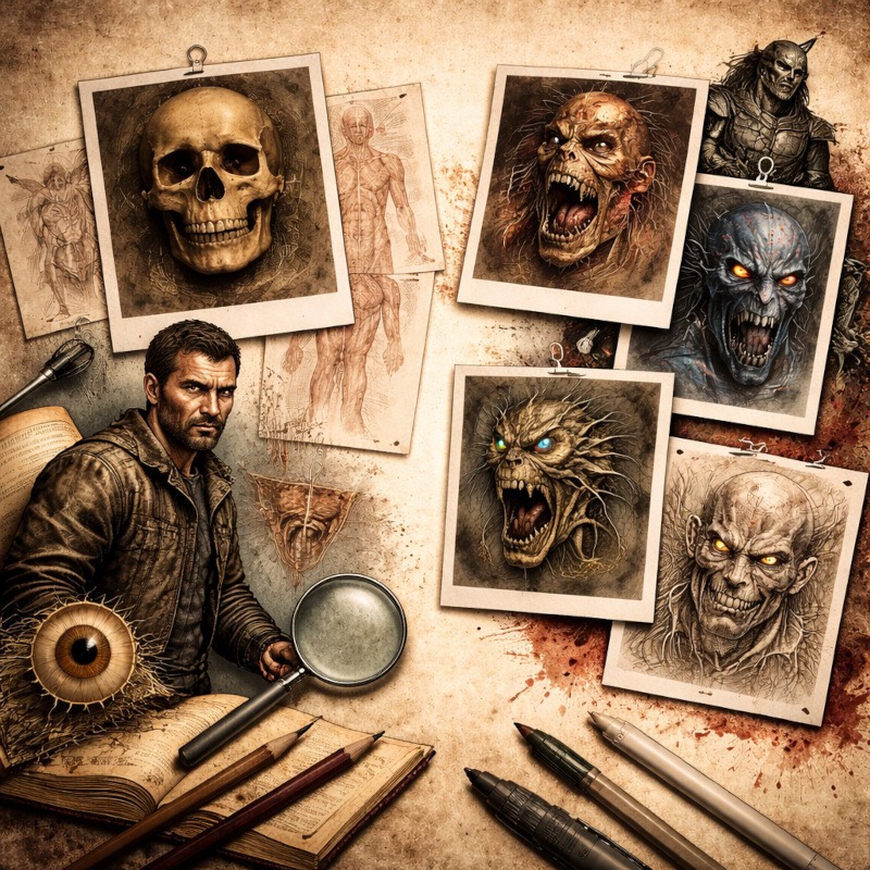
Real-world references keep your designs believable. Bones still connect the same way. Muscles still pull in certain directions. Gravity still exists, even in horror.
Fictional references let you push things further:
- Horror films
- Game art
- Creature designs
- Stylised illustrations
Use real life for structure, then exaggerate with horror references. That balance is what keeps designs creepy instead of accidentally goofy.
Common mistakes to avoid
A few things that trip artists up constantly:
- Relying on a single reference image
- Copying details without understanding structure
- Ignoring how things move and bend
- Being afraid to change the reference
References are starting points, not rules. If something feels wrong in your drawing, it probably is, even if the reference says otherwise.
Practical tips you can use immediately
- Flip your canvas regularly to spot stiffness
- Do quick studies instead of one “perfect” drawing
- Sketch from references, then redraw from memory
- Use references for parts, not the whole image
And remember: if your monster ends up with goat legs, ballerina arms, and lighting stolen from a horror movie screenshot, you’re doing it right.
Final thought
References won’t make you less creative. They make your creativity stronger by giving it something solid to push against.
Use references to learn. Use them to experiment. Then break the rules on purpose and see what crawls out of your sketchbook. And if your drawing looks like it escaped halfway through the summoning ritual, congrats. You’re doing it right. That awkward, uncomfortable stage is where understanding actually starts to form.
If something feels a bit off, trust that instinct. Horror thrives in distortion, exaggeration, and things that don’t sit quite right. References help you learn the rules so you can bend them until they snap.
Use them. Learn from them. Then let your monsters misbehave.
What You Learned:
- References don’t kill creativity; they reduce guesswork and free you to focus on ideas.
- Using multiple references prevents copying, forcing you to combine information instead of repeating one image.
- Real-world references ground horror designs so exaggeration feels unsettling rather than accidental.
- Breaking references into pose, anatomy, lighting, and texture makes them easier to study and use.
- Knowing when to step away from a reference allows your skills to grow instead of stagnate.
Explore More Reference & Study Resources
If you want to go deeper into building strong horror references, these posts expand on different parts of the process:
- Best Websites for Horror Art References
A curated collection of anatomy sites, creepy galleries, texture references, and pose tools to fuel your horror artwork. - Using Real-World Textures for Horror Art
Learn how to spot, study, and apply real-world decay, damage, and organic surfaces without copying directly. - Photographing Real-World Textures for Horror Art
A practical guide to photographing your own texture references using simple setups and everyday locations. - Real-World Texture Reference Photos for Horror Art
A curated gallery of decay, damage, and organic textures designed purely for observation and inspiration.