Suggestion vs Detail in Horror Art: Knowing What to Leave Out
In horror art, showing everything is rarely the best move.
The most unsettling drawings are often the ones that feel unfinished in particular places. A sharp eye. A blurred face. A hand that fades into shadow before you can fully understand it.
Suggestion versus detail is about learning what to define clearly and what to leave vague on purpose. When used well, it creates tension, unease, and a lingering discomfort that sticks with the viewer long after they look away.
This guide is for artists who understand basic shading and want to create stronger horror imagery by controlling focus instead of drawing every detail.
What This Technique Is
Suggestion versus detail is the balance between clear focal points and intentionally vague areas.
Instead of fully rendering everything in a drawing, you:
- Choose a few key features to define clearly
- Let other areas remain soft, blurred, or incomplete
- Use contrast and sharpness to guide the viewer’s attention
The brain naturally focuses on the most detailed, highest-contrast area first. Horror art takes advantage of this by making sure the viewer looks exactly where you want them to.
And then wonders what they are missing elsewhere.
Why Suggestion Works So Well in Horror Art
Horror thrives on uncertainty.
When details are missing, the viewer fills in the gaps using their imagination. And their imagination is usually much worse than anything you could draw.
Suggestion:
- Creates unease without over-explaining
- Directs focus to specific areas
- Makes scenes feel unstable or incomplete
- Keeps the viewer mentally engaged
A fully detailed drawing feels finished and safe.
A selectively detailed one feels like something is being hidden.
When to Use Suggestion Over Detail
This approach is most effective when mood is more important than clarity.
It is especially effective for:
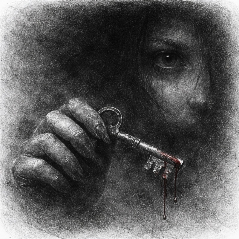
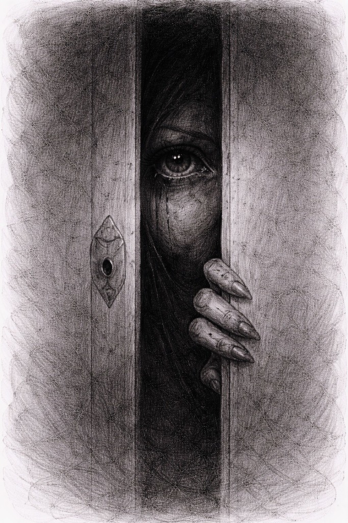
- Faces with one dominant feature, such as the eyes or mouth
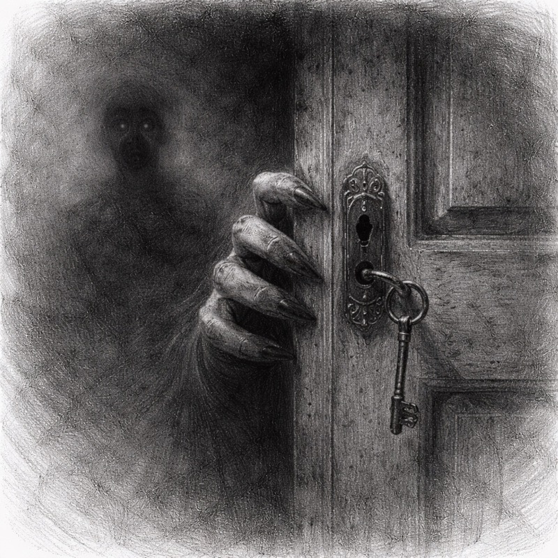
- Figures partially hidden in shadow
- Background characters or shapes
- Scenes meant to feel dreamlike or distorted
It is less effective when:
- The subject relies on precise anatomy
- You are studying realism or structure
- The entire drawing needs to be readable at a glance
Suggestion is a choice, not a shortcut.
Tools You Will Use:
You do not need special tools for this technique.
- Graphite pencils for controlled shading
- Charcoal or soft graphite for deep contrast
- Blending stump or tissue to soften areas
- Kneaded eraser to lift focus points
This technique is more about restraint than materials.
Step-by-Step: How to Practice Suggestion vs Detail
Step 1: Choose Your Focal Point
Decide what the viewer should notice first.
Common focal points include:
- Eyes
- Mouth
- Hands
- A single sharp edge or shape
This area will receive the most contrast and the cleanest detail.
Step 2: Fully Render the Focal Area
Spend time refining this one area.
Use:
- Sharper edges
- Higher contrast
- Clear shapes
This element anchors the drawing and provides the viewer with a solid point of focus.
Step 3: Let Other Areas Stay Soft
Reduce detail everywhere else. This does not mean messy, just intentionally unresolved.
You can:
- Blur edges
- Smudge shading
- Leave areas partially unfinished
This contrast makes the focal point feel even stronger.
Step 4: Decide What to Hide
Choose areas that fade into shadow or disappear entirely.
This might include:
- Parts of the face
- Limbs
- Clothing or hair
What you leave out is just as important as what you show.
Step 5: Use Contrast to Control Attention
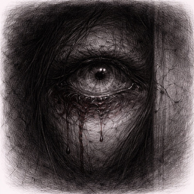
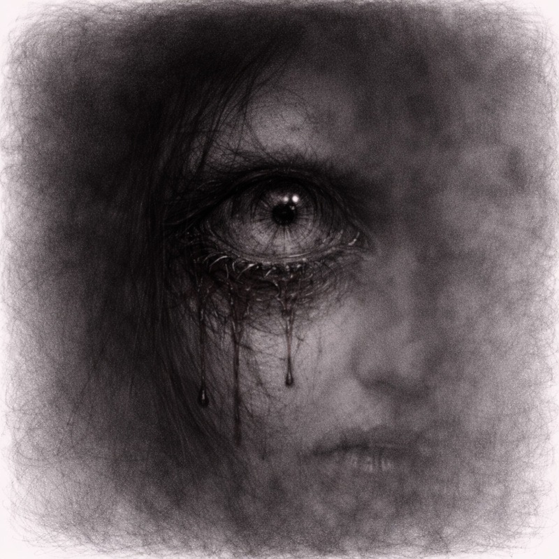
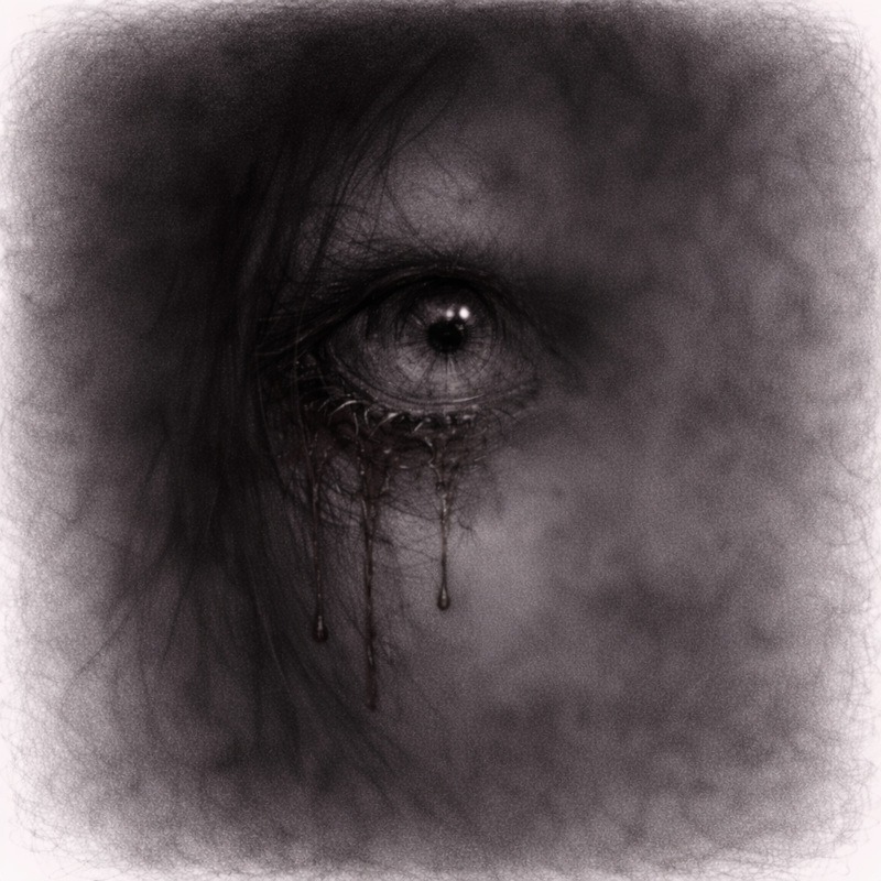
Strong contrast pulls the eye. Soft values push it away. In this step, you sharpen only the focal point and let the surrounding features stay present but gentle. The viewer should be able to recognise the nose and mouth, but they should never compete with the main detail. Think of them as background actors quietly doing their job while the eye steals the spotlight.
Keep the secondary features lightly defined. Use soft shading and low contrast so they support the focal point without stealing attention. This contrast guides the viewer exactly where you want them to look.
If the nose or mouth starts demanding attention, blur it slightly until it behaves.
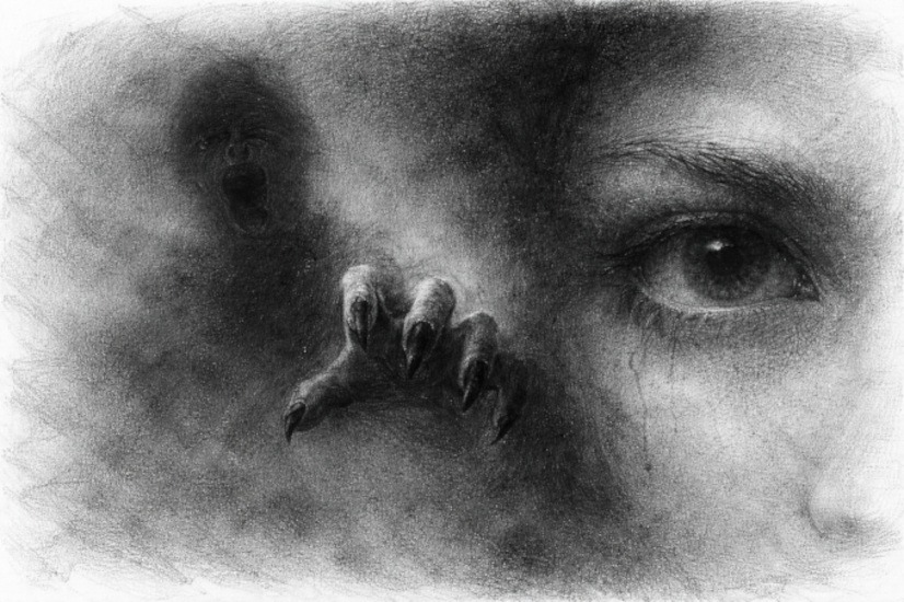
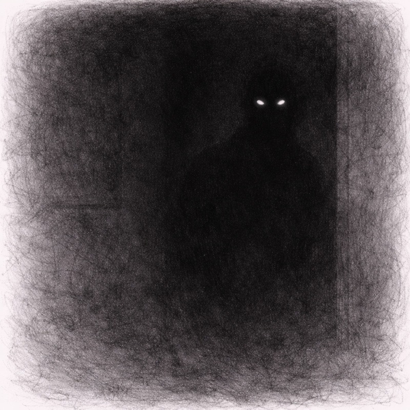
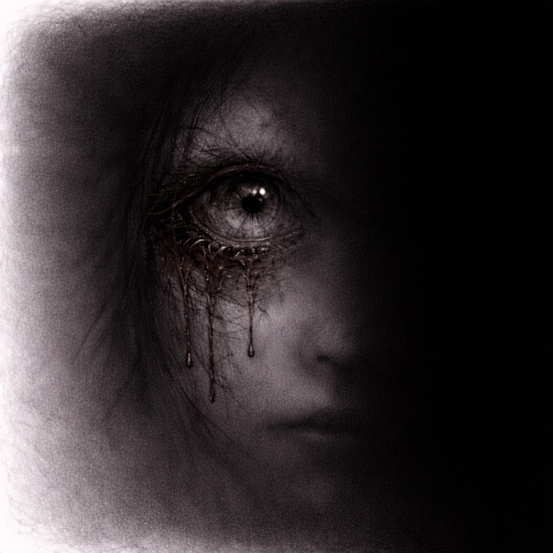
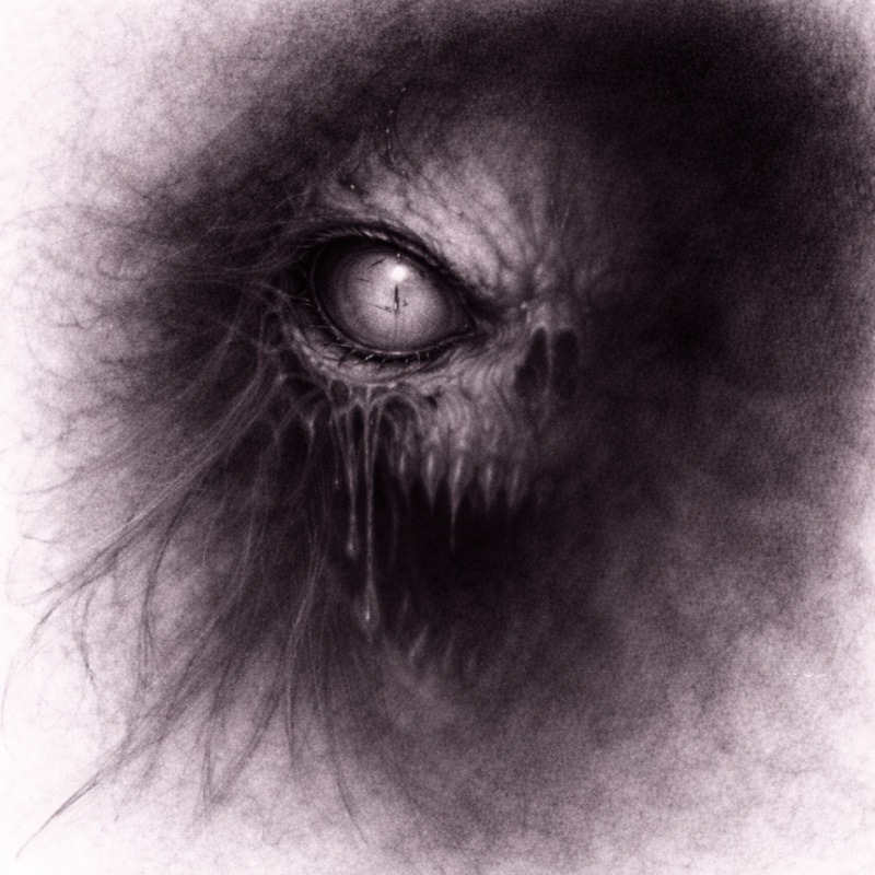
Horror Tip:
A single, sharply rendered eye in an otherwise blurred or shadowed face is instant nightmare fuel. The brain recognises the face, but cannot fully understand it, and that discomfort lingers.
Common Mistakes (And How to Fix Them)
1. Everything looks unfinished
You did not define a clear focal point. Add detail to one area to anchor the drawing. Suggestion fails when nothing in the drawing is clearly finished.
2. The drawing feels flat
Increase contrast in the focal area and soften the rest.
3. You added too much detail everywhere
Pull back. Blur or smudge secondary areas and let them fade.
Practice Exercise
This exercise teaches you how to create focus by sharpening one feature while letting the rest drift into softer, fainter shadows. The goal is to guide the viewer’s eye without overworking the whole drawing.
1. Draw a portrait or figure
Keep it simple; a basic head, a face, or a figure with a clear focal point works perfectly.
Lightly sketch the shape; don’t add heavy outlines or details yet.
2. Choose one feature to fully render
Pick the place you want the viewer to look first. Good choices include:
- One eye
- A hand or fingers
- A mouth
- A sharp object held by the character
This will be the most detailed, highest contrast part of the drawing.
3. Keep the rest soft or partially shaded
Every area that is not the focal point should be:
- Looser
- Lighter
- Blurrier
- Less defined
Let your pencil strokes feel softer and slower here.
You are not trying to match the level of detail you used on the focal point.
4. Let some areas fade into shadow
Let edges disappear completely in places:
- Jawlines
- Hairlines
- Clothes
- Background edges
Soft transitions help the viewer focus on what matters while their imagination fills in what they cannot quite see.
This fading effect is what makes the image feel unsettling and atmospheric.
5. Stop before everything feels complete
The moment the drawing starts to look “finished,” you have gone too far.
Your goal is to leave:
- Questions
- Ambiguity
- Soft gaps
- Slight uncertainty
If the image feels a little uncomfortable to stop on, you are doing it exactly right.
Final Thoughts
Suggestion versus detail is really about knowing when to stop.
It can feel uncomfortable leaving parts of a drawing vague on purpose, especially when your instincts are telling you to keep adding “just one more detail.” Try not to. The moment you pause before everything is explained is often the moment the drawing becomes unsettling.
When one area is sharp, and the rest feels uncertain, the viewer’s brain steps in and starts filling the gaps for you. It almost always does a far creepier job than you ever could. This is the same brain that sees faces in plugs and monsters in coats on chairs, so you are in good hands.
If your drawing feels slightly unfinished in a way that makes you hesitate before calling it done, that is usually a good sign. Horror does not need every answer. Sometimes it works best when it leaves the room mid-sentence and refuses to come back to explain itself.
What You Learned:
- Horror art does not need equal detail everywhere
- Strong focal points guide the viewer’s attention
- Missing details create unease and tension
- Contrast controls where the eye settles
- Suggestion is a deliberate storytelling tool
Continue Exploring Advanced Shading Techniques
Suggestion versus detail is about restraint and trust. If you want to strengthen that sense of unease and control how much the viewer sees, these techniques pair naturally with it:
- Layered Shadows for Extra Depth
Use gradual shadow layering to support suggestion without flattening your forms. - Textured Shading for Skin, Decay & Surfaces
Introduce surface detail selectively, letting some areas remain vague and uncomfortable. - Blending Graphite and Charcoal for Extreme Contrast
Push darkness where detail fades, creating stronger separation and tension. - Negative Space Shading for Eerie, Ghostly Effects
Let figures emerge from the shadows instead of fully defining them. - Strategic Highlights for Maximum Horror Impact
Guide the viewer’s eye to key details while the rest of the image stays uncertain.