Textured Shading for Skin, Decay and Surfaces
Not everything in horror art should be smooth. If it is, your drawing can start to look less “deeply unsettling” and more “unexpected skincare advert.”
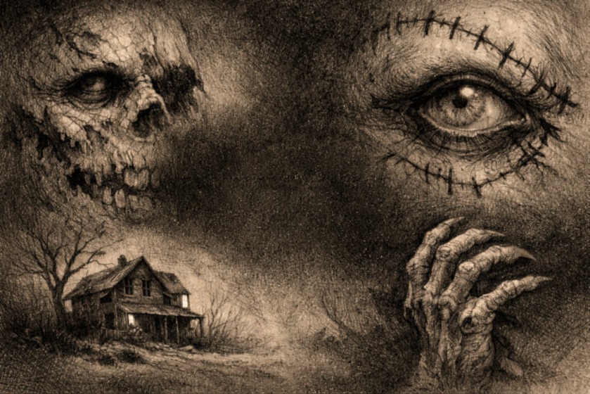
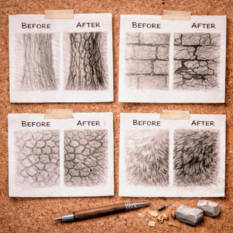
Horror thrives on texture. Wrinkled skin. Cracked walls. Peeling wallpaper. Surfaces that look like they have lived a long, uncomfortable life and are not coping particularly well.
Textured shading is about letting shadows stay rough instead of blending them into submission. When you use uneven strokes, broken shading, and layered marks, the skin suddenly looks aged, the walls appear rotten, and the surfaces feel as though they might flake off if touched. Which is exactly the energy we are aiming for.
This guide is for artists who already understand basic shading and want their horror drawings to feel more tactile, grimy, and uncomfortable in a very intentional way.
What Is Textured Shading?
Textured shading focuses on how shadows are applied, not just how dark they are.
Instead of smoothing everything into soft gradients, you allow shadows to remain uneven, broken, or fragmented to suggest surface detail. The texture comes from the marks themselves, not from outlining every crack or wrinkle.
An important distinction here is this:
- Form shading shows shape and structure
- Textured shading suggests surface quality
You still need solid form underneath. Texture sits on top of that form. If you skip the form and jump straight to texture, things get messy very quickly.
Why Textured Shading Works So Well for Horror Art
Horror art becomes more effective when the textures evoke an unpleasant sensation at the thought of touching them.
Textured shading:
- Makes surfaces feel tactile and real
- Adds age, decay, and damage without heavy outlining
- Keeps shadowed areas visually interesting
- Prevents drawings from looking too clean or polished
Smooth shading can feel calm and controlled.
Broken, uneven shading feels like something went wrong.
That tension is exactly what horror art feeds on.
When to Use Textured Shading (And When Not To)
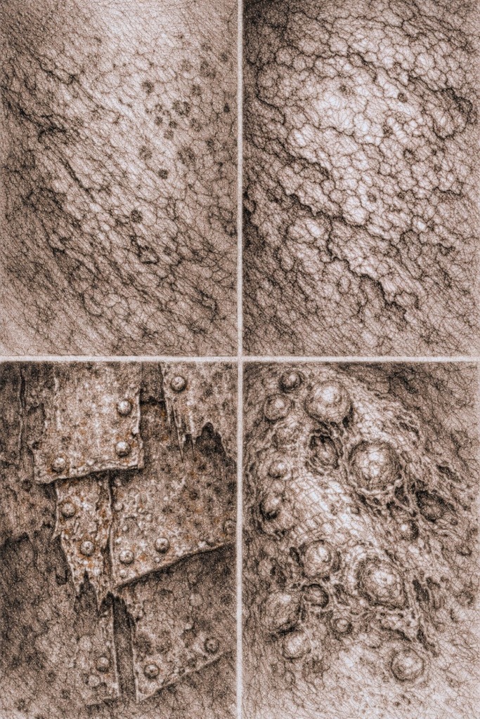
Textured shading works best when the surface itself has a story to tell.
Use it for:
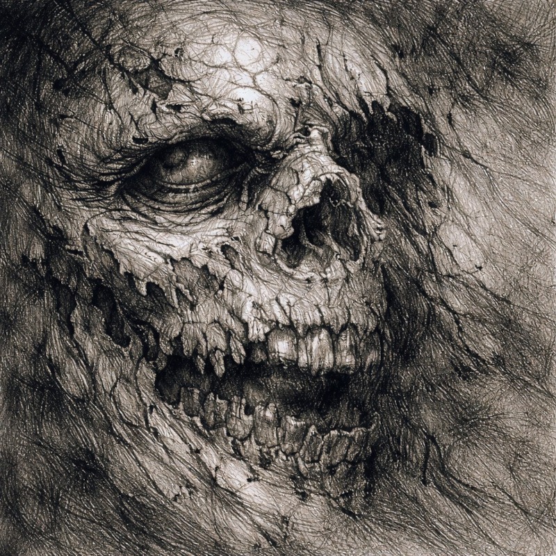
- Aged or wrinkled skin
- Cracked stone, walls, or floors
- Rotten wood or peeling wallpaper
- Diseased, damaged, or corrupted flesh
Avoid heavy texture on:
- Smooth skin that’s meant to look youthful
- Polished objects like glass or metal
- Areas that are supposed to stay calm or readable
Texture should support the subject, not fight it.
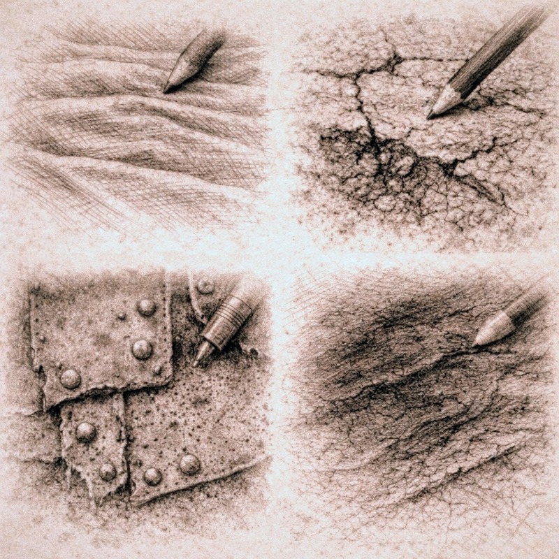
Tools and Shading Techniques You Will Use
You do not need special tools for textured shading. You mainly need to resist the urge to blend everything until it’s smooth.
Useful tools include:
- Graphite pencils (HB-6B)
Different hardness levels help you vary the texture naturally. Harder pencils keep marks sharp and scratchy, while softer pencils create darker, rougher shadows. - Mechanical pencil (optional)
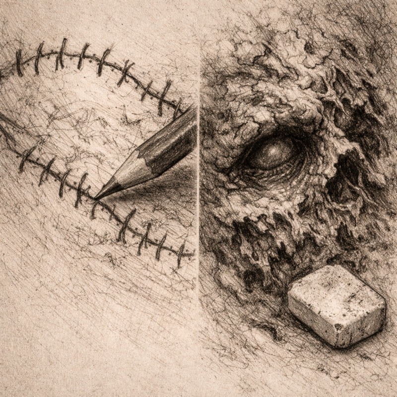
Great for fine cracks, wrinkles, and tight textures where you want control without thick marks. - Kneaded eraser
Used for lifting graphite rather than erasing cleanly. Perfect for breaking up texture, softening areas, and pulling out highlights without smoothing everything away. - Standard eraser
Useful for sharper highlights and correcting areas where texture has gone too far. - Paper with a slight tooth
Smooth paper fights texture. Slightly textured paper grabs graphite better and helps marks stay visible. - Blending stump or tissue (use sparingly)
Blending can still be useful, but only in small amounts and only when the surface calls for it. The goal is to soften, not polish.
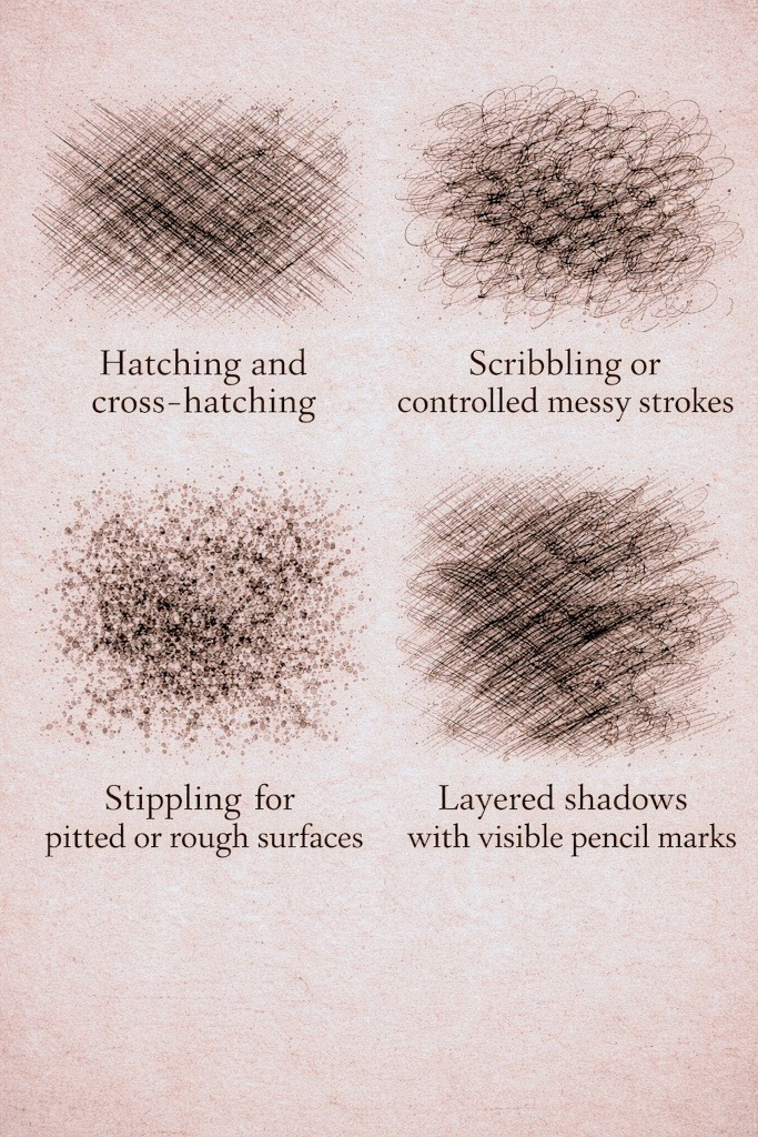
Useful techniques include:
- Hatching and cross-hatching
- Scribbling or controlled messy strokes
- Stippling for pitted or rough surfaces
- Layered shadows with visible pencil marks
Messy does not mean careless:
Even when marks look rough or uneven, they are still placed with intention. Textured shading is about controlled imperfection, not losing control of the drawing.
Blending can still be used sparingly, but only when the surface actually calls for it. Texture lives in the marks you leave behind.
How to Study References for Texture
Before you begin shading, take a moment to closely examine your reference.
Ask yourself:
- Where do shadows break instead of staying smooth?
- Are the edges sharp, soft, or irregular?
- Do darker shadows collect in cracks or folds?
- Does the texture repeat, or is it uneven?
You are not copying every detail. You are studying patterns.
How to Practice Textured Shading
1. Choose a surface to focus on, such as skin, stone, or fabric.
2. Lightly shade the main shadow areas to establish form first.
3. Build texture using uneven marks instead of blending. Let your pencil strokes stay visible rather than smoothing them away.
4. Layer shadows more heavily in cracks, folds, and damaged areas.
5. Step back regularly to make sure the form still reads clearly.
If the drawing starts to look noisy instead of intentional, pause. Texture should enhance the drawing, not overwhelm it.
Horror Tip:
Wrinkles, cracks, and folds become far more unsettling when the shadows between them are darker and less even. Suddenly, your “texture study” looks less like practice and more like it might offer you unwanted advice.
When to Stop Adding Texture
Stop when:
- The surface reads clearly from a distance
- The texture supports the form
- Additional marks stop adding useful information
If everything is textured equally, nothing stands out. Let some areas breathe.
Practice Exercise
This exercise helps you practice adding texture on top of solid form shading so your surfaces feel aged, rough, or decayed rather than smooth and polished. Work small. Texture is easier to control in tiny sections.
1. Draw a small section of skin, stone, or wall
Keep it simple. You only need a small square or patch.
No full characters needed here.
Choose one:
- Rotten or wrinkled skin
- Cracked stone
- Damaged wall
- Weathered fabric or bandages
Focus on one material at a time.
2. Shade the basic form lightly first
Before adding texture, establish the form.
- Add light shadows where the surface curves or turns away from the light
- Keep everything soft and subtle
- Do not add any texture yet
This layer gives you a foundation so the texture feels like it belongs to an actual 3D object, not a flat pattern.
3. Add texture only in the shadowed areas
Texture belongs where light struggles to reach.
Use:
- Short uneven strokes
- Broken lines
- Dots and small clusters
- Gritty marks
Let your pencil marks stay messy and irregular.
Avoid neat or repetitive patterns. Decay is rarely tidy.
4. Push darker texture into creases and folds
Deep damage and heavy texture sit in:
- Wrinkles
- Cracks
- Holes
- Overlaps
- Edges where decay is strongest
Darken these areas slowly.
Let the darkest textures fade into the shadows rather than sitting on top of them.
5. Leave highlight areas relatively clean
Texture disappears where strong light hits the surface.
So:
- Keep the lightest areas smooth
- Reduce texture gradually as the surface curves toward the light
- Let only the mid shadows and deep shadows carry the rough details
This creates the illusion that your texture is part of the material, not drawn over it.
6. Focus on suggestion, not explanation
Your goal is not to outline every crack.
You are aiming for the impression of decay, not a map of every surface detail.
Stop when it feels gritty and believable.
If you keep adding marks, it will turn into static rather than texture.
Final Thoughts
Textured shading focuses more on what to leave rough than on smoothing everything out.
If your first attempts feel messy or slightly out of control, that is completely normal. Texture is meant to look imperfect, especially in horror art, where those imperfections often do most of the heavy lifting.
Focus on letting shadows break, keeping marks visible, and allowing surfaces to feel a little uncomfortable. When texture supports the form instead of fighting it, your drawings start to feel older, heavier, and far more believable.
And remember, if everything looks too clean, too smooth, or a bit too polite, you are probably being far too kind to it. Horror art rarely rewards good manners.
What You Learned:
- Textured shading focuses on mark-making, not blending
- Texture sits on top of solid form, not instead of it
- Rough, uneven shadows help suggest age and decay
- Studying how shadows break improves realism
- Knowing when to stop keeps texture intentional
Continue Exploring Advanced Shading Techniques
Textured shading helps give your horror drawings age, damage, and that wonderfully uncomfortable surface detail. If you want to build on this and push the mood even further, these techniques work especially well alongside it:
- Layered Shadows for Extra Depth
Learn how building shadows gradually adds weight and dimension before texture is even applied. - Blending Graphite and Charcoal for Extreme Contrast
Discover how combining materials can push decay and darkness much further without losing control. - Negative Space Shading for Eerie, Ghostly Effects
Use shadow and absence to let figures emerge instead of fully defining them. - Suggestion vs Detail in Horror Art
Explore how selecting elements not to fully render can make textured surfaces feel more unsettling. - Strategic Highlights for Maximum Horror Impact
Explore how small deliberate highlights can bring attention to textures without ruining the mood.