
Why Texture and Depth Matter in Shading

Shading is not just about making things darker. If it were, we could all just aggressively scribble and call it a day. Sadly, art does not work like that.
Texture and depth are what turn a flat sketch into something that feels real. Or at least real enough to make someone lean in and go, “Oh… that’s unsettling.” Think of it like this. Without texture and depth, your drawing is a cardboard cutout. With them, it suddenly looks like it could step off the page and ask why you keep adding teeth.
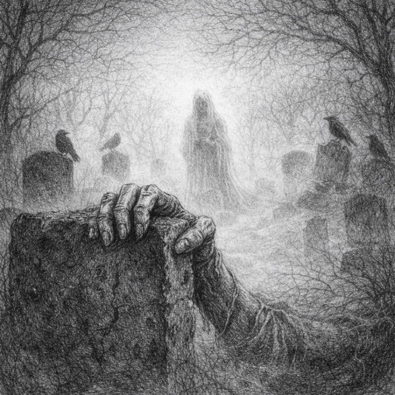
Whether you’re drawing cracked bone, wrinkled skin, fog creeping through a graveyard, or fabric that looks like it has not been washed since 1843, texture and depth are doing most of the heavy lifting behind the scenes.
Shading is not just about making things darker. It’s about showing the shape of objects, the surface they are made of, and the space they sit in.
Let’s break down why they matter and how they change your drawings.
Texture brings surfaces to life

Texture tells the viewer what something feels like. Artists show texture mostly through the direction, spacing, and pressure of shading lines, not by drawing every tiny detail.
Is it smooth?
Rough?
Soft?
Dry?
Or deeply suspicious?
Without texture, everything starts to look like it is made from the same mysterious grey material. You know the one. That cursed plastic texture used in early 2000s video games, where nothing had pores, souls, or hope.
Adding texture helps:
- Skin feel organic instead of shiny
- Bone look dry and brittle
- Fabric appear soft, torn, or worn
- Surfaces feel aged, damaged, or decayed
Texture doesn’t mean drawing every detail. It’s often suggested through shading patterns and mark direction, such as the way lines follow wrinkles, cracks, or fabric folds. You don’t need to draw every pore or crack. A few well-placed marks often do more than overworking the entire area.
Depth stops drawings from looking flat

Depth gives your drawing a sense of space. Without it, everything sits on the page like cardboard cutouts politely waiting their turn and refusing to be scary until called upon.
This is not about complex perspective grids. Depth can be as simple as darker shadows, softer edges, or less detail in the background.
Depth helps the viewer understand:
- What is close
- What is further away
- Where the focus should be
In horror art, especially, depth is powerful.
It allows you to:
- Pull attention toward unsettling details
- Push backgrounds into shadow
- Create atmosphere and tension
- Make scenes feel larger, heavier, or uncomfortably claustrophobic
A shadowed background can make a face feel closer.
A soft fade can make a hallway feel endless.
Strong contrast can make an object jump forward in a very rude way.
Depth quietly controls the mood by guiding where the eye goes and what stays hidden.
Texture and depth work best together

Texture and depth are best friends.
Texture makes things feel touchable. Depth tells us where they exist in space.
Together they:
- Guide the viewer’s eye
- Add mood and atmosphere
- Make drawings feel planned rather than accidental
- Create the eerie realism that horror art thrives on
You can have texture without depth, but it may feel busy.
You can have depth without texture, but it may feel empty.
When both work together, your drawing suddenly feels alive. Or undead. Depending on your theme.
Why this matters for horror art
Horror relies heavily on suggestion.
You don’t need to show everything. In fact, showing less often works better.
Texture and depth allow you to:
- Let shadows hide unsettling details
- Suggest decay without spelling it out
- Create mystery and tension
- Make viewers imagine what they cannot fully see
Sometimes the scariest part of a drawing is the area you barely shaded at all.
That is where texture and depth quietly whisper, “Something’s wrong here,” and then wander off.
Rude. But effective.
A gentle reminder before we move on
You don’t need perfect shading to use texture and depth well.
You do not need fancy tools.
You do not need to draw for hours every day to improve.
And you definitely do not need to shade every inch of the page as if it personally offended you.
Small choices matter more than heavy pressure.
A few thoughtful marks will always beat aggressive scribbling.
Your paper will thank you.
Conclusion
Texture and depth might sound like fancy art terms, but they’re really just ways of helping your drawings feel more believable and intentional. They help surfaces feel real, guide the viewer’s eye, and create atmosphere without having to add lots of extra detail. Even small shading choices can completely change how a drawing feels.
You do not need to master everything at once. Learning how texture and depth work is a gradual process, and every sketch you make teaches you something new, even the messy ones that don’t turn out as planned.
As you continue practising, you will start to notice when a drawing feels flat and why. And once you can spot it, you are already halfway to fixing it.
What you learned:
- Texture helps surfaces feel believable and tactile
- Depth creates space and guides the viewer’s eye
- Using both together helps drawings feel intentional instead of flat
- Subtle shading choices often work better than heavy pressure
- Horror art benefits greatly from suggestion, shadow, and atmosphere
Up Next: Understanding Surface Textures in Shading
Next, we will explore different surface textures and how shading behaves on skin, bone, fabric, and other wonderfully unsettling surfaces in the Understanding Surface Textures in Shading post.