Negative Space Shading for Eerie, Ghostly Horror Effects
Negative space shading is one of the sneakiest tools in horror art.
Instead of carefully shading the subject, you shade everything else and let the figure appear on its own. No heavy outlines and no overworked details. Just darkness doing most of the work while the viewer’s brain fills in the rest.
Used well, negative space shading makes figures feel ghostly, half-seen, and unsettling in a way that feels effortless. Used badly, it looks like you forgot to finish the drawing. So let’s avoid that.
This guide is for artists who understand basic shading and want to create eerie, atmospheric horror effects using suggestion rather than detail.
What Is Negative Space Shading?
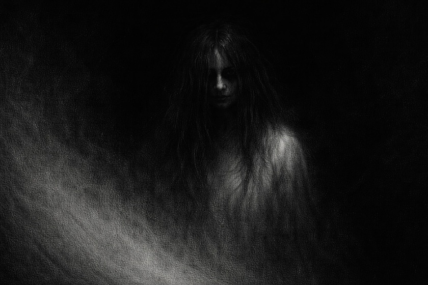
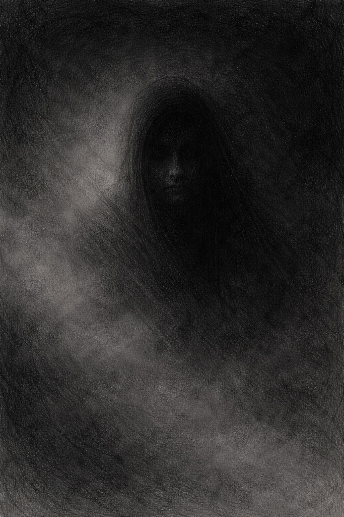
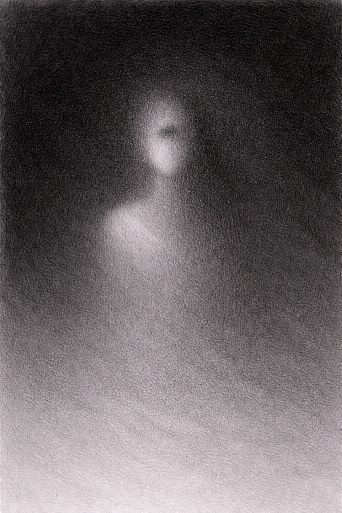
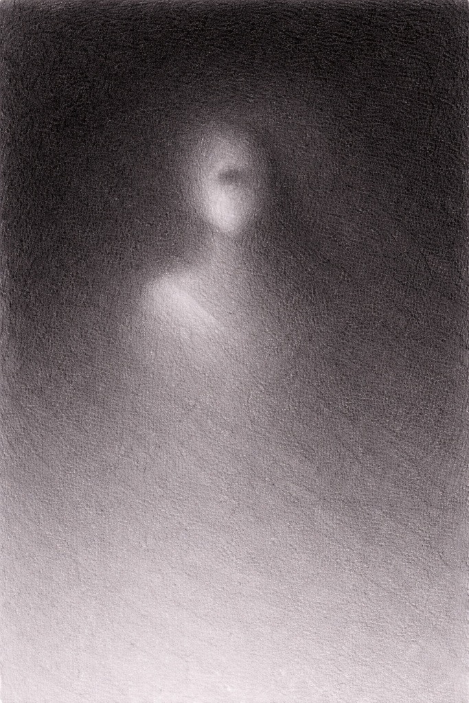
Negative space shading focuses on the area around the subject rather than the subject itself.
Imagine a face barely visible in the dark. You might catch the curve of a cheek or the hollow of an eye socket, but the rest is swallowed by shadow. Your brain fills in the missing parts, often imagining something worse than what is actually drawn.
Instead of shading the figure heavily, you:
- Darken the background
- Keep the figure lighter
- Let edges fade in and out of shadow
The subject appears because of contrast, not because it has been fully drawn.
This is especially effective in horror art because it mirrors how we see things in low light. We rarely see everything clearly. We catch shapes, hints, and movement, and our imagination fills in the worst parts for us.
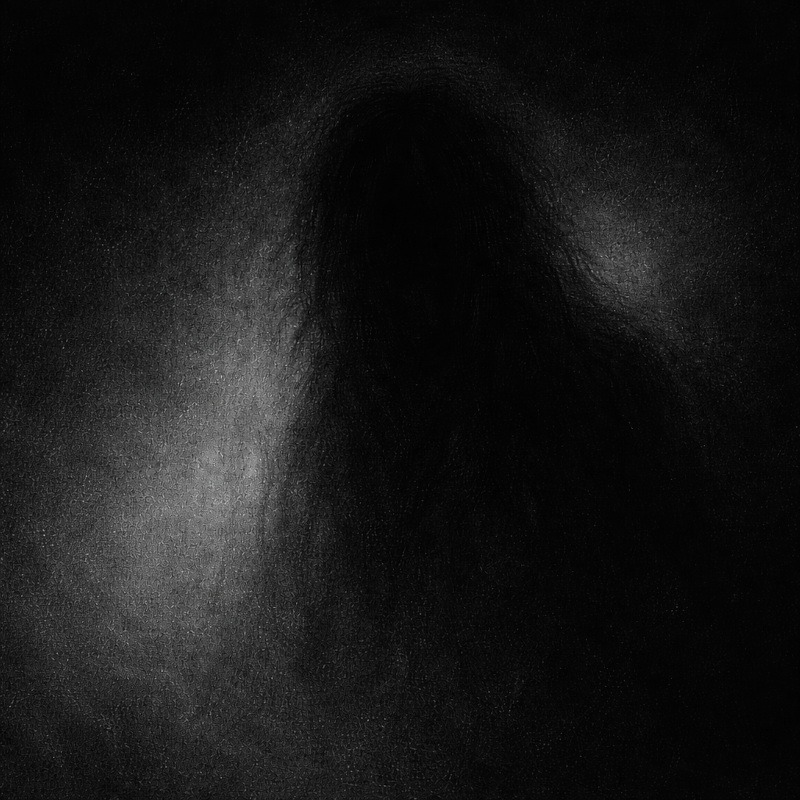
Why Negative Space Works So Well for Horror
Horror thrives on what is not fully revealed.
Negative space shading:
- Creates mystery without over-explaining
- Makes figures feel like they are emerging from darkness
- Keeps the viewer engaged as they try to “find” the subject
- Suggests presence rather than showing it outright
A clearly drawn figure can feel safe.
A partially revealed one feels like it might move when you look away.
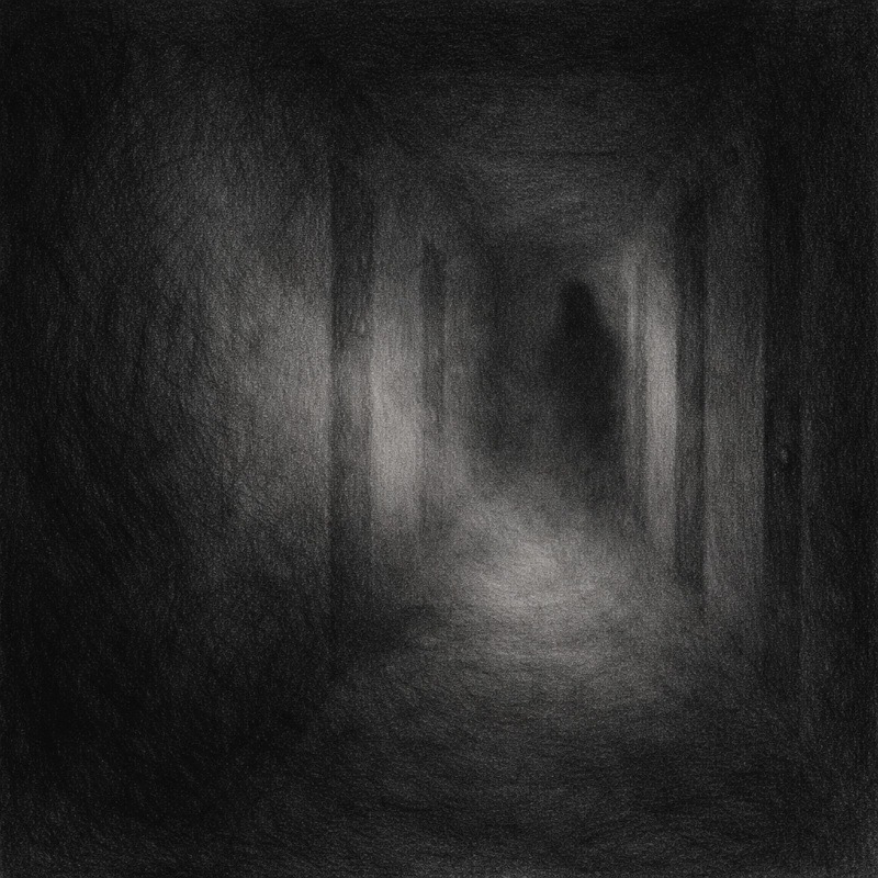
When to Use Negative Space Shading
Negative space works best when subtlety matters more than detail.
It is especially effective for:
- Ghosts and shadow figures
- Faces emerging from darkness
- Figures in fog, smoke, or low light
- Background characters you do not want fully defined
It is less effective when:
- The subject relies on clear anatomy
- The entire drawing is already very dark
- The subject relies on precise details or textures to read clearly
Negative space is about restraint. Too much darkness everywhere removes the effect.
Tools You Will Need:
This technique does not require anything fancy.
- Graphite pencils for light shading and control
- Charcoal or soft graphite for dark backgrounds
- Blending stump or tissue for smooth transitions
- Kneaded eraser for soft highlights and edge control
Negative space shading is more about decision-making than materials.
Step-by-Step: How to Practice Negative Space Shading
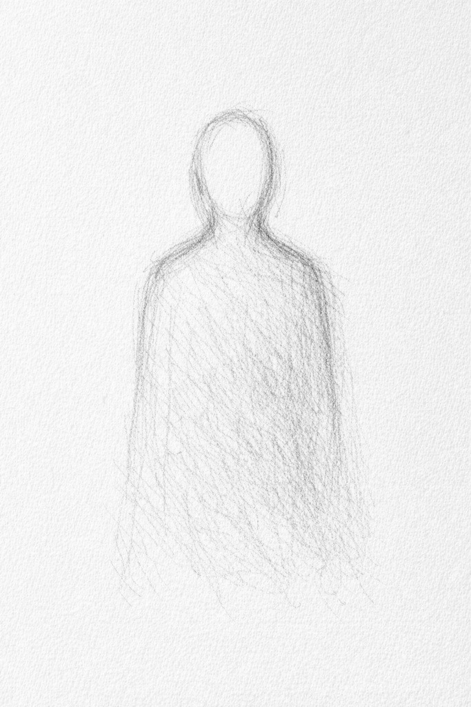
Step 1: Sketch a Simple Subject
Start with a rough outline of a figure or object. Keep it loose and simple. You are not committing to details here.
Think silhouette, not anatomy.
Step 2: Shade the Background First
Instead of shading the subject, shade the area around it.
Build the darkness gradually, focusing first on the space closest to the edges of the figure. This contrast is what allows the subject to emerge from the background.
Keep your pencil pressure light and uneven. Don’t aim for solid black yet. At this stage, you are establishing contrast, not finishing the drawing.
If this feels strange, that’s normal. You are deliberately letting the background do the work while the subject stays untouched for now.
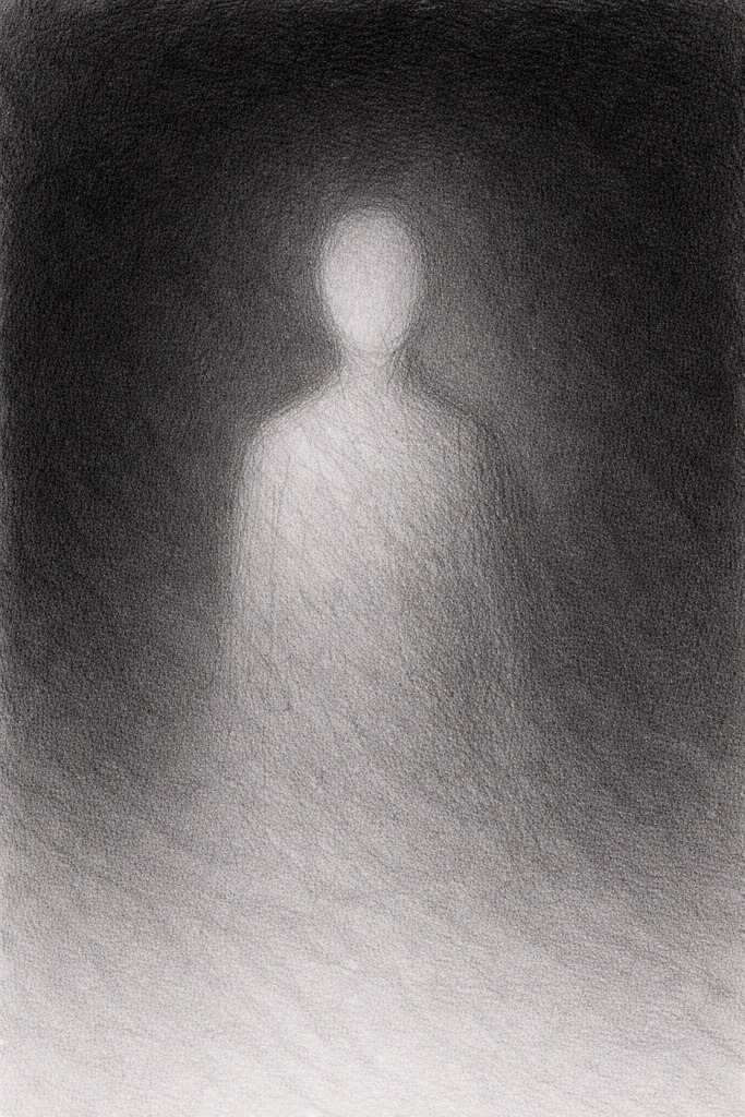
Step 3: Let the Figure Stay Lighter
Allow the subject to remain lighter than the surrounding space.
If you feel the urge to keep refining the figure, that is usually your cue to stop.
You can add minimal shading to suggest form, but resist the urge to fully define it. The less you draw, the more the viewer’s imagination takes over.
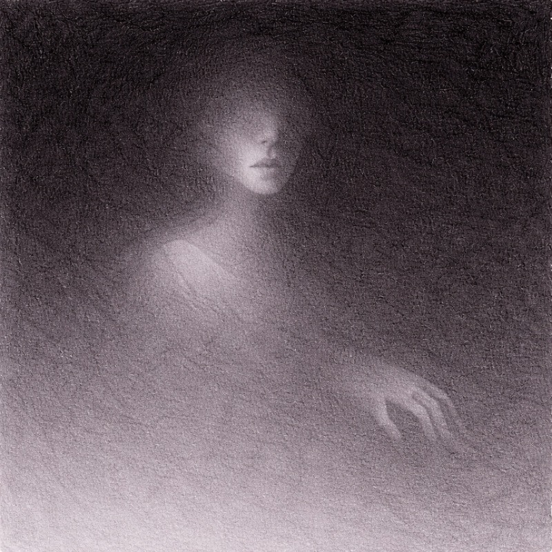
Step 4: Decide What to Reveal and What to Hide
Choose specific areas to reveal slightly, such as:
- Part of a face
- A hand or shoulder
- The edge of a skull or eye socket
Let other areas fade completely into shadow. Uneven visibility is what creates tension.
Reveal only one small area at a time. If you can clearly identify the entire subject, you have likely revealed too much.
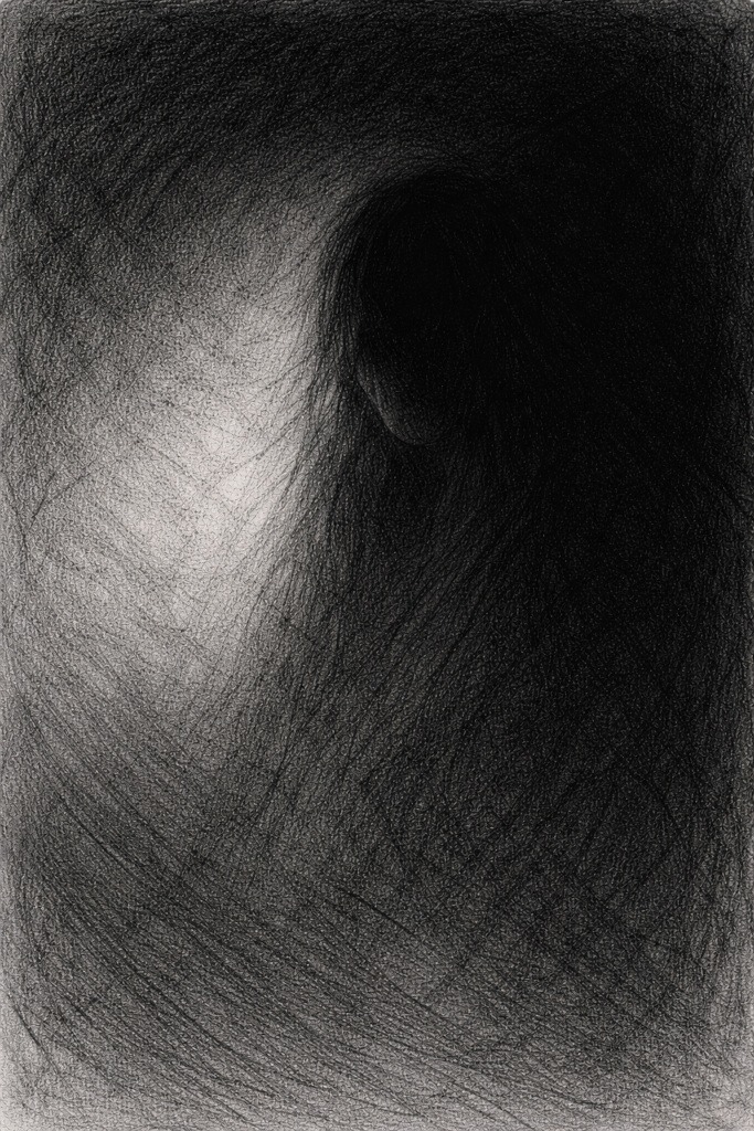
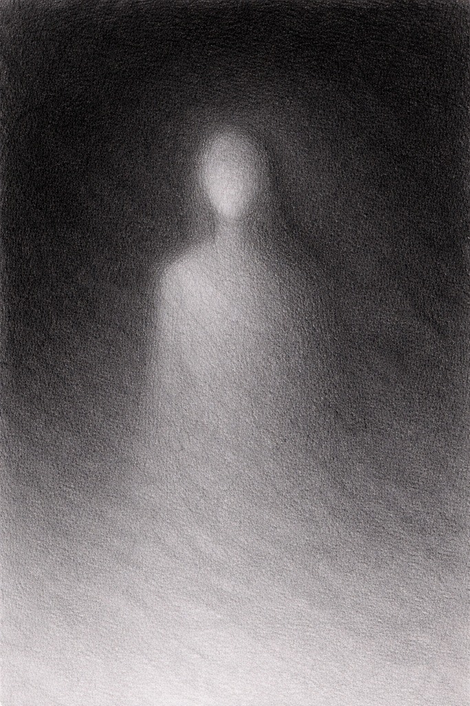
Step 5: Soften and Break Edges
Blend or use an eraser to soften edges where the figure meets the darkness.
Hard edges feel solid. Soft or broken edges feel unstable, like the figure is not fully anchored in the scene. If an edge looks like it could be cleanly traced with a pen, it’s probably too hard.
Horror Tip:
Negative space works best when it shows just enough. If the viewer is unsure whether they are seeing a figure or imagining one, you have nailed it. If they immediately see everything clearly, you have gone too far.
Common Mistakes (And How to Fix Them)
1. The subject disappears completely
Your contrast is too low. Darken the background or lift the figure slightly.
2. It looks unfinished
Add one or two small areas of detail to anchor the subject.
3. Everything feels flat
Introduce subtle value changes in the background instead of one solid tone.
Practice Exercise
This exercise teaches you how to suggest a figure using darkness around it instead of shading the figure directly. Keep the drawing small. Subtlety is easier in a small space.
1. Lightly sketch a skull, face, or simple figure
Keep the lines faint.
You’re only marking the basic shape, so you know where the figure sits.
Avoid details at this stage. Details come from contrast, not outlines.
2. Shade the background first
Start shading everything around the figure.
Use soft, light strokes at first.
Your goal is to slowly surround the figure with darkness.
The background should get gradually darker the closer it gets to the figure.
3. Keep the subject lighter
Do not shade the figure heavily.
Instead:
- Let the white of the paper act as the main highlight
- Add only the faintest mid-tones where absolutely needed
- Leave most of the form untouched
The contrast between a dark background and a light subject creates the ghostly effect.
4. Reveal only a few details
Choose one or two features to show clearly, such as:
- One eye
- The curve of a cheek
- Part of a mouth
- A small piece of bone
Keep them subtle.
The point is to hint, not fully describe.
Let the viewer’s imagination do the rest.
5. Let edges fade instead of outlining them
Do not draw strong outlines around the subject.
Instead:
- Let the background shading fade softly into the figure
- Allow some edges to disappear entirely
- Use gentle transitions to make the subject feel half-seen
This is what makes the figure feel ghostly, not unfinished.
6. Stop early
Negative space shading loses power when overworked.
If you shade the background too evenly or add too many details to the figure, it stops feeling eerie and starts looking like a normal portrait.
Stop when:
- The figure barely appears
- The background feels heavier than the subject
- The drawing gives you that subtle “something is there” tension
Less is stronger here.
Final Thoughts
Negative space shading works best when you resist the urge to explain yourself. If it feels slightly uncomfortable to stop where you are, you are probably doing it right.
It can feel strange leaving parts of a drawing unfinished on purpose, especially when every instinct says to add “just one more line.” Try not to. The moment you stop before everything is clear is usually the moment that the drawing starts to work.
When the background does most of the talking and the figure feels half-seen rather than fully drawn, your viewer’s imagination steps in and happily makes things worse. Which, for horror art, is ideal.
If your drawing looks like it is quietly appearing from the darkness instead of confidently standing in front of it, you have done this exactly right.
What You Learned:
- Negative space shading focuses on the space around the subject rather than the subject itself
- Contrast creates the figure, not heavy outlines
- Hiding information can be more unsettling than showing it
- Soft edges help figures feel ghostly and unstable
- Restraint is key to making this technique work
Continue Exploring Advanced Shading Techniques
Negative space shading is all about restraint, suggestion, and letting darkness do the talking. If you want to build on that eerie, half-seen feeling, these techniques work especially well alongside it:
- Layered Shadows for Extra Depth
Strengthen the sense of form and weight before letting parts of the subject fade into shadow. - Textured Shading for Skin, Decay & Surfaces
Add subtle surface detail where forms emerge from darkness, without fully revealing them. - Blending Graphite and Charcoal for Extreme Contrast
Push negative space even further by using deeper backgrounds and heavier shadow separation. - Suggestion vs Detail in Horror Art
Learn how choosing what to leave vague can make ghostly figures feel more unsettling. - Strategic Highlights for Maximum Horror Impact
Use small highlights to anchor the viewer’s eye when most of the subject is hidden in shadow.