Techniques to Add Texture and Depth
When it comes to creating eerie surfaces and unsettling detail in horror art, it is not just about shading darker. Texture and depth come from the techniques you use, the way your strokes move, and how gradually you build tone and surface detail.
In this guide, we will look at a range of techniques that help drawings feel rough, aged, foggy, cracked, or disturbingly alive. Some rely on shading, others on mark-making and surface control, but they all work together to bring atmosphere and depth into your artwork.
Why texture and depth matter
Texture tells your viewer what something feels like.
Depth tells them where it sits in space.
Think of texture as the surface, and depth as the space it exists in.
On their own, they can work well enough. Together, they stop your drawing from looking like a spooky sticker and start turning it into a proper scene.
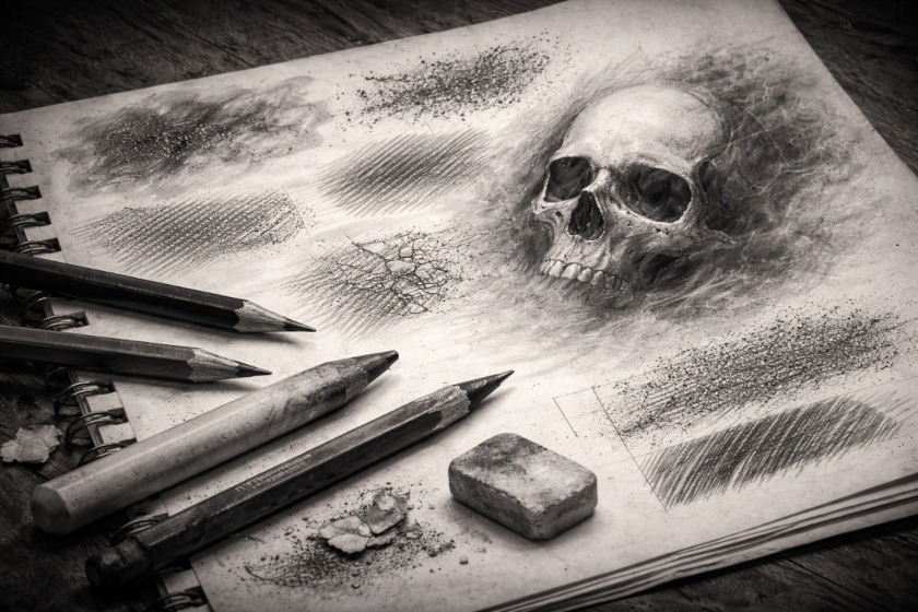
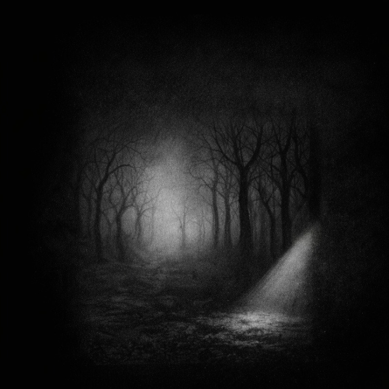
A flat, shaded skull may still appear to be just a drawing. But give it varied texture and believable depth, and it starts to feel like it has been sitting in a damp crypt for several centuries and is deeply unhappy about it.
That difference is what makes horror art feel real instead of decorative.
How shading creates texture
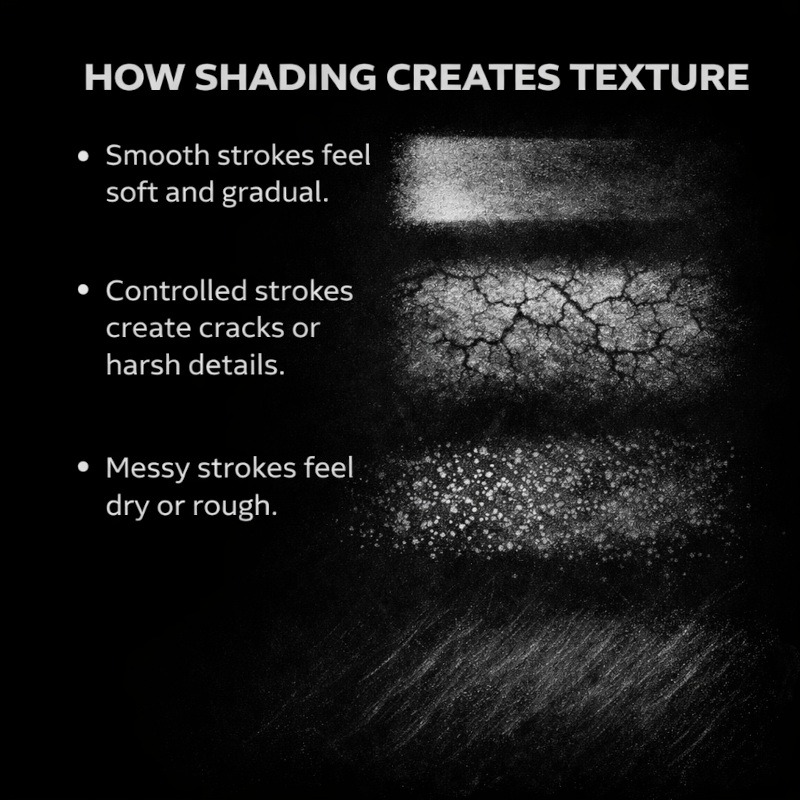
When you shade, you are not just moving your pencil across paper. You are deciding how a surface should feel.
The difference does not come from how dark you go, but from how you use your shading. The way your pencil moves leaves small clues behind, even when you do not realise it.
Neat, controlled strokes tend to feel smoother. Messy or broken strokes feel rougher. Soft transitions can look misty or ghostly, while harsh contrasts often feel dry, cracked, or sharp.
Your hand tells on you more than you might expect. Tense strokes look very different from relaxed ones, and those tiny differences are what give textures their personality. Once you start noticing this, shading stops being about filling space and starts becoming a way of shaping the surface itself.
Stroke direction changes everything
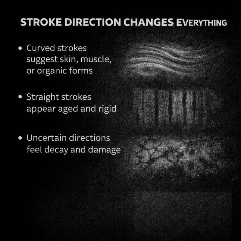
One of the easiest ways to create texture is simply changing the direction of your shading. It is a small adjustment, but it makes a huge difference. The way your pencil moves matters more than how hard you press.
When your shading follows the form of an object, it feels rounded and alive.
When it cuts across the form, it can suddenly feel stiff, stretched, or damaged.
For example:
- Curved strokes suggest skin, muscle, or organic forms
- Straight strokes feel harder and more rigid
- Uneven directions add decay and age
You don’t need more pressure.
Texture comes from direction, not force.
When your strokes follow the form, the surface begins to make sense.
Layering creates depth (and drama)
Depth rarely comes from one heavy layer of graphite. It is built slowly, starting with light tones and adding darkness little by little.
Light layers come first, then another, and then one more where the shadows deepen.
This gradual build creates space between light and dark, which is what makes areas feel closer or further away. When everything sits in the same shade, the drawing can start to look flat. As tone develops gradually, it begins to breathe.
In horror art, that slow build adds tension. The good kind. The sort that makes a drawing feel like something might be lurking just beyond what you can clearly see.
Soft shading vs harsh shading
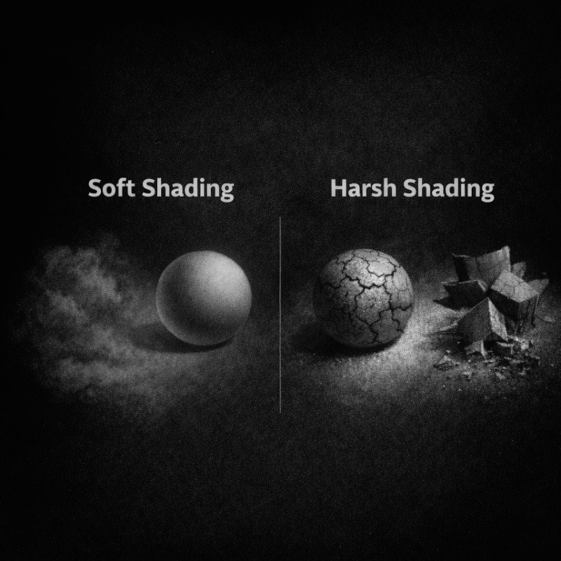
Not all shadows are meant to look the same.
- Soft shading works well for fog, mist, smoke, bruised skin, or eerie lighting
- Harsh shading works better for cracks, bones, wrinkles, and sharp forms
Mixing the two is where things start getting interesting, especially when contrast comes into play.
A soft shadow next to a sharp one instantly adds contrast, and contrast is what pulls the viewer’s eye exactly where you want it.
Indenting for Subtle Texture
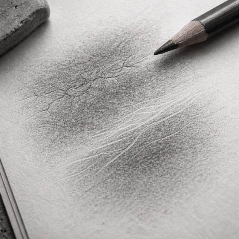
Not all texture comes from adding graphite. Sometimes it comes from changing the surface before you shade at all.
Indenting is a technique where you gently press lines into the paper first, usually with a kneaded eraser edge, embossing tool, or even an empty ballpoint pen. When you shade over these areas later, the indented lines resist the graphite, creating soft highlights and natural texture.
The pressure should be light. You want to mark the paper, not carve it.
This technique works especially well for fine details that should feel light rather than dark. Wrinkles, veins, scars, stretched skin, or faint cracks often look more convincing when they appear as highlights instead of heavy outlines.
Because indenting affects the paper itself, it is best done before any shading begins. Once graphite is layered on top, the effect becomes subtle but very effective. The result feels organic and slightly unpredictable, which suits horror art perfectly.
If you can clearly see the indented lines before shading, they are probably too deep.
It is not meant to be bold or obvious. Indenting works best when the viewer notices it without quite knowing why.
Why indenting works:
- Creates natural highlights without erasing
- Adds texture that feels embedded in the surface
- Works well for skin, veins, wrinkles, and fine cracks
Combining techniques for realism
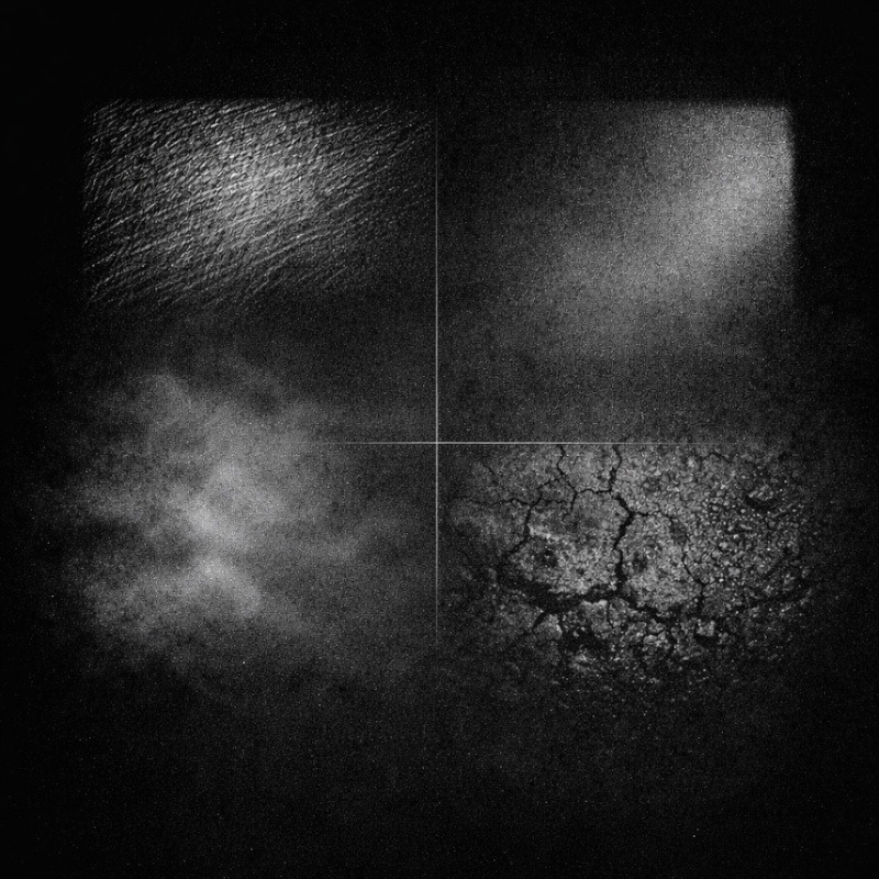
Most realistic horror textures use more than one technique at once.
For example:
- Light hatching for base tone
- Gentle blending for depth
- A touch of stippling or rough marks for texture
You don’t need to use everything at once.
Think of techniques as tools you layer together, depending on the surface you are trying to create.
Smooth skin needs a different treatment than cracked bone.
Fog behaves very differently from fabric.
And nothing in horror art is meant to look perfectly clean. Ever.
Where to learn the shading techniques themselves
Not sure how hatching, stippling, or blending actually work yet? My Shading Techniques for Creepy Drawings guide explains them all before things get properly spooky.
Final thoughts
Texture and depth aren’t about pressing harder or making everything darker.
They’re about:
- observing surfaces
- layering gradually
- letting your strokes work with the form
- and giving your drawing room to breathe
The more you experiment, the more natural the process becomes.
And if your shading looks a bit weird at first, that’s completely fine.
Horror art thrives on weird.
Some of the best textures start as an “oops.”
What You Learned:
- Texture is about how a surface feels, while depth shows where it sits in space.
- Shading is not just about going darker. Stroke direction, layering, and contrast all matter.
- Following the form of an object helps textures look more believable.
- Building tone gradually creates stronger depth than pressing hard straight away.
- Soft and harsh shading each have their place, especially in horror art.
- Indenting can add subtle highlights and fine texture before shading begins.
- Combining techniques helps surfaces feel aged, damaged, or unsettling rather than flat.