Coloured Pencils for Horror Art: Turning Sweet Tools into Nightmare Fuel
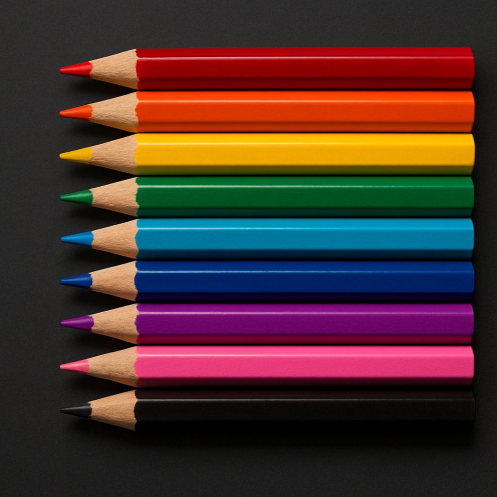
Coloured pencils look innocent – like they’re meant for sunshine, butterflies, and children drawing “Mum” with giant stick arms. But in horror art, they’re the quiet troublemakers. They don’t scream gore; they slip in hints that something is deeply wrong.
A soft purple under the eyes instantly says, “I haven’t slept since the moon started whispering.” A faint green around the cheekbones? “I crawl out of cellars for fun.” A touch of blue on the lips turns a normal character into “I walk between worlds now.”
You don’t have to colour the whole face, just enough to suggest the story beneath the skin. Coloured pencils don’t yell horror. They let the horror linger.
Colour Psychology for Horror Atmosphere
When adding colour to horror drawings, you’re not simply decorating, you’re signalling what the body has endured.
- Purple can suggest bruising, stress, or blood pooling under the skin.
- Green can imply infection, decay, or something that should not be happening inside the body.
- Yellow-grey tones create waxy, unhealthy, dehydrated skin.
- Soft blue can make the skin appear cold, drained, or corpse-pale.
- Red, used sparingly, adds irritation, pain, or broken blood vessels.
These colours work best when applied lightly. Horror isn’t sold through intensity; it’s sold through implication. Let the viewer’s brain fill in the rest.
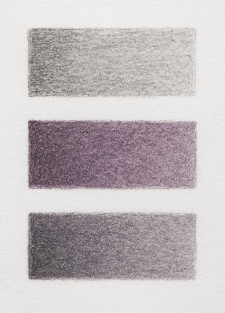
Essential Undertones for Horror Skin
You don’t need a huge pencil set to create unsettling, moody horror effects. Horror colouring works best with subtle, muted tones; colours that make the viewer think “Are they okay?” and the answer is no.
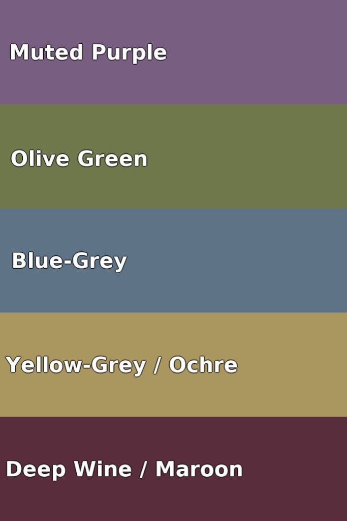
Start with these five:
- Muted Purple
Perfect for under-eye shadows, bruising, and emotional exhaustion so old it has its own postal address. - Olive Green (soft, not neon)
Adds that sickly, uneasy undertone – great for cheek hollows and jawlines. - Blue-Grey
Instantly makes skin look colder, drained, or a few degrees closer to the afterlife. - Yellow-Grey / Ochre
Gives the skin a waxy, feverish look, as if the character hasn’t eaten or breathed fresh air in… some time. - Deep Wine / Maroon Red
Perfect for dried blood, cracked lips, wounds, and old regrets.
You only need tiny amounts.
Horror colouring isn’t dramatic – it’s the slow dread creeping in.
Choosing Your Coloured Pencils
You’ll mainly encounter two pencil behaviours:
Softer-Core Pencils:
- Blend easily and glide smoothly.
- Create soft transitions ideal for:
- Bruising
- Tired eye sockets
- Ghostly skin tones
Firmer-Core Pencils:
- Stay sharp and precise.
- Perfect for:
- Veins
- Wrinkles
- Cracks and dried textures
You do not need both to begin. Whatever you already own can work; horror colouring relies on light pressure, slow layering, and restraint, not equipment.
Sharpening Coloured Pencils
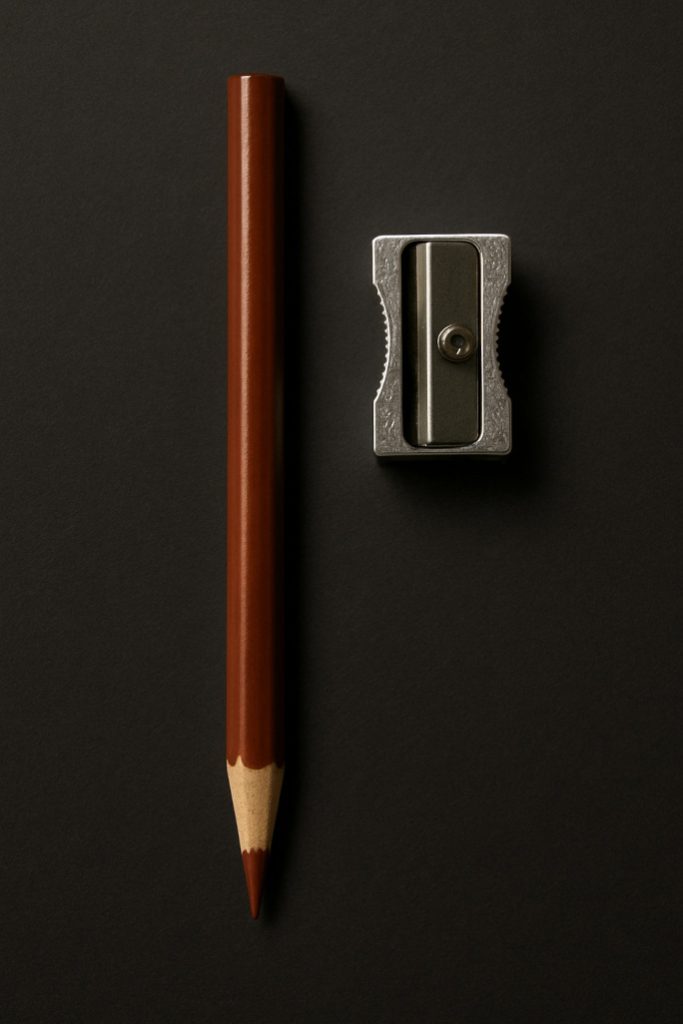
Colored pencils resemble graphite pencils in appearance, but the materials inside function quite differently.
Graphite has a solid mineral core.
Coloured pencils have a core made of pigment mixed with wax or oil, making them softer and more prone to breakage when handled roughly.
So we handle them a little more gently.
How to Sharpen Them Properly:
1. Use a good, sharp sharpener.
Cheap sharpeners often damage coloured pencils instead of sharpening them effectively.
If your pencil comes out looking like it lost a fight, it’s the sharpener – not you.
2. Turn the pencil, not the sharpener.
Hold the sharpener still and rotate the pencil slowly.
This puts less stress on the core and helps prevent snapping.
3. Don’t sharpen to a needle-point.
Super sharp points look impressive for about three seconds, then snap.
Aim for a sharp, but slightly rounded point, perfect for blending and detail without heartbreak.
4. If the pencil keeps snapping, the core is cracked inside.
This often happens if the pencil has been dropped (we’ve all done it).
Just sharpen slowly until you pass the damaged section.
Optional Technique (Artist-Level, Not Scary):
If you ever feel confident enough, you can use a craft knife to shave the wood away and shape the pencil tip more gently. This gives you amazing control and helps prevent breakage. Just take your time and always angle the blade away from you.
Think of it like peeling a carrot, not slashing at a demon.
The Paper You Use Matters
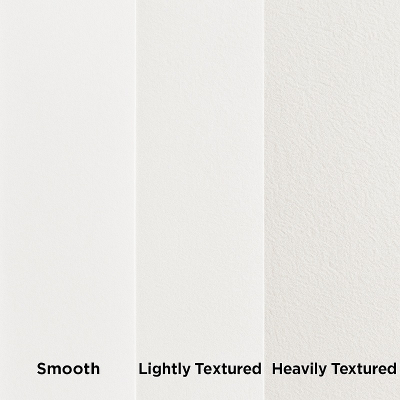
Paper texture changes how colour sits on the surface.
- Smooth paper gives clean, pale, porcelain skin (perfect for ghosts, dolls, and uncanny beauty).
- Lightly textured paper allows layers to build naturally (ideal for sickly humans, zombies, and possessed characters).
- Heavily textured paper gives broken, rough surfaces right away (great for corpses, fungal creatures, or anything rotten).
If you’re a beginner, mixed media paper is the easiest to control; it blends colour without forcing a grainy texture.
The Layering Method
- Start in graphite.
Do your basic drawing and shading first. Think of graphite as your foundation.
Make sure your light source, shadows, and form feel right before adding any colour – colour won’t fix shaky structure, it just highlights it (like contouring over a chaotic eyeliner moment). - Add your “creep tones” very lightly.
Use the softest pressure you can.
You’re not colouring the skin – you’re tinting it.
If you can hear your pencil scratching, you’re pressing too hard.
You want it to look like something is off, not like face paint from a school carnival. - Blend in tiny, gentle circles.
No long streaky pencil marks.
Small circular motions allow the colour to blend into the graphite rather than resting on top like chalk. - Use graphite again to tone and dull the colour.
Lightly shade back over the coloured areas.
This knocks down any brightness and gives that drained, eerie, “I have seen too much” skin tone.
This step is where the drawing quietly becomes unsettling, in a good way. - Add highlights and glow at the very end.
Use a white pencil, eraser edge, or a gentle lift of graphite to brighten key spots:- under the eye shine
- tip of the nose
- catchlights in the iris
The idea here is to make the eyes and key areas look alive in a way that makes you suspicious.
Common Beginner Troubles (and Easy Fixes)
- If it looks too colourful, tone down with graphite.
- If it looks muddy, you pressed too hard too early. Try lifting and relayering.
- If blood looks like cartoon makeup, mix in brown and purple, never pure red alone.
- If veins look “drawn on,” soften the edges and vary the thickness.
Quick Practice Exercise
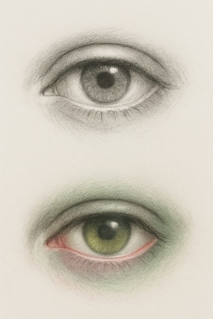
Start by drawing the eye in graphite. Focus on the overall shape, the eyelid crease, the iris and pupil, and some soft shading around the eye. Don’t rush the details; this is all about building form and gentle value transitions.
Now add colour very lightly:
- Brush a very soft hint of purple under the lower lid to suggest tiredness or stress.
Keep this extremely subtle, just a whisper of tone. If it turns into a defined purple stripe, it will start to look like makeup rather than mood. - Add a faint wash of swampy green around the outer edge of the eye socket for a subtle, eerie undertone.
Think of the green as a fog drifting around the eye, not something being painted on in solid patches. - Dot the waterline with the tiniest touch of pink/red, just enough to suggest life (or… questionable life).
Stop the moment it looks too bright, we want “haunted but functioning,” not “hay fever apocalypse.” - If you want, add a soft tint to the iris using whichever colour suits your character.
Keep the layer light, blend gently, and let the graphite show through; the goal is a subtle glow, not a bold colour-blocked eye.
If it looks like makeup, you’ve gone too heavy. Blend back, soften edges, and let everything melt into the graphite.
Conclusion
Coloured pencils don’t look like horror tools at first, and that’s exactly what makes them powerful. Their impact is quiet, subtle, and patient, the kind of horror that sneaks in slowly rather than jumping out all at once. With just a few gentle shifts in colour, you can make a character look exhausted, haunted, feverish, cursed, or like they’ve recently returned from somewhere they probably weren’t supposed to be.
There’s no need to cover the entire drawing in colour or go heavy-handed with red. A few intentional touches do the work. By suggesting what the character has been through, the viewer’s mind fills in the rest – and that’s always more unsettling than spelling everything out.
Let the horror stay quiet.
Let the unease linger.
What You Learned:
- Coloured pencils are great for subtle horror effects, not full, bright colouring.
- You learned how soft purples, greens, blues, and yellows can suggest illness, decay, or haunting.
- The trick is to apply colour very lightly, like a whisper, not like you’re filling in a children’s colouring book.
- Graphite + colour together creates that drained, unsettling look.
- The paper texture affects how smooth or gritty the skin appears.
- Small circular blending stops the skin from looking streaky.
- Tone down anything too bright by shading lightly with graphite.
- Save highlights and glow for last to make the eyes look a bit too alive.
Tools You Might Also Like
If you are building your horror art toolkit, these guides might help you in selecting your next piece:
- Ink & Dip Pens
For bold, scratchy lines and dripping ink shadows that look like despair itself crawled out of the bottle. Perfect for eerie cross-hatching and pure, inky chaos. - Specialised Markers
For smooth, atmospheric gradients and cursed colour washes that pencils can’t quite summon. Perfect for foggy backgrounds and glows that feel a little too alive. - Acrylic Paint Markers
For bold, opaque lines that look carved by something that didn’t survive the process. Great for highlights, thick strokes, and details that stick like a ghost’s last grudge.