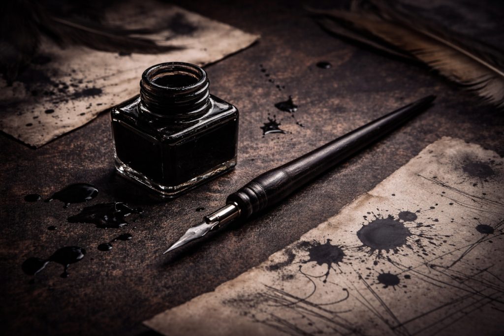
Ink and Dip Pens for Drawing
Horror in Liquid Form, With Attitude
Ink and dip pens are some of the most expressive drawing tools an artist can use. Unlike pencils, they create bold, permanent marks that range from razor-thin lines to rich, dramatic strokes. They don’t always behave politely, either. Expect the occasional splatter, unexpected blotch, or mysterious ink stain that seems to appear out of nowhere.
For horror artists, that’s often part of the appeal.
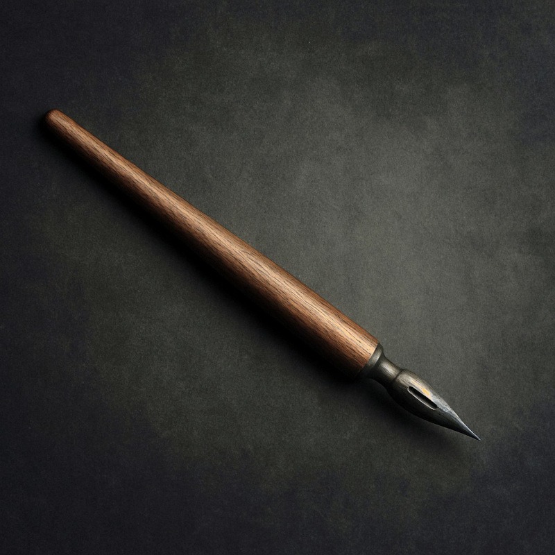
Using a dip pen involves dipping a metal nib into a bottle of ink before drawing. This traditional method gives you a level of line variation and texture that many modern pens struggle to match. By adjusting pressure and changing nibs, you can create deep shadows, scratchy textures, delicate details, and striking contrast that work beautifully in gothic and horror artwork.
While dip pens can feel a little messy at first, they offer a unique drawing experience that rewards patience and practice. Once you become comfortable controlling the flow of ink, you’ll discover why artists have relied on them for centuries to create everything from detailed illustrations to dramatic, high-contrast artwork.
What You’ll Learn:
In this guide, you’ll learn:
- What dip pens are and why they’re popular for horror art and atmospheric drawing
- How to choose suitable nibs, inks, and paper for different drawing styles
- Essential dip pen techniques for creating shadows, textures, and dramatic ink effects
- How to use cross-hatching, dripping strokes, broken linework, controlled bleeding, and ink splatter effectively
- Common dip pen mistakes that can ruin your results and how to avoid them
- How to clean, maintain, and store your dip pens to keep them performing properly
- How to create bold, gothic, and horror-inspired artwork using traditional ink techniques
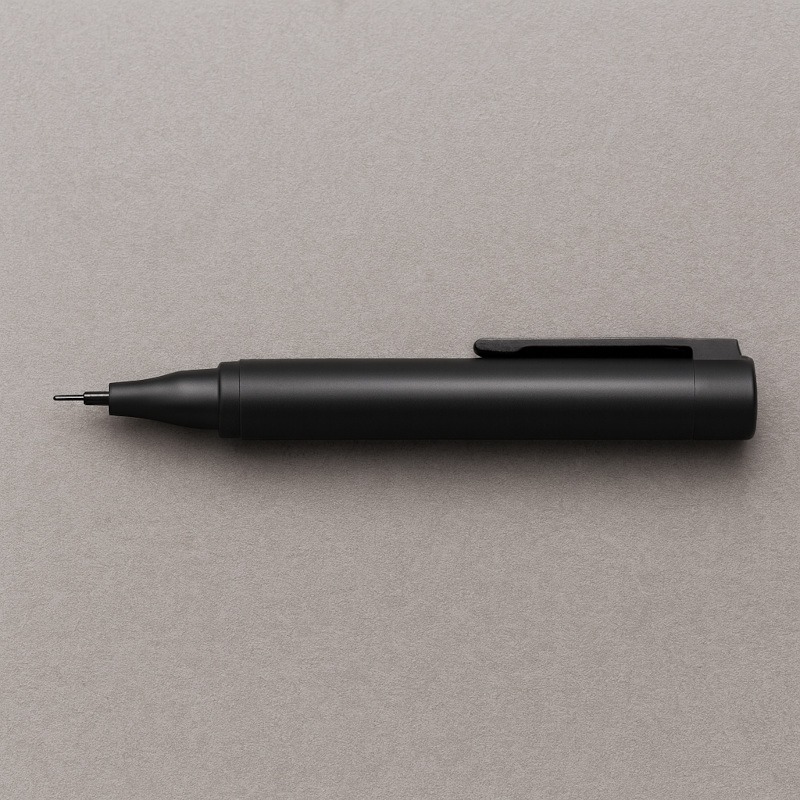
What Exactly Are Ink & Dip Pens?
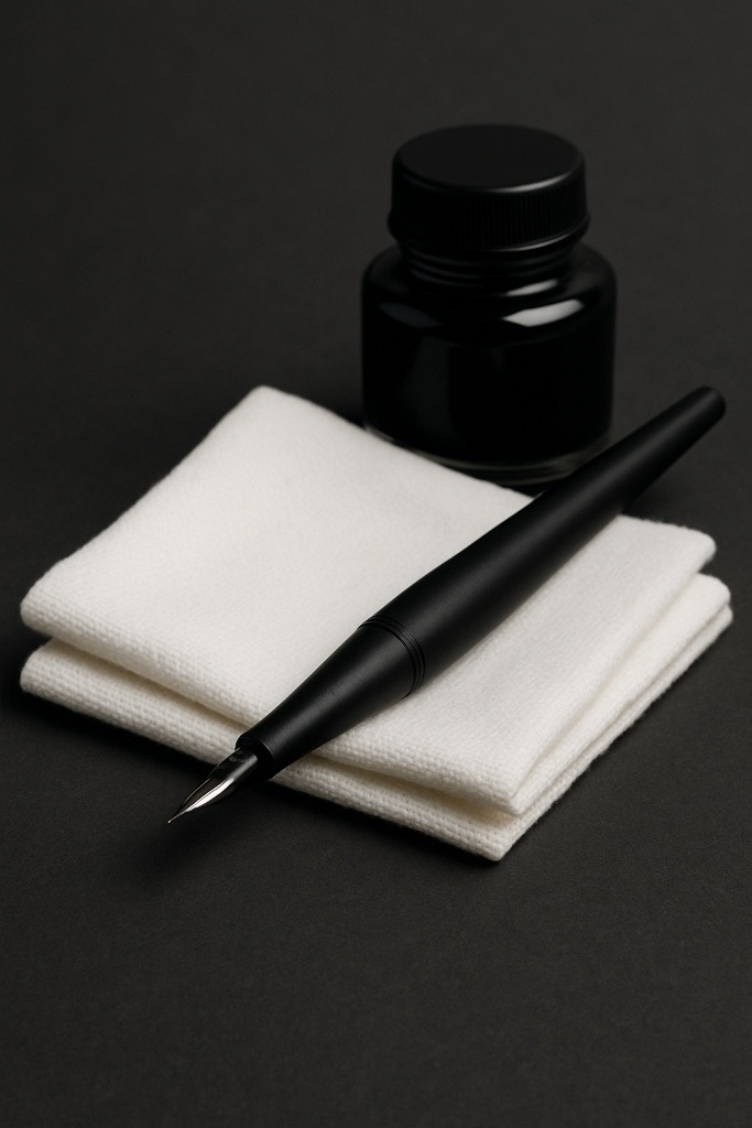
Dip pens are traditional drawing tools made up of three simple parts:
- A nib – the metal tip that holds and releases ink onto the paper
- A holder – the handle that the nib fits into
- Ink – usually bottled drawing ink that must be applied by dipping the nib
Unlike modern cartridge pens or fineliners, dip pens do not contain their own ink supply. Instead, you dip the nib into the ink, draw until the ink begins to run out, and then dip again.
This process may seem old-fashioned, but it gives artists far greater control over line variation, texture, and mark-making. By adjusting pressure and changing nib types, you can create everything from delicate details to bold, dramatic strokes.
Why Horror Artists Love Ink
Ink offers a combination of contrast, texture, and unpredictability that makes it particularly well-suited to horror artwork. Whether you’re creating unsettling creatures, gothic architecture, or atmospheric scenes, ink provides a range of effects that can be difficult to achieve with other drawing tools.
1. Deep, Ominous Shadows
One of ink’s greatest strengths is its ability to produce rich, deep blacks that create powerful shadows and dramatic contrast. Unlike graphite, which often reflects light and appears grey, black drawing ink can create areas of darkness that feel truly solid.
For horror artists, these dark values are invaluable. They can be used to hide details, suggest unseen threats, and create a sense of mystery that encourages viewers to look closer. Sometimes what you can’t see is far more unsettling than what you can.
Perfect for:
- Figures hiding in shadows
- Dark corridors and abandoned buildings
- Deep voids and negative space
- Dramatic lighting effects
- High-contrast horror illustrations
2. Scratchy, Unsettling Textures
Unlike many modern pens, dip pens don’t always produce perfectly smooth lines. The nib can catch slightly on the paper surface, creating rough textures, broken lines, and scratchy marks that add character to a drawing.
While artists creating clean technical illustrations may see this as a drawback, horror artists can use these imperfections to their advantage. The uneven marks produced by a dip pen can make objects feel older, damaged, weathered, or unsettling without requiring much additional effort.
These natural textures help create a sense of age, decay, and atmosphere that works particularly well in dark artwork.
Perfect for:
- Aged wood
- Peeling or old paint
- Cracked floors and walls
- Tattered clothing
- Creepy silhouettes
- Dead trees and twisted branches
- Weathered gothic architecture
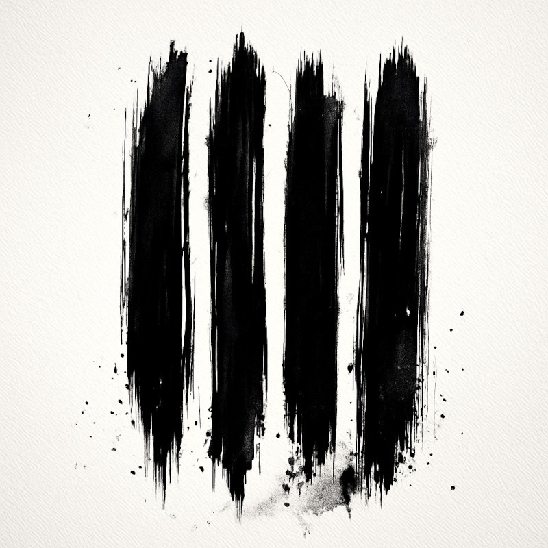
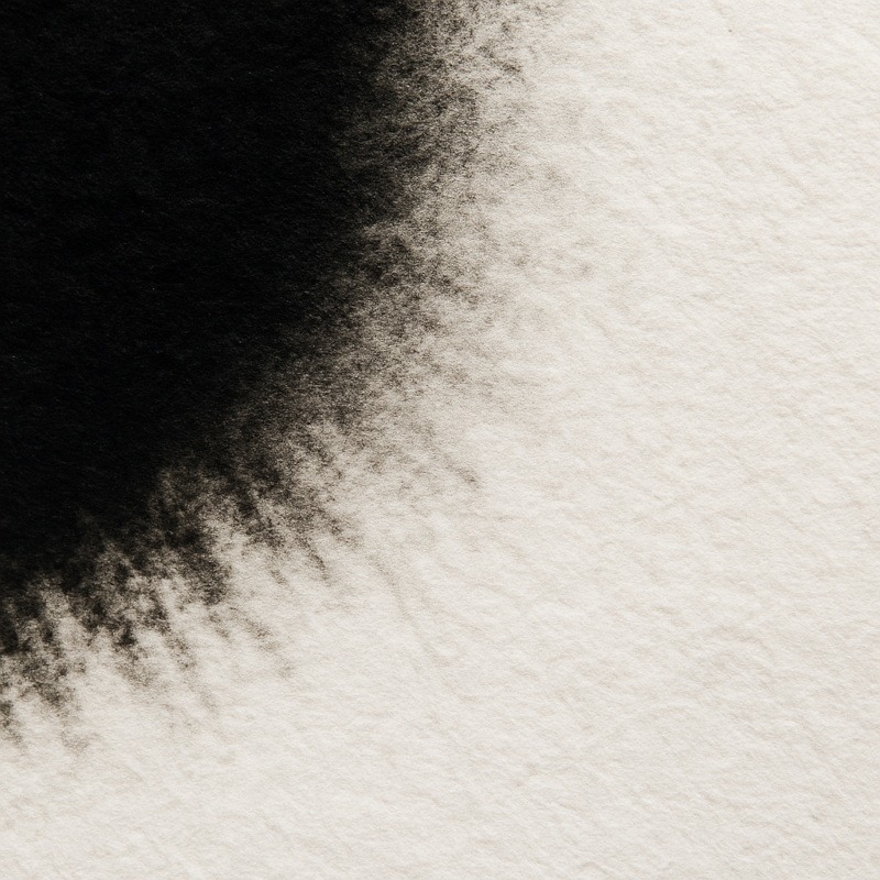
3. Drips, Runs & Bleeds
One of the most distinctive qualities of ink is that it doesn’t always stay exactly where you put it. Depending on the amount of ink on the nib, the paper you’re using, and how much pressure you apply, ink can spread, drip, feather, or create unexpected marks.
While these effects can be frustrating when you’re aiming for perfect control, they can be incredibly useful in horror artwork. The natural unpredictability of ink helps create organic textures and unsettling details that often look more convincing than carefully planned marks.
These accidental effects can add movement, decay, and visual tension to a piece, making scenes feel darker, dirtier, and more atmospheric.
With a bit of pressure (or chaos), you can create:
- Dripping shadows
- Veiny textures
- Bleeding edges
- Splatter effects
- Ink runs and streaks
- Organic stains and marks
Perfect for:
- Decayed environments
- Disturbing creature designs
- Grimy textures
- Atmospheric backgrounds
- Horror artwork that benefits from a sense of unpredictability
4. Bold, Confident Lines
One of the reasons ink has remained popular for centuries is its ability to create strong, decisive marks. Unlike graphite, which can be gradually built up and softened, ink demands commitment. Every line stands out clearly against the page, creating artwork with immediate visual impact.
This boldness is particularly useful in horror art, where strong silhouettes and dramatic shapes often play a key role in the overall atmosphere. A single confident ink line can define a character, emphasise a shadow, or draw attention to important details within a composition.
The natural contrast between black ink and white paper also helps horror illustrations feel more striking and memorable.
Perfect for:
- Strong silhouettes
- Dramatic character designs
- Gothic architecture
- High-contrast compositions
- Focal points that demand attention
5. Gothic, Old-World Aesthetic
Part of the appeal of dip pens is the sense of history they bring to the drawing process. Long before modern fineliners and digital art software existed, artists, illustrators, and writers relied on dip pens to create detailed artwork, manuscripts, and documents.
Because of this connection to the past, ink drawings often carry a timeless quality that naturally complements gothic and horror themes. The combination of bold black lines, dramatic contrast, and traditional techniques can make artwork feel older, darker, and more atmospheric.
For artists who enjoy drawing haunted mansions, gothic architecture, mysterious characters, or Victorian-inspired scenes, dip pens can help reinforce the mood before the viewer even begins examining the details.
Perfect for:
- Gothic architecture
- Victorian-inspired artwork
- Dark fantasy illustrations
- Antique objects and settings
- Haunted locations
- Atmospheric storytelling pieces
Types of Ink Tools (And What They’re Good For)
Dip Pens
Dip pens are the traditional choice for artists who want maximum control, expressive line work, and rich textures. By changing nibs and adjusting pressure, you can create everything from delicate details to bold, dramatic strokes.
They take more patience than many modern drawing tools, but the results can be incredibly rewarding. For horror artists, dip pens are particularly useful because they allow for sharp details, strong contrast, and textured marks that add atmosphere to a piece.
Best for:
- Creating detailed line work
- Cross-hatching and fine shading
- Strong contrast and dramatic shadows
- Textured horror illustrations
- Gothic and Victorian-inspired artwork
Advantages:
- Excellent line variation
- Rich, dark blacks
- Precise control
- Unique textures and expressive marks
Things to keep in mind:
- Require regular dipping
- Can be messy for beginners
- Take practice to master
- Mistakes are difficult to erase
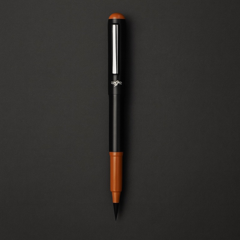
Brush Pens
Brush pens combine the convenience of a modern pen with the expressive qualities of a traditional paintbrush. Their flexible tips allow you to create both thin and thick lines with changes in pressure, making them a versatile option for a wide range of drawing styles.
While they don’t offer quite the same scratchy textures and unpredictability as dip pens, brush pens excel at creating smooth, flowing marks and atmospheric effects. They’re often easier for beginners to use and require far less setup than traditional ink tools.
Best for:
- Smooth, painterly strokes
- Soft shadows and shading
- Atmospheric backgrounds
- Ghostly figures and silhouettes
- Dark fantasy and horror illustrations
Advantages:
- Easy to use
- Portable and less messy
- Excellent line variation
- Great for expressive brushwork
Things to keep in mind:
- Less texture than dip pens
- Brush tips can wear down over time
- Can be harder to achieve extremely fine details
Technical Pens
Technical pens are designed for artists who want consistent, precise lines with maximum control. Unlike dip pens or brush pens, they produce a fixed line width, making them ideal for detailed work where accuracy is more important than expressive mark-making.
Because the ink flow remains consistent, technical pens are popular for architectural drawings, detailed illustrations, and clean line art. They may not create the dramatic textures or line variation of a dip pen, but they excel at producing neat, reliable results.
For horror artists, technical pens are particularly useful when drawing intricate details, gothic architecture, elaborate patterns, and highly controlled compositions.
Best for:
- Detailed line work
- Gothic architecture
- Precise cross-hatching
- Intricate patterns and textures
- Clean horror illustrations
Advanced:
- Consistent line widths
- Easy to control
- Portable and convenient
- Excellent for fine detail
Things to keep in mind:
- Limited line variation
- Less expressive than dip pens
- Creates cleaner, more controlled marks
- Can feel less organic than traditional nibs
Final Recommendation
If you’re creating horror artwork and only want to try one traditional ink tool, a dip pen is often the most versatile option. It offers a combination of deep blacks, dramatic line variation, rich textures, and expressive marks that suit horror art exceptionally well.
Technical pens are excellent for precision, and brush pens are fantastic for atmosphere, but dip pens sit comfortably between the two, giving you both control and character.
How to Use Dip Pens
1. Don’t Over-Dip The Nib
Only dip the very tip of the nib into the ink, usually around 2 – 3 mm.
If you submerge too much of the nib, it will collect excess ink and can flood the page as soon as it touches the paper. Starting with less ink gives you better control and helps prevent unexpected blobs and drips.
Think “touch the surface“, not “deep-sea dive.”
2. Always Test the First Stroke
Dip pens often release a little extra ink on the first mark after dipping.
Before drawing on your artwork, make a few quick strokes on a scrap piece of paper to remove any excess ink and check that the flow is behaving as expected.
Testing the first stroke only takes a few seconds and can save you from an accidental ink disaster.
3. Use Light, Controlled Pressure
Dip pens respond dramatically to pressure:
- Light pressure = thin, delicate lines
- Medium pressure = thicker lines, shadows, and outlines
- Too much pressure = damaged nibs, scratched paper, and a generally unpleasant drawing experience
Aim for gentle, controlled strokes and let the nib glide across the paper rather than digging into it. A lighter touch will usually produce cleaner lines and give you more control over the flow of ink.
4. Move More Slowly Than You Would With a Pencil
Ink is far less forgiving than graphite. Once a mark is on the page, there’s usually no erasing it.
Rushing often leads to smudges, skipped lines, uneven ink flow, or details that don’t end up where you intended. Taking your time allows the nib to move more smoothly across the paper and helps you maintain consistent line quality.
Slow, confident strokes almost always produce better results than fast, hurried ones.
5. Turn Your Paper for Better Angles
Dip pens have a natural “sweet spot” where they flow most smoothly across the paper. Trying to force the nib into awkward angles can cause scratchy lines, inconsistent ink flow, or even damage to the paper.
If a line isn’t flowing smoothly, rotate the paper rather than twisting your wrist into an uncomfortable position. This helps maintain a consistent nib angle and gives you better control over your strokes.
A simple turn of the page can often solve problems that artists mistakenly blame on the pen.
6. Be Patient With Drying
Ink can remain wet for longer than many beginners expect, especially when using heavier lines, dense shading, or highly absorbent paper.
Before adding details nearby or resting your hand on the page, allow the ink enough time to dry completely. Rushing this stage can lead to smudges, blurred details, and unwanted marks that are difficult to fix.
A few extra moments of patience can save an otherwise successful drawing from avoidable mistakes.
7. Choose the Right Paper
The paper you use can have a huge impact on how your dip pen behaves.
- Smooth paper produces clean, crisp lines and allows the nib to glide more easily across the surface. It’s ideal for detailed illustrations, fine line work, and controlled shading.
- Textured paper creates rougher, more unpredictable marks as the nib catches on the surface. This can be useful when creating distressed textures, weathered effects, and atmospheric horror artwork.
Different papers can also affect how quickly ink dries and how much it spreads. Testing your pen on a few paper types is one of the easiest ways to discover the effects you prefer.
Neither option is inherently better; they simply create different moods and textures.
Horror-Friendly Ink Techniques
Below are five simple ink techniques you can try right away – perfect for beginners, and perfect for adding that deliciously unsettling horror mood to your artwork.
1. Cross-Hatching for Deep Horror Shadows
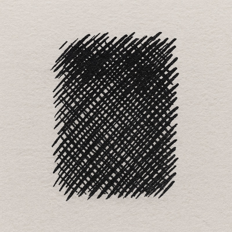
Create multiple layers of thin, overlapping lines to build darkness gradually.
- First layer: light, even strokes
- Second layer: cross the first at a different angle
- Third layer: vary direction for richer depth
The more layers you add, the darker and more atmospheric the shadows become. Unlike simply colouring an area solid black, cross-hatching creates subtle texture that can make surfaces feel aged, dirty, or unsettling.
This technique works particularly well for abandoned buildings, dark corridors, weathered faces, and shadowy backgrounds where you want depth without losing detail.
The more layers you add, the more dramatic and threatening the shadows become – perfect for corners where monsters lurk.
Tiny Tip:
Keep your strokes light at first. Heavy pressure too early can make the paper fight back.
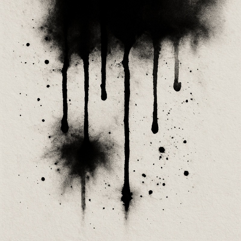
2. Dripping Shadow Strokes
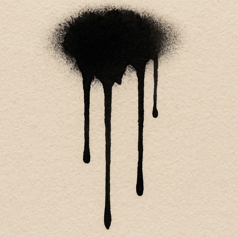
Load the nib with slightly more ink than usual and pull downward firmly.
This creates long, tapering drips that look like:
- leaking darkness
- dripping fog
- cursed liquids
- vague “something sinister happened here” residue
Dripping strokes immediately make an image feel less clean and controlled. Even a simple black shape can become unsettling once ink begins running away from it.
They work especially well beneath shadows, hanging objects, twisted trees, gravestones, abandoned architecture, or anywhere you want the darkness to feel alive and spreading.
Use sparingly for maximum impact. A little drip goes a long way.
Tiny Tip:
This works best with dip pens or brush pens. Technical pens don’t usually release enough ink to create natural drips.
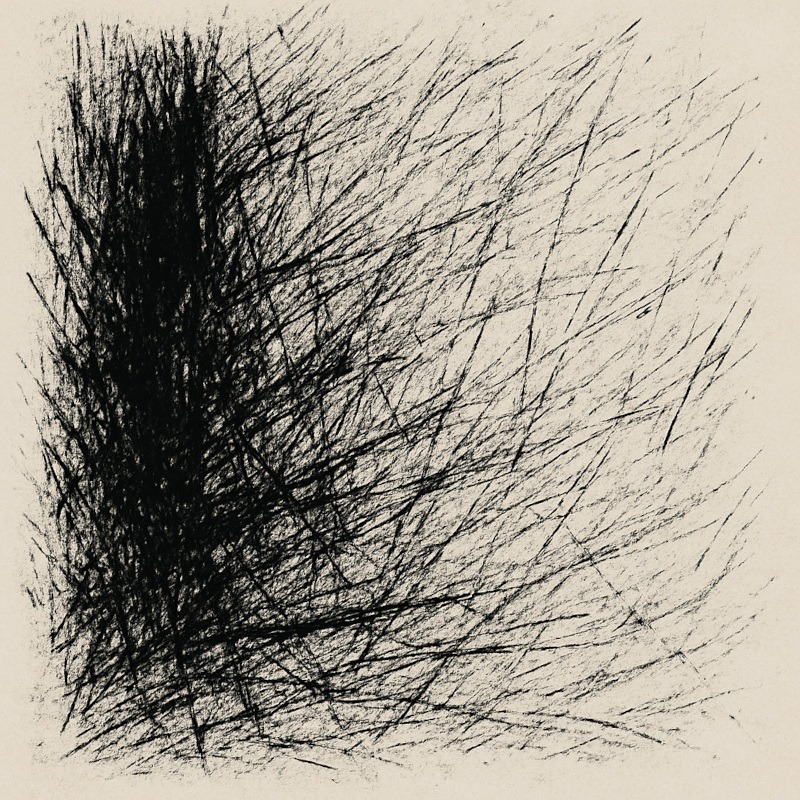
3. Scratchy, Broken Linework
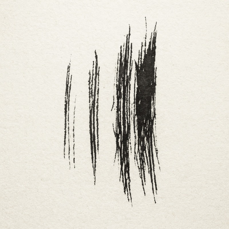
Hold the nib lightly and let it skip across the page.
This produces irregular, ghostly lines ideal for:
- tattered clothing
- wild hair
- skeletal forms
- old wood
- crumbling walls
Unlike smooth, continuous lines, broken linework creates a sense of age, decay, and instability. The gaps allow the viewer’s imagination to fill in the missing details, which often feels far more unsettling than showing everything clearly.
This technique is especially effective when drawing ghosts, decayed structures, weathered textures, or anything that should feel fragile and worn by time.
Embrace the imperfection – scratchy textures are one of ink’s biggest strengths.
Tiny Tip:
Paper with texture (“tooth“) helps the nib skip more naturally.
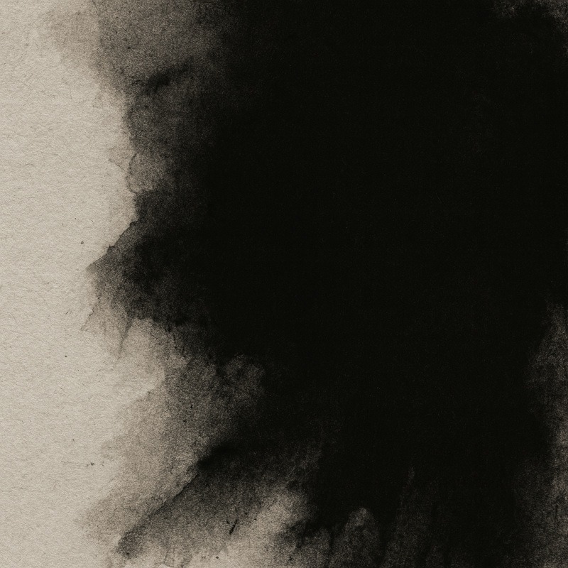
4. Controlled Bleeding on Textured Paper
Add a slightly heavier ink line on paper with tooth.
The ink naturally spreads into the fibres, creating organic, eerie edges that look like:
- rotting surfaces
- dusty shadows
- misty outlines
Unlike crisp technical pen lines, controlled bleeding softens the edge of a shape and creates a more natural, atmospheric appearance. The effect can make shadows feel as though they’re dissolving into darkness rather than ending abruptly.
This technique works particularly well for fog, distant figures, decayed architecture, smoke effects, and backgrounds where you want a sense of mystery rather than sharp detail.
Great for atmospheric horror.
Tiny Tip:
Different papers bleed differently. Test the edge on a scrap piece first so you can predict the effect.
5. Ink Splatter for Dramatic Effects
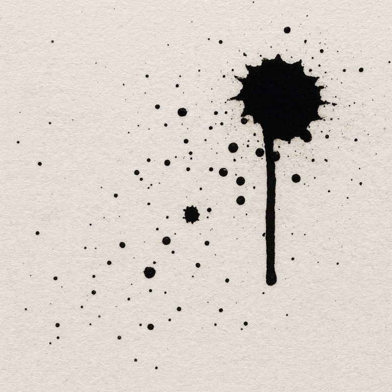
Tap the nib gently, or flick ink from a brush, to create small bursts of texture.
These tiny explosions of ink work beautifully for:
- dust
- ash
- mist
- blood-like effects
- chaotic energy
Splatter helps break up large empty areas and adds an element of unpredictability that suits horror artwork perfectly. A few carefully placed specks can make an image feel older, dirtier, or more unsettling without requiring much extra work.
For atmospheric scenes, subtle splatters can suggest floating debris, while heavier applications can create violent, energetic focal points.
(Just make sure to protect your desk first – splatter has no mercy.)
Tiny Tip:
The lighter the flick, the wider the scatter. Stay close to the page for tight, controlled splatters.
Common Ink Drawing Mistakes (And How to Avoid Them)
1. Dipping too Deeply
Result:
Giant ink blots, uncontrolled streaks, and sudden puddles of ink where you least want them.
Fix:
Only dip the nib tip – usually no more than 2–3mm into the ink.
Loading too much ink overwhelms the nib, making it difficult to control your first few strokes. A small amount of ink gives you cleaner lines and far fewer unpleasant surprises.
2. Pressing too Hard While Drawing
Result:
The nib digs into the paper, scratches the surface, catches unexpectedly, or even splits under excessive pressure.
Fix:
Use gentle pressure and let the ink flow naturally.
Unlike pencils, dip pens don’t need force to create dark marks. Most of the line variation comes from the nib itself, not how hard you push. A lighter touch gives you smoother lines, better control, and helps your nib last much longer.
3. Smudging Wet Ink
Result:
Blurred lines, fingerprints, smears, and accidental marks that can ruin otherwise clean details.
Fix:
Work in sections and allow each area to dry before touching nearby strokes.
Unlike graphite, ink doesn’t forgive accidental contact. Even a light touch can drag wet ink across the page, creating smudges that are difficult or impossible to remove. Developing the habit of working gradually helps preserve sharp details and clean shadows.
4. Using the Wrong Paper
Result:
Bleeding, feathering, fuzzy edges, scratchy gouges, or inconsistent ink flow that makes drawing unnecessarily frustrating.
Fix:
- For smooth, controlled lines: Bristol board or marker paper
- For rough, spooky textures: Lightly textured drawing paper
Different papers interact with ink in different ways. Smooth surfaces keep lines crisp and predictable, while textured papers can create interesting broken marks and atmospheric effects. Neither is inherently better – the right choice depends on the mood you’re trying to create.
5. Not Cleaning the Nib
Result:
Dried ink clogs the nib, causing inconsistent flow, scratchy lines, skipped strokes, and frustrating interruptions while drawing.
Fix:
Wipe the nib thoroughly after each drawing session and allow it to dry before storing it.
Even a small amount of dried ink can affect how smoothly a nib performs. Regular cleaning helps maintain consistent ink flow, prevents corrosion, and extends the life of your tools.
6. Drawing Too Quickly
Result:
Rushed strokes often lead to inconsistent lines, accidental flicks, skipped ink flow, and less control over fine details.
Fix:
Slow down and let the nib glide naturally across the paper. Dip pens reward patience, steady hand movements, and deliberate strokes far more than speed.
Unlike pencils, dip pens need a little time to deliver ink consistently. Working too quickly can cause uneven marks and make it harder to maintain clean, controlled linework.
7. Expecting Digital-Level Perfection
Result:
Frustration, dramatic sighing, existential questioning, and the occasional urge to blame the pen for everything.
Fix:
Ink is naturally unpredictable. Small variations in line width, texture, and ink flow are part of what gives traditional artwork its character.
Unlike digital tools, dip pens create marks that feel organic and alive. Tiny imperfections often add atmosphere, personality, and realism to horror artwork.
Instead of fighting every irregularity, learn to use those imperfections as part of the final piece.
Caring for Dip Pens
Taking care of your dip pens is the easiest way to keep your lines clean, your nibs happy, and your artwork free from accidental blotchy disasters.
A well-maintained nib lasts longer, behaves better, and is far less likely to spit ink at you out of spite.
Wipe Nibs After Every Use
- Use a soft cloth or tissue to remove wet ink before it dries.
- Dried ink clogs the nib, preventing smooth flow and making lines less predictable.
- A quick wipe after each drawing session only takes a few seconds and can greatly extend the life of your nib.
Don’t Leave Nibs Soaking in Water
- A quick dip to loosen dried ink is fine, but leaving nibs submerged for long periods can cause rust.
- A rusty nib often creates scratchy lines, inconsistent ink flow, and frustrating drawing sessions.
- If you need to clean stubborn ink, rinse the nib briefly and dry it thoroughly afterwards.
Close Your Ink Bottles Properly
- Ink can thicken and become harder to use when exposed to air for long periods.
- A tightly closed bottle helps keep your ink smooth, consistent, and ready for your next drawing session.
- It’s also far less likely to tip over during an enthusiastic hand gesture. Horror artists are known for those.
Dry Nibs Fully Before Storing
- Moisture leads to rust, and rust leads to scratchy, unpredictable lines.
- After cleaning your nib, make sure it is completely dry before putting it away.
- Even a small amount of trapped moisture can shorten the nib’s lifespan over time.
Replace Worn Nibs When Needed
- Dip pen nibs naturally wear down over time, especially with frequent use.
- If your lines start looking uneven, scratchy, or far more unpredictable than usual, it may be time to switch to a fresh nib.
- Replacing a worn nib is often much easier than fighting with one that’s reached the end of its life.
Why This Matters
Good nib care prevents rust, blocked ink flow, scratches on your paper, and many common ink problems.
It also helps prevent those heartbreaking ink splotches that appear out of nowhere like tiny chaotic offerings to the carpet gods.
A few minutes of maintenance can save hours of frustration and help your tools perform at their best whenever inspiration strikes.
Conclusion
Ink and dip pens are the little gremlins of the art world – dramatic, unpredictable, and capable of creating absolute magic with one tiny scratch. They splash, drip, skip, and occasionally behave, and somehow every one of those moods adds something beautifully eerie to your horror art. A single stroke can turn a calm drawing into a “should I be concerned?” moment, and honestly… that’s part of the fun.
Once you get used to their quirks, dip pens become the tool you reach for when your artwork needs atmosphere, attitude, or a suspiciously dark corner that looks as though it has opinions. They let you create the kind of bold shadows, scratchy lines, delicate details, and ink-soaked textures that pencils only dream about while quietly sulking in your pencil case.
Treat your nibs kindly, embrace the chaos, and you’ll end up with horror art that looks dramatic, gothic, and maybe a tiny bit possessed – which is exactly the goal.
What You’ve Learned:
- Dip pens use interchangeable nibs and liquid ink to create expressive lines, dramatic shadows, and detailed textures that are difficult to achieve with ordinary pens.
- Different nibs produce different drawing effects, allowing you to create everything from delicate details and fine hatching to bold, gothic linework.
- Paper choice has a major impact on ink behaviour, affecting line quality, texture, bleeding, feathering, and overall control.
- Proper ink loading and pen handling help prevent common issues such as ink blobs, scratching, skipping, smudging, and inconsistent line flow.
- Techniques such as cross-hatching, dripping strokes, broken linework, controlled bleeding, and ink splatter can be used to create atmosphere, texture, and mood in horror artwork.
- Most beginner mistakes are easy to avoid with the right pressure, pacing, paper selection, and drying time.
- Regular nib maintenance improves performance and longevity, helping prevent rust, clogging, and unreliable ink flow.
- Dip pens are especially effective for horror art, making it easier to create bold shadows, eerie textures, dramatic contrasts, and gothic atmospheres.
More Tools to Darken Your Art Kit
If ink has sparked your interest in creating bold shadows, dramatic textures, and atmospheric horror artwork, these tools can help you expand your creative options:
- Acrylic Paint Markers for Horror Art
Ideal for creating opaque highlights, bold outlines, and sharp details that stand out on a wide range of surfaces, including paper, wood, glass, and ceramics. - Specialised Markers for Drawing
Useful for smooth gradients, atmospheric colour effects, soft glows, and painterly shadows. They can add depth and mood that complement traditional ink techniques. - Liquid Chalk Markers for Horror Art
Excellent for creating dusty-looking effects, runes, sigils, foggy lettering, and other atmospheric details. Their soft, matte appearance works particularly well in gothic and horror-themed artwork.