Mastering Shadows for Depth and Drama in Horror Art
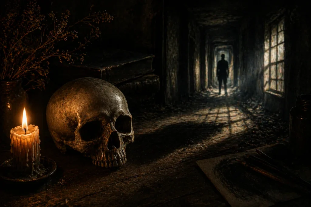
Mastering shadow techniques in horror art is what transforms a flat drawing into something that feels alive… or at least unsettling enough to make someone do a double-take.
Shadows are responsible for depth, drama, and eerie realism, creating that uneasy feeling that something might be lurking just out of sight. Whether you’re sketching creepy environments or refining your shading skills, understanding how light interacts with objects is one of the most powerful tools you can develop.
If you’ve ever wondered why some drawings feel immersive while others fall flat, it usually comes down to how shadows are used. Get this right, and your artwork suddenly has weight, atmosphere, and tension that pulls people in.
What You’ll Learn:
Before we dive in, here’s what you’ll be able to fix (and instantly improve) by the end of this guide:
- How to fix flat-looking shadows so your drawings instantly gain depth
- When to use soft vs hard shadows to match your lighting and mood
- How to shape shadows correctly so they feel grounded and believable
- How to avoid shadows that are too light or overly harsh
- How to use contact shadows to stop objects from looking like they’re floating
- How to simplify shadow details without losing realism
- How to create smooth, natural fades so shadows don’t look stiff or unnatural
1. Key Terms: Understanding Shadows
Understanding the key parts of a shadow is essential if you want your drawings to feel realistic and full of depth. Each area of light and shadow plays a specific role, and once you recognise them, shading becomes far more intentional instead of guesswork.
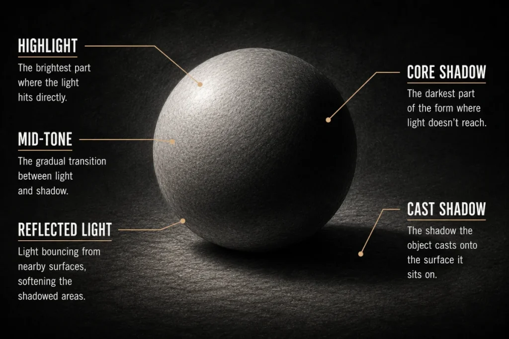
Highlight
- This is the brightest part of an object where the light hits directly.
- It sits closest to the light source and is usually small or sharply defined.
- In horror scenes, highlights can emphasise dramatic features like glinting eyes or a reflective surface – perfect for enhancing your shadow techniques in drawing.
If your highlights are too large or too soft, your drawing can start to look flat… like everything is politely lit instead of dramatically revealed.
Core Shadow
- This is the darkest part of the form, where light doesn’t reach.
- It sits on the object itself, usually opposite the light source.
- The core shadows help define form and structure, making them essential for creating depth in your shading.
If your core shadow isn’t clear, your drawing can start to look flat… like the object forgot how lighting works halfway through.
Cast Shadow
- This is the shadow an object casts onto a surface when it blocks the light.
- It stretches away from the light source and changes depending on the object’s shape and the surface it falls on.
- In horror art, cast shadows can create suspense and tension by hinting at unseen figures or unnatural movement.
A well-placed cast shadow can suggest something just out of frame… which is usually far more unsettling than showing everything clearly.
Reflected Light
- This is light that bounces off nearby surfaces and softens the shadowed areas of an object.
- It’s usually subtle and appears near the edge of the core shadow.
- In horror art, reflected light can add realism and tension by revealing just enough detail in the darkness without fully exposing it.
Reflected light adds just enough detail to the shadows to make them feel believable… while still leaving room for the unknown.
Mid-Tone
- Mid-tones are the transition between highlights and core shadows, creating a smooth gradient across the surface.
- These areas strike a balance, meaning they’re not fully lit and not fully shadowed.
- In horror art, mid-tones are crucial for adding subtle depth and soft, eerie lighting, helping forms fade naturally into shadow rather than cutting off abruptly.
- A common mistake is pushing mid-tones too light or too dark, which can make your drawing feel flat or muddy instead of smooth and dimensional.
Mid-tones are what stop your drawing from looking cut out of paper, letting forms fade gradually instead of dropping straight into darkness.
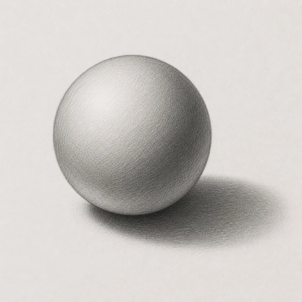
2. How to Shade a Sphere: A Step-By-Step Guide
To create realistic shading, it helps to understand how light interacts with objects. This guide walks you through shading a sphere, from highlights to shadows, so your artwork has more depth and realism.
Materials Needed:
- Graphite pencils: HB, 2B, 3B, 4B, and 6B (HB works well for outlining, 2B for mid-tones, 3B and 4B for core shadows, and 6B for the darkest areas such as the cast shadow).
- Eraser: A standard eraser, precision eraser, or kneaded eraser (great for lifting highlights, refining shadows, and cleaning edges).
- Blending tool: A blending stump, tissue, cotton bud, or soft brush (use very gently to smooth transitions and blend from light to dark).
- Drawing paper: Smooth or lightly textured sketching paper (such as cartridge paper or Bristol board).
- Pencil sharpener: Keeps your pencils sharp for cleaner shading and finer details.
- Optional: A ruler or circle template can help create a cleaner starting shape, although drawing the sphere freehand works just as well.
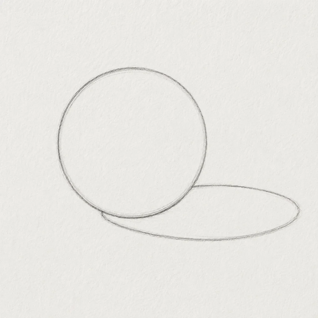
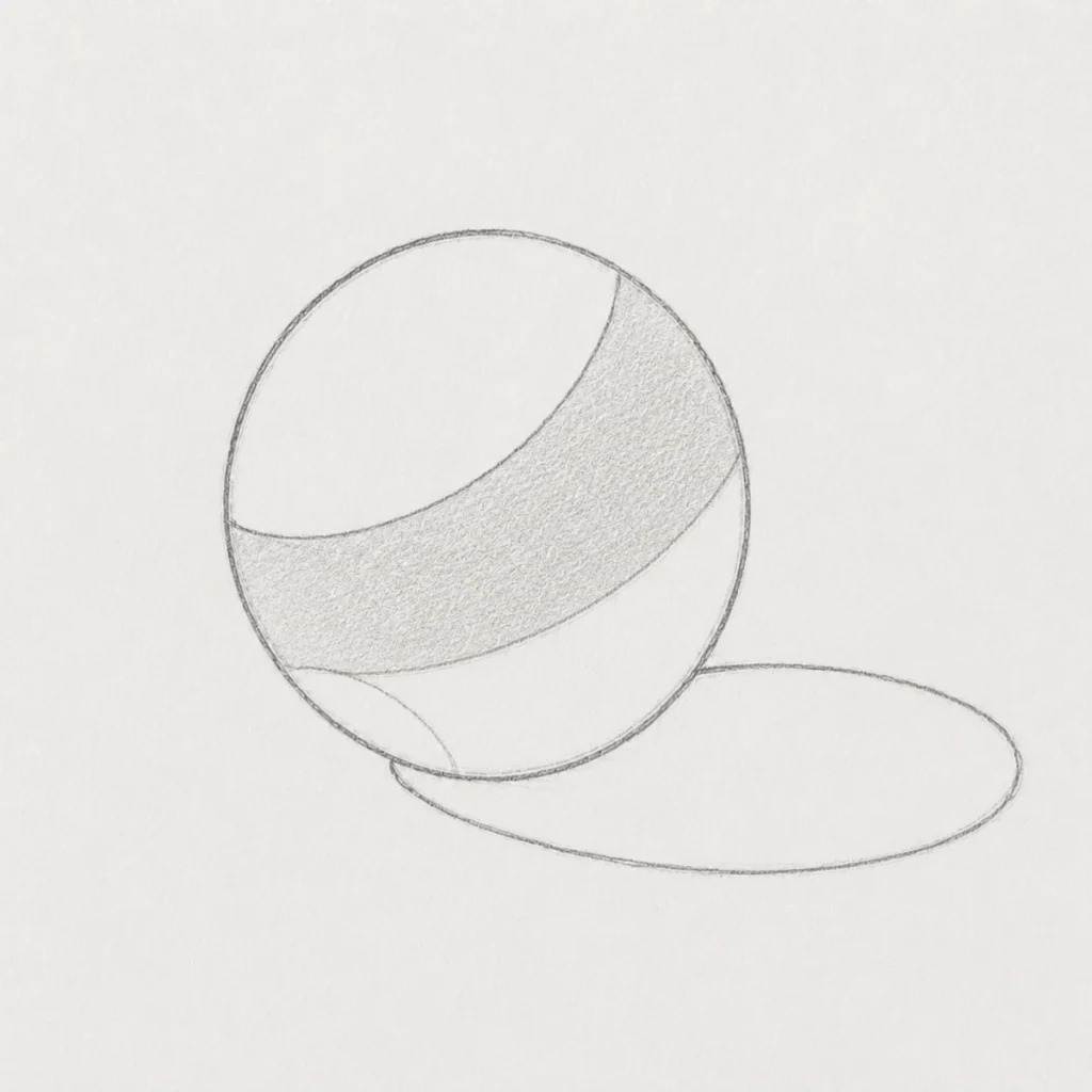
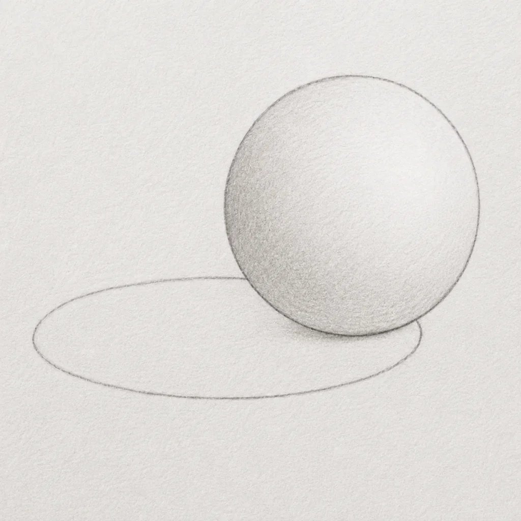
Step 1: OUTLINE THE SPHERE AND CAST SHADOW
Begin by lightly sketching the outline of your sphere using an HB pencil. Keep your pencil pressure soft and controlled so the lines stay easy to adjust later.
Next, sketch the basic shape of the cast shadow extending away from the light source. In this example, the light is coming from the upper left, so the shadow stretches toward the lower right.
At this stage, focus on placement rather than perfect detail. The shadow shape should feel smooth and natural, sitting close to the sphere at the base before widening outward.
These light construction lines act as the foundation for the entire drawing. If the outline or shadow direction feels off here, the shading will become much harder to control later on. Think of it like building the frame of a haunted house before turning the lights off and making everything unsettling.
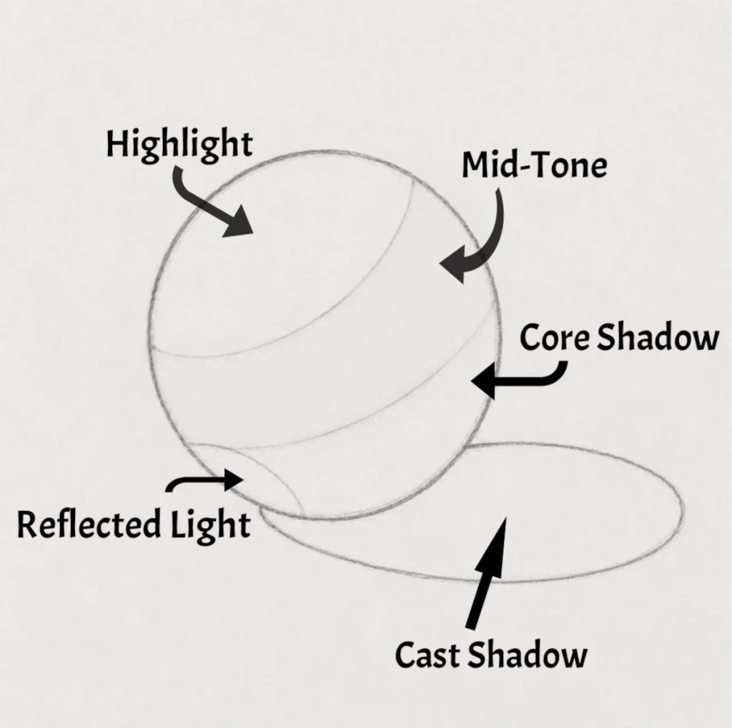
Step 2: Mapping Out Shadows and Highlights
Before adding any shading, lightly divide the sphere into the main lighting areas. These guidelines act like a roadmap, helping you understand where different values will appear once the shading begins.
Start by sketching a curved section for the highlight area, where the light hits the sphere most directly. Next, map out the mid-tone section, which sits between the light and darker areas. Beneath this, lightly mark the core shadow, which is the darkest part of the sphere itself.
Near the bottom edge of the sphere, add a small curved section for the reflected light. This is a softer light bounce that appears where surrounding surfaces reflect light back onto the object. Finally, keep the cast shadow shape underneath the sphere, following the direction of the light source.
Keep all these lines extremely light and easy to erase. At this stage, you’re only planning the structure of the shading rather than committing to dark values yet. Think of it like setting up invisible guardrails before the real shading work begins. Future-you will be very grateful for the organisation.
Step 3: BUILDING UP THE MID-TONES
Begin shading the mid-tone area using light, even layers of graphite. This area sits between the highlight and the darker shadow sections, helping create the smooth transition that makes the sphere start to look rounded instead of flat.
Work slowly and keep your pressure soft. It’s much easier to gradually darken an area than it is to erase heavy shading later.
Try using small circular motions or gentle back-and-forth strokes to keep the graphite looking smooth and consistent. Avoid pressing too hard or rushing to make the sphere look dark too early.
At this stage, your goal is simply to establish a soft middle value while still keeping the:
- highlight bright, reflected light lighter,
- and the core shadow mostly untouched.
The drawing may still look a little pale or unfinished right now, and that’s completely normal. Realistic shading is built up in layers, not all at once. Tiny graphite gremlins love convincing artists to panic halfway through. Ignore them.
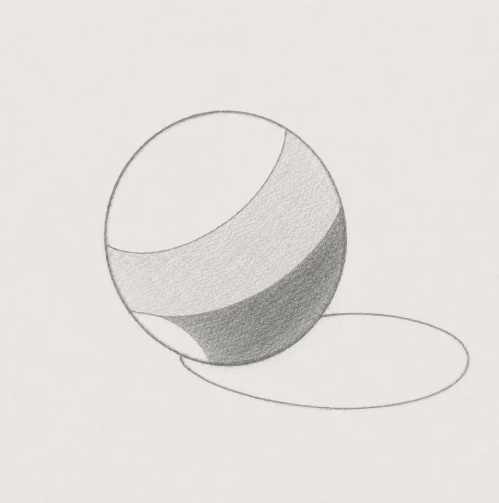
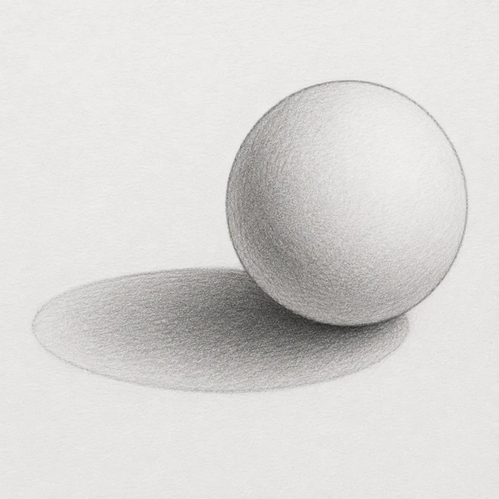
Step 4: Building the Core Shadow
Now begin darkening the core shadow, which is the darkest area on the sphere itself. This section appears on the side turning away from the light source and helps create the illusion of depth and roundness.
Using a softer pencil such as a 3B, 4B, or 6B, gradually layer graphite into the lower shadow section of the sphere. Keep your pressure light at first and slowly build the darkness in stages rather than pressing heavily straight away. This helps the shading stay smooth and easier to control.
The darkest part of the core shadow should sit just above the reflected light area near the bottom edge of the sphere. Leaving that lighter reflected section visible is important because it helps the sphere feel more three-dimensional and realistic.
Try to keep the transition between the mid-tone and core shadow soft and gradual. Harsh edges can make the sphere look flat, while smoother transitions help the form appear rounded.
This is the stage where the sphere really starts gaining volume. It finally stops looking like a suspicious floating circle and starts behaving like an actual solid object.
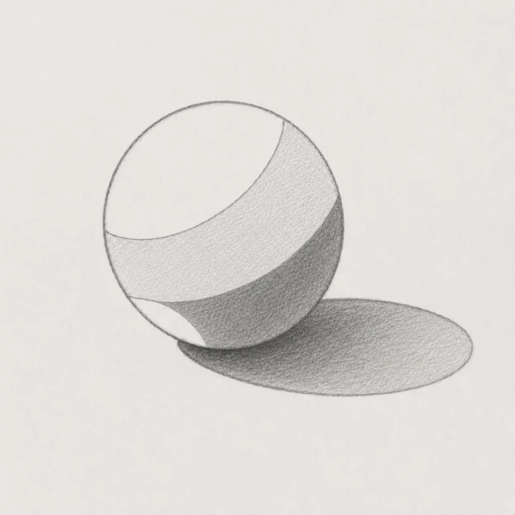
Step 5: Shading the Cast Shadow
Now begin shading the cast shadow beside the sphere using smooth, even pencil pressure. The cast shadow forms because the sphere blocks the light source, creating a darker area on the surface beneath and beside it.
Start by shading the area closest to the sphere with the darkest tone, since this part receives the least amount of light. As the shadow moves farther away from the sphere, gradually reduce your pencil pressure so the shadow becomes lighter and softer toward the outer edge.
Try to follow the curved shape of the shadow carefully while keeping your shading smooth and consistent. Avoid harsh outlines around the cast shadow, as real shadows usually fade gently into the surface around them.
Adding this shadow helps anchor the sphere to the page and gives the drawing a much stronger sense of depth and realism. Without it, the sphere can end up looking like it’s hovering awkwardly in mid-air like a confused moon.
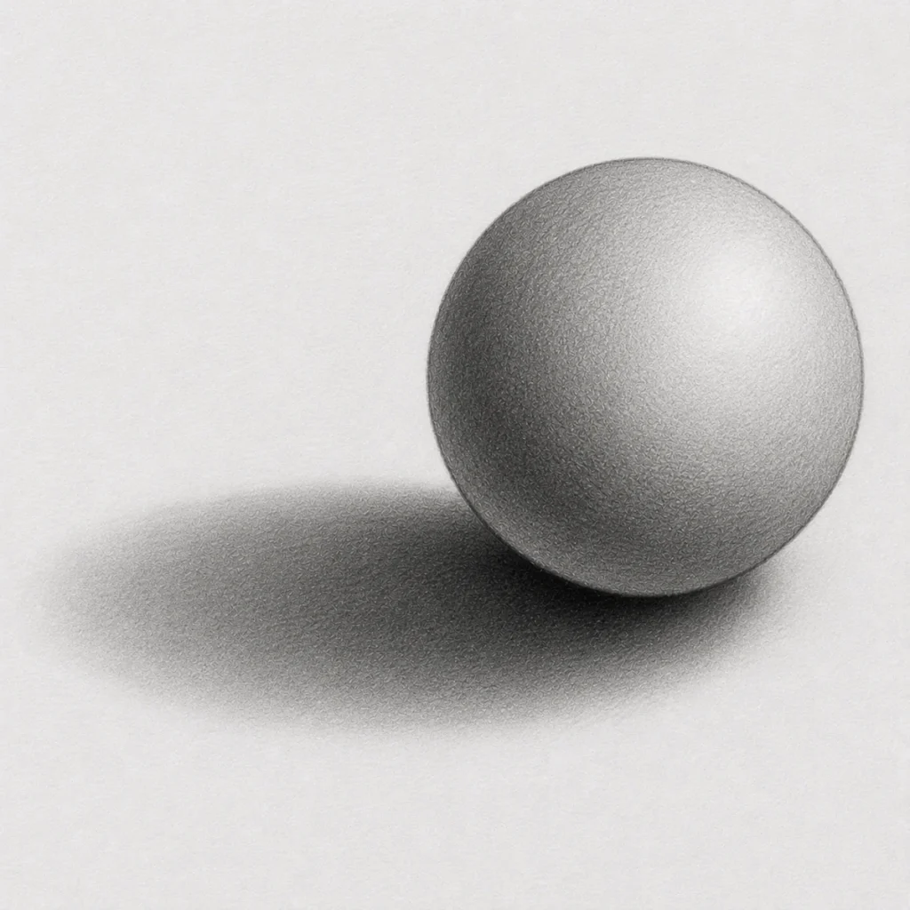
Step 6: Blend and Refine the Shading
Now begin smoothing the graphite to blend the different shaded sections together. Use a blending stump, tissue, or soft brush very lightly and work slowly with gentle pressure. Focus on softening the edges between the mid-tone, core shadow, and lighter areas so the sphere starts to look rounded instead of divided into separate sections.
Start blending from the lighter mid-tone area first and gradually move into the darker shadow section. This helps prevent too much graphite from spreading into the highlight. Use small circular motions or gentle sweeping motions rather than pressing hard, as heavy pressure can create patchy or streaky shading.
At this stage, the sphere should begin looking softer and more realistic, but you still want the different values to remain visible. The highlight should stay the lightest area, the mid-tone should appear soft and gradual, and the core shadow should remain the darkest section on the sphere.
You can also begin refining the cast shadow during this stage. Blending alone will usually make the shadow edges look messy or too soft, so use a kneaded eraser or precision eraser to carefully clean the shape of the shadow and lift unwanted graphite. Keep the shadow darkest closest to the sphere and gradually lighter toward the outer edge to create a more natural look.
If you accidentally blend too much graphite into the highlight area, gently lift it with a kneaded eraser to bring the lighter section back. Small adjustments like this make a huge difference to the final realism of the drawing.
Blend the graphite gradually while preserving the different value areas so the sphere keeps its realistic light and shadow structure.
Use an eraser to refine the cast shadow shape and clean up any areas where the graphite becomes too dark or muddy.
If you want to learn more about smoothing graphite and creating cleaner shading transitions, take a look at my guide on How to Use Blending Stumps with Graphite. It covers different blending techniques, common mistakes to avoid, and how to blend graphite without turning your drawing into a smudgy little disaster.
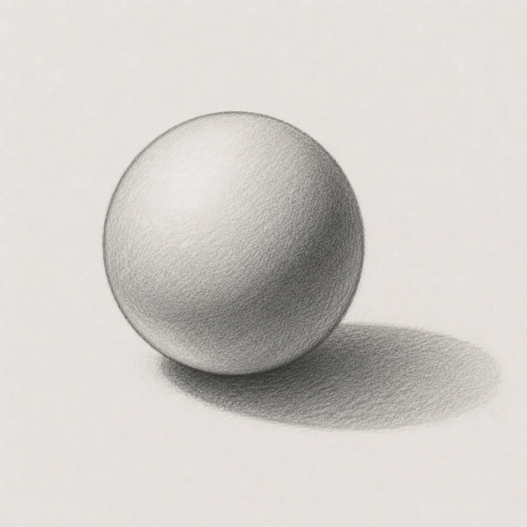
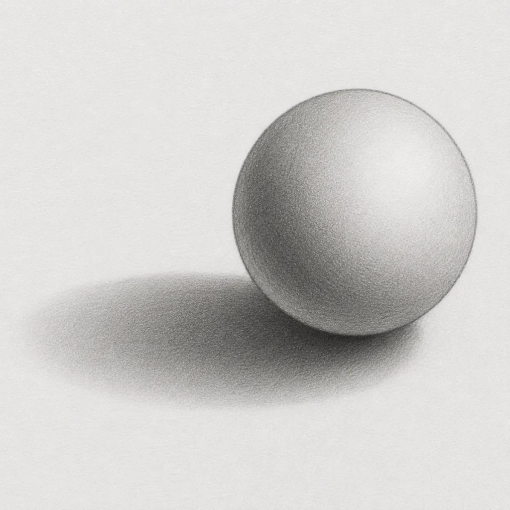
Step 7: Refine the Final Blending and Details
Continue refining the sphere by smoothing any remaining rough transitions between the light and dark areas. At this stage, the graphite should begin looking softer, cleaner, and more realistic while still keeping the overall shadow structure visible.
Carefully blend the mid-tones into the darker shadow areas using very light pressure. Avoid over-blending the highlight, as this area needs to remain brighter to maintain the illusion of light hitting the sphere.
You can now make small adjustments to improve the realism of the drawing. Darken areas that need more depth, soften harsh edges that look unnatural, and gently lift graphite with a kneaded eraser if certain sections become too dark.
The cast shadow should also appear softer and smoother during this stage. Keep the shadow darkest closest to the sphere and gradually lighter toward the outer edge. This helps create a more natural sense of depth and contact with the surface underneath.
Try to keep the shading transitions gradual and controlled rather than completely smoothing everything into one flat tone. A small amount of graphite texture is perfectly normal and helps the drawing retain a realistic hand-drawn appearance.
Refine the shading gradually while keeping the highlight, mid-tone, and darker shadow areas clearly separated.
Use light blending and careful erasing to smooth the graphite without losing the structure and depth of the sphere.
3. Effective Shadow Techniques for Drawing
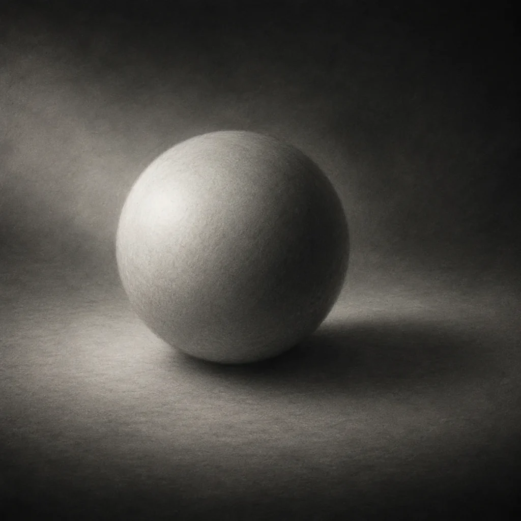
Soft vs Hard Shadows
Understanding how to use soft and hard shadows is key to developing strong shadow techniques in drawing. Each type creates a different visual effect and can dramatically improve depth, realism, and atmosphere in your artwork.
Soft shadows usually appear when light is diffused, while hard shadows form under direct, strong lighting.
Soft Shadows
What They Are:
Soft shadows have gradual transitions from light to dark. They appear blurry, diffused, and less defined at the edges.
How to Use Them:
Soft shadows are ideal for creating smooth gradients, atmospheric lighting, and portraying soft light sources such as moonlight or foggy environments.
Application in Horror Art:
These shadows work well for creating ghostly or ethereal figures and can suggest subtle lighting effects, like moonlight filtering through mist. They help build an eerie, dreamlike atmosphere in your artwork.
(The kind where everything looks calm… right before it isn’t.)
How to Create:
To create soft shadows, focus on gentle layering and smooth blending:
- Lightly layer graphite using an HB or 2B pencil
- Blend using a stump, tissue, or cotton swab for a smooth gradient
- Build the tones gradually for better control and realism
Hard Shadows
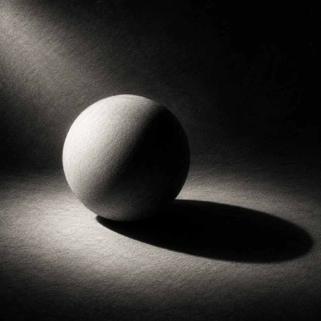
What They Are:
Hard shadows have sharp, well-defined edges with a quick transition from light to dark.
How to Use Them:
They are best for high-contrast scenes or when using strong light sources like a spotlight or direct sunlight.
Application in Horror Art:
Hard shadows add drama and intensity. They can be used to create sharp silhouettes or emphasise harsh details like jagged shapes, weapons, or threatening forms.
How to Create:
To create hard shadows, focus on precision and contrast:
- Use a sharp pencil (4B or 6B) to apply dark, bold shading
- Lightly outline the shadow shape before shading it evenly (without blending)
- Keep the edges crisp to maintain strong shadow definition
Pro Tip:
Use soft shadows to build tension subtly… then hit viewers with a hard shadow when they least expect it.
(Emotional damage, but make it artistic.)
4. Blending Techniques for Smooth Transitions
Blending is essential for creating realistic shadows and soft gradients. It helps smooth transitions between light and dark areas, improving overall form and depth in your artwork.
Blending Tools
Blending Stump:
Blending stumps are ideal for small areas or detailed shading. They offer precision and control, making it easier to blend without affecting nearby areas. Use a gentle twisting motion to smooth out your shading, helping prevent smudging and keeping edges clean.
Tissue:
Tissues work well for blending broad areas with smooth gradients. You can fold the tissue for more precise blending near edges or forms. This is particularly useful for background shading and creating soft transitions.
Cotton Swabs:
Cotton swabs are excellent for controlled blending in tight or delicate areas, such as highlights or fine details. Their small size allows for precise application without disturbing surrounding areas.
Fingers (optional):
While fingers can be used for quick blending, it’s best to use them sparingly. Natural oils from your skin can smudge or stain the paper. If you do use them, wash and dry your hands first to avoid unwanted marks.
Now that you know the tools, let’s look at how to actually use them to create smooth, realistic transitions.
Step 1. Light to Dark Gradient Blending
Start by applying a light layer of graphite. Gradually build up darker values as you move into shadow areas. Use a blending tool to gently smooth the transition, working from light into dark to avoid harsh lines.
Tip: Build up slowly. If you go too dark too quickly, your blending will look muddy instead of smooth.
Step 2. Layered Blending
Instead of blending everything at once, work in layers. Apply a light layer of shading, blend it, then repeat. This gives you more control and creates a softer, more realistic finish.
This is where the magic happens. It’s slower, but your shading will look far more polished.
Step 3. Edge Softening
Use a blending tool to lightly soften the edges between light and shadow. This is especially useful for curved surfaces like faces or rounded objects.
Be careful not to over-blend. Some edges should stay sharp for contrast.
Step 4. Directional Blending
Blend in the same direction as the form of your object. For example, follow the curve of a sphere rather than blending randomly.
This helps reinforce the shape and prevents your drawing from looking flat.
Step 5. Controlled Blending for Details
For small or detailed areas, use a blending stump or cotton swab with light pressure. This allows you to smooth shading without losing important detail.
5. Creating Sharp Edges for Cast Shadows
Add Depth, Contrast & Realism to Your Drawings
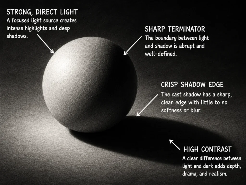
Cast shadows help anchor your spooky shapes to the ground and make them feel solid (and a little more menacing). They often have crisp edges – especially near the base of the object – adding contrast and a more polished, realistic finish to your drawing.
Let’s break down the process of creating sharp, realistic cast shadows that work with any horror-themed artwork.
Before we dive into the step-by-step process, let’s quickly go over the materials you’ll need:
Materials You’ll Need:
- HB pencil (for outlines)
- 4B – 6B pencil (for building smooth values and deep shadows)
- Blending stump or soft tissue (for smoothing transitions)
- Eraser (kneaded or precision eraser for cleaning edges and lifting highlights)
- Drawing paper with a slight texture (helps grip graphite and improves blending)
Step 1: Outline the Shadow
Lightly sketch the basic shape of your cast shadow using an HB pencil. Keep your lines soft and loose so they can be adjusted easily as the drawing develops. At this stage, you’re simply mapping out where the shadow will sit and how it connects to the object.
Pay close attention to the direction of your light source. The cast shadow should always stretch away from the light, not randomly wander off like it’s lost.
Add only the faintest amount of shading to the sphere itself. This subtle tone helps establish the form without pulling attention away from the cast shadow outline, which is the real focus of this step.
If the light source is soft or angled, the shadow will usually appear longer and slightly curved. Keep your pencil pressure very light so the shape stays easy to refine later.
Think of this stage as the foundation for the entire shadow. A clean, believable outline now makes the later shading and blending steps much easier to control.
Step 2: Fill In the Shadow
Using a 2B pencil, begin gradually filling in the cast shadow with smooth, even graphite. Keep the darkest area closest to the object, where the light is being blocked most strongly.
As the shadow stretches further away from the sphere, use lighter pencil pressure so the tones fade out naturally. Avoid making the entire shadow one flat value. Realistic shadows usually soften and lose intensity as they move away from the object.
At this stage, focus on building up the values slowly rather than trying to make everything perfectly blended straight away. The goal is to create a smooth transition from dark to light while keeping the overall shadow shape clean and controlled.
Pro Tip:
Use small circular motions or short, even strokes to build graphite gradually. Save softer pencils like 4B or 6B for the darkest areas later in the drawing process.
(Because once graphite goes nuclear, there’s no negotiating with it.)
Step 3: Refine and Smooth the Shadow
Now begin refining the cast shadow by smoothing out the graphite and strengthening the value transitions. Use a blending stump, tissue, or soft circular pencil strokes to soften any rough or patchy areas while keeping the overall shadow shape intact.
The darkest values should remain closest to the sphere, especially where the object touches the surface. This area, often called the contact shadow, creates a stronger sense of weight and realism.
As the shadow moves further away from the object, allow the graphite to become lighter and softer. The outer edges should gradually fade rather than end abruptly. This creates a more natural shadow transition and helps the object feel grounded on the page.
You can also begin refining the shading on the sphere itself so the lighting feels more connected between the form and the cast shadow. Keep the transitions smooth and controlled without losing the subtle graphite texture.
Pro Tip:
Blend gradually and in small sections instead of smudging the entire shadow at once. Too much blending can flatten the texture and make the graphite look muddy.
(A tragic fate. One minute it’s realism, the next it looks like the paper survived a small chimney explosion.)
Step 4: Sharpen the Shadow Edges
Now begin strengthening the darkest areas of the cast shadow to create sharper definition and stronger contrast. Using a softer pencil such as a 4B or 6B, carefully darken the contact shadow directly beneath the sphere, where the light is being blocked most intensely.
Keep the shadow edges cleaner and sharper closest to the object, then gradually soften them as the shadow stretches further away. This contrast between sharp and soft edges helps create a much more realistic sense of depth and lighting.
Refine the transition between the sphere and the surface so the object feels firmly grounded rather than floating above the page. The darker contact area adds weight, while the softer outer shadow keeps the lighting looking natural and believable.
At this stage, you can also smooth out any uneven graphite texture and strengthen the overall contrast slightly to make the form stand out more clearly.
Pro Tip:
Sharp edges are most effective when used selectively. If every edge is equally sharp, the shadow can start to look flat or unnatural instead of realistic.
(Basically, treat sharp shadows like horror villains – much more effective when used at the right moment.)
6. Layering For Depth
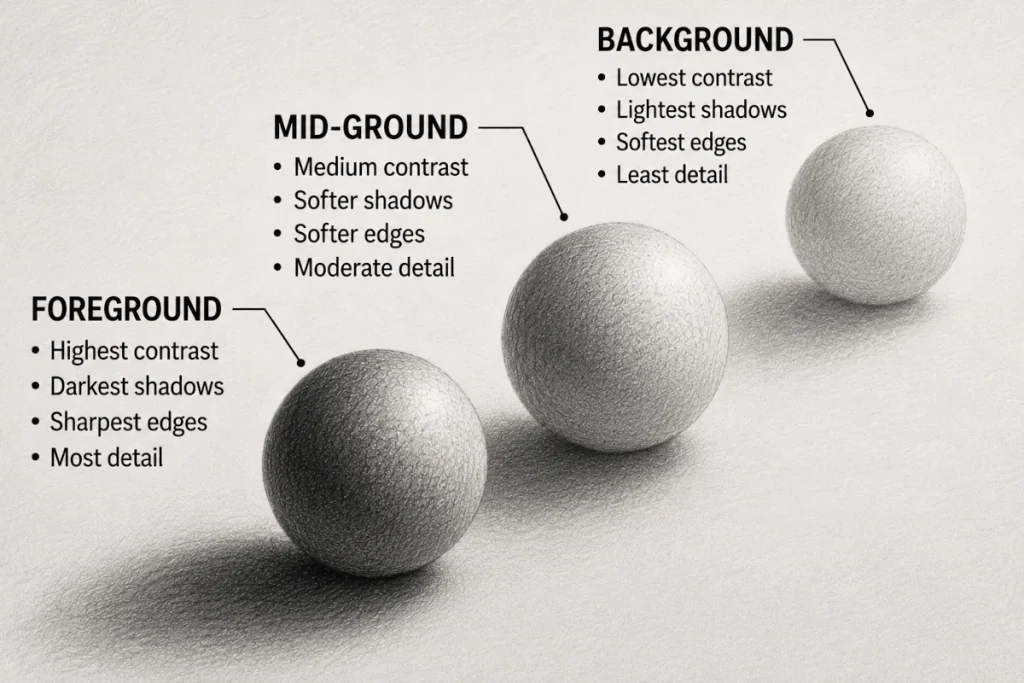
Shadows aren’t just about darkness. They’re about depth.
Layering shadows with different levels of contrast creates a sense of space and realism. Done right, it makes your drawing feel like it could almost lift off the page… or at least quietly judge you from it.
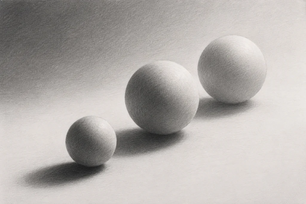
How to Create Depth Using Shadows
Overlap objects with contrasting shadow strengths:
- Use dark, sharp shadows for foreground elements to make them stand out.
- Apply softer, lighter shadows in the middle ground to create a smooth transition.
- Keep the background light and minimal to suggest depth without pulling focus away from your subject.
Think of it like depth staging: bold in front, gentle in the middle, barely there in the back.
How to Build Depth With Shadow Layering
- Start with a light HB pencil to sketch your base shadows.
- Gradually build up darker tones (2B, 4B, etc.) to deepen areas as needed.
- Blend between layers to create natural, smooth transitions.
Pro Tip: Always build shadows from light to dark. It keeps your shading clean and controlled, and stops your drawing from turning into something that looks like it lost a fight with a puddle.
Why This Works:
Layering shadows separates the visual planes in your drawing.
Foreground shadows stay bold and defined.
Mid-ground shadows soften and ease back.
Background shadows fade into subtle suggestions rather than shouting for attention.
This creates a clear sense of space and depth, making your scene feel more believable and more immersive. Perfect for that slightly unsettling, almost-too-real horror vibe where something feels just a bit… off.
7. Exaggerated and Distorted Shadows
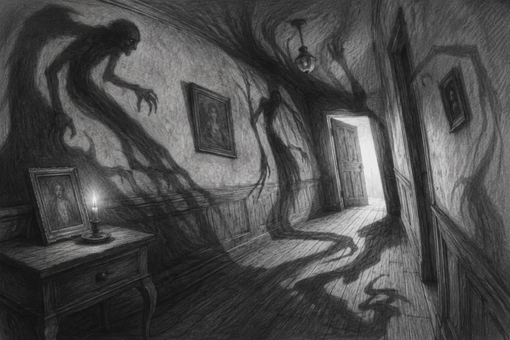
Shadows don’t always have to follow the rules of reality.
In horror art, they’re free to stretch, twist, and creep up walls like they’ve got unfinished business. Give them a sense of movement or intention to make the scene feel more alive… or more wrong.
Push this further by exaggerating their shapes. Let them grow longer than they should, bend at unnatural angles, or form silhouettes that don’t quite match what’s casting them.
By manipulating perspective and light direction, you can make shadows crawl across walls, warp across the floor, or take on sinister, almost human forms.
This works especially well in haunted settings, surreal horror, and dreamlike scenes where reality feels unreliable at best.
Tips For Creating Distorted Shadows in Horror Art:
- Use a strong directional light (like a candle, flashlight, or open doorway) to cast exaggerated shadows.
- Warp the shape to appear eerie or unnatural. Elongate fingers, stretch limbs, or distort outlines.
- Let shadows move independently from the object casting them to create surreal effects.
- Use angled surfaces like walls or floors to distort the shape, making the shadow crawl unnaturally or appear closer than the subject itself.
Why This Works:
Distorted shadows can transform a simple horror scene into something surreal or nightmarish. They amplify unease and challenge the viewer’s sense of reality. Experimenting with elongation or warped forms can intensify the eerie atmosphere because sometimes, what’s lurking in the dark isn’t as terrifying as the shadow it casts.
8. Common Mistakes in Shadow Techniques for Drawing
Shadows can make or break your artwork. Done well, they add eerie realism, depth, and just the right amount of atmosphere. Done poorly, they can flatten your drawing, confuse the viewer, or completely ruin the mood.
Here are the most common shadow mistakes and how to avoid them:
Shadows Going In the Wrong Direction
Mistake:
Shadows don’t match the position of the light source, making the scene feel off or unnatural.
Fix:
Make sure shadows extend away from the light. If the light is above, shadows fall downward. If it’s coming from the left, shadows stretch to the right.
Before you start shading, lightly sketch arrows to map your light direction. This gives you a clear guide and makes shadow placement much easier to control.
Why this works:
Shadows follow logic, even in horror art. When the direction is consistent, your scene feels believable, which makes the unsettling elements hit harder. When the direction is wrong, the viewer might not know why it looks off, but they’ll feel it immediately.
Shadows That Are Too Soft or Too Hard
Mistake:
Using only soft, blurry shadows or only hard-edged shadows makes the image feel flat or unnatural.
Fix:
Match your shadow edges to the type of light source.
Use hard shadows for strong, direct light (like a spotlight or harsh sunlight).
Use soft shadows for diffused light (like an overcast sky or foggy atmosphere).
In most scenes, a mix of both soft and hard edges creates more depth and realism.
Why this works:
Light isn’t one-note. Even in a single scene, it creates a range of shadow edges depending on distance, intensity, and surface.
When everything is soft, your drawing can look hazy and undefined. When everything is hard, it can feel stiff or cut out. Mixing both gives your shadows structure and variation, which makes the scene feel more believable and visually interesting.
Shadows That Don’t Match the Object’s Shape
Mistake:
Shadows don’t follow the form and contours of the object, making them look disconnected from the subject.
Fix:
Make your shadows reflect the form of the object casting them.
Rounded forms create softer, curved shadow shapes.
Angular objects produce sharper, more defined edges.
Also, think about the surface the shadow is landing on. A flat wall, uneven ground, or curved surface will all affect how the shadow bends and stretches.
Why this works:
Shadows are not random shapes. They’re a direct extension of the object’s form, projected through light.
When the shadow doesn’t match the structure of the object, the illusion breaks. It starts to look like a separate shape instead of part of the same scene.
By matching the form and adjusting for the surface it falls on, your shadows feel grounded, believable, and properly connected to the object.
Shadows That Are Too Light or Too Dark
Mistake:
Shadows that are too faint or completely black break the illusion of depth and make the drawing feel flat.
Fix:
Aim for balanced values. Shadows are rarely pure black.
Instead, let them pick up subtle colours from the environment.
Try adding hints of dark blue, purple, or warm brown to make them feel more natural and grounded.
Vary the intensity within the shadow. The area closest to the object is usually darker, while edges soften and lighten as they move away.
Why this works:
Shadows define depth through value variation, not just darkness.
If everything is too light, the form disappears. If everything is pitch-black, detail gets swallowed whole as if it fell into a tiny void.
By controlling how dark your shadows are and introducing subtle colour and variation, you create a sense of volume, atmosphere, and realism that pulls the viewer in.
Floating Objects (No Contact Shadows)
Mistake:
Objects can appear to float unnaturally if there’s no shadow connecting them to the surface.
Fix:
Always include a contact shadow directly beneath the object. This is a small, dark, concentrated shadow where the object touches the surface.
Keep it tight and slightly softer at the edges, depending on the light source. From there, larger cast shadows can extend outward.
Why this works:
Contact shadows act like visual glue.
They show exactly where the object meets the surface, which instantly grounds it in the scene. Without them, your object looks like it’s hovering… even if everything else is drawn perfectly.
That tiny patch of darkness does a surprisingly heavy job, anchoring the form and making the whole drawing feel more believable.
Overcomplicating Shadow Details
Mistake:
Adding too much detail to a shadow makes it feel cluttered, noisy, and unrealistic.
Fix:
Keep shadows simple and consistent. A touch of reflected light is fine, but the main body of the shadow should stay clean. Think in clear shapes rather than lots of tiny details.
Focus on whether the shadow is solid or smoothly blended, not overly textured or busy.
Why this works:
Shadows aren’t the star of the show; they’re the supporting cast.
When you over-detail them, they start competing with the actual subject, which confuses the eye and flattens the image.
Simple shadows create strong, readable shapes, which makes your drawing feel clearer, more controlled, and more realistic. Your details should live in the light, not get lost in the dark.
Shadows That Don’t Fade Properly
Mistake:
Shadows that stay the same tone from start to finish can feel flat, heavy, and unnatural.
Fix:
Let shadows gradually lighten as they move away from the object. The area closest to the object is usually the darkest, then it softens and fades as it stretches outward.
Think of it as a gentle fade, not a solid block. This helps the shadow blend naturally into the surface and surrounding light.
Why this works:
Light loses strength as it spreads, so shadows do too.
When your shadow stays one tone, it looks like it’s been stamped on rather than cast by light. A gradual fade creates a sense of distance, space, and realism, making the object feel grounded instead of pasted onto the page.
Final Thoughts
Mastering shadows is one of the most powerful ways to add mood, realism, and depth to your horror art. Whether you’re creating something subtly eerie or going full nightmare fuel, strong shadow work is the foundation that everything else builds on.
Keep sketching, keep observing, and don’t be afraid to experiment. The more you study how light behaves, the more natural your shadows will start to feel.
Because the best horror doesn’t just sit in the obvious places… it creeps in through the smallest details and settles deep in the darkest corners.
Next Up: Advanced Lighting Techniques for Horror Art
You’ve conquered shadows, now it’s time to level up your lighting and push that eerie atmosphere even further.
Continue to Advanced Lighting Techniques for Horror Art