How Different Light Sources Affect Horror Art
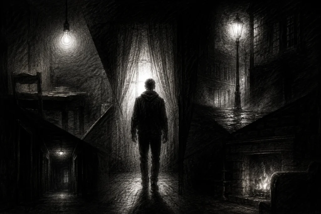
Lighting is the secret sauce of horror art. It sets the mood, shapes the atmosphere, and casts dramatic shadows that make your creatures look terrifying instead of, well… about as spooky as a piece of steamed broccoli. (Unless you still have flashbacks to childhood dinners, in which case… fair.)
If you want to master lighting in horror art, it’s important to understand how it behaves, how it interacts with objects, and, most importantly, how it can crank up the creep factor and make your scenes feel just a little bit wrong. In this guide, we’ll break down different light sources and explore how each one can enhance the atmosphere and amplify the dread.
What You’ll Learn:
By the end of this post, you’ll understand:
- How different lighting directions (top, side, under, and back lighting) affect mood and form
- When to use each lighting type to create tension, mystery, or drama in horror art
- How multiple light sources and colour temperature can change the atmosphere of a scene
- Common lighting mistakes that can make your artwork feel flat or confusing
- Simple ways to fix and improve your lighting so it feels more intentional and believable
1. Types of Light Sources
Direct Light
Direct light uses a strong, focused source to create bold contrast and clearly defined shadows.
This type of light comes from a focused, single source, like a flashlight, a lamp, or the sun. It produces strong contrasts and sharp-edged shadows, clearly defining the boundary between light and dark. This makes it ideal for highlighting specific areas and building dramatic tension in your horror scenes.
Horror Application:
Direct light is great for drawing attention to one subject while leaving the rest of the scene in shadow. In horror art, this is especially useful for isolating a figure, adding a sense of vulnerability, or making a monster feel like it’s emerging from the dark. It’s also effective for backlighting eerie silhouettes or spotlighting disturbing details.
Helpful Hint:
Use direct light to create strong contrast between light and shadows. This works especially well when you want to guide the viewer’s focus or heighten the emotional impact of a scene. Always keep track of where your light source is placed, as the angle will dramatically affect how forms and shadows appear.
Watch Out:
Too much direct light without supporting light sources can flatten a scene or make it feel unnatural. To avoid this, soften the effect by blending in some ambient or bounce lighting. This helps maintain depth while keeping that sharp, horror-driven contrast.
Example Scenario:
Imagine a flickering flashlight suddenly revealing a hunched figure in a dark basement. The harsh beam picks out twisted limbs and glinting eyes, while the surrounding darkness hides the rest. The viewer sees just enough to feel uneasy… and that’s exactly where the fear lives.
Diffused Light
Diffused light creates soft shadows and smooth transitions, reducing harsh contrast across your subject.
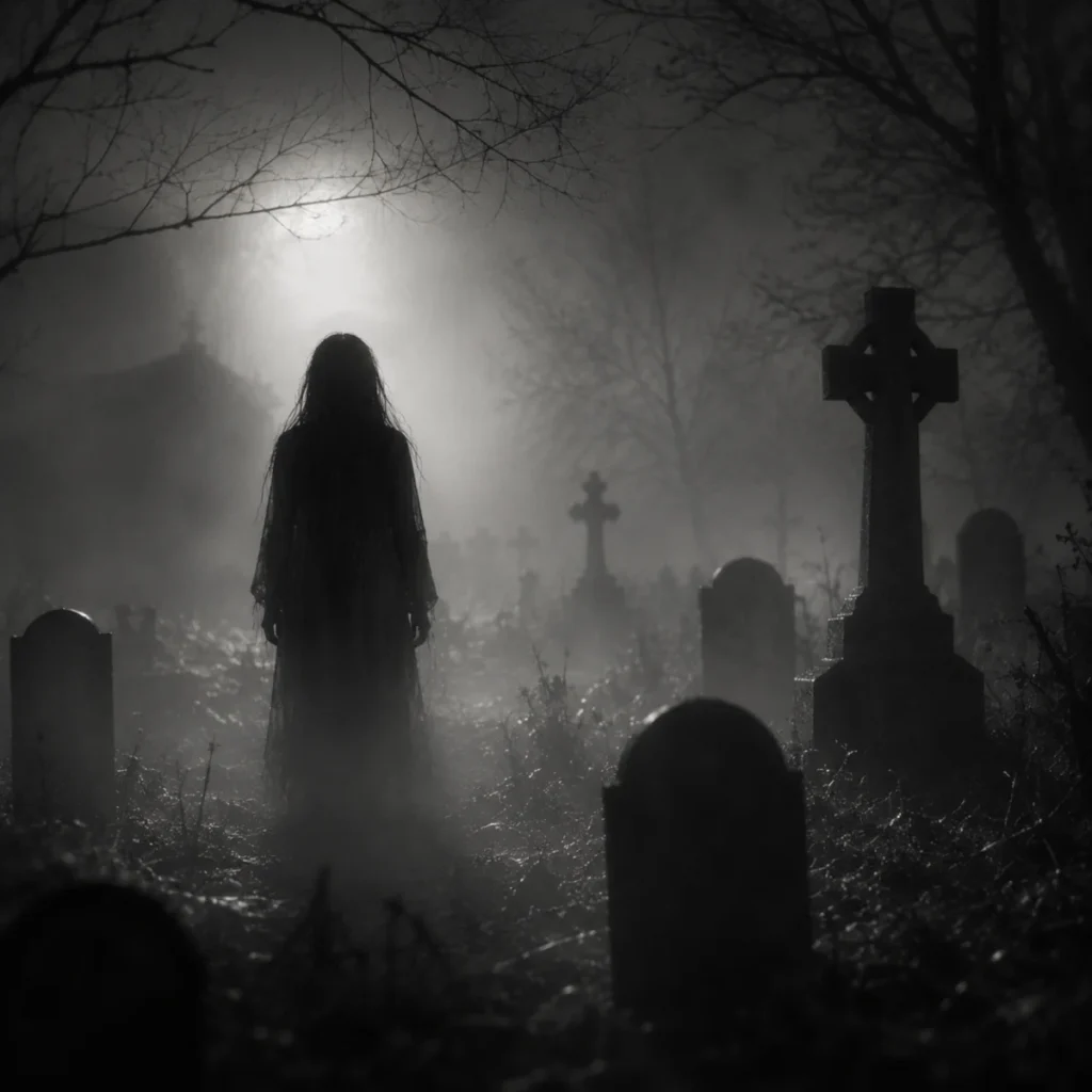
Diffused light refers to light that has been scattered, similar to the soft glow of an overcast sky or a room filled with ambient lighting. It produces subtle shadows with smooth transitions and a gentle falloff across surfaces. Instead of harsh contrast, it creates a more even, softened look.
Horror Application:
This type of lighting is ideal for creating eerie, atmospheric scenes, like misty graveyards, haunted forests, or abandoned buildings. Because diffused light softens or hides details, it adds a sense of mystery and tension, making the viewer feel like something could be lurking just beyond what’s visible.
Helpful Hint:
Use diffused light to build a soft, moody atmosphere without harsh contrast. It works especially well for scenes that feel quiet, unsettling, or dreamlike, like fog drifting through trees, moonlight filtering into a forest, or a figure barely visible through mist.
Watch Out:
Relying too much on diffused light can make your scene feel flat or low-energy. Without contrast, tension can fade. To bring back depth and focus, try combining it with a stronger light source, like direct or ambient light.
Example Scenario:
Picture a ghost lingering in a foggy graveyard at dusk. The diffused light from the clouded sky softens everything. Edges blur, shadows fade, and nothing stands out. The figure almost disappears into the haze… until a sudden glint of light catches in its eye.
Quick Tip:
Try using backlighting through fog to create a soft glow around silhouettes. It’s a great way to suggest a presence without fully revealing it.
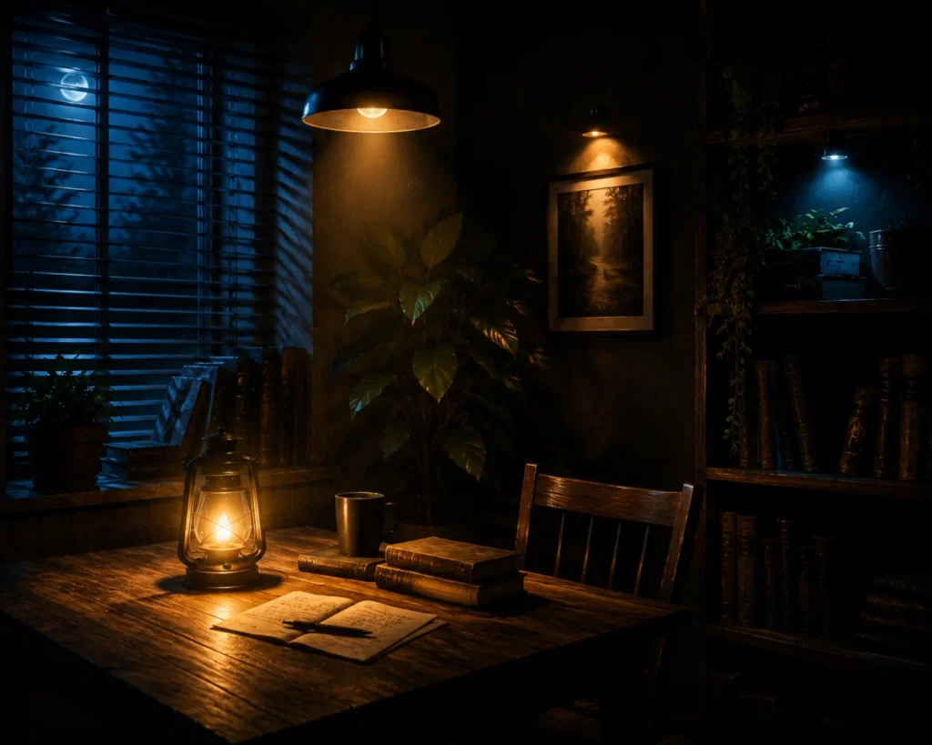
Ambient Light
Ambient light creates balanced, even illumination with soft edges and minimal contrast.
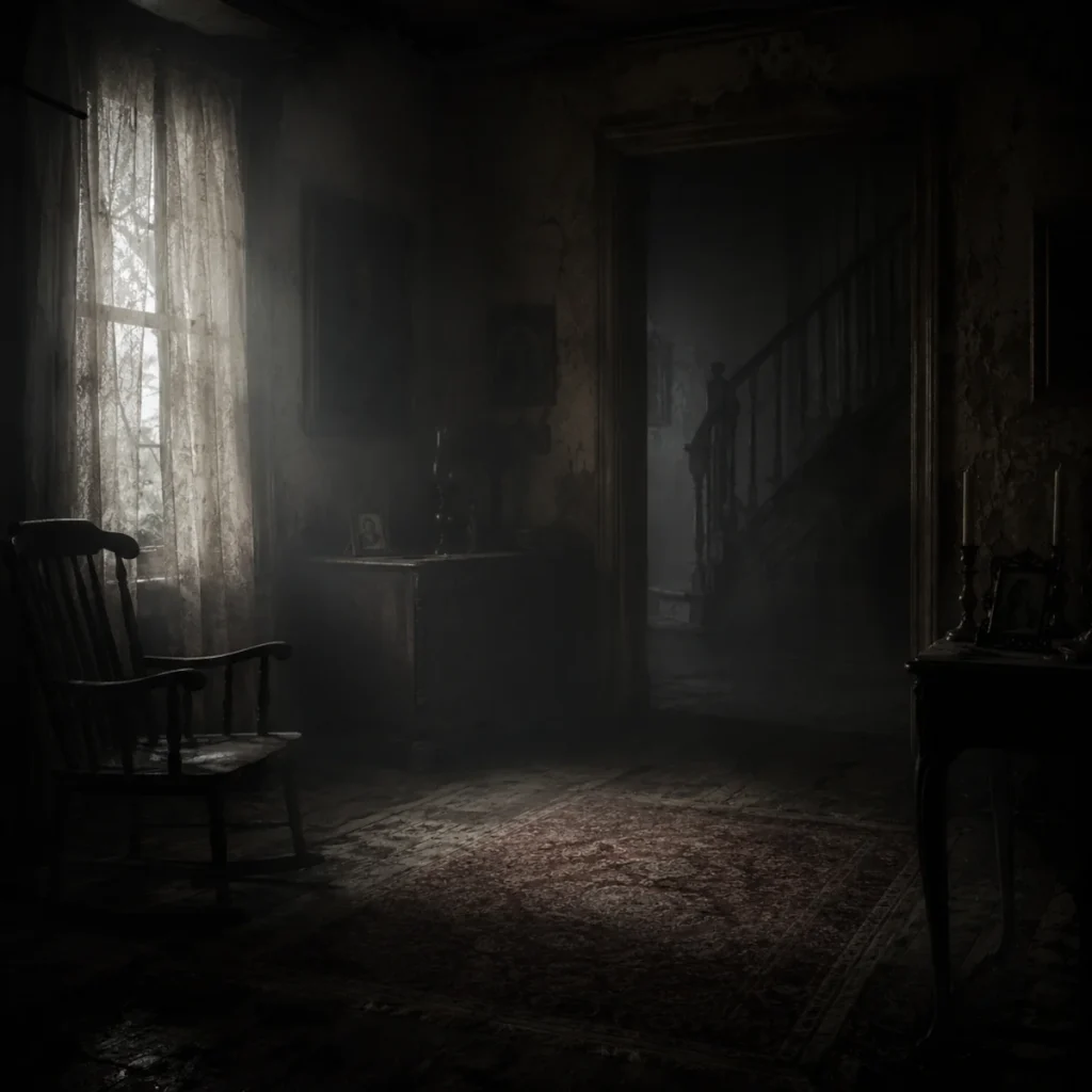
Ambient light refers to the general lighting that fills a space evenly, often bouncing off multiple surfaces. It produces minimal shadows but plays an important role in setting the overall tone and mood of your drawing. Ambient light often works as a base layer before introducing stronger, more directional light sources.
Horror Application:
This type of lighting is ideal for scenes where the light source isn’t immediately visible, like a room lit by a faint, ghostly glow from an unknown direction. It creates a subtle, unsettling atmosphere and builds a sense of discomfort, as if something might be nearby without ever fully revealing itself.
Helpful Hint:
Ambient lighting is great for establishing a background atmosphere. It allows you to show details without making them stand out too sharply, making it perfect for eerie environments, dreamlike horror spaces with surreal elements, or scenes that feel just a little too quiet. Think liminal rooms, abandoned buildings, or slow-building dread.
Watch out:
Too much ambient light can make your scene feel flat or overly soft. Because it fills space evenly, it can reduce contrast and wash out shadows. Be careful not to let it overpower your scene. Balance it with stronger light sources to keep depth and tension intact.
Example Scenario:
Imagine an old hotel hallway, dimly lit by an unseen source. The furniture casts faint shadows, and the corners dissolve into darkness. Nothing stands out, but everything feels slightly wrong… like the space is watching you back.
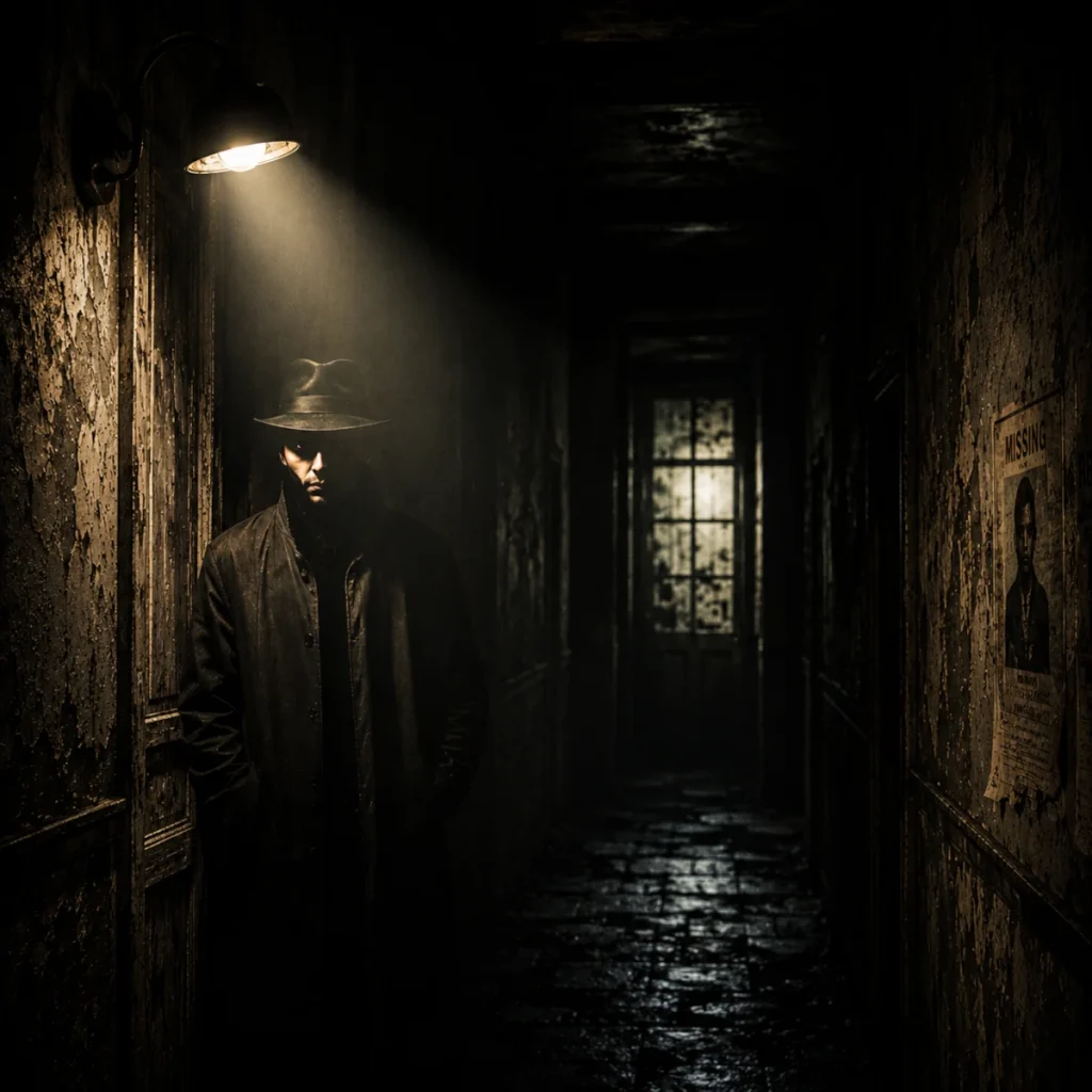
Point Light
Point light comes from a single, concentrated source, creating sharp highlights and clearly defined shadows.
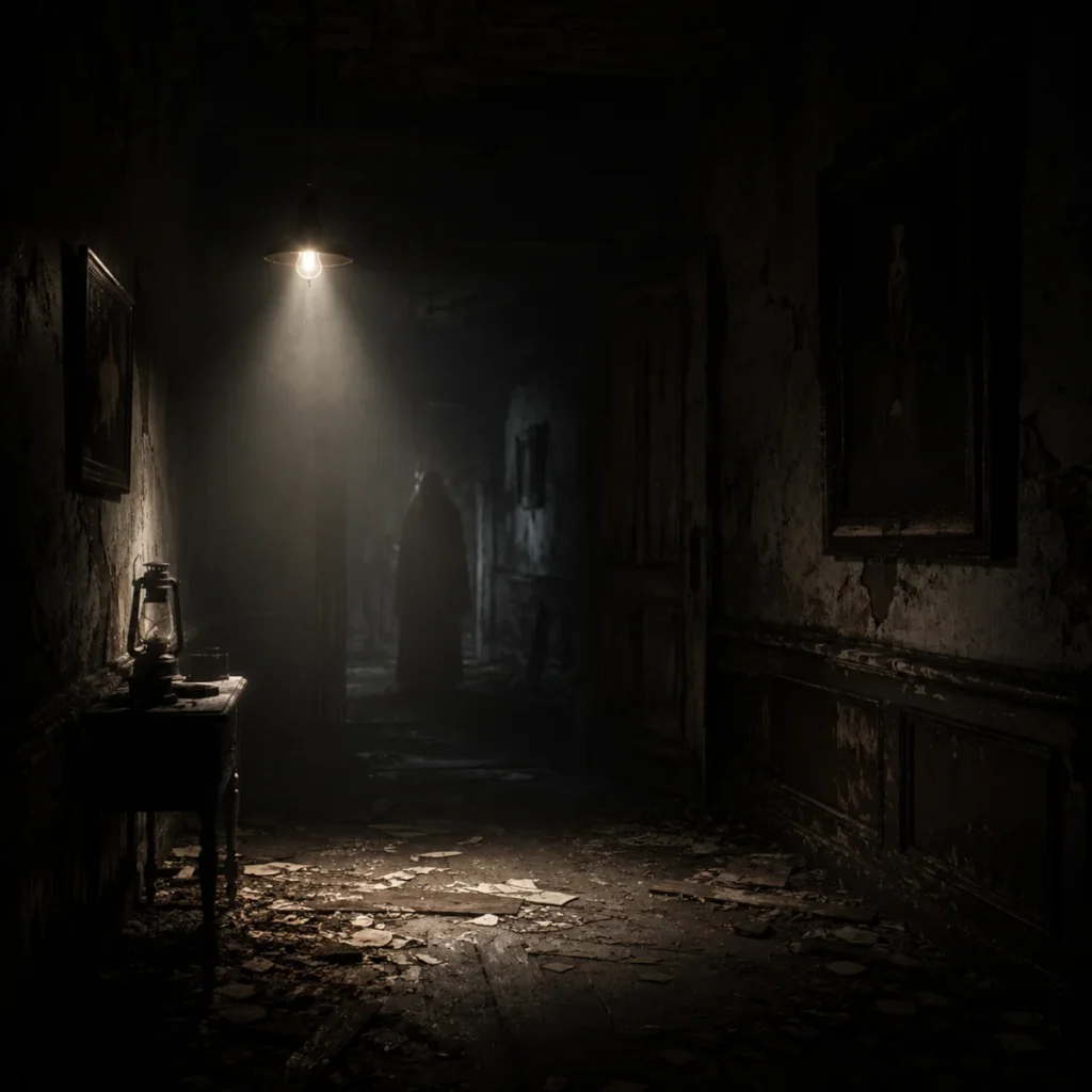
A small, localised source of light, such as a candle, glowing orb, or single lightbulb. Shadows spread outward from the source, and the contrast between light and dark can vary depending on the light’s strength and how close it is to the subject. Point lights are commonly used in games and films for dramatic horror reveals.
Horror Application:
Candlelight is a classic choice for spooky, gothic settings like haunted mansions or crypts. It creates a warm but unsettling atmosphere, giving you just enough visibility to see what’s in front of you… and question what isn’t.
Helpful Hint:
Point light is excellent for drawing attention to a single subject. Try placing the light source within the scene, like a lantern on the ground or a glowing object held by a character, to create a more immersive and atmospheric effect.
Watch Out:
Because point light creates strong, focused highlights and deep shadows, it can make surrounding areas feel unnaturally dark or washed out if not balanced properly. To avoid this, introduce some ambient or reflected light to soften transitions and maintain depth.
Example Scenario:
A cloaked figure holds a lantern in a crumbling hallway. The light stretches its shadow across the floor and walls, warping as it flickers. The glow pulses softly, revealing just enough to see… but leaving everything beyond its reach untouched, as if something is waiting in the dark.
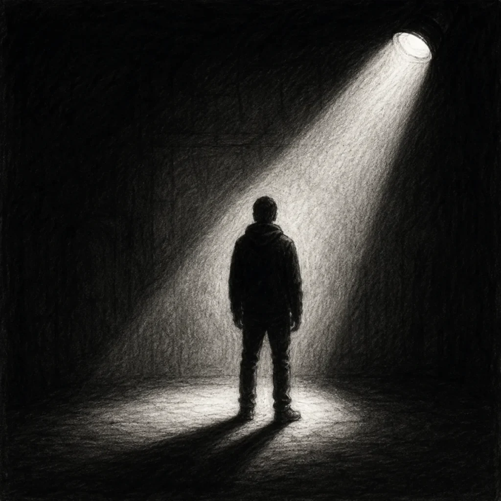
Directional Light
Directional light comes from a single direction, creating strong, consistent shadows that clearly define form and depth.
Directional light comes from a distant source, like the sun or moon, and travels in parallel rays. This creates consistent, dramatic shadows that stretch across a scene in a clear direction. Unlike ambient or diffused light, directional lighting gives a strong sense of where the light is coming from, making it perfect for horror scenes where shadows do the storytelling.
Horror Application:
Use moonlight to create long, stark shadows that cut across eerie environments. It’s perfect for scenes that feel isolating, mysterious, or tense, like someone’s watching… but you can’t tell from where.
Helpful Hint:
Directional light works especially well outdoors. Use it to exaggerate shadows, highlight forms, or cast dramatic lighting across surfaces. It’s ideal for night scenes lit by the moon or harsh, high-contrast daylight, like an empty desert town under a relentless sun.
Watch Out:
Since directional light creates consistent angles, every shadow in your scene should follow the same direction. If they don’t align, the result can feel “off” or visually unrealistic, especially in outdoor scenes where the light source is clearly defined.
Example Scenario:
A lone figure walks through a windswept cornfield beneath a full moon. Directional light casts a long, thin shadow behind them, stretched and unnatural. The rows of crops form endless dark lines… and somewhere in the distance, one shadow doesn’t move the way it should.
2. Light Direction and Its Effects
The direction of light isn’t just about visibility – it’s about drama, mystery, and making sure your horror creatures look extra terrifying. Experiment with different lighting angles to create depth and mood in your artwork.
Top Lighting
Top lighting comes from above, casting shadows directly beneath objects and creating a natural, grounded sense of form.
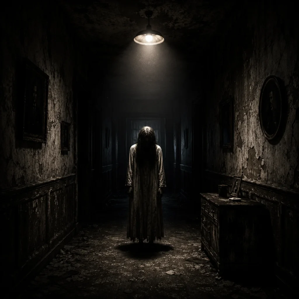
Top lighting comes from above, casting shadows directly beneath objects. It’s the most natural and commonly used light direction, as it reflects how we typically experience light in the real world, whether from the sun, overhead lamps, or ceiling fixtures.
Horror Application:
Top lighting emphasises hollow or sunken areas, making it perfect for skeletal faces, gaunt figures, or anything that needs that “I haven’t slept in 300 years” energy. It adds unease without being overly dramatic, making it great for slow-building tension.
Helpful Hint:
Use top lighting to add realism and depth to your drawings. It highlights the upper surfaces while softly shading the areas beneath, giving your forms a more three-dimensional appearance. It’s especially effective for making horror characters feel grounded yet subtly unsettling.
Watch Out:
Top lighting can make things look too neutral or clean if there isn’t enough contrast. It might not generate enough tension on its own unless you deepen the shadows or pair it with secondary light sources to enhance the drama.
Example Scenario:
A corpse-like figure slouches under a flickering hallway bulb. The overhead light casts deep shadows beneath its eyes and cheekbones, hollowing its face and making it resemble a skull stretched tight with skin. You can’t quite see what it’s holding… but whatever it is, it’s dragging it behind.
Bonus Tip:
Top lighting can create dramatic drop shadows under the chin, brow, nose, and eye sockets, especially when paired with little to no fill light. These exaggerated shadows sculpt the face in a more intense, unsettling way, perfect for making your horror characters look gaunt, menacing, or like they haven’t blinked in a century.
Side Lighting
Side lighting illuminates one side of your subject while leaving the other in shadow, clearly defining form and depth.
Side lighting strikes your subject from one side, creating dramatic contrast and deep shadows across the form. It divides the subject into light and dark, making shapes feel more three-dimensional and visually striking.
Horror Application:
Perfect for eerie portraits, side lighting works especially well for a split-face effect or revealing only part of a lurking figure. It suggests that something is hidden, building tension by making viewers feel like something might be just out of sight.
Helpful Hint:
Side lighting is great for sculpting features and adding intensity, especially in faces and figures. You can control how much of the subject is revealed, and often the shadow side tells a far more interesting story than the lit one.
Watch Out:
If both sides of your subject are evenly lit, you lose that sense of contrast and drama. Always make sure the light direction is clear, or the image can end up feeling flat or uncertain.
Example Scenario:
A masked stranger stands just inside a doorway. Light from a nearby streetlamp spills in from the side, illuminating only half of their face while the rest disappears into shadow. You can’t tell if they’re smiling… or just watching you without blinking.
Bonus Tip:
Depending on the angle, side lighting can create subtle shadows under the nose, cheekbones, or eye sockets, adding a slightly gaunt or uneasy look. Just enough to make your subject feel like they haven’t slept… or maybe don’t need to.
Under Lighting
Under lighting shines up from below, reversing normal shadow direction and creating a warped, uneasy effect.

Under lighting comes from below, casting shadows upward and creating a distorted, unnatural look. It goes against how we normally see light, making familiar forms feel eerie, warped, and slightly unsettling.
Horror Application:
This lighting is perfect for creepy effects, like a ghost story told by candlelight or a torch held under the chin. It throws shadows upward across the face, warping features and instantly building tension.
Helpful Hint:
Under lighting is excellent for creature designs and jump-scare moments. Use it to exaggerate facial features, hollow out eye sockets, or highlight the chin and jaw to give characters a more otherworldly appearance.
Watch Out:
Because it’s so unnatural, under lighting can easily come off as comedic or overdone if you’re not careful. Balance it with softer lighting, or make sure the overall scene supports that eerie tone… unless you want that slightly unhinged campfire storyteller energy.
Example Scenario:
A terrified camper raises a flashlight under their chin. Their face twists into something skull-like, shadows crawling across the tent walls. Outside, something snaps a branch… but the beam is pointed the wrong way to see what’s getting closer.
Bonus Tip:
Under lighting can create dramatic shadows that stretch upward across walls and surfaces, warping silhouettes into something unfamiliar. Perfect for those quiet little “that shape was not there a second ago” moments.
Back Lighting
Back lighting outlines your subject with a glow, pushing details into shadow and emphasising shape.
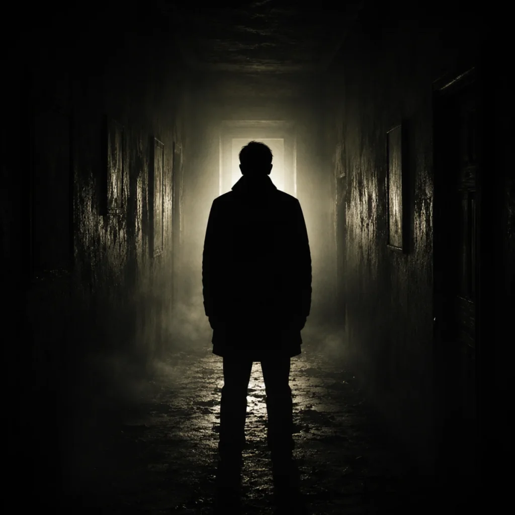
Back lighting comes from behind the subject, casting them into silhouette. This hides most details while emphasising shape, giving your subject a mysterious and dramatic presence.
Horror Application:
Back lighting is perfect for figures that are more suggested than seen. It works beautifully for ghosts, lurking creatures, or anything you want to hint at without fully revealing.
Helpful Hint:
Use back lighting when you want to control what your viewer sees. Let them notice the outline, but not the face or what’s being held. Pair it with fog, smoke, or mist to create a more atmospheric and eerie scene.
Watch Out:
Back lighting can make your scene feel flat or overly silhouetted if used on its own. If everything disappears into shadow, you may lose important form. Add a subtle secondary light, like rim lighting or soft fill, to bring back just enough detail without ruining the mood.
Example Scenario:
A figure stands at the end of a foggy path, backlit by a glowing doorway. You can’t tell who or what it is. The light outlines a tall, still shape… just watching. Then the fog shifts, and a second silhouette quietly steps into view.
Bonus Tip:
Back lighting is perfect for those “you can see the outline… but not the danger” moments. Use it to tease shapes and movement, letting your viewer’s imagination do most of the work… which is usually far worse.
3. Multiple Light Sources
Multiple light sources interact to create layered lighting, allowing different areas of your scene to feel distinct and intentional.
Using multiple light sources enhances the complexity of your drawing by introducing different light directions, intensities, and colours. This creates richer contrast and allows you to shape the mood of a scene in more controlled and intentional ways.
Horror Application:
Layer your lighting to tell a story. Try combining a warm light (like fire or candlelight) with a cool light (such as moonlight or a faint artificial glow) to build contrast and tension. This works especially well for scenes that feel surreal, unbalanced, or slightly “off”, keeping the viewer on edge.
Cinematography Note:
In horror films, multiple light sources are often used to separate subjects from their surroundings. One light might reveal part of a character, while another creates a shadow elsewhere, subtly guiding the viewer’s attention without fully explaining what they’re seeing.
Helpful Hint:
Use colour temperature to separate your light sources clearly. A warm light in front and a cooler light behind can help define form and depth while leading the viewer’s eye. Just remember: each light source creates its own shadows, so plan them carefully to avoid confusion.
Watch Out:
It’s easy to lose consistency when using multiple lights. If you don’t plan where each one is coming from, your shadows can clash, and your highlights may feel scattered. Sketch small light direction guides during your planning stage to keep everything organised.
Example Scenario:
A child stands frozen in the woods. A jack-o’-lantern in front of them glows with warm orange light, casting flickering shadows across their face. Behind them, cold moonlight cuts through the trees, creating a second, longer shadow stretching in the opposite direction… and it moves first.
4. Visualising Light Interaction
Before you start slapping shadows everywhere, pause and ask yourself:
- Where is the light coming from?
- Is it strong and harsh, or soft and subtle?
- What’s blocking the light, and where will the shadow fall?
- Does the light bounce off nearby surfaces (reflected light)?
- And… are you still alone in the room? (Just checking.)
Helpful Hint:
Try sketching a quick light diagram in the corner of your page to keep your lighting setup clear. Even a simple doodle of your light source and subject can help you avoid awkward or inconsistent shadows… so your creature doesn’t end up looking like it’s being lit by a fridge at 3am instead of something genuinely unsettling.
5. Common Mistakes When Using Light Sources (And How to Fix Them)
Mastering lighting takes time, and even experienced artists make mistakes. When your light sources aren’t clear or consistent, your drawing can quickly feel confusing or unrealistic. Here are some common issues to watch for and how to fix them.
Unclear Light Source
Mistake:
Forgetting to establish a clear and consistent light source leads to shadows and highlights that don’t align properly.
Fix:
Before you start shading, decide where your main light source is coming from. A simple trick is to sketch a small symbol, like a sun, lamp, or glowing orb, in the corner of your page as a reminder.
Helpful Hint:
Draw a small light icon in the margin to keep your lighting direction consistent. It acts as a quick visual guide, helping you place shadows accurately and avoid confusion as your drawing develops.
Clashing Light Sources
Mistake:
Using multiple light sources without considering how they interact can lead to confusing or unnatural lighting, where shadows and highlights don’t feel consistent.
Fix:
When combining light sources (like candlelight and moonlight), make sure one is dominant. The secondary light should support the scene with subtle highlights rather than competing for attention.
Helpful Hint:
Think of one light source as the main focus, and the others as supporting elements. Keeping a clear hierarchy helps your lighting stay believable and prevents your scene from feeling visually cluttered.
Shadows That Don’t Match the Light Source
Mistake:
Shadows falling in inconsistent or incorrect directions instead of clearly extending away from the light source.
Fix:
Shadows should always extend in the opposite direction of your light source. For example, if your light is above and to the left, your shadows should fall downward and to the right. Keeping this direction consistent helps your scene feel believable and grounded.
Helpful Hint:
Lightly sketch in your light direction or angle lines before shading. This gives you a clear guide for where shadows should fall and helps you avoid mistakes as your drawing becomes more detailed.
Flat Lighting (No Contrast)
Mistake:
Not using enough contrast between light and shadow leaving your artwork looking dull, flat, and lacking depth.
Fix:
Increase the contrast by pushing your darks darker and your highlights brighter. Strong contrast helps define form, making your subject feel more three-dimensional and visually striking. Shadows should feel solid and intentional, not faint or washed out.
Helpful Hint:
Try squinting your eyes or zooming out to simplify the image. If everything blends together into similar tones, you likely need to increase your contrast. This quick check helps you see whether your lighting is clearly defined or getting lost.
Ignoring Ambient Light
Mistake:
Only focusing on your main light source and forgetting that light bounces off surfaces, even in darker scenes.
Fix:
Even in dim environments, light can reflect off nearby walls, floors, or objects. These subtle reflections create soft highlights within shadowed areas, helping your drawing feel more realistic and adding depth to your scene.
Helpful Hint:
Look for faint reflected light in unexpected areas, like under the chin, along edges, or near surrounding surfaces. These small touches can make shadows feel more natural and connected to the environment.
Overcomplimenting the Lighting
Mistake:
Adding too many unnecessary highlights and shadows can make your lighting feel chaotic rather than intentional, pulling attention away from the mood of your scene.
Fix:
Keep it simple. If your lighting starts to feel confusing, strip it back and rebuild from a single clear light source. Only add extra highlights or shadows when they support the mood or help guide the viewer’s eye.
Helpful Hint:
If your shadows start heading off in different directions, it’s a sign to simplify. Stick to one main light source until everything feels consistent and easy to read.
Forgetting Colour Temperature
Mistake:
Using random colours for your lighting without considering how warm and cool tones affect the mood of your scene.
Fix:
Warm lights, like fire or candlelight, tend to create orange or yellow tones, while cool lights, like moonlight or neon, lean toward blue or purple. Keeping your colour temperature consistent helps your lighting feel believable and adds depth to your artwork.
Helpful Hint:
Think about how your light should feel. Warm tones can make a scene feel tense or unsettling, while cooler tones often create a colder, more distant atmosphere. Choosing one direction and sticking to it helps your lighting feel intentional.
Final Tip: Study Real-Life Spookiness
Grab a torch or candle, dim the lights, and experiment. Watch how shadows stretch, soften, or sharpen depending on the light’s strength and distance. The more you observe lighting in real life, the more convincing your drawings will feel… and the harder it becomes to ignore what’s lurking in the corners.
What You Learned:
- Light direction affects the mood, depth, and atmosphere of your horror artwork.
- Different light types create different emotional effects, from subtle tension to dramatic contrast.
- Point lighting creates focused highlights and strong shadows around a single light source.
- Directional lighting produces long, consistent shadows that help guide the viewer’s attention.
- Top lighting creates natural depth while emphasising hollow or sunken features.
- Side lighting splits subjects between light and shadow, adding mystery and dramatic contrast.
- Under lighting reverses normal shadow placement, creating distorted and unsettling effects.
- Back lighting hides details and turns subjects into silhouettes, making scenes feel mysterious and eerie.
- Multiple light sources can layer warm and cool tones together to build tension and visual complexity.
- Consistent shadow direction is essential for believable lighting and stronger realism.
- Contrast, colour temperature, and shadow placement all help shape storytelling in horror art.
- Combining lighting techniques with fog, silhouettes, reflections, or atmospheric effects can make scenes feel more immersive and cinematic.
Next Up: Mastering Shadows for Depth and Drama in Horror Art
Lighting sets the scene, but shadows bring the tension. In the next post, we’ll explore how to use shadows to build mood, create depth, and add that extra layer of unease to your artwork.
Continue to Mastering Shadows for Depth and Drama in Horror Art