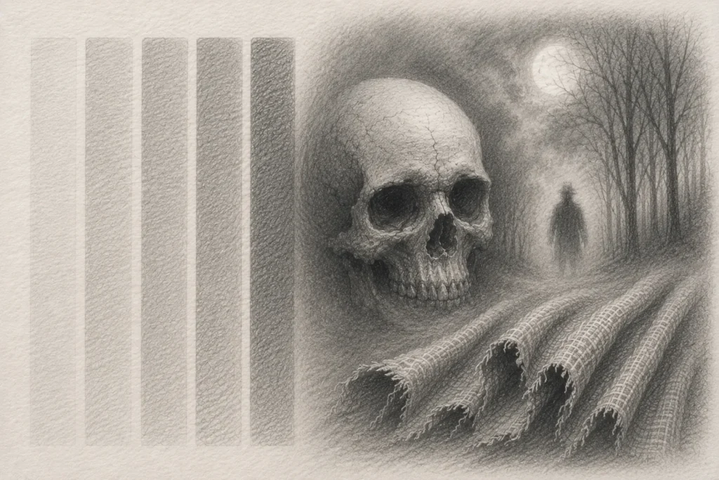
Layering Pencil Shading for Smooth Gradients (and Creepy Realism)
Layering is one of the most important skills in pencil shading. It transforms flat sketches into smoother, deeper, more atmospheric drawings by gradually building tone instead of forcing dark values too quickly.
Rather than pressing heavily into the paper, layering teaches patience, control, and how to build depth step by step using lighter shading passes.
Think of it like fog slowly gathering across a scene. You don’t drop all the atmosphere in at once – you build it gradually until the drawing starts to feel richer, softer, and more immersive.
For horror artwork especially, layering helps create smooth gradients, eerie shadows, realistic textures, and subtle transitions that make your drawings feel more believable and unsettling.
What You’ll Learn:
Learn how to build smooth graphite shading using gradual pencil layers for richer depth and creepy realism.
- How to start shading lightly and build darker tones gradually.
- Why layering creates smoother gradients than heavy pencil pressure.
- How to blend graphite without over-smoothing your textures.
- Why paper texture affects shading quality and atmosphere.
- How to avoid common layering mistakes like patchy tones and muddy shading.
- How layering improves horror textures such as fog, skin, fabric, and undead features.
- How overlapping layers create smoother transitions and richer shading.
- How to practise smooth tonal transitions with a simple layering exercise.
1. Start Light (Seriously, Light)
Your first layer should always be a whisper, not a scream. Use a harder pencil, like an H or 2H, to sketch soft base tones. These early tones act as the underpainting for your shading, creating a foundation for darker passes later.
If your first layer is too dark, it becomes much harder to smooth out later layers or erase mistakes cleanly. Starting lightly gives you far more control as your drawing develops.
Keep your strokes consistent and even, following the form of what you’re shading. For example, if you’re working on a face, your pencil should move along the curves of the cheek, not straight across it. That way, your tones follow the shape instead of fighting it.
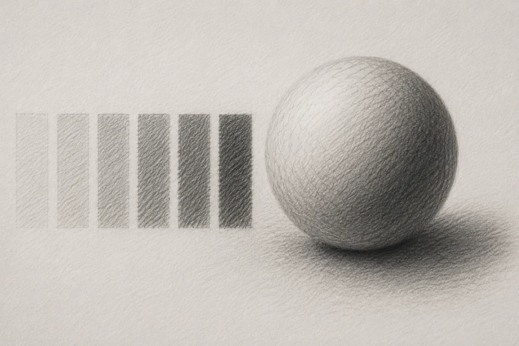
Try using small circular or overlapping strokes instead of long, harsh lines. This helps fill the paper texture more evenly and creates smoother transitions as you build layers.
2. Build Gradually in Layers
Once that light base is down, it’s time to slowly build up the intensity. Move to a slightly softer pencil (like HB or 2B) and go over your earlier shading using gentle, overlapping strokes. Don’t rush it; this stage is all about patience and control.
Every new layer darkens your tones, fills gaps between graphite grains, and smooths transitions. If you jump to a soft 6B too early, you’ll lose that natural gradient and end up with patchy, uneven shading instead of smooth depth.
Try to deepen your tones gradually rather than forcing darkness in one pass. Slow layering gives you far more control over smooth blends and realistic shadows.
3. Blend (But Don’t Overdo It)
After a few layers, you can gently blend with a tissue, blending stump, or soft brush. The goal is to soften transitions, not completely erase the pencil texture.
Use gentle circular motions and stop before the surface becomes overly smooth. A small amount of texture helps your shading feel more natural and realistic, especially in horror art where rough surfaces, skin, fog, and shadows benefit from subtle variation.
After blending, you can add more layers to deepen contrast and restore lost detail. Layering and blending work best together when used gradually rather than all at once.
Wipe your blending stump or brush between passes. Leftover graphite can muddy lighter areas and accidentally dull your gradients.
4. Paper Texture Matters
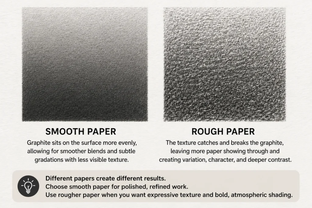
The texture (or “tooth”) of your paper can make a huge difference to how your layering behaves.
- Smooth paper (such as Bristol) creates cleaner gradients, softer blends, and finer detail.
- Rough paper grabs more graphite, creating grittier textures and stronger contrast that work especially well for horror art and atmospheric shading.
Rougher paper also leaves more visible grain in your shading, while smoother paper creates a cleaner, more polished finish.
If you’re new to layering, experiment with both types to see which feels easier to control. Sometimes the mood of a drawing comes as much from the paper texture as the shading itself.
5. Common Mistakes and Quick Fixes
Pressing Too Hard Too Soon
One of the biggest beginner mistakes is trying to reach dark values immediately by pressing heavily into the paper. This usually creates shiny graphite patches, rough texture, and harsh transitions that become difficult to smooth out later.
Instead, build your tones gradually using light pressure and multiple layers. Think of shading like fog slowly rolling in – not a jump scare appearing at full volume.
Starting lightly also gives you more control and makes mistakes far easier to fix.
Patchy or Streaky Shading
If your gradients look scratchy or uneven, the problem is usually inconsistent stroke direction or gaps between layers.
Try using small overlapping strokes or gentle circular motions to slowly fill the paper tooth more evenly. Keep your pressure relaxed and avoid rushing into darker areas too quickly.
Rotating your paper occasionally can also help your hand move more naturally across the surface.
Over-Blending Your Drawing
Blending can soften your shading beautifully, but too much blending removes texture and makes drawings look flat or plastic.
You still want a little graphite grain visible beneath the surface. Realistic shading usually has subtle texture, especially in horror artwork where roughness and atmosphere add character.
If your drawing starts looking like polished stone or melted wax, ease off the blending and reintroduce texture with fresh pencil layers.
Muddy or Dirty Looking Tones
Muddy shading often happens when too many soft layers are piled on top of one another without sufficient control.
Using softer pencils too early can overwhelm the paper, making transitions look heavy instead of smooth. Try building your foundation with harder grades first, then slowly introduce softer pencils as the darker values develop.
Cleaning your blending stump or brush regularly also prevents accidental graphite buildup from spreading across lighter areas.
Smudging and Fingerprints
Nothing ruins a clean gradient faster than dragging your hand through fresh graphite like a tiny artistic crime scene.
Place a scrap sheet of paper under your drawing hand while working, especially during longer shading sessions. This protects lighter areas and keeps your transitions cleaner.
You can also work from top to bottom – or away from your drawing hand – to reduce accidental smears.
Final Tip
Layered shading takes patience. Smooth gradients rarely happen in one pass, and even experienced artists build their tones slowly over time.
If your shading looks rough at first, that’s normal. Most polished graphite drawings begin as messy, uneven layers before everything settles together.
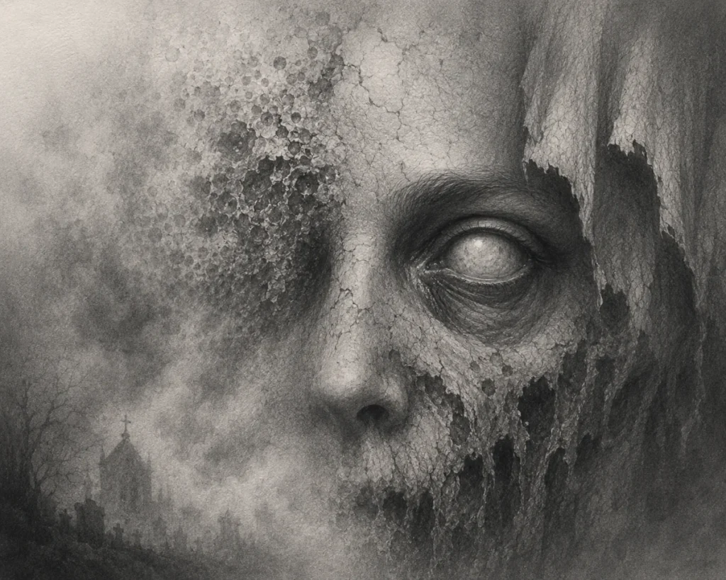
6. Apply It to Creepy Textures
Once you’re comfortable building smooth layers and gradients, it’s time to use those skills on horror textures and atmospheric details.
Rotting Skin and Flesh
Layering is perfect for creating unhealthy skin tones, soft bruising, wrinkles, and decayed textures. Start with light base layers and slowly darken areas around folds, cracks, and hollow sections of the face.
Uneven tones actually help here – slightly patchy shading can make skin look more organic and unsettling.
Fog and Mist
Soft layering is one of the best ways to create foggy, dreamlike atmosphere in horror drawings.
Use light circular shading and gentle blending to slowly build misty areas without harsh edges. Let some sections fade naturally into the paper so the atmosphere feels airy and ghostlike instead of outlined.
The smoother your transitions are, the more believable the fog will feel.
Hollow or Undead Eyes
Layering helps create depth around the eyes without making them look flat or cartoonish.
Build shadows gradually around the eyelids and eye sockets, using darker accents only near the deepest areas. Leaving softer mid-tones around the edges helps the eye feel sunken and realistic.
For glossy undead eyes, lighter underlayers combined with darker outer shadows can create an eerie glowing effect.
Mixing Smooth and Rough Textures
Some of the best horror drawings combine smooth shading with rough texture.
Try placing smooth bone beside cracked skin, soft fog beside rough stone, or clean highlights against gritty decay. These texture contrasts make your artwork feel more dramatic and believable.
This isn’t just about practice – it’s about creating atmosphere. Layering is what gives horror art that slow, unsettling realism that feels wrong in all the right ways.
Practice Exercise
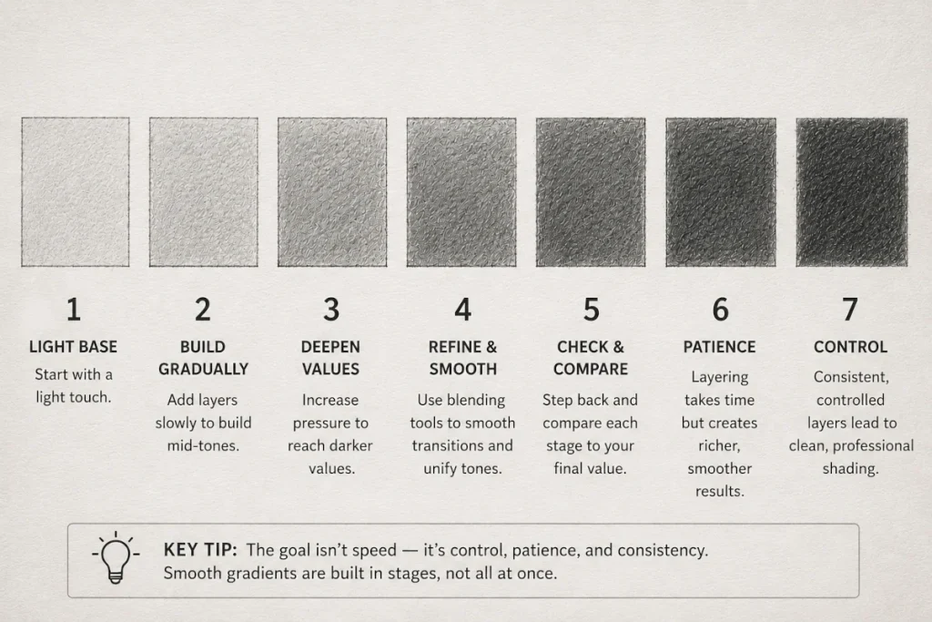
Before you dive into haunted portraits and creepy textures, warm up with this simple layering drill. Think of it as training your hand to control pressure, build smoother gradients, and develop cleaner shading habits.
Recommended Tools:
- Pencils: H, 2H, HB, 2B, 4B, 6B, and 9B. These grades let you gradually move from soft pale tones to deep shadow values.
- Blending tools: A tissue, blending stump, or soft brush for gentle smoothing between layers.
- Paper: Medium-grain sketch paper or smooth Bristol paper for cleaner gradients and easier layering.
- Eraser: A kneaded eraser for lifting highlights and softening small areas without damaging the paper.
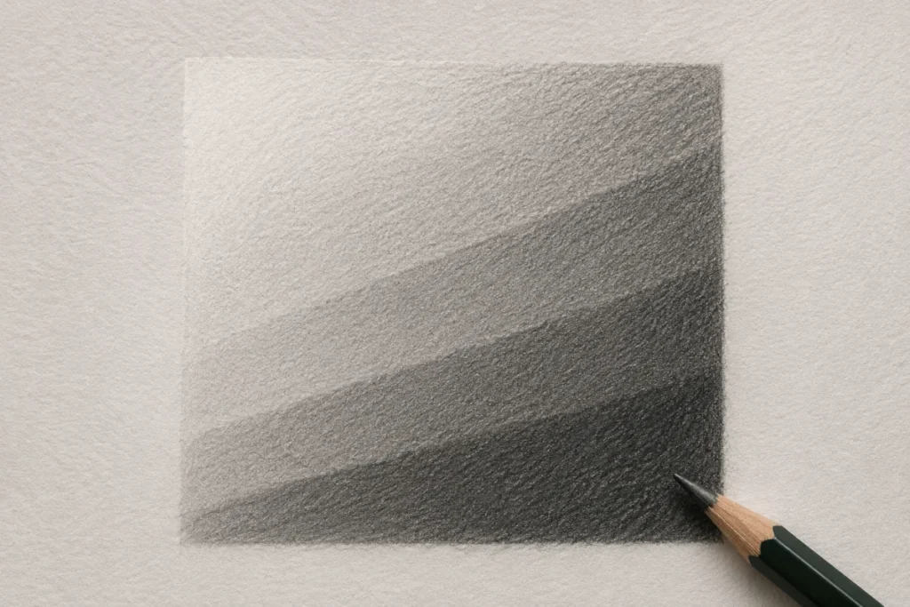
Step 1: Draw Seven Squares
Create seven equal boxes in a row or column. Each box will represent a different stage of your shading progression.
Step 2: Build Your Gradients Slowly
Inside each square, layer graphite gradually from light to dark using multiple passes instead of heavy pressure.
Start with lighter pencils like H or HB and slowly work toward softer grades as the values deepen. Focus on keeping your transitions smooth and controlled.
Step 3: Compare Your Results
Once finished, compare your first square to your final one.
You should notice smoother blending, darker values, and more controlled transitions as the layers build up. If the later squares look richer and softer than the early ones, your layering technique is improving.
The goal isn’t speed – it’s control, patience, and consistency.
Like most shading skills, smooth layering develops slowly over time. Even experienced artists build gradients in stages rather than forcing dark values immediately.
Final Thoughts
Layering isn’t about perfection – it’s about patience, control, and slowly building believable depth. Every layer adds smoother transitions, richer shadows, and more atmosphere to your artwork.
The more time you spend practising gradual shading, the more natural your pencil control will start to feel. What seems difficult at first eventually becomes muscle memory.
Don’t rush dark values or expect perfectly smooth gradients immediately. Most strong graphite drawings are built through multiple light passes, careful blending, and small adjustments over time.
Whether you’re drawing foggy graveyards, cracked skulls, hollow eyes, or decayed skin, layering helps bring realism and mood into your horror artwork.
Take your time, trust the process, and let your shading develop gradually. Smooth, atmospheric pencil work is built one layer at a time.
What You’ve Learned:
- Starting with light pencil pressure keeps your early layers smooth and easy to control, giving you room to gradually build darker shadows without damaging the paper.
- Building graphite slowly in multiple layers creates softer gradients and more natural transitions than trying to reach dark values in one heavy pass.
- Overlapping pencil strokes help fill the tiny gaps in the paper surface, which makes shading look smoother and more realistic.
- Using different pencil grades together allows you to control both soft atmospheric shading and sharper dark details without making the drawing look muddy.
- Paper texture affects how graphite behaves, with smooth paper producing cleaner blends while rough paper creates grainier, moodier textures.
- Layering and blending, when used together, help create depth, atmosphere, and dimensional shading that make horror artwork feel more immersive.
- Over-blending and heavy pressure flatten your shading, removing texture and making gradients appear patchy or artificial.
- Practising smooth gradients repeatedly trains your hand to control pressure naturally, making clean shading feel easier over time.
Related Posts
Want to keep your pencils moving? Here are a few more tutorials that’ll help you sharpen your drawing skills:
- Mastering Pencil Pressure and Grades for Creepy Drawings
Learn how different pencil grades affect shading, texture, darkness, and overall control. - Basic Shading Techniques Overview
A beginner-friendly guide to core shading methods, creating form, and building depth in your drawings. - Shading Techniques for Creepy Drawings
Explore ways to create eerie depth, dramatic shadows, and unsettling horror textures.