Coloured Pencils for Horror Art: Turning Sweet Tools into Nightmare Fuel
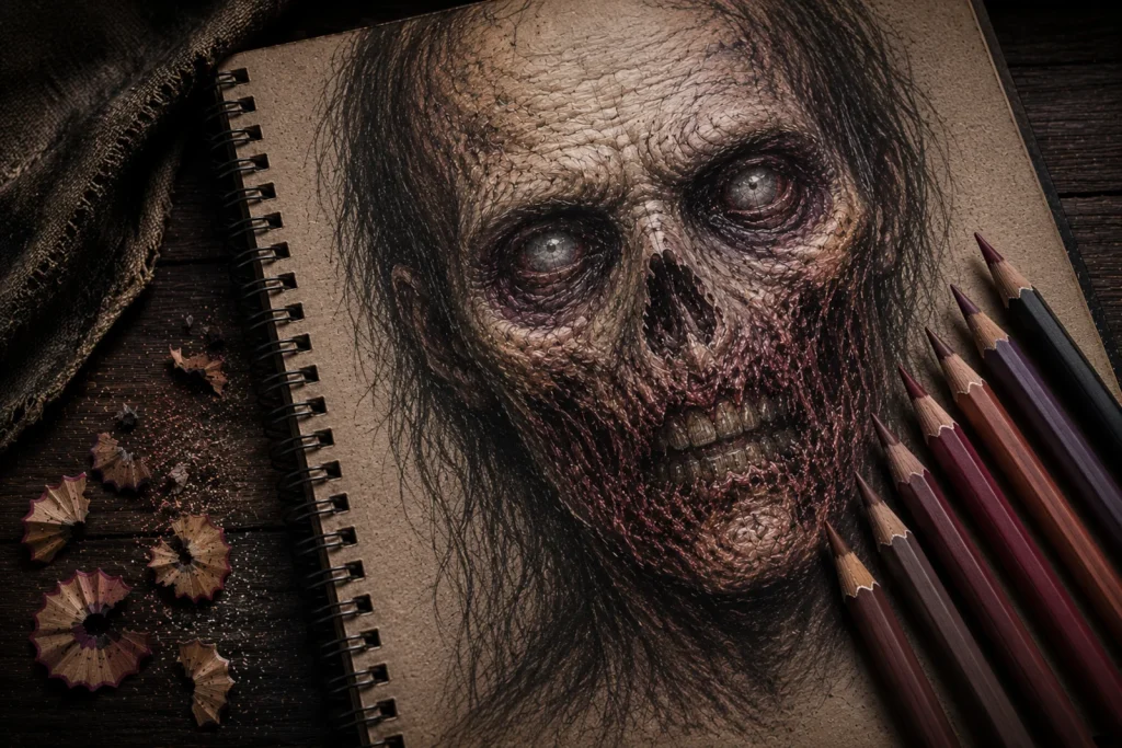
Coloured pencils look innocent – like they’re meant for sunshine, butterflies, and children drawing “Mum” with giant stick arms. But in horror art, they’re the quiet troublemakers. They don’t scream gore; they slip in subtle hints that something is deeply wrong.
A soft purple under the eyes instantly says, “I haven’t slept since the moon started whispering.” A faint green around the cheekbones whispers, “I crawl out of cellars for fun.” A touch of blue on the lips can turn a normal character into someone who looks like they’ve already stepped one foot into the afterlife.
You don’t need to colour the whole face – just enough to suggest the story beneath the skin. Coloured pencils don’t yell horror. They let the horror linger.
What You’ll Learn:
Learn how to use coloured pencils to create subtle horror atmosphere, unsettling skin tones, and eerie details without overpowering your drawings.
- How muted colours create stronger horror atmosphere than bright colouring.
- Which undertones work best for bruising, illness, decay, and exhaustion.
- The difference between soft-core and firm-core coloured pencils.
- How to sharpen coloured pencils without constantly breaking the core.
- How different paper textures affect blending and surface texture.
- Why layering colour over graphite creates more natural horror effects.
- How to use light pressure and gradual layering for smoother colouring.
- Ways to create unsettling eyes, skin, shadows, and creepy undertones.
- Common beginner mistakes that can make horror colouring look muddy or artificial.
- How subtle colouring creates stronger horror than overly dramatic effects.
Colour Psychology for Horror Atmosphere
When adding colour to horror drawings, you’re not simply decorating; you’re signalling what the body has endured. Subtle colour changes can make a character look sick, exhausted, corrupted, or deeply unnatural without needing excessive gore.
- Purple can suggest bruising, stress, exhaustion, or blood pooling beneath the skin.
- Green can imply infection, decay, nausea, or something that should not be happening inside the body.
- Yellow-grey tones create waxy, dehydrated, unhealthy-looking skin.
- Soft blue can make the skin appear cold, drained, corpse-pale, or emotionally lifeless.
- Red, used sparingly, adds irritation, pain, broken blood vessels, or rawness around sensitive areas.
These colours work best when applied lightly and gradually. Horror usually isn’t sold through overwhelming intensity; it’s sold through implication. A faint sickly tint often feels far more unsettling than fully saturated colour.
Try concentrating these colours around the eyes, nose, lips, knuckles, scars, or cheekbones where the skin naturally changes tone. Small touches in the right places can make a character feel subtly wrong without the viewer immediately understanding why.
Let the viewer’s brain fill in the rest. That’s where the discomfort starts creeping in.
Essential Undertones for Horror Skin
You don’t need a huge pencil set to create unsettling, moody horror effects. Horror colouring works best with subtle, muted tones; colours that make the viewer think, “Are they okay?” and the answer is absolutely not.
In horror art, undertones help suggest things happening beneath the skin. A character can look exhausted, feverish, corrupted, or barely human just through slight colour shifts in the shadows.
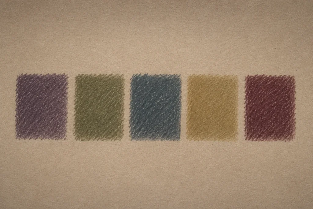
Start with these five:
- Muted Purple
Perfect for under-eye shadows, bruising, stress, and emotional exhaustion so old it has its own postal address.
Apply it lightly around the eyes, temples, and lower cheek areas to create that sleep-deprived, haunted look.
- Olive Green (soft, not neon)
Adds that sickly, uneasy undertone – great for cheek hollows, jawlines, and shadowed skin folds.
A tiny amount mixed into grey shading can instantly make healthy skin feel wrong.
- Blue-Grey
Instantly makes skin look colder, drained, corpse-pale, or a few degrees closer to the afterlife.
This works especially well around the lips, fingertips, and lower shadows where blood flow naturally appears weaker.
- Yellow-Grey / Ochre
Gives the skin a waxy, feverish, dehydrated look, as if the character hasn’t eaten or breathed fresh air in… some time.
These tones are excellent for creating unhealthy highlights instead of bright, healthy-looking skin.
- Deep Wine / Maroon Red
Perfect for dried blood, cracked lips, wounds, irritated skin, and lingering regret.
Use this colour sparingly in small areas to stop it from overpowering the drawing.
You only need tiny amounts of these colours. In horror art, subtle undertones are often more disturbing than bright, obvious effects.
Try layering them slowly over neutral skin tones rather than using them at full strength immediately. The gradual buildup creates a far more believable and atmospheric result.
Horror colouring isn’t dramatic – it’s the slow dread creeping in.
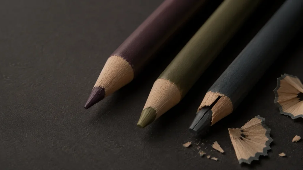
Choosing Your Coloured Pencils
You’ll mainly encounter two pencil behaviours, and each creates a very different kind of horror texture.
Some pencils are softer and smoother, making them perfect for subtle skin shading and eerie colour transitions. Others stay sharper for longer and help create disturbing little details that make viewers uncomfortable in the best way.
Softer-Core Pencils
Softer-core pencils blend easily and glide smoothly across the paper. They’re ideal for creating bruising, tired eye sockets, ghostly skin tones, and cold shadows around the face.
Because the pigment spreads more gently, these pencils are excellent for atmospheric horror effects. A soft layer of purple or blue-grey under the eyes can instantly make a character look exhausted, sick, or emotionally haunted.
They also work beautifully for gradual skin transitions where you want the horror to feel subtle rather than exaggerated.
Think less “cartoon zombie,” more “hasn’t slept since 1846.”
Firmer-Core Pencils
Firmer-core pencils stay sharper and give you more control over fine details. They’re perfect for veins, wrinkles, cracks, dried skin textures, scratches, and sharp facial lines.
Where softer pencils help build atmosphere, firmer pencils create the unsettling details that make a drawing feel believable. They allow you to add texture without everything becoming too blurry or over-blended.
You do not need both types immediately to begin. Whatever you already own can work; horror colouring relies more on light pressure, slow layering, and restraint than expensive tools.
Sharpening Coloured Pencils
Coloured pencils resemble graphite pencils in appearance, but the materials inside function quite differently.
Graphite has a solid mineral core, while coloured pencils contain pigment mixed with wax or oil. This makes them softer, smoother, and more prone to breakage if handled too roughly.
So when sharpening them, a gentler approach usually gives the best results.
How to Sharpen Them Properly
1. Use a good, sharp sharpener
Cheap sharpeners often damage coloured pencils instead of sharpening them cleanly. A dull blade can tear at the wood and snap the core before you even start drawing.
If your pencil comes out looking like it survived a small exorcism, it’s probably the sharpener – not you.
2. Turn the pencil slowly
Hold the sharpener still and rotate the pencil gently instead of twisting aggressively.
This places less stress on the internal core and helps prevent snapping, especially with softer pencils.
3. Avoid ultra-sharp needle points
Super sharp points look impressive for approximately three seconds before they explode into sadness.
Aim for a point that’s sharp but slightly rounded. This gives you enough precision for wrinkles, veins, cracks, and fine creepy details while still allowing smoother shading and blending.
4. If the pencil keeps snapping, the core may be cracked
This often happens after a pencil has been dropped – which almost every coloured pencil experiences eventually.
Instead of forcing it, sharpen slowly until you pass the damaged section inside the barrel.
A well-shaped pencil gives you cleaner shadows, smoother skin blending, and sharper horror details without damaging the colour layers underneath.
Optional Technique (Artist-Level, Not Scary)
If you feel confident enough, you can use a craft knife to shave the wood away gradually and shape the pencil tip more gently.
This method gives you excellent control and can reduce breakage, especially on softer-core pencils. Just work slowly and always angle the blade away from yourself.
Think of it like peeling a carrot, not fighting for your life in a slasher film.
The Paper You Use Matters
Paper texture changes how colour sits on the surface, how smoothly it blends, and how much texture appears in your final drawing.
Different papers can completely change the mood of your horror art, even when using the exact same pencils.
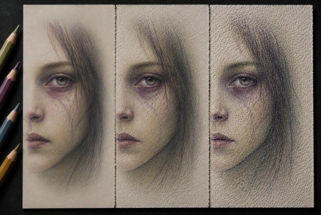
Smooth Paper
Smooth paper creates cleaner blending and softer transitions. Colours glide across the surface more easily, making it ideal for ghostly skin, porcelain dolls, eerie lighting, and uncanny beauty.
Because the surface has very little texture, your shadows appear softer and more controlled.
Lightly Textured Paper
Lightly textured paper gives you a balance between blending and texture. It holds extra layers without becoming too rough, which makes it great for zombies, tired faces, bruising, and unhealthy skin tones.
This is often the easiest surface for beginners because it still blends nicely while adding a little natural texture to the artwork.
Heavily Textured Paper
Heavily textured paper creates broken, gritty colour layers immediately. The grain catches the pencil unevenly, producing rough surfaces perfect for rotting flesh, fungal creatures, cracked skin, and decayed textures.
It can look incredibly atmospheric, but it’s also harder to blend smoothly.
If you’re just starting out, mixed media paper or lightly textured paper is usually the easiest to control. It allows soft layering without forcing every shadow to look grainy or rough.
The Layering Method
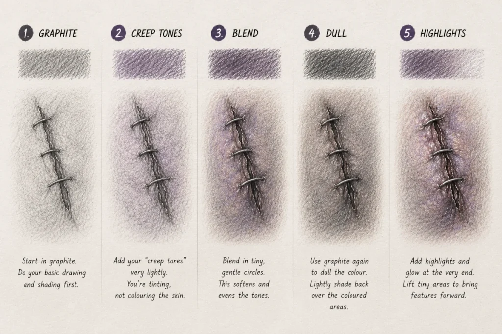
1. Start in graphite.
Do your basic drawing and shading first. Think of graphite as your foundation.
Make sure your light source, shadows, and form feel right before adding any colour. Colour won’t fix weak structure; it only highlights it.
Starting with graphite first also helps the coloured pencil blend more naturally into the skin instead of sitting on top in flat, artificial patches.
2. Add your “creep tones” very lightly.
Use the softest pressure you can.
You’re not colouring the skin – you’re tinting it.
If you can hear your pencil scratching, you’re probably pressing too hard.
The goal is subtle discomfort. You want the viewer to think something feels off, not like the character fell into a face-paint stand at a carnival.
3. Blend in tiny, gentle circles.
Avoid long, streaky pencil marks.
Small circular motions help the colour settle gradually into the graphite, creating softer transitions and more natural skin tones.
This keeps the colouring looking atmospheric instead of chalky or patchy.
4. Use graphite again to dull the colour.
Lightly shade back over the coloured areas using graphite.
This softens bright colours and creates that drained, eerie, unhealthy look that works so well in horror portraits.
It’s often this step that quietly transforms the drawing from “normal face” into something genuinely unsettling.
5. Add highlights and glow at the very end.
Use a white pencil, eraser edge, or gentle graphite lift to brighten tiny areas like the lower eyelids, the tip of the nose, or small reflections inside the eyes.
These tiny highlights create contrast and make certain features feel strangely alive against the duller surrounding tones.
In horror art, small highlights often feel more unsettling than strong lighting because they pull attention toward the expression without fully revealing everything.
Common Beginner Troubles (And Easy Fixes)
- If your colouring looks too bright or artificial, lightly shade over it with graphite. Horror colouring usually works best when colours feel muted, tired, and slightly unhealthy rather than vibrant.
- If your drawing looks muddy or waxy, you probably pressed too hard too early. Try gently lifting some colour with a kneaded eraser, then rebuild the layers slowly using lighter pressure.
- If blood looks unrealistic or cartoon-like, avoid using pure red by itself. Mixing small amounts of brown, purple, or dark maroon creates deeper, drier, more believable horror tones.
- If veins or cracks look like they were simply drawn on top, soften parts of the edges and vary the thickness slightly. Real skin textures usually fade in and out rather than staying perfectly sharp the whole way across.
- If your skin tones feel flat, try layering subtle cool and warm tones together instead of relying on a single colour. Tiny shifts in colour create far more believable creepy skin.
Quick Practice Exercise
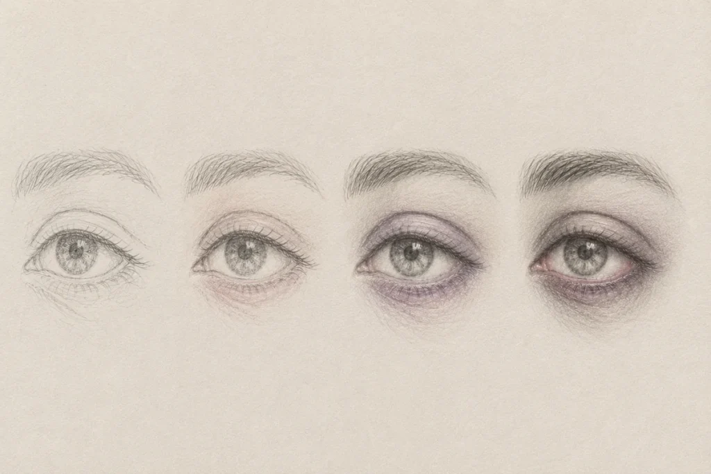
Start by drawing the eye in graphite. Focus on the overall shape, the eyelid crease, the iris and pupil, and some soft shading around the eye.
Don’t rush the details yet. This stage is mainly about building form, soft shadows, and smooth value transitions.
Now add colour very lightly.
Add a very soft hint of purple beneath the lower eyelid to suggest tiredness, stress, or exhaustion.
Keep this extremely subtle – just a whisper of tone. If it starts becoming a visible purple stripe, it’ll begin to look more like makeup than atmosphere.
Blend a faint wash of muted green around the outer edge of the eye socket for a sickly, eerie undertone.
Think of the colour as something drifting through the skin rather than sitting on top of it in obvious patches.
Touch the waterline with the tiniest amount of pink or muted red to add a fragile sense of life.
Stop the moment it starts looking bright. The effect should feel “barely healthy,” not irritated or cartoonish.
If you want, lightly tint the iris using a muted colour that suits your character.
Keep the layer soft and transparent enough that some graphite still shows through. That slight grey influence helps the eye feel more grounded, natural, and unsettling.
If the colouring starts looking like makeup, you’ve probably gone too heavy. Blend the edges back into the graphite and soften everything until the colours quietly merge into the drawing instead of dominating it.
Conclusion
Coloured pencils don’t look like horror tools at first, and that’s exactly what makes them powerful. Their impact is quiet, subtle, and patient; the kind of horror that sneaks in slowly rather than jumping out all at once.
With just a few gentle shifts in colour, you can make a character look exhausted, haunted, feverish, cursed, or like they’ve recently returned from somewhere they probably weren’t supposed to be.
There’s no need to cover the entire drawing in colour or go heavy-handed with red. A few intentional touches do the work. By suggesting what the character has been through, the viewer’s mind fills in the rest – and that’s always more unsettling than spelling everything out.
The strongest horror often whispers instead of screams.
Let the horror stay quiet.
Let the unease linger.
What You Learned:
- Subtle colour creates stronger horror atmosphere than bright colouring. Small colour shifts can make characters feel sick, haunted, or exhausted.
- Muted colours work best for horror skin tones. Purple, green, blue-grey, and yellow-grey can suggest bruising, decay, and illness.
- Different coloured pencils create different effects. Softer pencils blend smoothly, while firmer pencils create sharper textures and details.
- Sharpening coloured pencils carefully helps prevent breakage. Gentle sharpening protects the softer pigment core inside the pencil.
- Paper texture changes how colour behaves. Smooth paper creates cleaner blends, while textured paper adds rough, distressed effects.
- Layering coloured pencil over graphite creates more natural horror effects. The graphite helps keep colours soft, muted, and atmospheric.
- Light pressure creates smoother and more believable colouring. Building colour slowly prevents muddy or overly bright results.
- Small highlights and undertones can make eyes and skin feel unsettling. Tiny details often create more tension than dramatic effects.
- Most beginner mistakes come from applying too much colour too quickly. Soft layering and blending create stronger horror atmosphere.
- Horror colouring works best through implication. Suggesting something is wrong is often creepier than making it obvious.
Tools You Might Also Like
If you are building your horror art toolkit, these guides might help you choose the right materials for different effects and textures:
- Ink & Dip Pens for Drawing
Perfect for rough cross-hatching, scratchy textures, dripping shadows, and sharp details that feel tense and unstable. Great for darker line work and dramatic contrast. - Specialised Markers for Drawing
Useful for smooth gradients, eerie atmosphere, foggy backgrounds, and glowing effects that coloured pencils can struggle to create on their own. - Acrylic Paint Markers for Horror Art
Ideal for bold highlights, solid opaque details, sharp symbols, glowing eyes, and thick marks that stand out aggressively against darker drawings.