How to Combine Graphite, Carbon and Charcoal in Drawing
When graphite, carbon, and charcoal team up, your artwork stops behaving and starts growling.
Graphite, carbon, and charcoal: three materials that look like they should play nicely together, but in reality, they’re more like that chaotic trio in a horror movie – one’s too polite, one’s broody and dramatic, and one just shows up to cause absolute carnage. (Seriously, if graphite were a dinner guest, it would politely stack the plates. Charcoal? It would set the table on fire and call it “art.”)
But when you learn how to combine these three properly, you get the best of all worlds: smooth details, rich mid tones, and jet-black shadows that practically growl at you from the page. Perfect for horror art and for anyone who wants to push their drawings past the shiny sketch stage and into full nightmare territory.
If you’re still learning the basics of shading, understanding how light and shadow behave in drawings makes everything easier. I go through the fundamentals in my Introduction to Light and Shadow Effects in Horror Art guide.
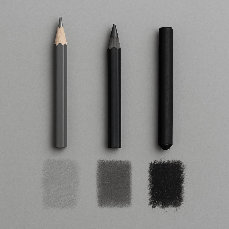
The Materials in Depth
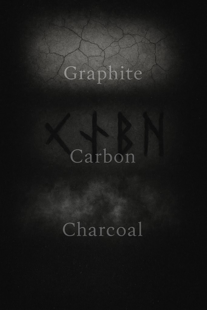
Graphite:
- Smooth, silvery, and blendable.
- Excellent for fine details, underdrawings, and smooth gradients.
- Downsides: it gets shiny in heavy applications, which kills depth in dark areas.
Carbon:
- The underrated middle child. Darker than graphite, less shiny, and sharper in application.
- If you’re new to carbon, don’t worry – carbon pencils feel a lot like graphite, so it’s an easy step up before you dive into the chaos of charcoal.
- Great for creating deep shadows and crisp details without the reflective glare of graphite.
- Works beautifully for eerie features like hollow eyes, tangled hair, or shadowed fabric folds.
Charcoal:
- The drama queen of the bunch. Comes in sticks, pencils, or powders, and lays down the deepest, richest blacks.
- Perfect for bold backgrounds, dramatic lighting, and expressive textures.
- Downsides: messy, smudgy, and about as predictable as a horror villain in the third act.
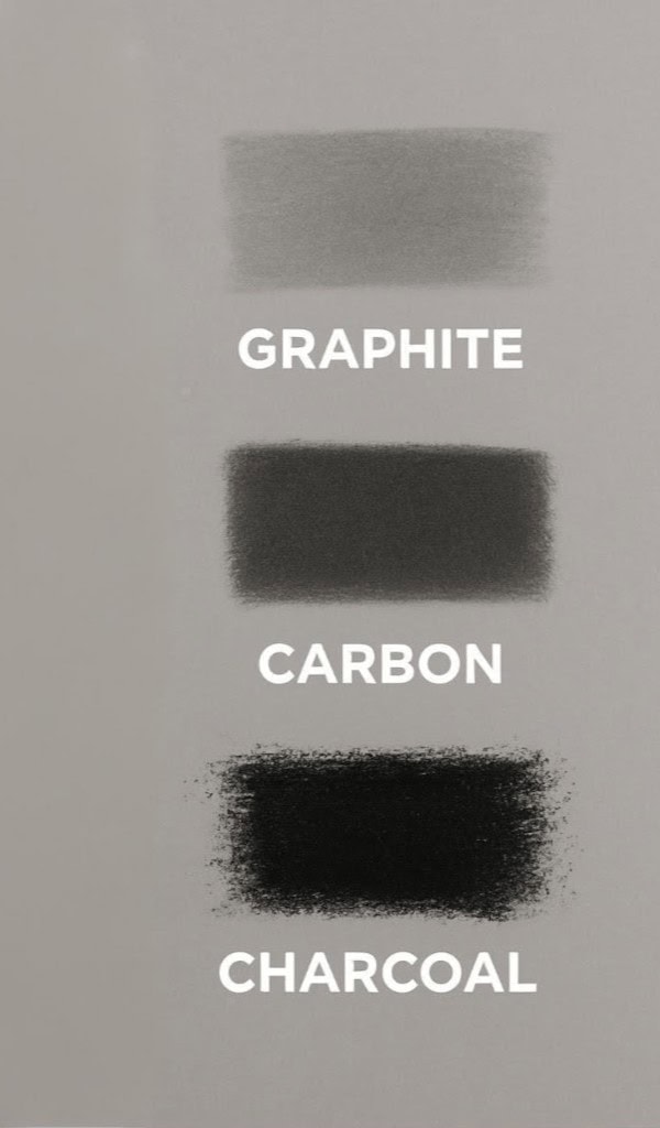
Why Combine Them?
On their own, each medium has limitations. Together? They cover each other’s weaknesses and create an unholy alliance of texture, tone, and depth.
- Contrast & Depth:
Graphite struggles to reach true black. Charcoal delivers, but it’s hard to control. Carbon bridges the gap, giving you darkness without chaos. - Texture Variety:
Graphite is smooth, carbon is matte and sharp, charcoal is rough and expressive. Mix them, and you can make surfaces look alive (or undead). - Shadows & Highlights:
Graphite for skin-like smoothness, carbon for solid shadows, charcoal for murky voids. White charcoal can even add eerie ghostly highlights.
How to Combine Them (Step-by-Step Guide)
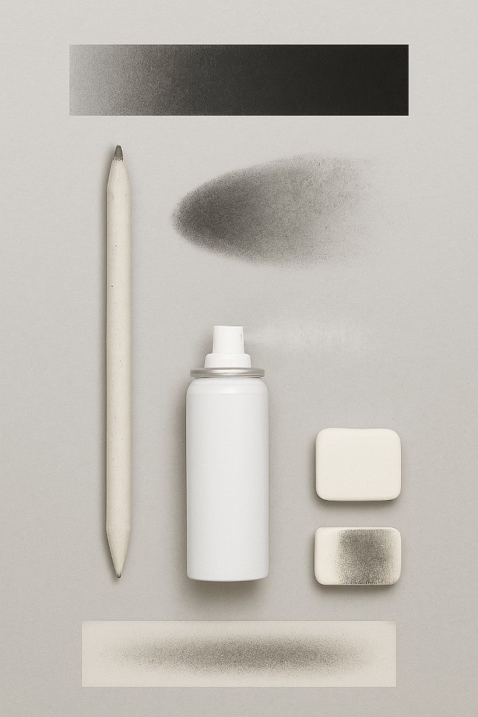
Materials Needed:
- HB pencil – for the light graphite base.
- Carbon pencil – for stronger mid-to-dark tones.
- Charcoal pencil or stick – for the deepest shadows.
- Blending stump or tissue – to smooth out transitions.
- Eraser (kneaded or standard) – to tidy edges or lift highlights.
- Paper – medium texture (minimum of 120gsm) works best for layering.
Optional: Nerves of steel for when charcoal inevitably smudges where you don’t want it.
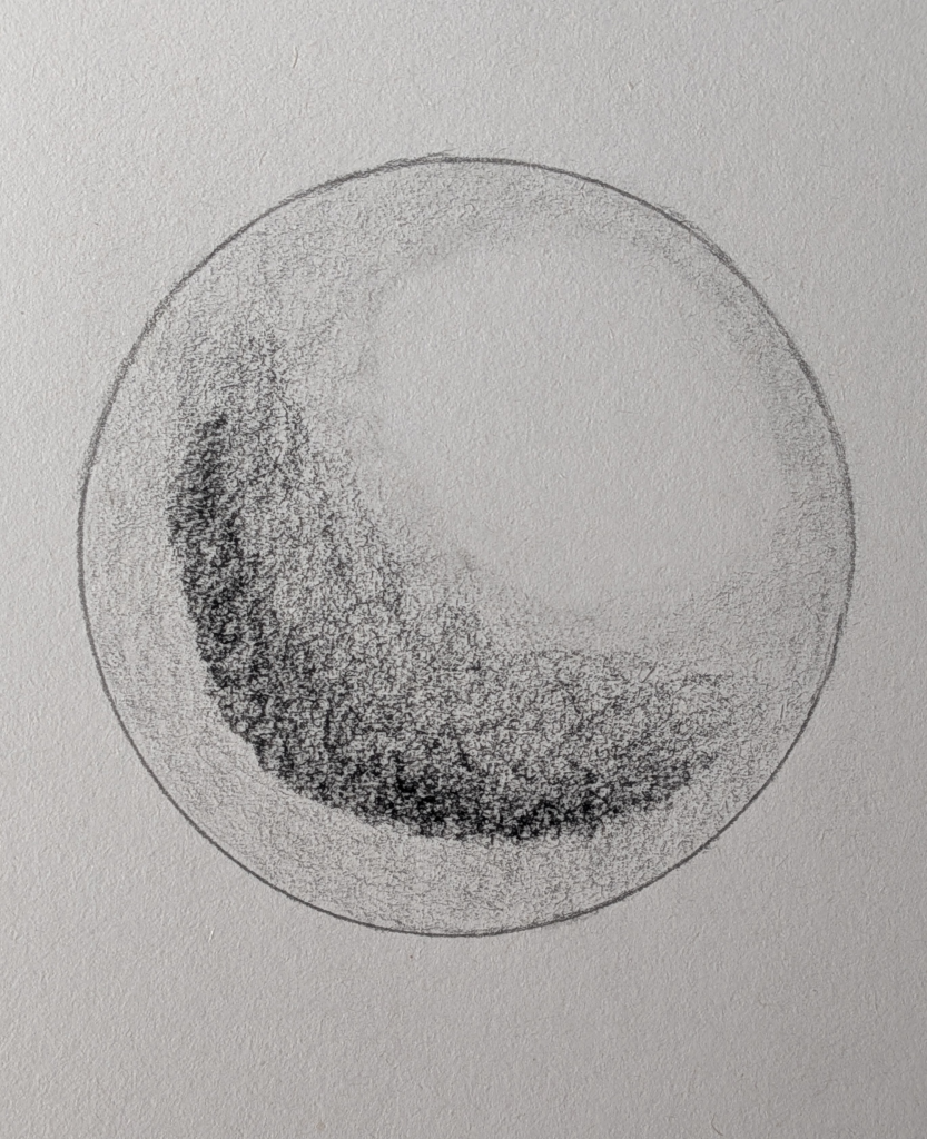
1. Lay Down the Graphite Base
- Lightly shade the sphere with an HB pencil.
- Keep the strokes even and smooth, leaving a clear, bright spot for the highlight.
- This creates your mid-tone base and sets up the overall form.
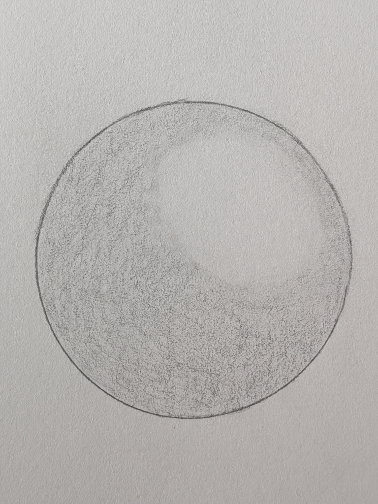
2. Add Carbon for Depth
- Use a carbon pencil to darken the shadow side of the sphere.
- Build up gradually, layering strokes instead of pressing hard.
- Keep the highlight area clean and untouched.
- Think of this as “sculpting” the roundness of the sphere.
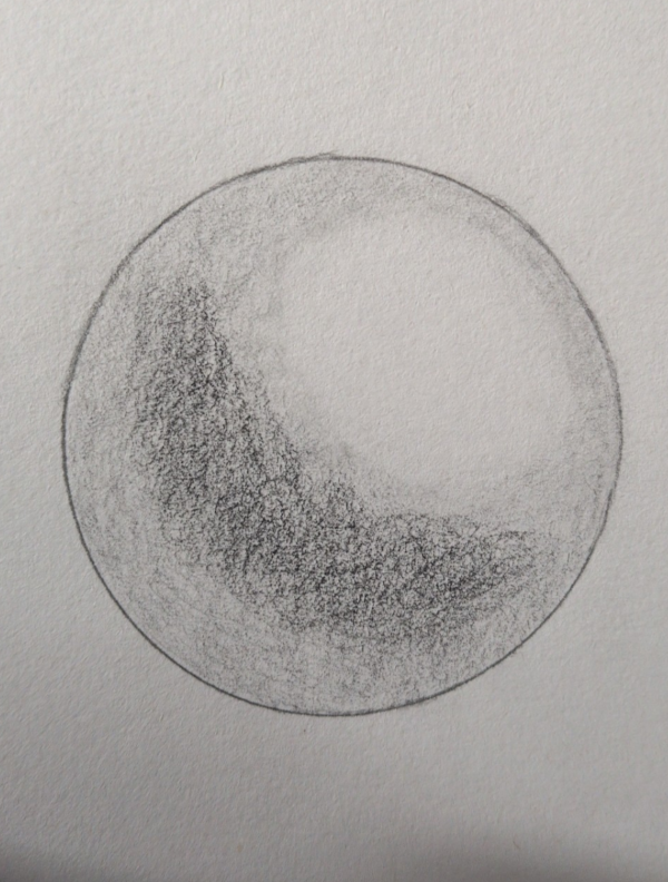
3. Deepen with Charcoal
- Add charcoal in the darkest curve of the shadow to bring bold contrast.
- Focus on the lower edge and the side opposite the highlight.
- Use charcoal sparingly – it’s powerful and should sit mainly in the deepest shadows.
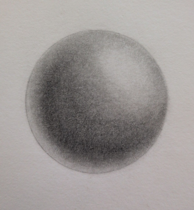
4. Blend for a Smooth Finish
- Use a blending stump or tissue to soften the transitions.
- Blend from dark to light, letting the tones fade naturally into the highlight.
- This final step ties the layers together and makes the sphere look realistic and three-dimensional.
Tips & Tricks (Avoiding Art Crimes)
- Work light to dark. If you dump charcoal first, you’ll be chasing smudges forever – like trying to clean glitter after a kid’s craft party. Good luck.
- Use blending stumps or tissue sparingly – overblending kills texture.
- Spray a light fixative to set charcoal and carbon, but don’t overdo it (too much will flatten values). Remember, fixative also slightly darkens your tones, so highlights may look less crisp afterwards.
- Keep your tools clean – a graphite eraser contaminated with charcoal is basically a crime scene waiting to happen.
Paper & Tools Matter
The surface you choose can make or break the combo:
- Smooth paper (Bristol, hot press): Perfect for fine graphite details and controlled shading.
- Textured paper (cold press, toned, rough): Gives charcoal something to grip onto and makes shadows richer.
- Toned paper: Amazing for horror art – mid-tone background plus graphite for light, charcoal for dark, and white charcoal for highlights = instant eerie atmosphere.
Extra helpers worth trying:
- Brushes (soft paintbrush or makeup brush) for subtle blends.
- Powdered graphite or charcoal for foggy effects, smoky skies, or that “something’s lurking” atmosphere.
Horror Art Applications
Here’s where this combo really shines for your spooky projects:
- Graphite – Pale skin tones, delicate textures (cracked porcelain doll vibes).
- Carbon – Cursed runes, sharp shadows, black voids in eyes or mouths.
- Charcoal – Foggy backgrounds, dramatic lighting, or the kind of darkness that makes viewers lean closer to see what’s hiding inside.
Conclusion: Embrace the Chaos
Graphite, carbon, and charcoal may each have their quirks, but when you wrangle them together, you unlock a powerhouse of depth, drama, and eerie atmosphere. Think of them less as rivals and more as a dysfunctional family – graphite keeps things neat, carbon brings the edge, and charcoal crashes in like a drunk uncle at Halloween.
Once you learn how to balance them, your horror art won’t just look creepy – it’ll feel like it’s crawling off the page.
What You Learned:
- Graphite keeps things smooth and controlled, carbon adds bold depth, and charcoal crashes in with dramatic darkness.
- Layering them in the right order (graphite → carbon → charcoal) gives you rich shadows and seamless transitions.
- Blending carefully ties everything together without smudging the soul out of your artwork.
- Paper texture matters – smooth for detail, textured for mood, toned for instant atmosphere.
- Each medium has its own horror superpower, and combining them lets you build eerie skins, foggy backgrounds, cursed symbols, and void-like shadows with way more control.
Keep Exploring
If you enjoyed this guide and want to sharpen your horror art toolkit, check out these posts:
- Erasers
Because sometimes the scariest part of drawing is the mistakes. - Blending Tools
Learn how to control those shadows without turning your page into a crime scene. - Coloured Gel Pens
Discover how to use coloured gel pens to make your horror art gleam with ghostly charm (and just a hint of chaos).