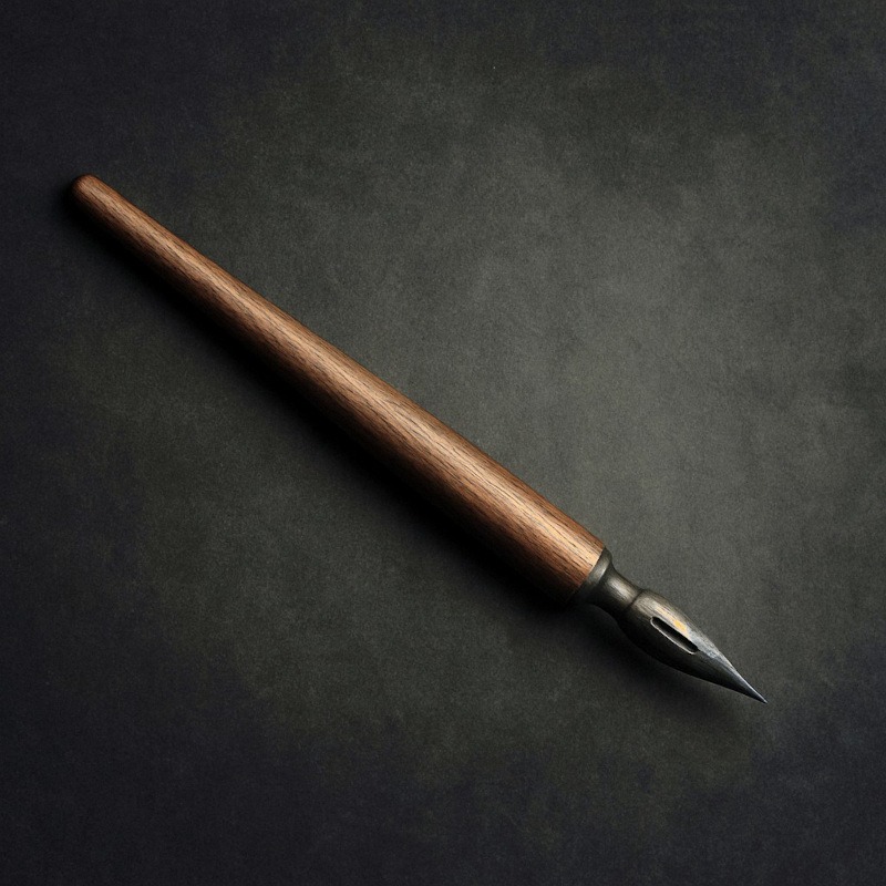
Ink and Dip Pens for Drawing
Horror in Liquid Form, With Attitude
Ink and dip pens are the divas of the art world. They don’t show up quietly, behave politely, or offer gentle forgiveness. No. They arrive like, “Hello, I am here to make dramatic lines, questionable splatters, and at least one stain you’ll find on your elbow three hours later.” And honestly? That energy is perfect for horror art.
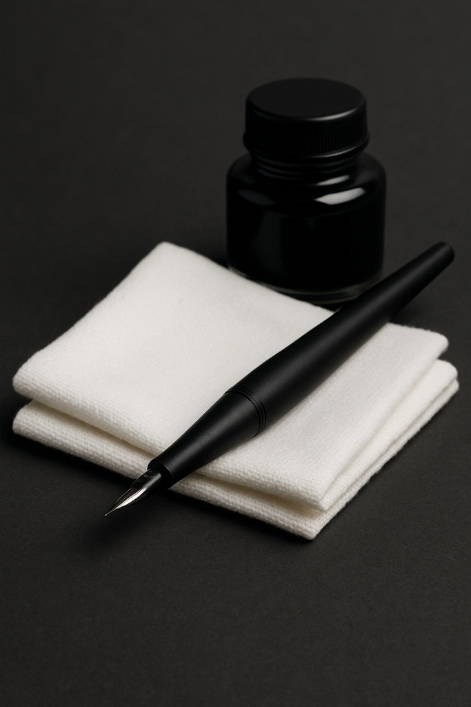
Using a dip pen feels like performing a tiny gothic ritual. You dip this delicate metal nib into a pot of ink, and suddenly you’re creating shadows so deep they look like they’re plotting something, scratchy textures that feel emotionally unstable, and bold lines that scream, “I was drawn with commitment and possibly fear.” It’s messy, chaotic, gorgeous – and once you fall in love with ink, there’s no going back.
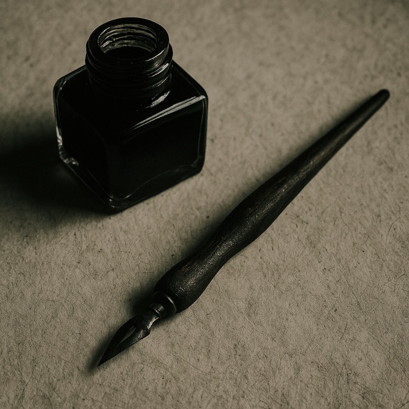
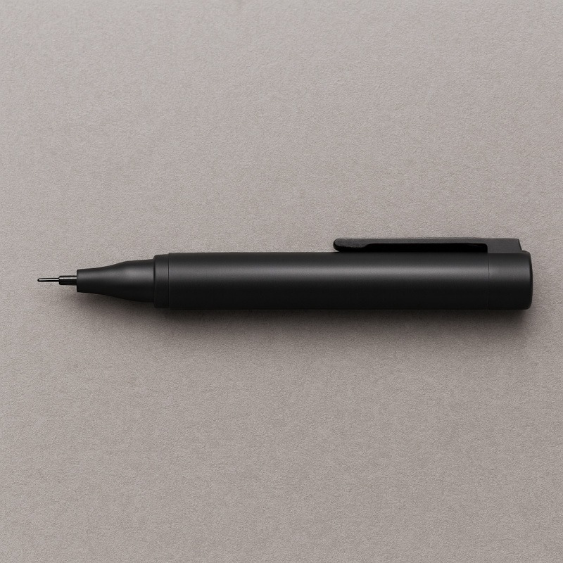
What Exactly Are Ink & Dip Pens?
Dip pens are wonderfully simple tools from the pre-iPad era:
- A nib – the metal tip that holds and releases ink
- A holder – the little stick you push the nib into
- Ink – the dramatic black potion that turns your drawing into a Victorian séance
You dip the nib into the ink, draw until it runs dry, then dip again. It’s repetitive in a strangely soothing way, giving your art a handmade, gritty charm that pens with cartridges can’t match.
Dip pens are loved for:
- Ridiculously bold blacks
- Crisp lines you can’t get with pencils
- Scratchy textures that look perfectly haunted
- Their natural chaotic energy
They are basically the opposite of neat, polite tools like fineliners – and that’s exactly why horror artists adore them.
Why Horror Artists Love Ink
Ink brings a kind of intensity that fits horror art like a glove dipped in questionable goo.
1. Deep, Ominous Shadows
Ink lets you create blacks so dark they feel like they’re swallowing the page.
Perfect for:
- figures hiding in corners
- creepy voids
- cursed backgrounds
- dramatic lighting
2. Scratchy, Unsettling Textures
A dip pen naturally skips and scratches, giving you:
- aged wood
- old paint
- cracked floors
- tattered clothing
- creepy silhouettes
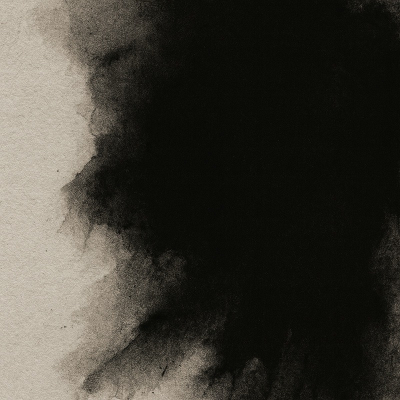
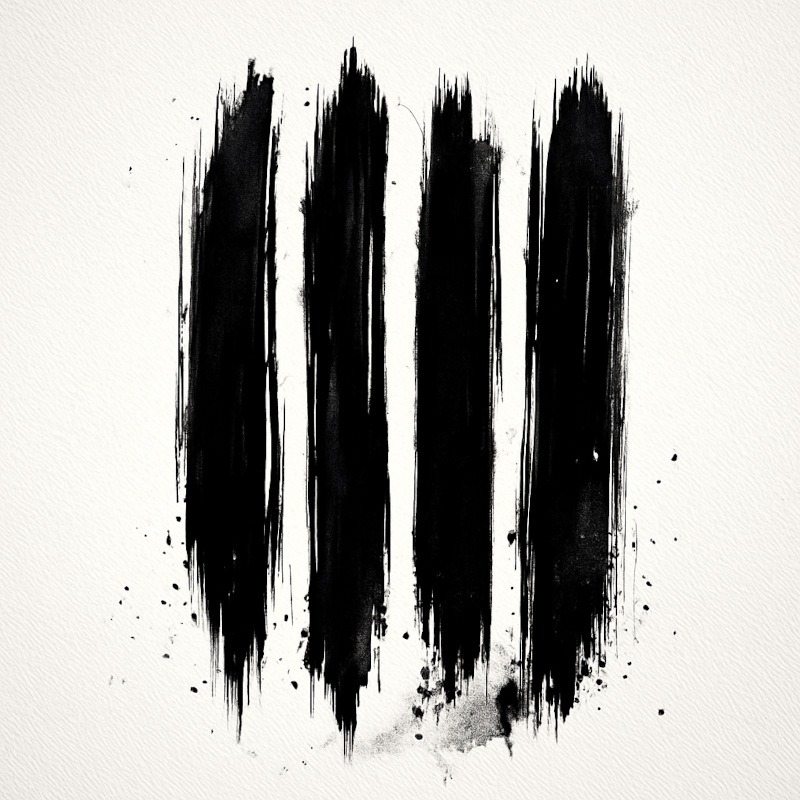
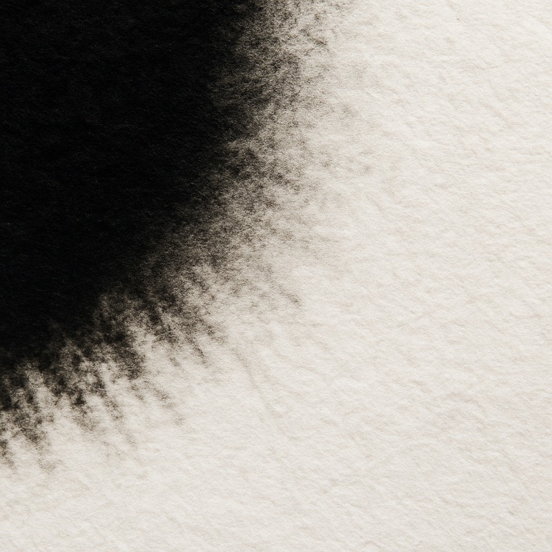
3. Drips, Runs & Bleeds
This is where ink becomes extra spooky.
With a bit of pressure (or chaos), you get:
- dripping shadows
- veiny textures
- bleeding edges
- splatter effects
Perfect for horror art that needs to look uncomfortable.
4. Bold, Confident Lines
Ink doesn’t do “subtle.”
If graphite whispers… ink yells.
5. Gothic, Old-World Aesthetic
Dip pens automatically give your piece Victorian diary vibes.
You can practically hear the thunder.
Types of Ink Tools (And What They’re Good For)
Dip Pens
The classic chaos stick.
- AMAZING textures
- tight control
- perfect for cross-hatching and sharp detail
- will absolutely punish you if you rush
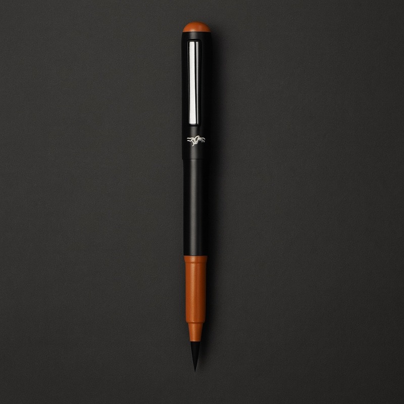
Brush Pens
Not the focus of this post, but worth mentioning.
- smooth, painterly strokes
- soft shadows
- great for ghostly shapes and atmospheric effects
Technical Pens
- stable
- predictable
- ideal for immaculate horror art or architecture
- less personality, more control
Dip pens are the most fun, and the most unhinged – which is why we love them for horror.
How to Use Dip Pens (Without Accidentally Summoning Ink Demons)
1. Don’t Over-Dip The Nib
Only dip the very tip of the nib into the ink – about 2–3mm.
If you submerge half the nib, it will collect way too much ink and flood the page the moment it touches the paper.
Think “touch the surface,” not “deep-sea dive.”
2. Always Test the First Stroke
Dip pens often release a large blob of ink on the first touch.
Test your first mark on scrap paper to prevent accidental ink explosions on your artwork.
3. Use Light, Controlled Pressure
Dip pens respond dramatically to pressure:
- Light pressure = thin, delicate lines
- Medium pressure = thicker shadows and outlines
- Too much pressure = nib splits, scratches paper, and screams internally
Aim for gentle, steady strokes – let the nib glide rather than dig.
4. Move More Slowly Than You Would With a Pencil
Ink isn’t as forgiving as graphite.
If you rush, you’re more likely to smear, skip, or create lines that wander off like confused ghosts.
Slow, confident strokes give you cleaner details.
5. Turn Your Paper for Better Angles
Dip pens have a “sweet spot” where they flow best.
If a line feels scratchy or inconsistent, rotate the paper instead of contorting your wrist.
This keeps your nib angle steady and prevents accidental gouges.
6. Be Patient With Drying
Ink smears at the slightest touch.
Let the area fully dry before shading near it or resting your hand on the page.
Working too soon = smudges, stains, and artistic heartbreak.
7. Choose the Right Paper
- Smooth paper gives clean, crisp lines and controlled detail.
- Textured paper creates scratchy, unpredictable marks ideal for eerie, distressed horror effects.
Neither is “right” – they just give different moods.
Horror-Friendly Ink Techniques
Below are five simple ink techniques you can try right away – perfect for beginners, and perfect for adding that deliciously unsettling horror mood to your artwork.
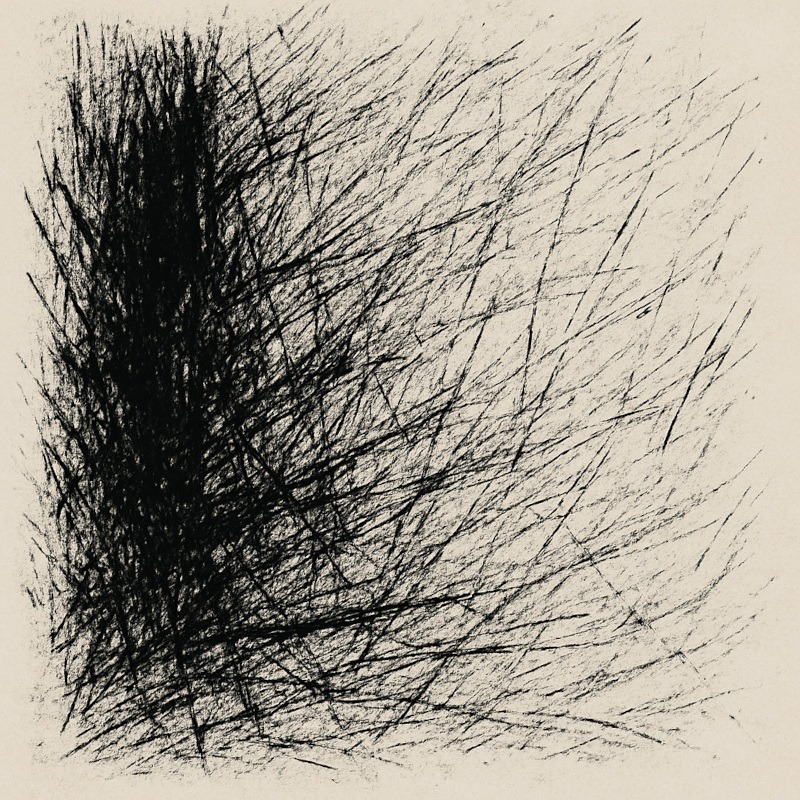
1. Cross-Hatching for Deep Horror Shadows
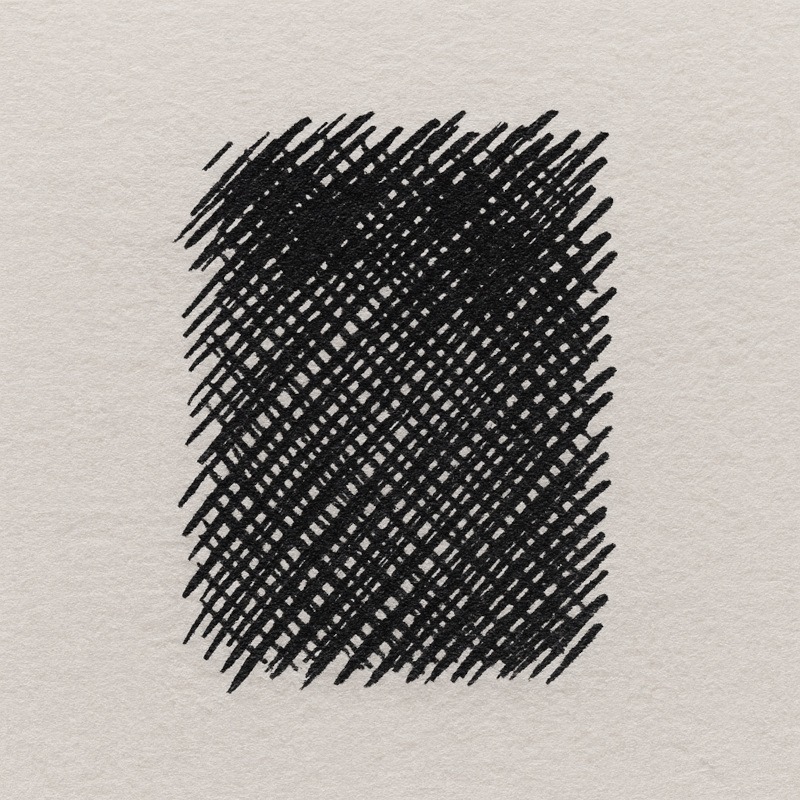
Create multiple layers of thin, overlapping lines to build darkness gradually.
- First layer: light, even strokes
- Second layer: cross the first at a different angle
- Third layer: vary direction for richer depth
The more layers you add, the more dramatic and threatening the shadows become – perfect for corners where monsters lurk.
Tiny tip: Keep your strokes light at first. Heavy pressure too early can make the paper fight back.
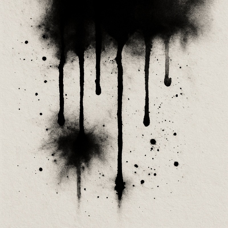
2. Dripping Shadow Strokes
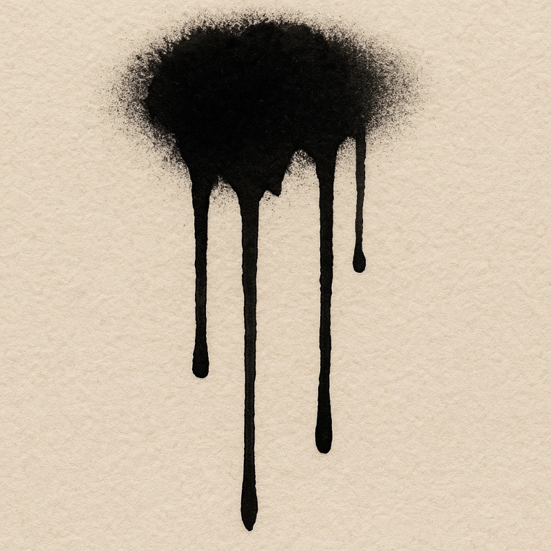
Load the nib with slightly more ink than usual and pull downward firmly.
This creates long, tapering drips that look like:
- leaking darkness
- dripping fog
- cursed liquids
- vague “something sinister happened here” residue
Use sparingly for maximum impact. A little drip goes a long way.
Tiny tip: This works best with dip pens or brush pens – technical pens don’t usually release enough ink to drip.
3. Scratchy, Broken Linework
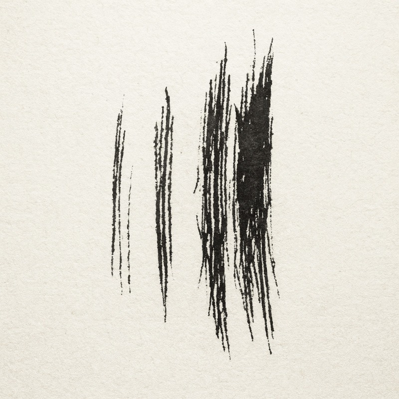
Hold the nib lightly and let it skip across the page.
This produces irregular, ghostly lines ideal for:
- tattered clothing
- wild hair
- skeletal forms
- old wood
- crumbling walls
Embrace the imperfection – scratchy textures are one of ink’s biggest strengths.
Tiny tip: Paper with texture (“tooth”) helps the nib skip more naturally.
4. Controlled Bleeding on Textured Paper
Add a slightly heavier ink line on paper with tooth.
The ink naturally spreads into the fibres, creating organic, eerie edges that look like:
- rotting surfaces
- dusty shadows
- misty outlines
Great for atmospheric horror.
Tiny tip: Different papers bleed differently – test the edge on a scrap piece first so you can predict the effect.
5. Ink Splatter for Dramatic Effects
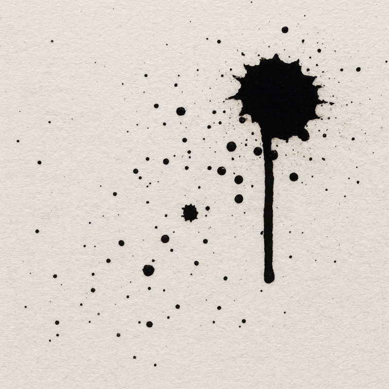
Tap the nib gently, or flick ink from a brush, to create small bursts of texture.
These tiny explosions of ink work beautifully for:
- dust
- ash
- mist
- blood-like effects
- chaotic energy
(Just make sure to protect your desk first – splatter has no mercy.)
Tiny tip: The lighter the flick, the wider the scatter. Stay close to the page for tight, controlled splatters.
Common Ink Drawing Mistakes (and How to Avoid Them)
1. Mistake: Dipping too deeply
Result:
Giant ink blots, uncontrolled streaks.
Fix: Only dip the nib tip – no more than a few millimetres.
2. Mistake: Pressing too Hard While Drawing
Result:
Nib digs into paper, scratches, or splits.
Fix: Use gentle pressure. Let the ink flow naturally.
3. Mistake: Smudging Wet Ink
Result:
Blurred lines, fingerprints, smears.
Fix: Work in sections. Let each area dry before touching nearby strokes.
4. Mistake: Using the wrong paper
Result:
Bleeding, feathering, or scratchy gouges.
Fix:
- For smooth, controlled lines: Bristol or marker paper
- For rough, spooky textures: lightly textured drawing paper
5. Mistake: Not Cleaning the Nib
Result:
Dried ink clogs the nib, ruining line flow.
Fix: Wipe nibs thoroughly after each session.
6. Drawing too Quickly
Result:
Inconsistent lines and accidental flicks.
Fix: Slow down – dip pens reward patience and steady pacing.
7. Expecting Digital-Level Perfection
Result:
Frustration, dramatic sighing, existential questioning.
Fix: Ink is moody. Embrace the organic look. That’s its charm!
Caring for Dip Pens (So They Don’t Betray You)
Taking care of your dip pens is the easiest way to keep your lines clean, your nibs happy, and your artwork free from accidental blotchy disasters. A well-maintained nib lasts longer, behaves better, and is far less likely to spit ink at you out of spite.
• Wipe nibs after every use
Use a soft cloth or tissue to remove wet ink before it dries.
Dried ink clogs the nib, preventing smooth flow.
• Don’t leave nibs soaking in water
A quick dip to loosen dried ink is fine, but leaving nibs submerged will cause rust.
A rusty nib = scratchy lines and unreliable ink flow.
• Close your ink bottles properly
Ink thickens when exposed to air.
A closed bottle keeps it smooth, usable, and far less likely to tip over during a dramatic hand gesture.
• Dry nibs fully before storing
Moisture leads to rust, and rust leads to scratchy, unpredictable lines.
Ensure the nib is completely dry before putting it away.
• Replace worn nibs when needed
Nibs naturally wear down over time.
If your lines start looking uneven, scratchy, or far too unpredictable, it may be time to switch to a fresh one.
Why this matters:
Good nib care prevents rust, blocked ink flow, scratches on your paper, and those heartbreaking ink splotches that appear out of nowhere like tiny chaotic offerings to the carpet gods.
Conclusion
Ink and dip pens are the little gremlins of the art world – dramatic, unpredictable, and capable of creating absolute magic with one tiny scratch. They splash, drip, skip, and occasionally behave, and somehow every one of those moods adds something beautifully eerie to your horror art. A single stroke can turn a calm drawing into a “should I be concerned?” moment, and honestly… that’s part of the fun.
Once you get used to their quirks, dip pens become the tool you reach for when your artwork needs atmosphere, attitude, or a suspiciously dark corner that looks as though it has opinions. They let you create the kind of bold shadows, scratchy lines, and ink-soaked textures that pencils only dream about while quietly sulking in your pencil case. Treat your nibs kindly, embrace the chaos, and you’ll end up with horror art that looks dramatic, gothic, and maybe a tiny bit possessed – which is exactly the goal.
What You Learned:
- Dip pens offer bold, dramatic lines that are perfect for horror shadows and eerie details.
- Scratchy textures, drips, and ink bleeds enhance the spooky vibe, rather than detracting from it.
- Light dipping and light pressure prevent ink tantrums (and emotional ones).
- Smooth paper gives clean lines; textured paper gives delicious chaos.
- Keeping nibs clean means fewer blots, less betrayal, and happier drawings.
- Ink isn’t about perfection – it’s about mood, drama, and controlled artistic mischief.
More Tools to Darken Your Art Arsenal
If ink has awakened your love for bold, dramatic darkness, a few more tools are waiting in the wings – all ready to help you push your horror art even further:
- Acrylic Paint Markers
Perfect for adding thick, opaque lines, eerie highlights, and crisp details that stand out on almost any surface – paper, wood, glass, even ceramics. If your art needs lines that refuse to blend in, these markers have your back. - Specialised Markers
When you need smooth gradients, eerie washes, or moody colour effects that pencils can’t handle, specialised markers step in like little colour-soaked demons. Perfect for glows, atmospheres, and painterly shadows. - Liquid Chalk Markers
Liquid chalk markers give you that dusty, mysterious, “written on a cursed school blackboard” vibe. Great for fog effects, runes, sigils, and moody lettering that looks like it might evaporate at any moment.