Pastels for Horror Art
Use pastels once, and your artwork starts developing its own ghost story.
Pastels might look soft and delicate at first glance, but don’t be fooled – they’re absolute powerhouses for creating eerie atmosphere in horror art. Whether you want drifting fog, ghostly glows, or that dusty, abandoned look every haunted location seems to specialise in, pastels deliver it with almost ridiculous ease.
They behave differently from pencils and paints, which can make them feel unpredictable at first, but once you understand how each type works, they become one of the most expressive tools in your horror art arsenal. Think of them as the medium that sets the mood before you’ve even drawn the monster.
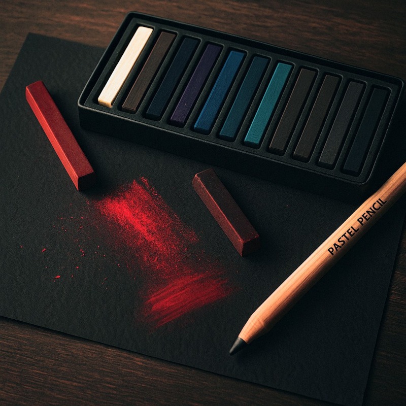
What Are Pastels?
Pastels are basically pure pigment mixed with a binder to form a solid stick. That means you’re holding concentrated colour in your hand – no brushes, no water, no palette.
For horror art, they’re perfect for:
- smoky atmospheres
- ghostly light glows
- dusty textures on old objects
- dreamlike or nightmarish backgrounds
What they aren’t great for is sharp, tiny details… unless you’re using pastel pencils (we’ll get to those little heroes in a moment).
Types of Pastels & How They Fit into Horror Art
Each pastel type has its own personality, strengths, and “chaos level.”
Here’s the breakdown:
Soft Pastels – The Drama Queens
Soft pastels are made with a high concentration of pigment and only a small amount of binder. Translation:
They’re intense, dusty, blendable, and absolutely gorgeous.
Best horror uses:
- Thick cemetery fog
- Eerie, glowing light around supernatural objects
- Hazy dream/nightmare scenes
- General “this place feels haunted” atmospheres
Strengths:
- Vibrant rich colour
- Effortless blending
- Brilliant for big atmospheric shapes
Weaknesses:
- Dust explosions
- Tricky to get fine details
- Rubs off easily unless you seal it
Hard Pastels – The Calm, Structured Ones
These have more binder, so they’re firmer and less crumbly.
Best horror uses:
- Cracks in floors and walls
- Tree branches, silhouettes, sharp shadows
- Structural elements in haunted architecture
- Underlayers before adding softer pastels
Strengths:
- Better control of detail
- Less dust
- Good for sketching foundations
Weaknesses:
- Not as vibrant as soft pastels
- Blending is possible, but takes more effort
Oil Pastels – The Greasy Goblins
Oil pastels are pigments mixed with wax/oil, meaning they produce no dust and have a totally different texture.
Best horror uses:
- Gritty, grimy walls
- Textured skin (zombies, stitched dolls, bruises)
- Smeared, painterly backgrounds
- Thick, moody colour fields behind characters
Strengths:
- Bold colour
- Great for expressive strokes
- No dust trying to enter your lungs uninvited
Weaknesses:
- Hard to get sharp detail
- Never fully “dry”
- Can be messy
They’re not subtle, but neither are most monsters.
Pastel Pencils – The Detail Demons
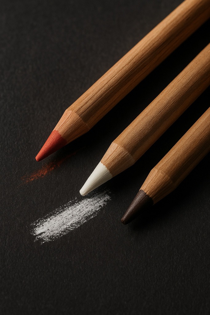
These are pastels in pencil form; the same pigment, but easier to control.
Best horror uses:
- Eyes, teeth, cracks, and any tiny details
- Hair on creatures
- Fine scratches on doors or windows
- Small highlights and finishing touches
Strengths:
- Precise lines
- Great for layering on top of soft pastel
- More familiar to artists used to pencils
Weaknesses:
- Fragile leads
- Still dusty when sharpened
Pan Pastels – The Smooth Operators
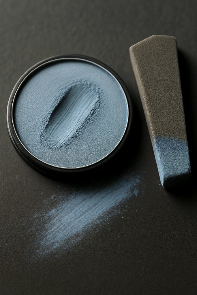
Pan pastels come in pans and are applied with sponges or soft tools.
Best horror uses:
- Smooth gradients in night skies
- Atmospheric shading around characters
- Soft light halos
- Gentle tonal transitions
Strengths:
- Low dust
- Incredibly smooth
- Excellent for backgrounds
Weaknesses:
- Not suitable alone for line work
- Tools need cleaning to avoid colour transfer
They behave more like soft paint – great for mood, not great for micro-detail.
Paper & Surfaces for Pastels
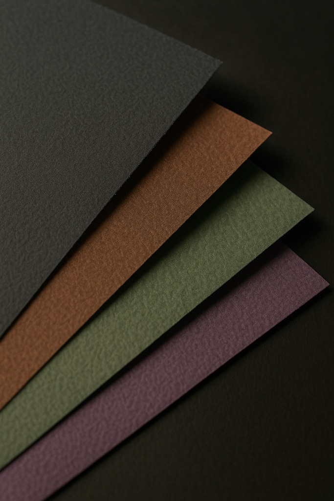
Pastels require texture (tooth) so the pigment actually has something to grip onto. If the surface is too smooth, the pastel will slide around as if it’s trying to escape the artwork entirely.
Best surfaces:
- textured drawing paper
- dedicated pastel paper
- sanded pastel boards
- toned papers (dark greys, browns, greens, purples – perfect for horror)
Recommended GSM (paper weight):
To keep your pastel layers stable and prevent buckling, aim for:
- 180–250gsm → The sweet spot for most pastel artwork.
- 160gsm → Bare minimum; okay for light practice.
- 300gsm+ → Great for heavy layering, mixed media, and more intense horror pieces (strong, durable, and built for chaos).
Why toned and dark paper works so well:
It instantly adds atmosphere before you even start drawing. Highlights, glows and ghostly effects pop dramatically against darker backgrounds, making your horror art feel more alive (or undead).
Fixative – The Necessary Evil
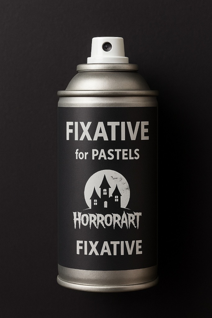
Fixative is a spray used to stop pastels from rubbing off. It doesn’t make them indestructible, but it helps them stay where they’re supposed to.
Key things to know:
- apply in light layers, not heavy blasts
- spray from a distance
- colours may darken slightly
- always test on scrap paper first
Fixative works like a hostage negotiator: “Everybody stay exactly where you are, nobody move, and nobody gets smudged.”
Mixed Media: Pastels with Other Horror Tools
Pastels can team up with your other art supplies:
Pastels + Graphite
- Use graphite for details
- Add soft pastel for atmospheric backgrounds
- Perfect for horror portraits and moody scenes
Ink + Pastels
- Ink gives crisp silhouettes
- Pastel adds glow, fog, or stormy skies
Pastels + Coloured Pencil
- Use pastel for soft areas
- Coloured pencil adds the sharp finishing marks
Common Pastel Problems (and Easy Fixes)
1. “Everything looks muddy.”
- You’re over-blending.
- Use fewer colours at once.
- Let some strokes stay visible.
2. “Where did my details go?”
- Add details last.
- Use hard pastels or pastel pencils for edges.
3. “It keeps wiping off.”
- The surface may not have enough tooth.
- Apply in thin layers.
- Add light fixative between stages.
4. “My piece looks flat.”
- Increase contrast.
- Push your shadows and highlights further apart.
Conclusion – Are Pastels Worth Using in Horror Art?
Absolutely…
Pastels bring atmosphere, mood, and drama faster than almost any other medium. They’re fantastic for fog, haunting backgrounds, glowing effects, and the unsettling softness you see in dreamlike or nightmare scenes.
They do require a bit of patience – the dust, the blending, the occasional sneeze that sends everything into orbit – but the results are incredibly rewarding. You get colour intensity, expressive textures, and that unmistakably eerie haze that works beautifully in horror artwork.
Whether you stick with pastel pencils for precise, creepy details or dive into soft pastels for full haunted-fog chaos, they add a whole new dimension to your horror toolbox.
What You Learned:
- Soft pastels are super blendable, very dusty, perfect for fog, glows and soft, eerie backgrounds.
- Hard pastels are firmer and better for structure and sharper details, such as cracks or branches.
- Oil pastels = bold, waxy, textured; great for gritty walls, rough surfaces and expressive colour.
- Pastel pencils = best for fine details (eyes, teeth, scratches, tiny highlights).
- Pan pastels = smooth, low-dust, ideal for soft gradients and atmospheric shading.
- Pastels work best on paper with tooth, such as pastel paper, textured drawing paper or sanded surfaces.
- Recommended paper weight: aim for 180 – 250 gsm for reliable results (160 gsm is the bare minimum, and 300 gsm+ is ideal for heavy layering).
- Toned or dark paper instantly boosts horror atmosphere and makes glows pop.
- Fixative helps stop smudging but can slightly darken colours, so use light layers.
- Pastels mix well with graphite, ink and coloured pencils to create detailed, dramatic horror art.
Explore More Horror Art Tools
If you enjoyed learning about pastels and want to build up the rest of your horror art toolkit, you might like these other guides:
- Sketchbooks & Paper Types
Your masterpiece needs a proper home! This guide helps you choose the right sketchbook, textured paper, or toned pages for eerie lighting, sharp details and atmospheric horror drawings. - Liquid Chalk Markers
Perfect for bold, chalky strokes, foggy effects and creepy handwritten symbols. If you want textures that look like they’ve come from a cursed chalkboard… this one’s for you. - Pencil Sharpeners
A dull pencil is scarier than any monster (in all the wrong ways). Learn the pros and cons of manual, electric and craft knife sharpening so your tools stay battle-ready for every sketch.