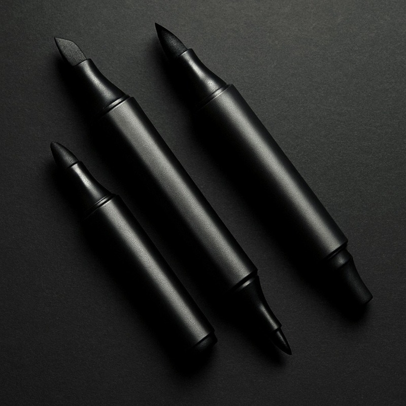
Specialised Markers for Drawing
For Smooth Blends, Creepy Colour Effects & Atmospheric Horror Magic
Specialised markers are the dramatic divas of the art world. Pencils are steady, pens are loyal, but these markers? They show up like, “Darling, let me handle the spooky lighting. You just sit there and pretend you planned this.”
Fast-blending, deeply pigmented, and suspiciously good at creating eerie glows and soft atmospheric shadows, they’re basically the colour-soaked spirits of your horror toolkit. Whether you want cursed red gradients, foggy backgrounds, glowing eyes, or moody transitions that look like you painted them with haunted water, specialised markers add the kind of depth that makes your art feel… deliciously unsettling.
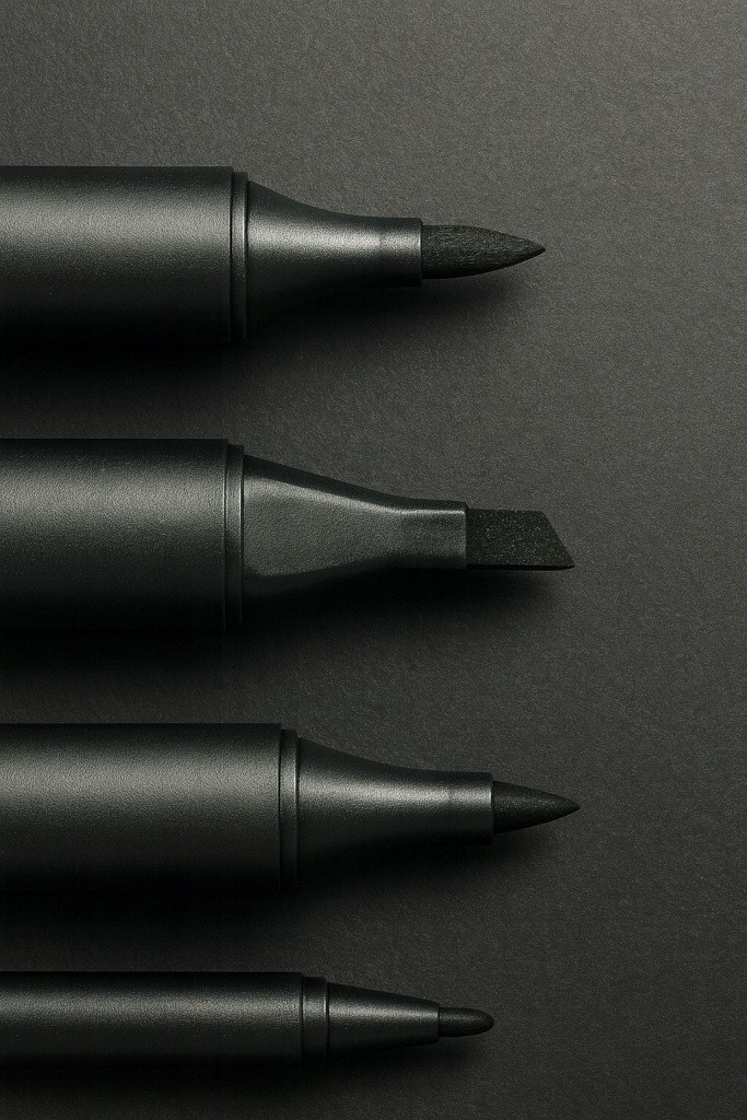
Types of Specialised Markers (and What They’re Good For)
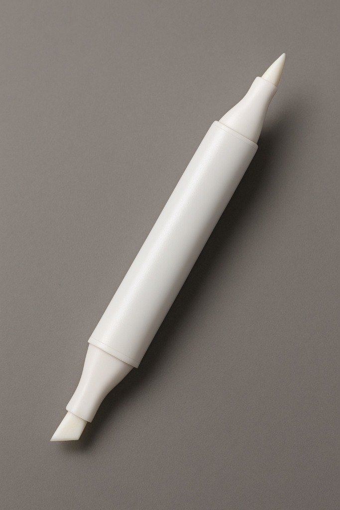
1. Alcohol-Based Markers
Smooth, blendable, dramatic – these are the main event.
Alcohol markers dry fast and layer beautifully, giving you sleek gradients and smooth shadows without streaking (as long as you use the right paper).
Great for:
- blood tones and splatters
- eerie red glows
- foggy transitions
- soft horror lighting
- shading skin – human, demon, or something in between
- layering over graphite or ink
They blend while wet, so once you get the timing right, you can create gradients smoother than a vampire trying to charm their next dinner.
2. Ink Wash Markers (Water-Based Brush Markers)
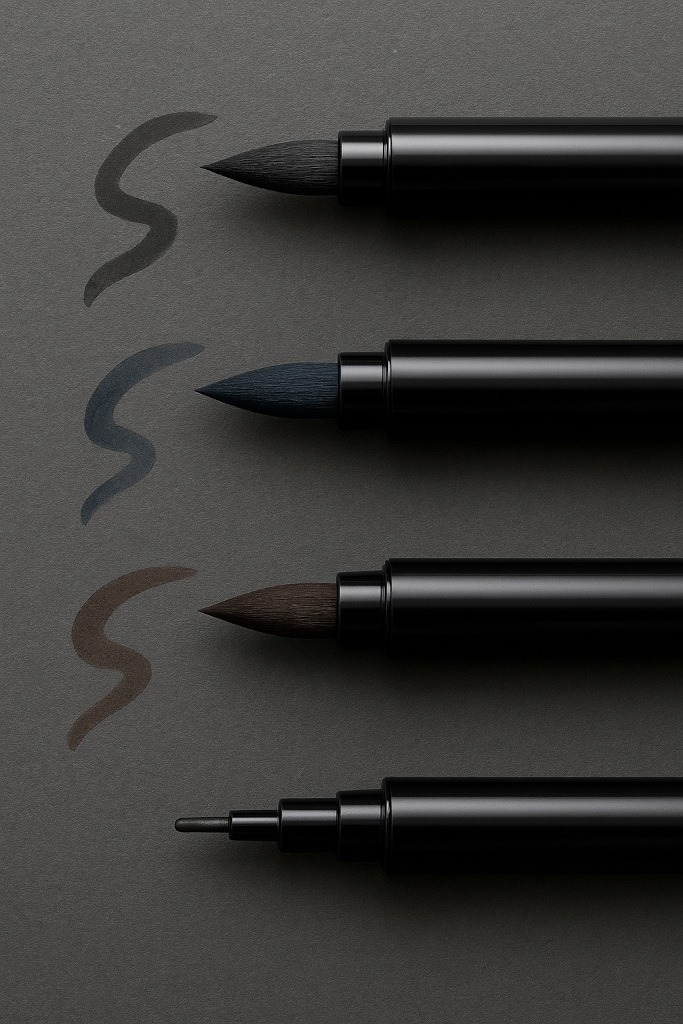
For artists who want atmospheric gloom without water pots and accidental splash zones.
Ink wash markers mimic traditional ink washes, but with more control and less panic.
Great for:
- heavy shadows
- fog and smoke
- misty backgrounds
- damp, decayed textures
- dramatic shading
They’re ideal for that “the only light source is a flickering bulb and possibly regret” type of art.
How to Use Specialised Markers
1. Work Light to Dark
Markers layer fast. Starting light gives you room to build shadows without losing detail.
2. Blend While It’s Wet
Alcohol markers blend best when both colours are fresh.
Ink wash markers overlap beautifully if you follow the natural flow.
3. Build Layers Slowly
Let layers settle instead of drowning the paper.
Your paper will thank you, your markers will thank you, and your sanity will thank you.
4. Combine with Pencils or Ink
Markers LOVE mixed media.
Add them over:
- graphite shading
- ink outlines
- textured linework
The results look polished and professional.
5. Choose the Right Paper
This is half the battle.
(Full paper section below)
6. Ventilate Your Space
Alcohol markers have a pretty strong smell, so opening a window keeps the fumes away and prevents you from summoning a headache instead of a masterpiece.
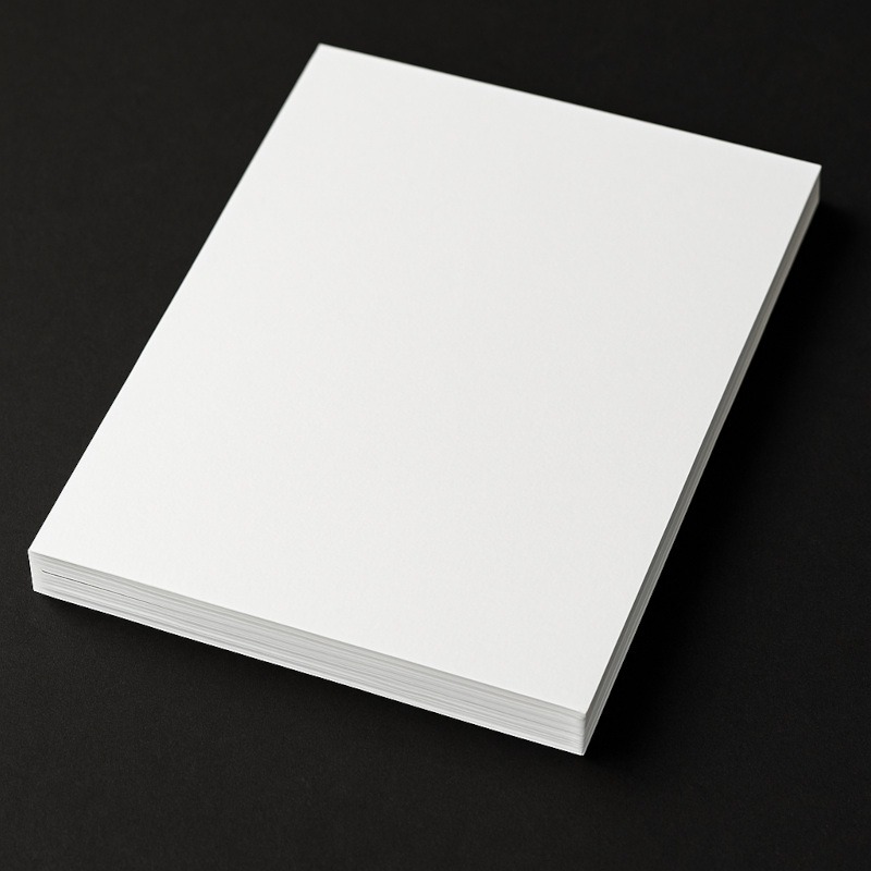
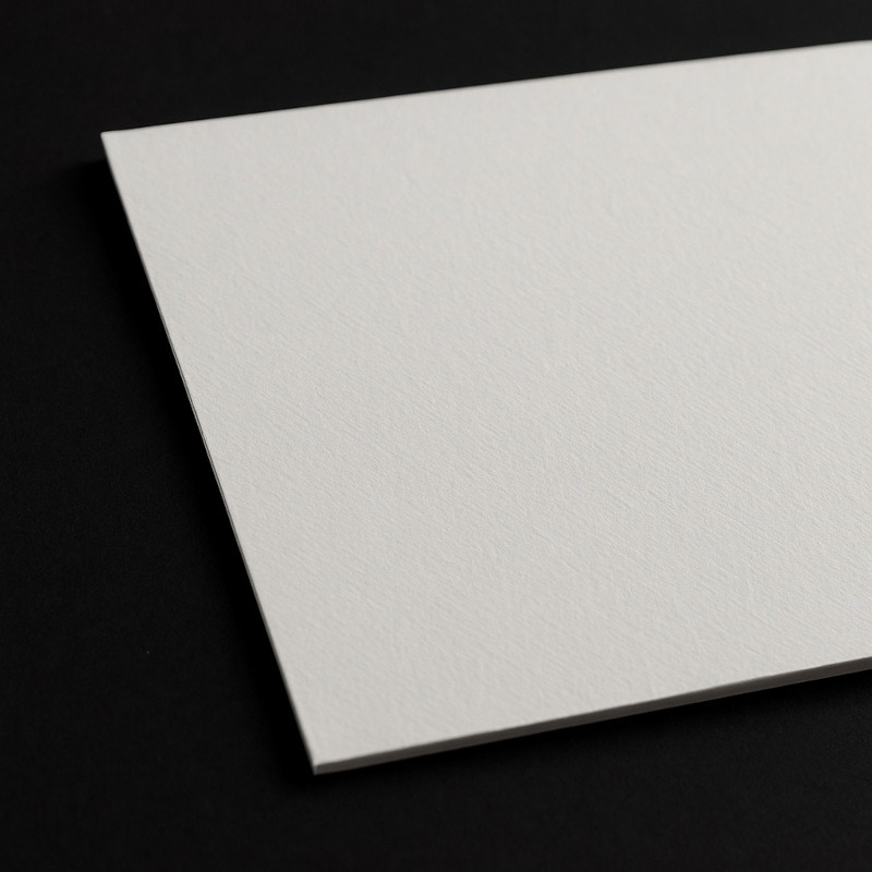
Best Paper for Specialised Markers
Specialised markers behave VERY differently depending on the paper.
Right paper = smooth blends.
Wrong paper = sadness and blotchy despair (and streaks you can’t fix).
Marker Paper (Best Overall)
70 – 100gsm
Super thin, but coated to stop ink from soaking through.
Pros:
- Beautifully smooth blends
- Minimal streaking
- Bold colour
- Kinder to your markers
Perfect for: beginners, lighting practice, smooth gradients
Smooth Bristol Board
220 – 300gsm
Thick, smooth, durable – perfect for mixed media.
Pros:
- Handles heavy layering
- Won’t buckle
- Great for graphite + marker combos
Cons:
- Uses a LOT of ink – markers drink like they’ve been crawling through the desert.
- Not cheap – your wallet may sigh dramatically.
- Very smooth surface – great for blends, but not ideal for textured effects.
- Can smudge graphite if you press too hard or overwork shaded areas.
Perfect for: polished illustrations, detailed characters, mixed-media horror
Hot Press Watercolour Paper
200 – 300gsm
Light texture, soft atmospheric results.
Pros:
- Gorgeous moody gradients
- Takes lots of ink
- Adds slight grit to your horror scenes
Cons:
- Absorbs ink quickly – blends can dry faster than you expect.
- Eats ink – seriously, it’s hungry.
- Can lift fibres if you scrub too intensely with the marker nib.
- More expensive – gorgeous results, but your bank account might whimper.
Perfect for: fog, grunge, aged surfaces, anything “abandoned and possibly whispering”
Avoid: Printer Paper
70 – 90gsm
Printer paper treats markers like a buffet.
It drinks ink instantly and unevenly.
Why it’s cursed:
- Heavy bleed-through
- Streaking
- Warping
- Ruins markers faster
It’s the fastest way to take your art from “creepy” to “crime scene.”
If you only have printer paper, use it for rough thumbnails – not finished art.
Do You Need a Blender Marker?
Short answer: sometimes.
Long answer:
Blender markers don’t blend the way beginners expect – they don’t magically mix two colours like paint. Instead, they help you push, lighten, and soften ink.
What They’re Actually Good At:
- Softening harsh edges
- Fading shadows
- Lifting colour for highlights
- Smoothing transitions
- Creating foggy or glowing edges
Best Horror Uses:
- Glowing monster eyes
- Candlelight edges
- Misty transitions
- Ghostly silhouettes
What They Don’t Do:
- Remove heavy marker stains
- Blend opposite colours into a perfect gradient
- Fix overworked areas
Used right, though, they’re incredibly helpful.
Note:
A blender marker won’t fix a mistake, but it can soften it so it’s less noticeable.
Common Issues (and How to Avoid Them)
• Streaky Colour
When colours streak, it usually means the ink dried too quickly. Try blending while the surface is still wet, or switch to smoother paper.
• Bleeding
If the ink spreads too far, the paper is probably too thin or absorbent. Thicker, coated paper will keep the colour where you actually want it.
• Over-saturation
Layering too heavily can turn the paper soft and muddy. Giving the ink a moment to settle between layers keeps everything cleaner.
• Muddy Colours
Colours from the same family blend nicely together. Opposing hues, however, tend to mix into bruise territory – unless that’s part of the vibe you’re going for.
Conclusion
Specialised markers are basically your artwork’s personal paranormal lighting crew. They glide across the page like they’ve been summoned for dramatic effect, layering shadows and glows with the confidence of an entity that definitely knows your browsing history. Once you learn how they behave – and which paper won’t betray you – they become one of the most satisfying tools in your horror art arsenal.
Whether you’re creating cursed glows, painterly shadows, foggy silhouettes, or backgrounds that feel like something’s breathing just outside the frame… these markers bring atmosphere in a way pencils simply can’t. Experiment, layer slowly, pick the right paper, and soon your art will have that eerie, cinematic look that makes people quietly say, “This is amazing… but should I be worried?”
What You Learned:
- Alcohol markers blend smoothly and add painterly depth.
- Ink wash markers create moody shadows and atmospheric gloom.
- Paper choice makes or breaks your blends.
- Marker paper, Bristol, and hot press each have specific strengths.
- Blender markers help soften edges and add glows (not mix colours magically).
- Specialised markers shine in horror art thanks to their shadows, glows, and soft gradients.
Build the Rest of Your Horror Art Toolkit
If specialised markers have opened your eyes to just how dramatic and atmospheric your horror art can look, there are a few more tools worth exploring. Each one adds a different flavour of spooky magic to your creations.
- Sketchbooks & Paper Types
Your tools are only as good as the surface on which you use them. This guide walks you through sketchbooks, paper textures, and page tones, helping you choose what works best for eerie shadows, fog, highlights, and high-contrast horror drawings. - Coloured Gel Pens
Perfect for glowing runes, neon sigils, cursed symbols, and unsettling pops of light. Gel pens slice through graphite and charcoal like tiny glowing knives, adding bright details that look almost supernatural. - Ink & Dip Pens
If you love rich blacks, scratchy textures, and dramatic shadows, this guide breaks down everything you need to know about ink and dip pens – from nib types to how to control those chaotic (but gorgeous) strokes.