Advanced Shading Techniques for Horror Drawings (Depth, Texture and Contrast)
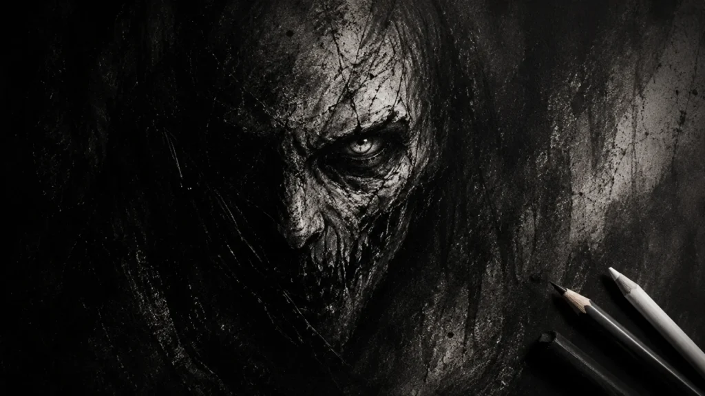
So, you’ve mastered your value scales, spheres, and candlelit teddy bears. Now it’s time to step into the deep end of the shadow pool, the place where shading gets dramatic, layered, and downright unsettling.
Advanced shading isn’t about showing off technical skill. It’s about using darkness to create mood, tension, and that deliciously creepy atmosphere horror art thrives on. Think of it as shading so good, your eraser files for early retirement.
These advanced shading techniques for horror drawings will help you go beyond the basics and give your work the kind of depth that makes viewers squirm (in a good way).
In this guide, we’ll explore several advanced shading techniques used in horror drawings. Each section links to a deeper tutorial, so you can dive into each technique in detail.
What You’ll Learn:
In this guide, you’ll learn how to:
- Build layered shadows to create deeper, more convincing darkness
- Use textured shading to add decay, skin detail, and unsettling surfaces
- Combine graphite and charcoal for extreme contrast and dramatic impact
- Apply negative space shading to create eerie, ghost-like effects
- Control suggestion vs detail to make your drawings more disturbing
- Use strategic highlights to sharpen focus and create haunting glows
1. Layered Shadows for Extra Depth in Horror Drawings
What This is:
Instead of shading once and calling it done, advanced artists build shadows in layers, gradually deepening the tone to create richer, more believable darkness.
Real shadows rarely happen in a single pass. They build up slowly, adding depth, soft transitions, and weight to your drawing. Each layer strengthens the form and helps your shadows feel more natural and immersive.
The result is depth you can feel, not just see.
How to Practice:
- Shade in 3-4 passes, starting light and gradually deepening your shadows
- Look for areas where shadows overlap, like under chins, inside folds, and tight corners
- Build layers gradually rather than jumping straight to your darkest values
- Let transitions stay smooth so your shadows don’t look patchy or harsh
Horror Tip:
Overlapping shadows can suggest something lurking just out of sight.
Dark corners, partially hidden forms, or layered folds create tension and make the viewer feel like something is there… even if they can’t fully see it.
Take it Further:
Combine layering with uneven textures or broken edges to create more organic, unsettling shadows. The less perfect and uniform your shading looks, the more disturbing and lifelike it becomes.
Want to Go Deeper?
I go into this technique in more detail in the Layered Shadows for Extra Depth in Horror Drawings post, including how to build shadows gradually for stronger depth and control.
2. Textured Shading for Skin, Decay and Surfaces
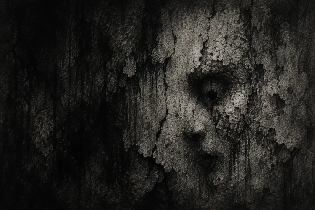
What This is:
Not all shadows are smooth. Horror thrives on texture – cracked stone, wrinkled skin, mouldy walls, and rotting flesh.
Instead of blending everything into soft gradients, textured shading uses irregular marks and layered detail to create surfaces that feel rough, aged, or unsettling.
A plain wall is just a wall. But add cracks, stains, and uneven shading, and suddenly it feels like it’s been there too long… and might be watching you back.
How to Practice:
- Choose a surface like skin, stone, or fabric and study a reference image
- Use hatching, stippling, or rough strokes instead of smooth blending
- Vary your mark size and direction to avoid repetitive patterns
- Layer shadows into the texture to suggest depth, cracks, and grime
Horror Tip:
Texture becomes unsettling when it’s uneven and unpredictable.
Deepening shadows inside wrinkles, cracks, or folds makes them feel exaggerated and unnatural… turning something ordinary into something quietly disturbing.
Take it Further:
Mix multiple techniques in the same area – for example, combine soft shading with sharp cracks or stippling. This contrast creates surfaces that feel more organic, chaotic, and lifelike.
Want to go Deeper?
For a bit more context on textured shading and when it works best, the Textured Shading for Skin, Decay and Surfaces post explores these ideas in greater detail.
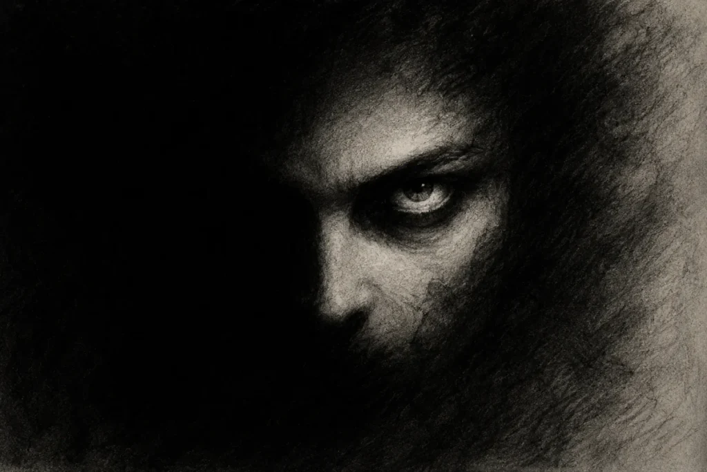
3. Blending Graphite & Charcoal for Extreme Contrast in Horror Art
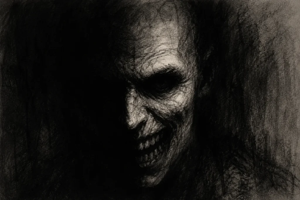
What This is:
Graphite handles subtlety. Charcoal delivers intensity.
Used together, they create a powerful contrast that’s perfect for horror art.
Graphite is ideal for mid-tones, soft transitions, and controlled detail, while charcoal pushes your darkest areas into deep, almost light-absorbing blacks.
Blending the two allows you to create drawings that feel like they’re emerging from darkness rather than sitting on the page.
How to Practice:
- Use graphite for mid-tones and lighter shading to build form and structure
- Introduce charcoal in the darkest areas, such as pupils, deep shadows, and backgrounds
- Blend carefully where they meet to avoid harsh, muddy transitions
- Keep charcoal controlled so it enhances contrast without overwhelming your drawing
Horror Tip:
Push your backgrounds darker than you think is comfortable.
A graphite-drawn face against a charcoal-black background can feel like it’s emerging from endless darkness… simple, but incredibly effective.
Take it Further:
Separate roles for each material.
Use graphite for your subject and charcoal for the surrounding shadows or background. This contrast makes your character feel isolated, swallowed, or creeping out of the void.
Want to go Deeper?
If you’d like to see this technique used more deliberately, check out the Blending Graphite and Charcoal for Extreme Contrast in Horror Art post.
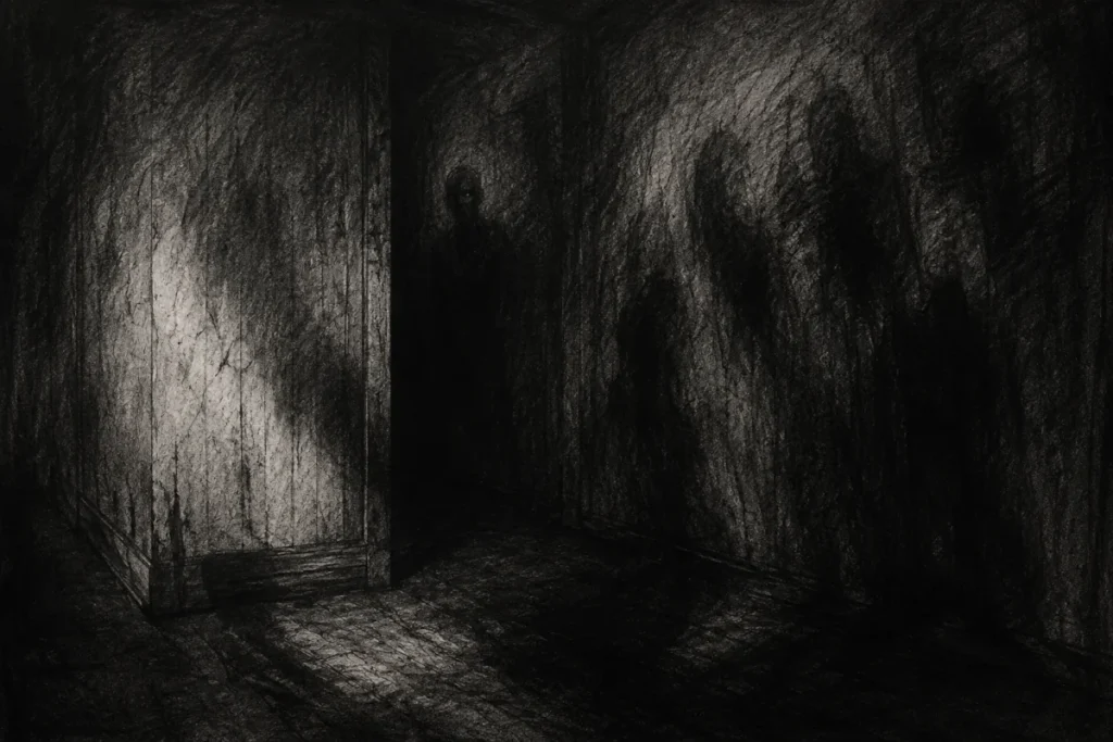
4. Negative Space Shading for Eerie, Ghostly Horror Effects
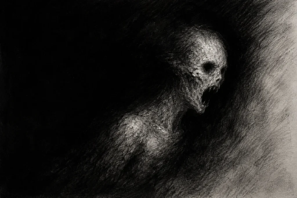
What This is:
Instead of shading the subject, you shade everything around it.
This technique uses darkness to define light, allowing forms to emerge rather than be drawn directly.
It’s one of the most effective ways to create ghostly, unsettling figures, because the subject feels half-present, half-imagined. Done well, it looks like the figure is forming out of the darkness itself… or dissolving back into it.
How to Practice:
- Start with a loose outline of your subject to guide placement
- Shade the background heavily, building darkness around the form
- Gradually refine edges by contrast, not outlines
- Choose carefully what to reveal and what to hide to control the mood
Horror Tip:
Leave parts of the figure unfinished on purpose.
When areas fade into the background, the brain tries to “complete” the image… and usually makes it creepier than anything you could fully draw.
Take it Further:
Push this technique beyond simple silhouettes by letting entire sections disappear into shadow, such as:
- Faces partially swallowed by darkness
- Limbs fading out at the edges
- Figures that feel like they’re phasing in or out of existence
The less you show, the more unsettling it becomes.
Want to go Deeper?
For a closer look at this approach, take a look at the Negative Space Shading for Eerie, Ghostly Horror Effects post, where the technique is broken down step by step.
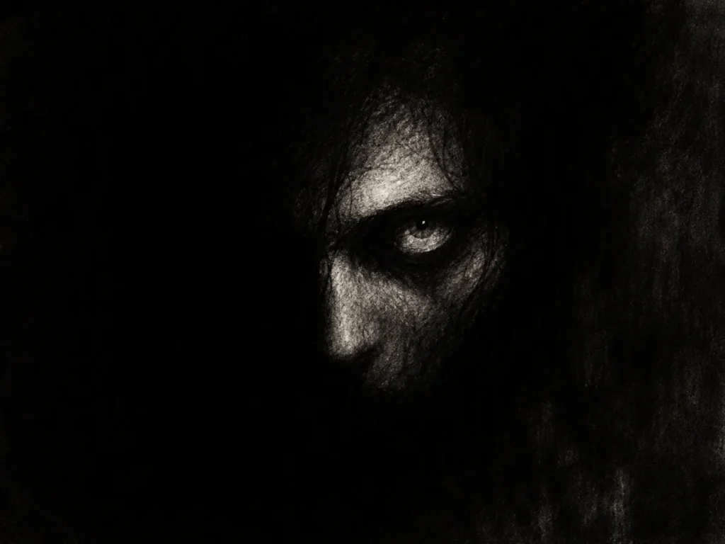
5. Suggestion vs Detail in Horror Art: Knowing What to Leave Out
What This is:
What you don’t draw can be more powerful than what you do.
In horror art, suggestion creates tension, while too much detail can actually weaken the impact.
Instead of fully defining everything, you guide the viewer’s eye by sharpening certain areas and letting others fade into ambiguity.
A pair of sharp eyes emerging from soft, undefined shadows will always feel more unsettling than a fully rendered face.
How to Practice:
- Focus your detail on key features such as eyes, mouth, or hands
- Let the surrounding areas fade, blur, or remain unfinished
- Use strong contrast to control attention and guide where the viewer looks first
- Resist the urge to over-render everything
Horror Tip:
One fully rendered feature can carry the entire piece.
A single, sharply detailed eye on an otherwise fading face is often far more disturbing than showing everything clearly.
Take it Further:
Start experimenting with intentional imbalance in your drawings:
- Fully rendered features surrounded by loose, unfinished areas
- Faces that dissolve into shadow or texture
- Details that feel like they’re appearing and disappearing at the same time
This creates tension because the viewer never feels like they’re seeing the whole picture.
Want to go Deeper?
To explore this idea in more detail, take a look at Suggestion vs Detail in Horror Art: Knowing What to Leave Out, where I break down how these techniques work together.
6. Strategic Highlights for Maximum Horror Impact
What This is:
Highlights aren’t just empty spots; they’re deliberate points of focus.
In horror art, they create eerie glows, sharp contrast, and controlled attention.
The key is restraint. Highlights work best when most of your drawing is buried in shadow, allowing small areas of light to feel intense and unnatural.
Less light = more tension.
How to Practice:
- Lift highlights with an eraser in shaded areas to create subtle, natural light
- Use white pencils or gel pens sparingly for sharper, more striking effects
- Place highlights only where you want the viewer to look first
- Pair small highlights with deep shadows to maximise contrast and drama
Horror Tip:
Tiny highlights can feel disturbingly alive.
A single white dot in a pitch-black eye can instantly make a character feel aware… and watching you.
Take it Further:
Start thinking of highlights as storytelling tools, not just lighting:
- Use them to suggest wet textures, reflective surfaces, or unnatural glow
- Add subtle highlights where they shouldn’t logically exist to create unease
- Let highlights break the darkness in unexpected places to draw attention
The smaller and more controlled they are, the more powerful they become.
Want to go Deeper?
For a closer look at how to use this technique effectively, take a look at Strategic Highlights for Maximum Horror Impact, where I break down how to control light for stronger results.
Final Words
Advanced shading isn’t about how much graphite you can grind into your page; it’s about control.
Darkness, softness, and sharp light each play a role.
Knowing when to hold back and when to push contrast is what gives your horror art that unsettling edge.
When used well, your shading doesn’t just describe a subject.
It can breathe, whisper… and sometimes stare back.
Tip:
Don’t throw every advanced technique into one drawing.
Think of these skills like horror movie props.
Use them with intention. Use them at the right moment.
Bring out the chainsaw when it counts… not when you’re sketching grandma’s teacup.
Next Up: Horror Lighting Practice Exercises for Artists
Now that you’ve explored advanced shading techniques, it’s time to push things further with lighting.
Shading builds the form… but lighting controls the fear.
In the next post, you’ll dive into practice exercises designed to help you control eerie light sources, sharpen contrast, and create those spine-chilling atmospheres that make your drawings feel alive.
Continue to Horror Lighting Practice Exercises for Artists