Common Shading Mistakes in Drawing and How to Fix Them
Shading is one of the most powerful tools in art – a well-executed shadow can add depth, realism, and that deliciously spooky atmosphere. But small mistakes? They can sneak in like a gremlin with a crayon, throwing everything off and making your drawing look as flat as a haunted pancake.
In this guide, we’ll go over the most common shading mistakes in drawing and how to fix them, so your artwork can rise from the paper like a beautifully shaded crypt-dweller living its best afterlife.
If you’re still learning the basics of shading, you may want to check out Basic Shading Techniques before diving into these common mistakes.
1. pressing too hard, too soon
The Mistake:
Applying too much pressure from the start makes shading look harsh and limits smooth blending. It can also indent the paper, making mistakes difficult to erase.
The Fix:
- Start with light layers and gradually build up darkness.
- Use soft, controlled strokes instead of pressing hard.
- Try using softer pencils (B grades) for darker shading.
- Ease up on the pressure – or risk turning your shading into a summoning circle of graphite chaos.
- Bonus Tip: H pencils are great for light sketching or crisp outlines, but not ideal for deep shading.
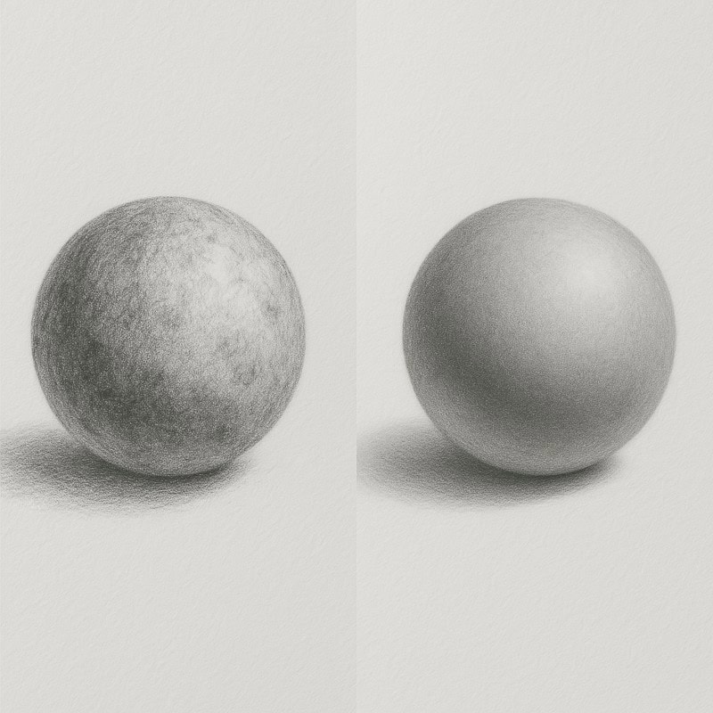
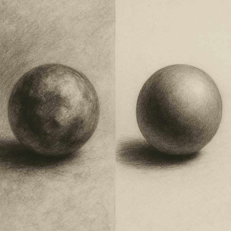
2. uneven or patchy shading
The Mistake:
Inconsistent shading creates an unnatural look, with areas that appear blotchy or unintentional.
The Fix:
- Use small circular or back-and-forth strokes for an even application.
- Work in layers, gradually darkening instead of trying to get the right tone in one pass.
- Blend carefully, using a blending stump or tissue for smoother results.
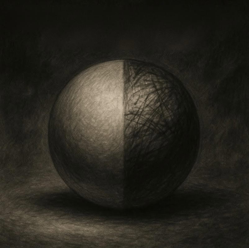
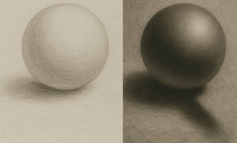
3. Over-blending (muddy shadows)
The Mistake:
Excessive blending removes texture and depth, making shadows look muddy or lifeless.
The Fix:
- Keep some sharp edges and visible strokes to maintain a gritty, unsettling feel, especially effective for eerie lighting effects.
- Use blending selectively – only smooth areas where necessary.
- Reinforce highlights and contrast after blending to bring back definition.
4. Ignoring the light source
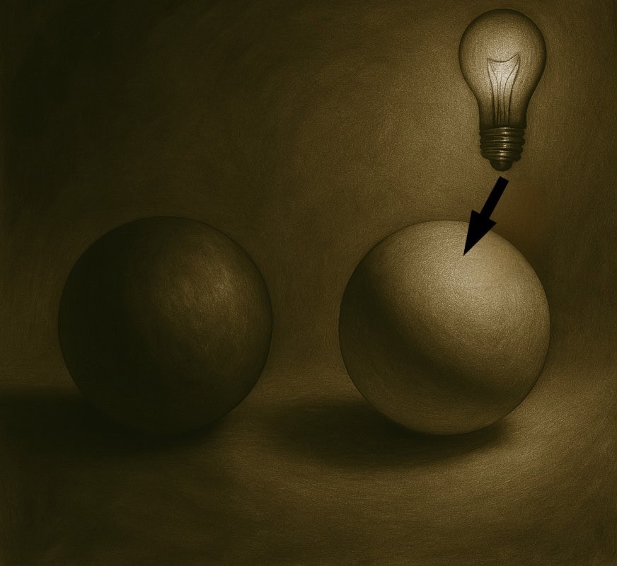
The Mistake:
Shading randomly without considering the light source makes objects look unrealistic.
The Fix:
- Before shading, identify the direction of the light and map out where shadows should fall.
- Use a simple light guide (draw an arrow) to keep shading consistent.
- Avoid placing highlights and shadows in conflicting areas.
5. Using only one pencil
The Mistake:
Relying on a single pencil (often HB) results in limited contrast, making the drawing look flat.
The Fix:
- Use a range of pencils:
- H pencils for light, subtle shading.
- B pencils for deep shadows and rich contrast.
- Experiment with layering different grades to create more dynamic shading:
- Mixing H and B pencils allows for eerie depth, soft shadows for atmosphere, and deep darks for intense contrast.
6. Overusing fingers for blending
The Mistake:
Smudging with fingers adds oils to the paper, making it harder to layer shading properly.
The Fix:
- Use blending stumps, tissues, or cotton swabs for smoother blending.
- If you must use your fingers, wash your hands first and dab excess oil off the paper.
- For a rougher texture, skip blending altogether and use controlled shading strokes.
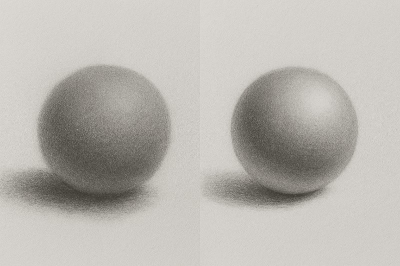
7. Not refining highlights
The Mistake:
Failing to bring back highlights can make shading look dull and lacking contrast.
The Fix:
- Use a kneaded eraser to lift highlights subtly.
- Try a vinyl eraser for crisp, bright highlights.
- Avoid over-shading areas that are meant to stay bright.
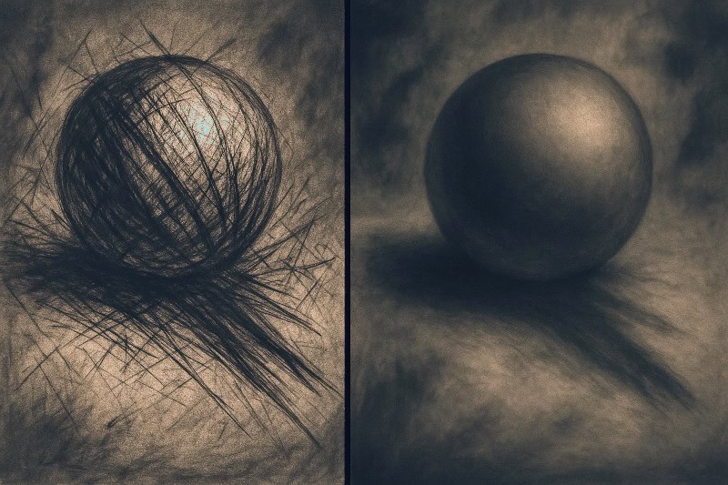
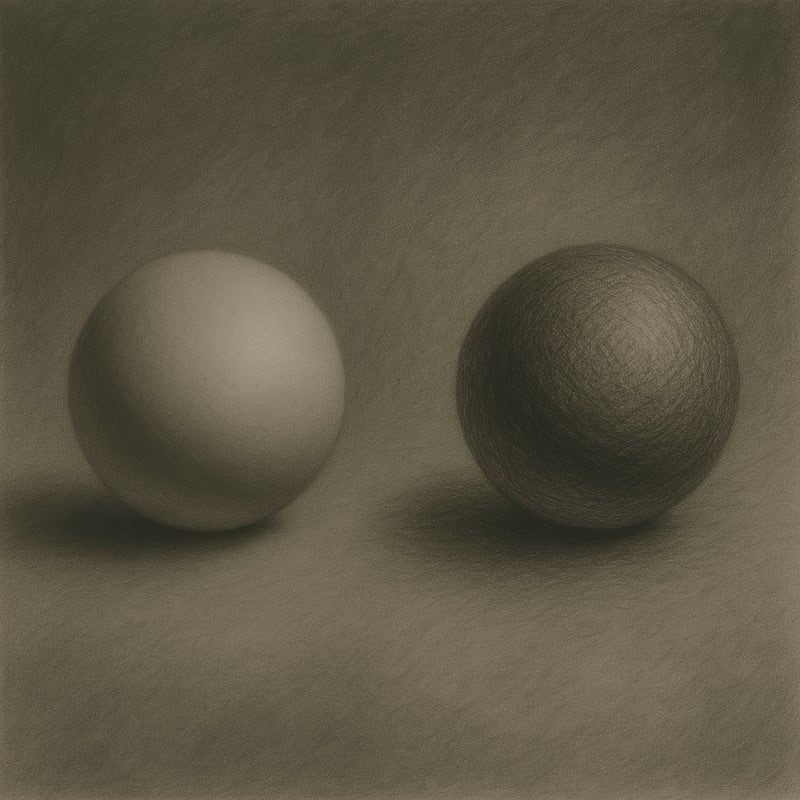
8. Smudging everything instead of creating texture
The Mistake:
Blending everywhere removes texture, making rough surfaces look too smooth.
The Fix:
- Use cross-hatching, stippling, or directional strokes for texture instead of just blending.
- Keep shading varied – not every surface should be ultra-smooth.
- Bonus Tip: Want believable skin texture or cracked horror flesh? Try layering controlled scribbles or sharp crosshatching in random directions – it’s like giving your drawing a creepy epidermis.
Smooth is nice for baby bums – not so much for undead tentacle beasts. Let that texture show!
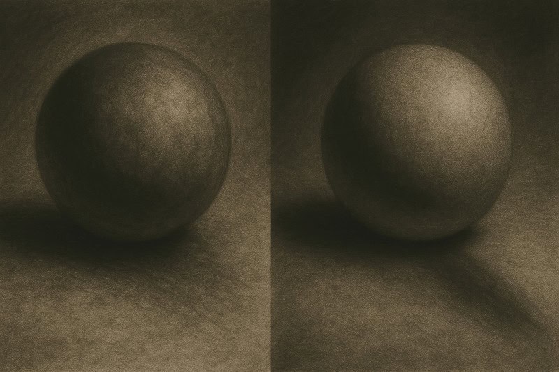
9. Practice challenge: Fix these mistakes
Try these exercises to improve your shading control:
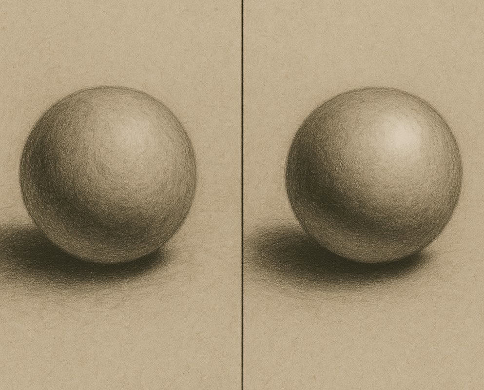
- Shade a sphere with clean blending and well-placed highlights.
- Draw an object with visible texture (wood, fabric, or stone) without over-smudging.
- Use multiple pencil grades in a drawing to enhance contrast.
Or, if you’re up for the challenge. You could combine these techniques to bring something eerie to life, like a cracked mask left in the woods, half-buried and watching. If your drawing gives you the heebie-jeebies… you’re doing it right.
Next up: practice exercises for mastering shading
Now that you know what NOT to do, let’s focus on getting it right. In the next post, we’ll go through structured shading exercises to improve your skills. No more accidental smudge monsters, just beautifully creepy, well-shaded creatures of your own making.
Dare to continue? Head to Practice Exercises for Mastering Shading and bring those shadows to life.