
Common Lighting Mistakes in Drawing and How to Fix Them
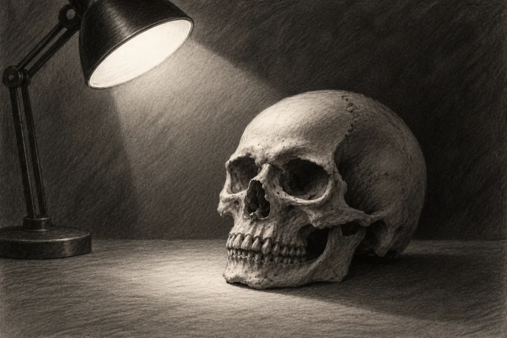
Lighting can completely transform a drawing, but when something isn’t quite right, even a carefully detailed piece of artwork can feel strangely unconvincing. Perhaps your shadows are falling in different directions, your highlights don’t match the light source, or your carefully shaded character somehow looks flatter than when you started.
Small lighting mistakes can make a surprisingly big difference, especially in horror art, where shadows, contrast and atmosphere play such an important role. The good news is that most lighting problems can be corrected once you understand what’s causing them. Often, you don’t need to start your drawing again. A few thoughtful adjustments to your highlights, shadows or light sources can make everything feel much more believable.
In this guide, you’ll discover the most common lighting mistakes in drawing, why they happen and how to correct them, with practical advice and horror-inspired examples you can apply to your own artwork.
What You’ll Learn
- Why unclear light sources can make highlights and shadows appear inconsistent.
- How to prevent multiple light sources from creating confusing or competing lighting effects.
- How to recognise and correct shadows that don’t match the direction of the light.
- Why insufficient contrast can make drawings appear flat and how to improve their depth.
- How ambient and reflected light affect shadows, even in darker environments.
- Why overcomplicated lighting can distract from your subject and weaken the atmosphere.
- How to use warm and cool lighting more intentionally in coloured horror artwork.
- A simple method for checking and correcting your lighting before finishing a drawing.
Why Lighting Mistakes Matter in Horror Art
Lighting does more than make your subject visible. It helps establish three-dimensional form, directs the viewer’s attention and influences the emotional atmosphere of your artwork. When your lighting is consistent, viewers can usually understand where the illumination comes from, even if the light source itself isn’t visible.
Highlights suggest which surfaces receive light, while shadows reveal form, depth and the position of objects within a scene. When these relationships don’t make sense, the drawing can become visually confusing.
This is particularly important in horror art, where you’re often relying on darkness to conceal information, exaggerate certain features or suggest something lurking beyond the visible scene.
Of course, unrealistic lighting isn’t always a mistake. Deliberately breaking lighting rules can create surreal or supernatural effects. The important difference is whether the effect feels intentional.
Understanding how lighting normally behaves gives you the freedom to distort it without accidentally undermining your drawing.
If you’d like to explore these principles in more detail, How Different Light Sources Affect Horror Art explains how lighting behaviours, directions and different light sources influence a scene.
Common Lighting Mistakes and How to Fix Them
1. Starting Without a Clear Light Source
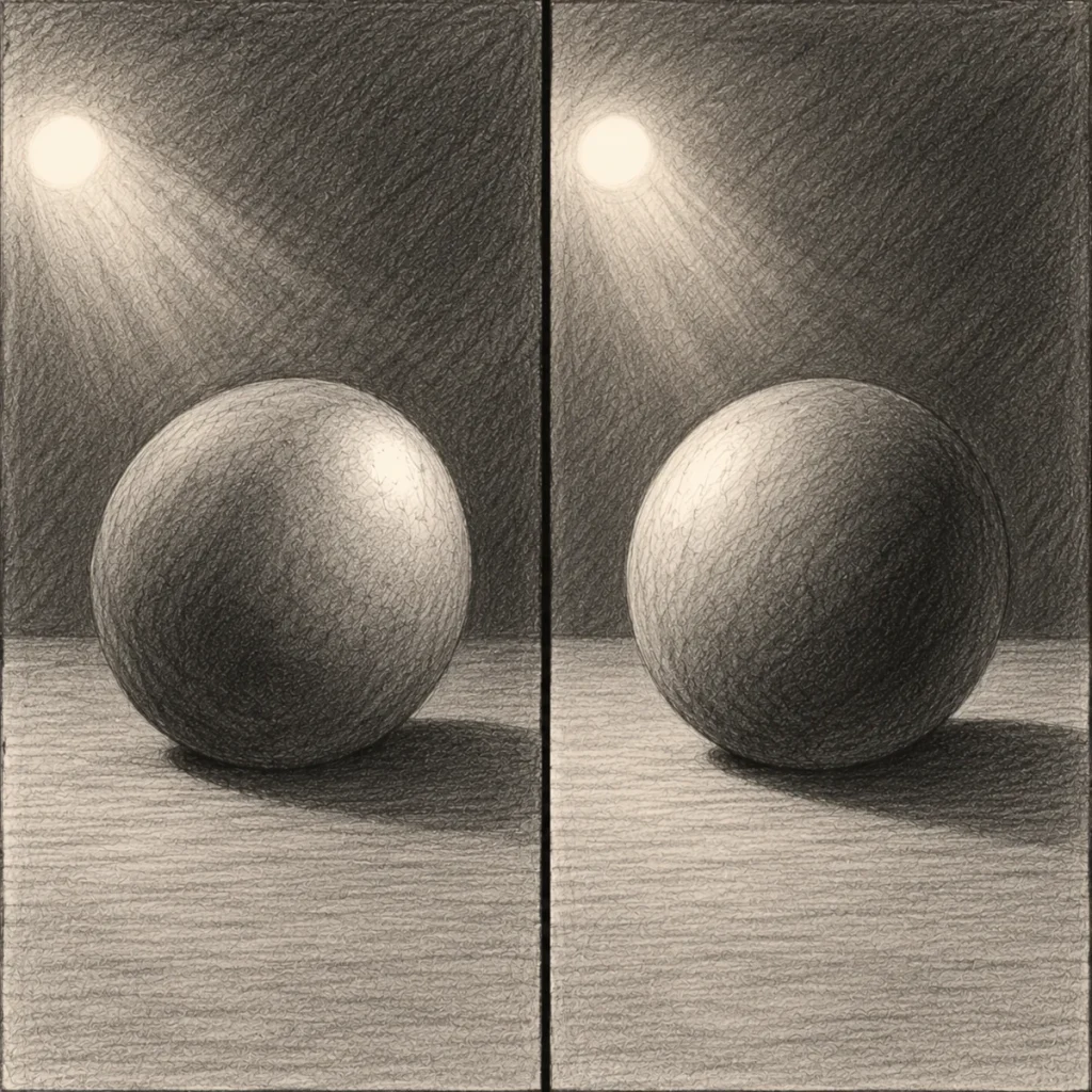
One of the most common lighting mistakes is adding highlights and shadows before deciding where the light is coming from.
You might shade one side of a character’s face, add a highlight to the opposite cheek and darken the background without considering how those areas relate to a particular light source.
Individually, each shaded area might look convincing. Together, however, they can suggest several conflicting lighting directions, and this can make the subject appear inconsistent or strangely flat.
Why It Happens
It’s easy to become focused on making individual features look three-dimensional without considering the lighting across the entire drawing.
This is particularly common when working from imagination, where you don’t have a physical reference showing exactly how the light should behave.
You may also become so focused on adding dramatic shadows that you forget to establish what’s creating them.
How to Fix It
Before shading, decide where your main light source is positioned. Think about whether the illumination comes from above, below, beside or behind your subject. Next, consider which surfaces face the light and which turn away from it.
As a general rule:
- Surfaces facing the light generally receive more direct illumination.
- Surfaces angled away receive less direct illumination.
- Objects blocking the light create cast shadows on other surfaces.
- Ambient and reflected light may still illuminate areas outside the main light.
Try drawing a small arrow beside your sketch to indicate the direction of the light.
If your light source is a nearby lamp or candle, you can also mark its actual position.
This simple reference helps you maintain consistent lighting as the drawing becomes more detailed.
Horror Art Example
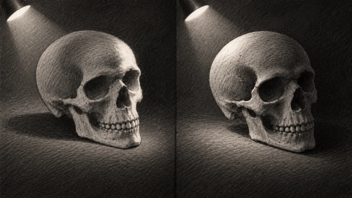
Imagine drawing a skull resting on a table beside a candle.
If the candle is positioned to the left, the left-facing surfaces of the skull should generally receive stronger illumination. The opposite side will receive less direct light, while the skull may cast a shadow across the tabletop. If you accidentally place your strongest highlights on the right without introducing another source, the lighting may become difficult to understand.
By establishing the candle’s position first, you can create believable contrast and shadows that support the eerie atmosphere.
2. Using Multiple Light Sources Without a Plan
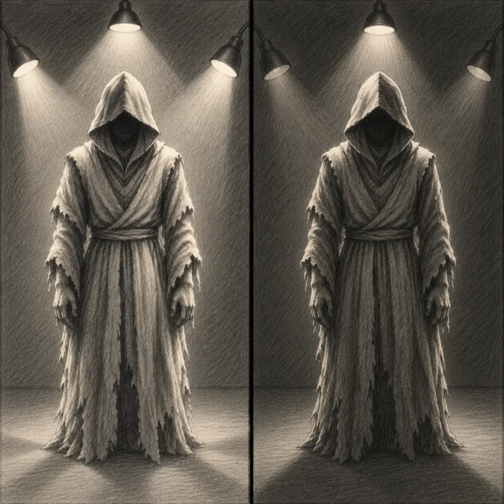
Combining several light sources can create interesting lighting effects, but it can also make a drawing unnecessarily complicated.
A character might receive illumination from a window, a lantern and an overhead lamp, each affecting different surfaces.
If you haven’t considered how these sources interact, your highlights and shadows may compete rather than work together.
Why It Happens
Multiple light sources are more difficult to manage because each one can illuminate a subject from a different direction.
A secondary source may brighten an existing shadow, introduce a highlight on another surface or create an additional cast shadow. These effects are physically possible, but they become confusing when their positions and relative brightness aren’t clear.
It’s also tempting to add more light simply because certain parts of the drawing feel too dark. Unfortunately, revealing every detail can weaken the atmosphere you’re trying to create.
How to Fix It
Start by choosing one primary light source.
This will usually provide the strongest illumination or establish your main focal point.
Once you’ve worked out its highlights and shadows, introduce a secondary source.
Ask yourself what purpose that additional light serves.
Is it revealing an important detail? Softening an existing shadow? Creating a contrasting colour? Separating the subject from the background?
If it doesn’t contribute anything useful, you may not need it.
When combining lights, remember that one source can illuminate a shadow created by another. Separate sources can also produce overlapping cast shadows. You don’t need to eliminate these interactions. You simply need to plan them consistently.
For beginners, working with two light sources is often a good place to start.
Horror Art Example
Imagine a figure standing inside an abandoned room.
A warm lantern illuminates the front of their body, while cool light enters through a window behind them.
The lantern establishes the main illumination, while the window provides subtle highlights along the figure’s outline.
Both sources have a clear purpose.
If you introduce several additional lights without considering their effects, the scene may lose its focus.
Keeping the arrangement simple allows you to create depth and atmosphere without overwhelming the drawing.
3. Drawing Shadows That Don’t Match the Light Direction
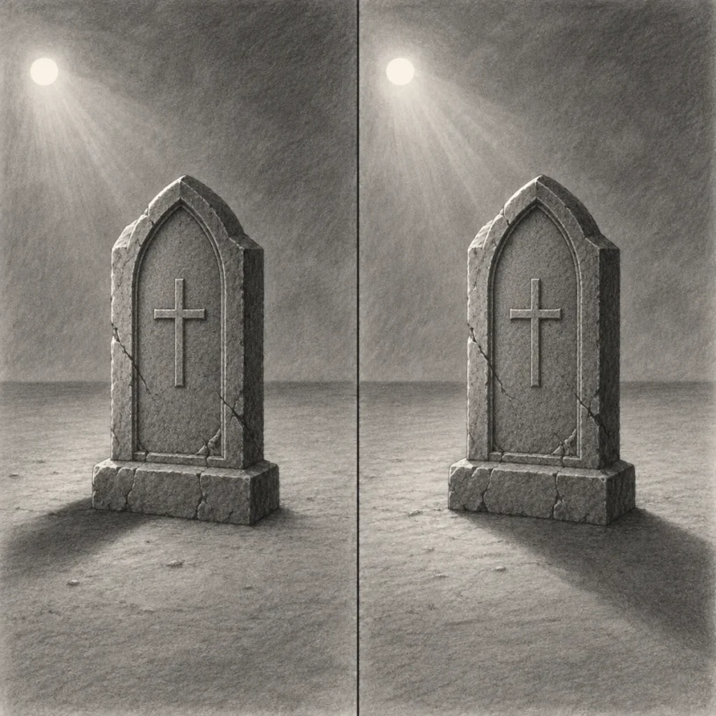
Shadows are one of the clearest indicators of where light is coming from.
When their direction or placement doesn’t match the light source, the entire scene can feel inconsistent. For example, you might draw a character illuminated from the upper left but place a cast shadow extending towards that same light.
Unless another source is involved, the shadow would normally extend away from the illumination.
Why It Happens
It’s easy to confuse the different kinds of shadows present in a drawing.
Form shadows develop on parts of an object that receive less direct illumination because of the object’s shape. Cast shadows appear when an object blocks light from reaching another surface. Both depend on the lighting conditions, but they behave differently.
A cast shadow also changes shape depending on the object creating it, the light source’s position and the surface receiving it.
How to Fix It
Begin by identifying your main light source.
Next, imagine light travelling from that source towards the objects in your scene. Where an object blocks the light, a cast shadow forms on the surfaces behind it.
Cast shadows generally extend away from their light source, although their visible direction and shape depend on perspective and the surfaces they fall across.
If the light is above and to the left of an object, its shadow on a level surface will generally extend towards the opposite side. However, remember that shadows falling across walls, steps, or uneven ground won’t necessarily appear as simple straight shapes.
The apparent size of the light source also affects shadow softness. A relatively small-looking source tends to produce sharper edges, while a larger-looking source creates softer transitions.
Before committing to your darkest shading, lightly sketch the main shadow shapes and check their relationship to the light. You can also use a reference photograph to check how the shadow changes when you move the light source.
Horror Art Example
Imagine a skeletal figure standing beneath a streetlamp.
The lamp illuminates the figure from above, creating shadows beneath its brow, nose and jaw.
On the ground, the figure casts a shadow away from the lamp’s position.
If you draw that ground shadow extending towards the lamp instead, the scene may feel visually inconsistent.
Correcting its direction helps establish the lighting, allowing the figure’s unusual appearance to remain the focus.
4. Using Too Little Contrast and Making Everything Look Flat
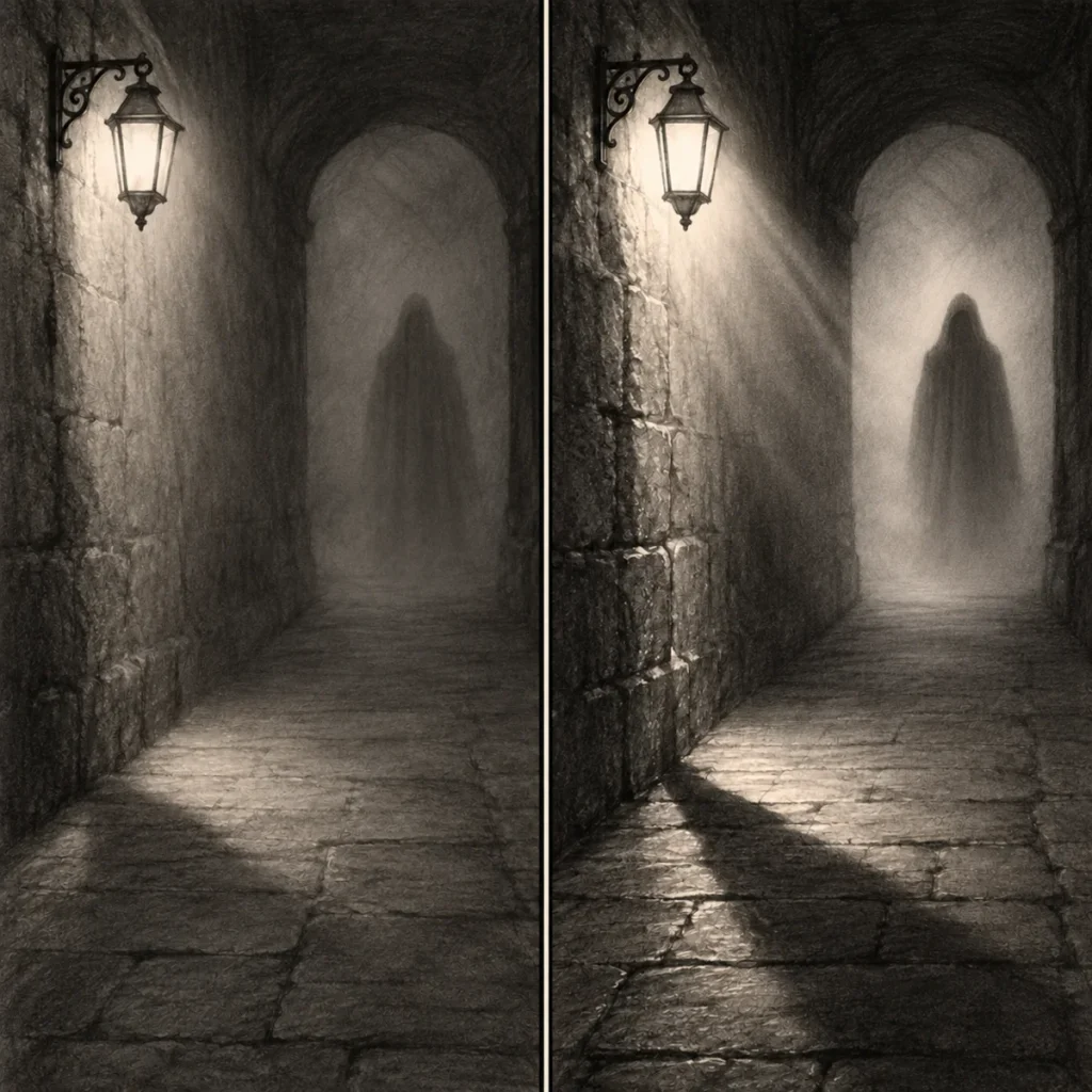
Not every horror drawing needs intense highlights and deep black shadows.
In fact, low-contrast lighting can be extremely effective for foggy landscapes, ghostly figures and quiet, unsettling environments.
The problem occurs when important shapes unintentionally blend together because there isn’t enough difference between their values. Objects may become difficult to distinguish, facial features can lose definition, and the scene may lack a convincing sense of depth.
Why It Happens
This often happens when most of the drawing is shaded using similar midtones.
You might be reluctant to darken shadows too much, particularly if you’ve spent time carefully developing the details. Alternatively, you may shade every area with similar pressure, leaving little variation between light-facing and shadowed surfaces.
The result can feel flat, even when the drawing contains plenty of detail.
How to Fix It
Begin by checking the overall value structure of your drawing.
Values describe how light or dark an area appears, regardless of its colour.
Try simplifying your artwork into three broad groups:
- Light values: Areas receiving stronger illumination.
- Midtones: Surfaces receiving moderate illumination or appearing between light and dark.
- Dark values: Areas receiving little illumination, including deeper shadows.
Before adding detailed shading, try making a small three-value sketch using only a light, medium and dark tone. This helps you establish the larger shapes and decide where the strongest contrasts should appear.
When working with graphite pencils, build your darker values gradually using light layers rather than pressing heavily straight away. If an area needs to become brighter, a kneaded eraser can help lift graphite gently, creating subtle highlights without completely removing the surrounding shading.
You can also try squinting at your drawing or stepping back from it. This makes it easier to judge the larger areas of light and shadow.
If your subject disappears into the background unintentionally, adjust the surrounding values to improve separation. You don’t always need brighter highlights. Sometimes darkening a nearby area or slightly lightening the subject is enough. The goal is purposeful contrast, not maximum contrast everywhere.
If your intention is to create a soft, misty scene, keep the overall contrast gentle while preserving enough tonal differences for important forms to remain readable.
Horror Art Example
Imagine a ghostly figure standing in a deserted corridor.
If the figure and surrounding walls share almost identical values, the subject may become difficult to recognise.
You could make the wall behind the figure slightly lighter, allowing its darker silhouette to stand out.
Alternatively, a small area of stronger illumination might reveal its face or hands.
These adjustments create a clearer focal point while preserving the overall darkness.
5. Ignoring Ambient and Reflected Light
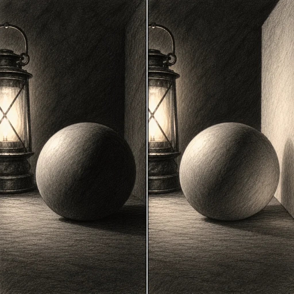
Another common mistake is assuming that any surface facing away from the main light source must be completely black.
In reality, light can scatter through an environment and reflect from nearby surfaces, providing additional illumination. It’s helpful to understand the difference between two important concepts.
Ambient light describes the general background illumination within a scene, while reflected light is illumination that has bounced off another surface. Reflected light can contribute to ambient illumination, but the terms aren’t interchangeable. Even a relatively dark room may contain subtle light reflected from its walls, floor or surrounding objects.
Ignoring these effects can make your shading appear overly harsh or disconnected from the environment.
Why It Happens
When learning to shade, it’s natural to focus on the main light source and the shadows it produces.
You might assume that once an object blocks the direct light, no illumination can reach the area behind it. However, surrounding surfaces can reflect some of the available light into those darker regions.
The amount depends on the materials, their colours, the environment and how much light is present. A pale wall may reflect considerably more light than a dark, non-reflective surface.
How to Fix It
After establishing your main highlights and shadows, look for areas that might receive ambient or reflected illumination.
Ask whether nearby walls, floors or objects could reflect light towards your subject. For example, a candle placed beside a pale stone wall may illuminate the wall, which then reflects some light back towards nearby objects.
This secondary illumination is generally weaker than the direct light from the candle. You can represent it with subtle changes in value within the darker areas. Be careful not to brighten every shadow equally. Deep recesses and areas with very little available light may remain extremely dark.
When working with graphite, build your shadow areas gradually so you can preserve a few slightly lighter tones where reflected light might appear. If you’ve already darkened an area too much, try gently lifting a little graphite with a kneaded eraser.
Your reflected light should support the three-dimensional form rather than remove the contrast you’ve established.
Horror Art Example
Imagine a skull resting beside a lantern in a stone crypt.
The lantern illuminates one side of the skull, while the opposite side receives little direct light.
However, the nearby stone walls may reflect a small amount of illumination back towards its shadowed surfaces.
Adding a faint reflected highlight can help preserve the skull’s rounded form without making the scene feel overly bright.
Subtle reflected light can make your shadows feel more believable while preserving the atmosphere.
6. Overcomplicating the Lighting
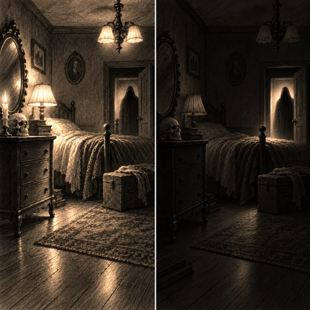
Sometimes a drawing becomes less effective because you’ve added too many highlights, shadows and lighting effects.
Each individual detail may look interesting, but together they can compete for attention. Instead of guiding the viewer towards your main subject, the lighting becomes visually confusing.
Why It Happens
It’s tempting to keep adding effects as a drawing develops.
A highlight might improve one feature, so you add another elsewhere. A shadow creates drama, so you deepen several more. Before long, the scene contains multiple bright areas and competing patches of darkness without a clear visual hierarchy.
This is especially easy to do in horror art, where dramatic contrast can feel like an essential ingredient.
How to Fix It
Start by identifying the most important part of your drawing. What should viewers notice first? It might be a character’s face, a figure in a doorway or an unusual object hidden within the scene.
Once you’ve established that focal point, consider how the lighting can support it. You can use stronger contrast around important areas while allowing less significant details to remain softer or darker. If the lighting feels overwhelming, try simplifying the scene into a few larger value shapes. A quick three-value sketch can help you identify which areas need emphasis before you commit to more detailed shading.
Remove unnecessary highlights and reduce competing areas of contrast. Every lighting effect should have a reason for being there.
Sometimes, leaving something hidden creates far more tension than revealing another carefully shaded detail.
Horror Art Example
Imagine drawing an abandoned bedroom with a mysterious figure standing beside the bed.
If every piece of furniture, wall decoration and object receives dramatic highlights, the figure may lose its importance.
Instead, you could use a narrow area of illumination to reveal part of the figure while keeping the surrounding furniture subdued.
The viewer’s attention moves towards the figure naturally.
And because so much of the room remains concealed, the environment feels more uncertain.
7. Using Colour Temperature Without Considering the Scene
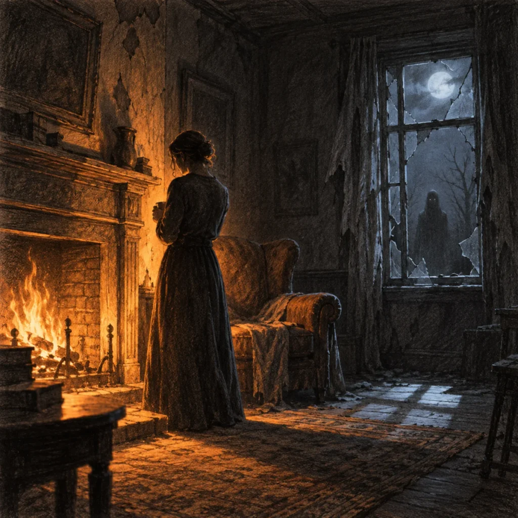
Colour can strongly influence the mood of a drawing, particularly when combining natural and artificial light sources. However, using warm and cool colours without considering where they come from can make the lighting feel inconsistent.
This is mainly relevant to coloured artwork, but understanding the principle can also help you plan lighting references for monochrome drawings.
Why It Happens
Warm colours such as orange and yellow are often associated with candlelight, fire and certain artificial lamps. Cooler colours such as blue are frequently used to suggest moonlit environments, cold interiors or eerie artificial lighting.
These associations are useful artistic choices, but they aren’t fixed rules. For example, moonlight isn’t inherently blue, even though it’s frequently represented that way in artwork and film.
A light’s apparent colour also depends on the source, surrounding surfaces and how the scene is represented.
How to Fix It
Before choosing your lighting colours, think about what is producing the illumination. A candle may create warm orange-yellow highlights, while a nearby window might introduce cooler-looking daylight in comparison.
Consider how those colours affect the surfaces they illuminate. You can also use contrasting warm and cool light to separate different areas of your composition. For example, a warm lamp might illuminate the foreground while a cooler light defines the background. However, don’t assume every horror scene needs contrasting colours.
A limited lighting palette can be just as effective, particularly when you’re trying to establish a consistent atmosphere.
If you’re drawing in graphite, focus on the differences in brightness and contrast between sources instead. You can create convincing lighting without relying on colour.
Horror Art Example
Imagine a deserted room illuminated by a flickering fireplace.
The warm firelight catches nearby furniture and part of a figure standing beside the hearth.
Through a broken window, cooler-looking light reveals the outline of a second figure outside.
The contrast helps separate the two subjects and creates different moods within the scene.
By making the firelight your main source of illumination, you can preserve a clear focal point while using the cooler background to introduce tension.
A Simple Lighting Check Before Finishing Your Drawing
Before you consider your artwork finished, take a few minutes to review the lighting. You don’t need to examine every tiny pencil mark. Start with the larger relationships between highlights, shadows and the surrounding environment.
1. Identify your light sources.
Can you explain where the main illumination comes from and which direction it travels?
2. Check your highlights.
Do the brighter surfaces face the appropriate light sources? Are there any highlights that don’t seem to belong?
3. Examine your shadows.
Are the form shadows and cast shadows consistent with the position of the light? Do their shapes make sense?
4. Review your contrast.
Does your main subject stand out clearly enough? Are the darker values helping establish depth rather than hiding important features unintentionally?
5. Consider the surrounding environment.
Could ambient or reflected light influence any of the darker areas?
6. Look at the overall composition.
Is the lighting guiding attention towards the most important part of the drawing, or are too many areas competing for attention?
If something feels wrong, return to the simplest version of your lighting setup.
Start with the main light source, correct the larger value shapes and rebuild the smaller details gradually. This is often far more effective than trying to correct every individual highlight or shadow separately.
Try This: A Simple Lighting Practice Exercise
One of the best ways to improve your understanding of lighting is to experiment with a real object. You don’t need anything complicated. A plain mug, small ornament or skull model will work perfectly.
Place your object on a table in a room where you can control the lighting.
Use a torch or desk lamp as your main light source.
Start with the light positioned slightly above and to one side of the object.
Observe where the highlights appear, which surfaces become darker and where the cast shadow falls.
Make a quick sketch using simple shapes and broad areas of shading.
Next, move the light source to the opposite side.
Keep the object in exactly the same position and create a second sketch.
Compare the two drawings.
Notice how the object’s shape remains unchanged, but the position of the highlights and shadows creates a different appearance.
You can repeat the exercise with the light above, below or behind the subject.
If possible, take reference photographs of each arrangement so you can study them again later.
Practising with simple objects helps you understand lighting without becoming distracted by complicated anatomy or intricate details.
Once you’re comfortable with the basics, try applying the same observations to a horror character or environment.
What You’ve Learned:
- Unclear light sources can produce inconsistent highlights and shadows. Establishing the main light’s position before shading helps keep your drawing believable.
- Multiple light sources can create overlapping illumination and additional shadows. Planning their positions and relative brightness helps maintain a clear focal point.
- Incorrect shadow placement can make objects appear disconnected from their lighting. Cast shadows should follow the light source’s position and the surfaces they fall across.
- Insufficient contrast can make important shapes difficult to distinguish. Clear relationships between light, midtone and dark values help establish form and depth without requiring extreme contrast.
- Ambient and reflected light can illuminate areas outside the main light source, revealing subtle details within shadows without removing their depth.
- Overcomplicated lighting can distract from your subject. Keeping highlights and shadows purposeful helps guide attention and strengthen the atmosphere.
- Colour temperature influences the appearance and mood of coloured artwork. Choosing lighting colours that suit your sources and environment creates more convincing results.
- Checking your lighting before finishing helps you recognise inconsistent highlights, misplaced shadows and areas where the overall value structure needs improvement.
- Practising with real objects helps you understand how light behaves, while simple three-value sketches make it easier to establish believable lighting before adding detail.
Continue Learning: How Different Light Sources Affect Horror Art
Correcting lighting mistakes becomes much easier when you understand how different light sources behave and why they create particular highlights and shadows.
In How Different Light Sources Affect Horror Art, you’ll explore direct, diffused, ambient, point and directional lighting, along with practical ways to use different lighting angles to create depth, contrast and unsettling atmospheres.
Continue reading: How Different Light Sources Affect Horror Art
