Best Sketchbooks and Paper Types for Horror Art (Complete Guide)
Because every haunted masterpiece needs the right grave to be buried.
Your horror art deserves a proper home. Think of paper as the stage where your monsters perform – and just like horror movies, the wrong set ruins the atmosphere. Printer paper? That’s like trying to summon a demon in a kiddie pool. The surface you choose shapes how your pencils behave, how your shadows creep, and whether your highlights glow like candle flames or fizzle out like a damp match.
So let’s creep through the crypt of sketchbooks and paper types, and find the perfect resting place for your next eerie masterpiece.
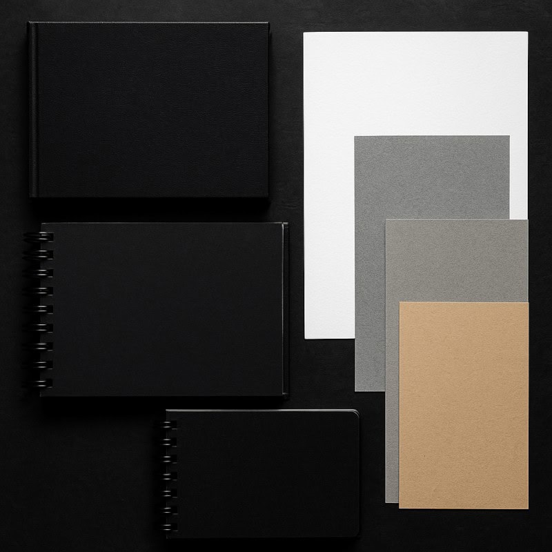
1. Sketchbooks
Every haunted masterpiece needs the right grave to be buried in – your sketchbook is where the monsters come out to play.
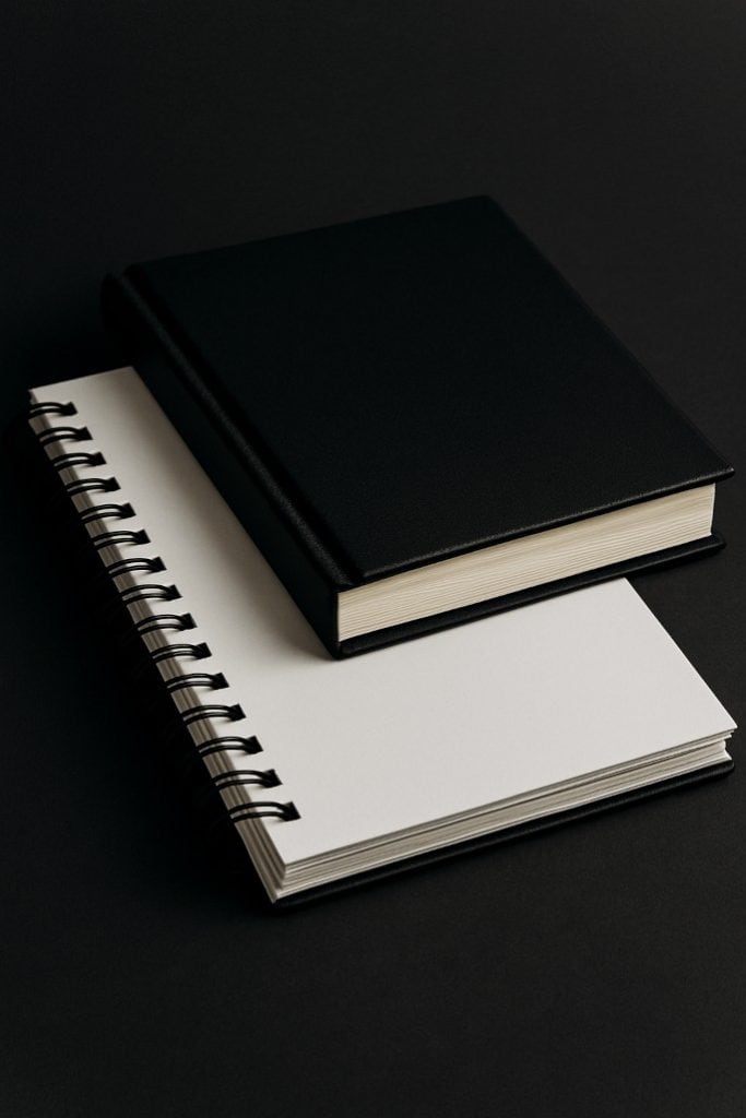
- Hardback vs. Spiral-Bound
- Hardback: Durable and portable, perfect for those who enjoy sketching on the go (graveyards, bus stops, suspiciously quiet basements).
- Spiral-Bound: Lies flat on your desk – perfect for sprawling creature concepts or double-page horror spreads. Downside? Pages can tear out more easily, like a victim in the first five minutes of a slasher film.
- Paper Weight (GSM explained)
- 70 – 100gsm: Thin, ghost-sheet paper. Works for quick sketches but buckles under heavy shading.
- 120 – 160gsm: The sweet spot. Strong enough for graphite layering, light ink, or coloured pencil accents without tearing.
- 180+: Heavy-duty paper. Handles mixed media, brutal blending, and even a splash of red paint (no questions asked).
- Sizes & Formats
- A5 or smaller: Handy for sketching creepy crawlies while you’re out and about.
- A4: Classic size – versatile and reliable, your go-to coffin.
- A3+: For the ambitious – big sheets for full graveyards, sprawling monsters, or wall-worthy nightmares.
2. Smooth vs. Textured Paper
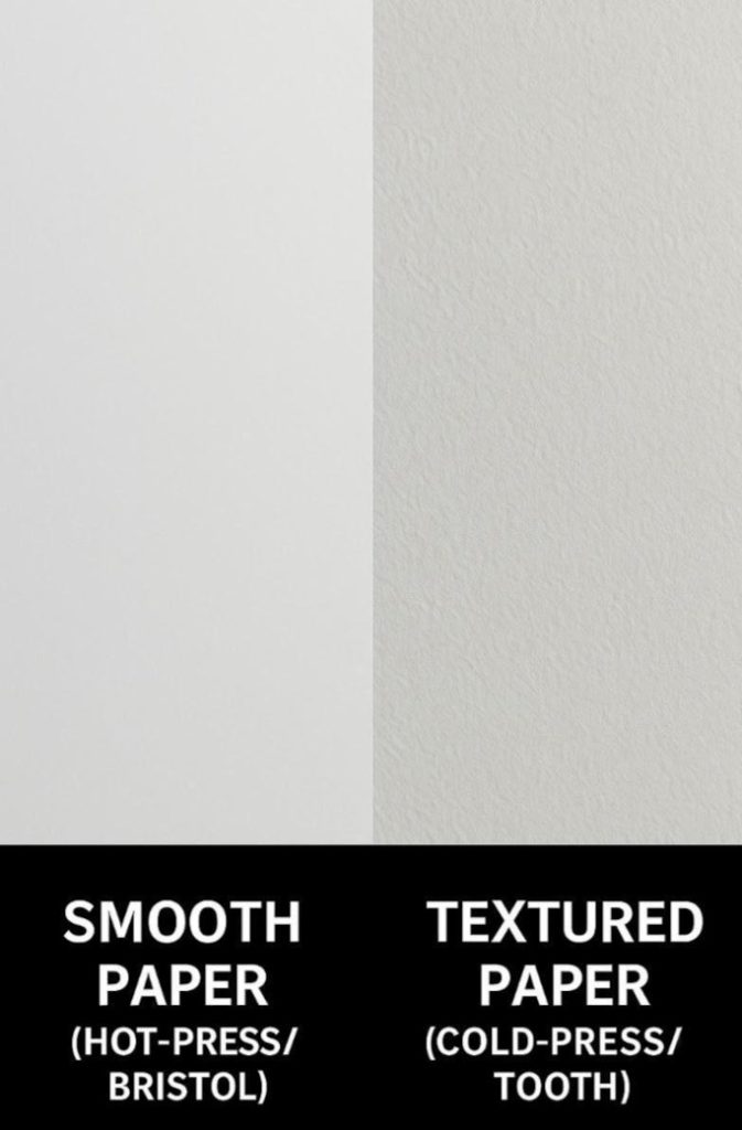
The texture of paper sets the mood: smooth for polished porcelain nightmares, textured for gritty, bone-crumbling horror.
- Smooth Paper (Hot-Press/Bristol)
- Ideal for clean details: doll faces, insect wings, sharp veins, and those uncanny glassy eyes.
- Blends like butter, making highlights glow.
- Downside: harder to build atmosphere – too polished for some gritty horror effects.
- Textured Paper (Cold-Press/Tooth)
- Adds grit and atmosphere. Perfect for foggy shadows, decayed walls, and crumbling bone.
- Graphite clings to the surface of the paper, creating depth and an unsettling, raw quality.
- Downside: eats through pencil points faster than a ghoul at an all-you-can-eat brain buffet.
3. Toned Paper (Grey & Tan)
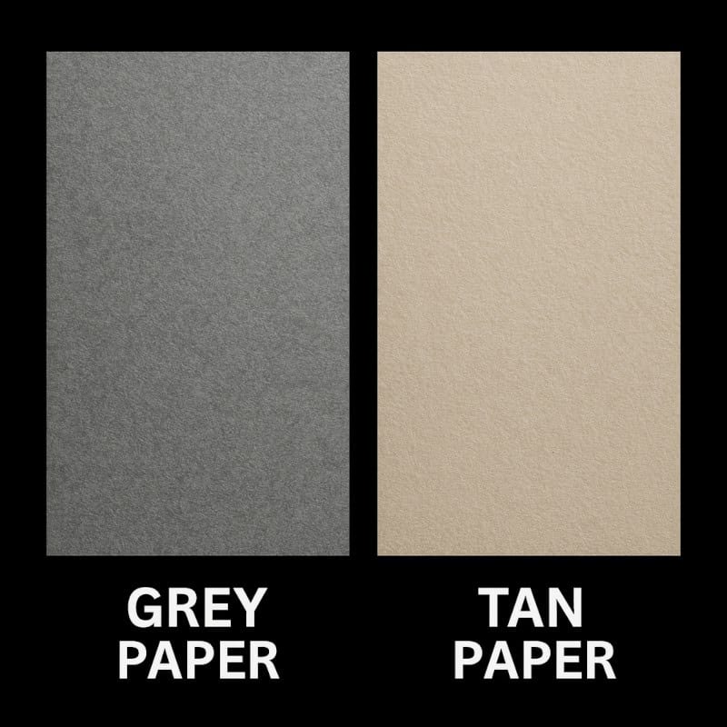
Toned paper is a shortcut to atmosphere – instantly eerie, like parchment pulled from a witch’s spellbook.
- Grey Paper: Perfect for crypts, mist, or industrial horror settings. Shadows sink deep, highlights blaze.
- Tan Paper: Feels like aged parchment – like your sketch slipped out of a witch’s spellbook. Great for folklore-style monsters or eerie historical designs.
Why it works: The midtone background allows you to add both darkness and light. Your shadows feel heavier, and your highlights practically levitate off the page.
4. Black Paper
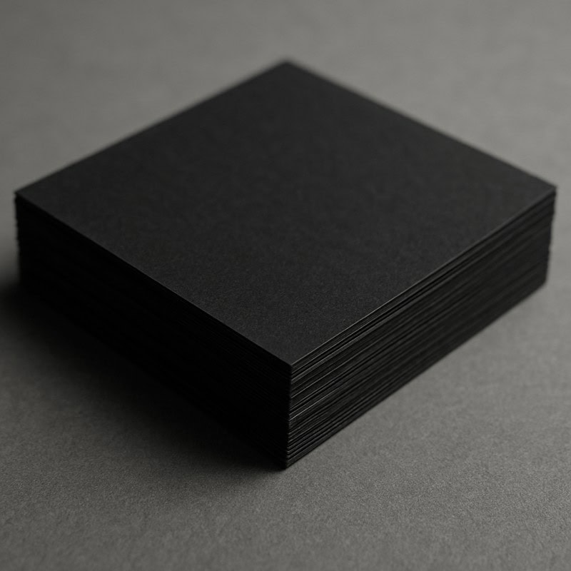
Want maximum contrast? Black paper is your dark altar, where glowing skulls and spectral eyes blaze against the void.
- White pencils, gel pens, and neon colours blaze against it like glowing eyes in a void.
- Fantastic for glowing skulls, shadow creatures, or ghostly apparitions half-seen in candlelight.
- Challenge: Hard to see your initial sketch.
Tip: Use a white or pale blue coloured pencil for your under-drawing so you don’t end up drawing like a blindfolded cultist.
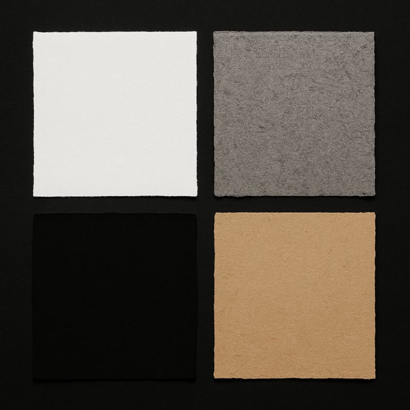
5. Paper Finish & Surface Colour
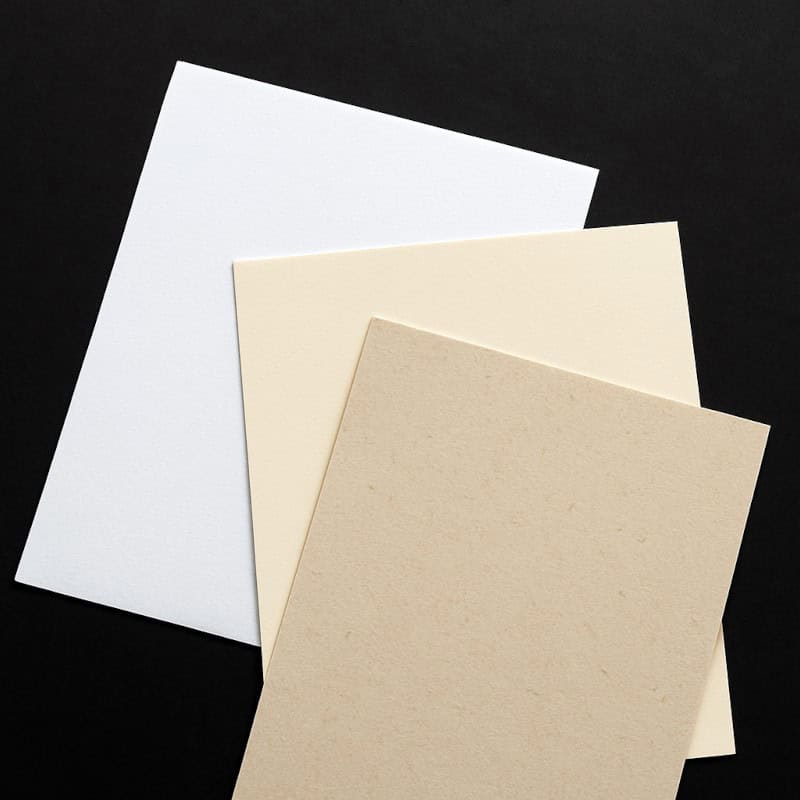
Not all “white” paper is created equal – subtle tones can twist the entire mood of your horror art.
- Bright White: Maximum contrast, crisp shadows, and sharp details. Great for sterile lab horrors or clinical monster dissections.
- Ivory/Cream: Softer, warmer look. Perfect for gothic, old-world illustrations that require an aged atmosphere.
- Natural or Recycled Tones: Slightly rougher feel, can add gritty texture even before your pencil touches it.
6. Speciality Papers
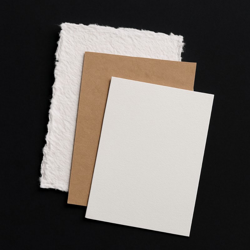
If you want to push your horror art further, speciality papers can add eerie texture and unsettling drama before your pencil even touches down.
- Handmade or Rough Paper: Fibrous, ragged, organic. Your drawing instantly looks like it was ripped from a cursed manuscript.
- Mixed Media Paper: For artists who blend graphite, ink, and charcoal powder. Holds up against layering without warping.
- Scrap & Novelty Papers: Kraft paper, envelopes, even old letters – they add a “found footage” vibe to your drawings, like artefacts from a forgotten ritual.
7. Archival Quality (Acid-Free Paper)
Do you want your horror art to age gracefully like an ancient relic, or crumble away faster than a vampire in sunlight? Acid-free paper won’t yellow, fade, or disintegrate over time, making it a must if you plan to keep your cursed creations long-term (or sell the originals). Without it, that beautiful vampire sketch might decay into something less Nosferatu and more… dust bunny.
Extra Tip: “Acid-free” doesn’t mean “indestructible.” Store your finished art away from direct sunlight and damp crypts if you want it to survive the centuries.
8. Paper for Specific Mediums in Horror Art
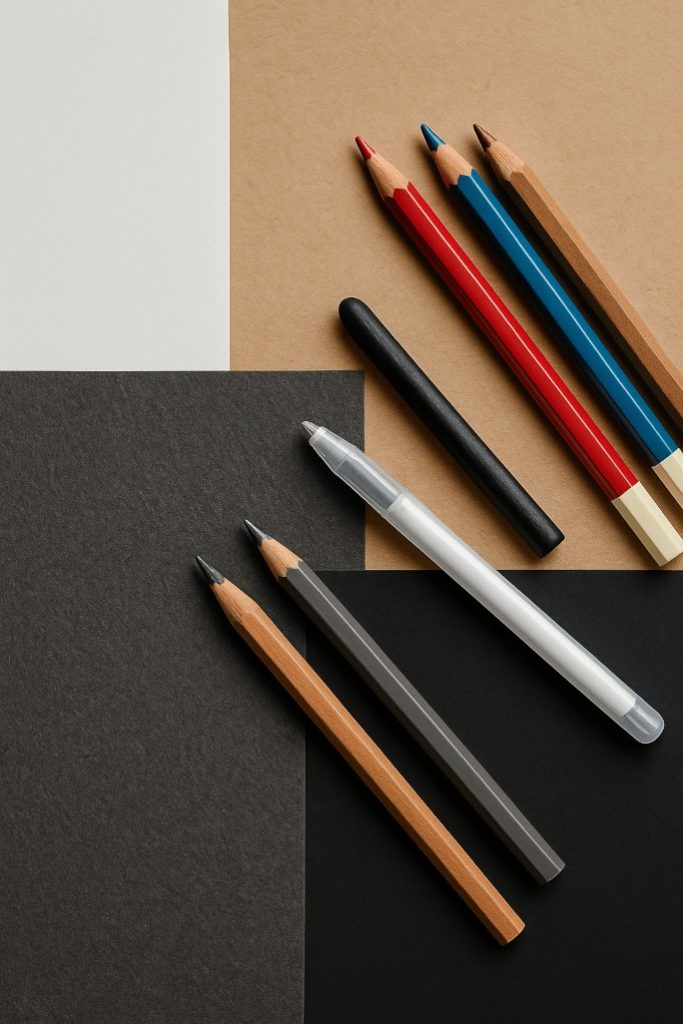
Different tools function like various types of monsters. The incorrect match can make your eerie masterpiece look more like a haunted smudge.
Here’s a breakdown of how paper choice affects the most common horror art tools:
- Graphite Pencils – smooth or light-tooth paper, 120-160gsm. Perfect for fine details, shading, and building those creeping shadows.
- Charcoal – Needs textured paper, 160gsm+. The rough “tooth” grabs the charcoal, keeping it from sliding off like ectoplasm.
- Coloured Pencils – Medium-tooth for layering colours. Too smooth and your pencils skid around, too rough and they chew down to stubs.
- White Gel Pens – Best on toned or black paper for dramatic highlights, glowing eyes, or ghostly runes.
- Coloured Gel Pens – Pop beautifully against black or toned paper, like neon graffiti on a crypt wall.
- Markers (Alcohol-Based) – Use bleed-proof marker paper (coated to stop ink soaking through) or heavier paper (160gsm+). Prevents smears and protects the next page from becoming collateral damage.
- Water-Based Markers – Heavier paper (160gsm+) or watercolour paper. These tend to warp thin paper like a haunted mirror.
- Ink Pens/Dip Pens – Smooth, heavy paper (160gsm+) for crisp lines.
- Watercolour Washes – Watercolour or mixed media paper (200gsm+). Absorbs watery layers without buckling into something resembling zombie skin.
- Pastels (Soft/Oil/Chalk) – Textured or pastel-specific paper. The tooth holds pigment in place so your eerie smudges don’t vanish into thin air.
- Acrylic Paint – Thick, gessoed or mixed-media paper.
- White Charcoal or Pastel Pencil – Works best on toned or black paper for spectral highlights.
- Ballpoint Pens – Smooth paper is best for scratchy horror sketches and quick scribbles that look like notes from a cursed diary.
Bonus Horror Tip: If you’re using a mix (graphite + charcoal + gel pen + washes), go with mixed-media sketchbooks (180gsm+), so your pages don’t bleed through like cursed parchment.
Extra Tip: Bleed-proof marker pads often feel thinner than regular sketchbook paper (around 70-80gsm). Don’t worry, it’s not cheap paper. The special coating keeps the ink sitting on the surface so it doesn’t soak through. That’s why they’re lightweight but still perfect for crisp, layered marker work.
9. Page Features in Sketchbooks
Even the undead appreciate good design – little extras like perforations or pockets can keep your art from an early burial.
- Perforated Pages: Easy to remove cleanly if you want to frame or sacrifice a page.
- Lay-Flat Binding: Perfect for sprawling monster spreads.
- Pockets & Elastic Bands: Handy for storing creepy references.
10. Budget vs Premium Sketchbooks
Not every survivor makes it out of a horror movie – some sketchbooks are expendable victims, while others deserve to be the star of the sequel.
- Budget Sketchbooks: Great for warm-ups, rough concepts, and disposable doodles. Think of them as your expendable extras.
- Premium Sketchbooks: Higher GSM, acid-free, better binding. These are the ones you keep safe and proudly show off.
11. Matching Paper to Horror Effects
Want the right creepy vibe? Match your paper to the effect, or risk summoning a cartoon ghost instead of a nightmare.
- Skin textures, veins, porcelain dolls – Smooth paper.
- Decay, grit, and atmosphere – Textured paper.
- Glowing lights, haunted figures – Black paper.
- Misty graveyards, parchment vibes – Toned paper.
- Experimental mixed horror media – Mixed media paper.
12. Common Paper Mistakes
The wrong paper choice can sabotage your drawing faster than a cursed ritual gone wrong – here are the classic traps to avoid.
- Using printer paper: Cheap, yes. But it buckles, tears, and smudges like a wet tissue.
- Ignoring GSM: Thin paper rips when blending or erasing aggressively.
- Wrong surface for the medium: Charcoal on smooth paper smears like a crime scene. Ink on textured paper goes jagged, unless you want your line art to look like a possessed chicken scratched it out.
13. Horror Art Practice Prompts
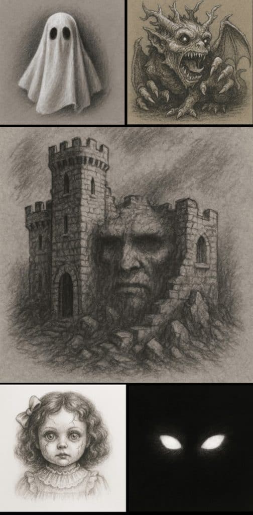
Now it’s your turn to unleash the horror. Grab a sketchbook, pick your paper type, and see what creeps out of the shadows.
- On toned paper: Draw a ghost using only black and white pencils.
- On black paper: Glowing eyes in darkness – no face, just the eyes.
- On smooth paper: A porcelain doll with cracked features.
- On textured paper: A crumbling castle wall with hidden faces.
- On mixed-media paper: Layer graphite, ink, and white gel pen into one monster.
Conclusion
The surface you choose is more than background; it’s part of your art’s soul (or its restless spirit). Smooth, textured, toned, or black, each paper type changes the atmosphere of your work. Don’t chain yourself to one grave; experiment, mix and match. And see which one makes your monsters come alive… or refuse to stay dead.
What You Learned:
- Different sketchbooks and paper types change the entire atmosphere of your horror art, from smooth porcelain nightmares to gritty bone-textured sketches.
- GSM matters – thin paper buckles or tears, while heavier paper supports deep shading, blending, and mixed media.
- Smooth paper is perfect for clean details, while textured paper grips graphite for raw, atmospheric effects.
- Toned and black papers instantly shift the mood, letting your highlights glow, and your shadows sink deeper.
- Each medium behaves differently depending on the surface – matching pencil, charcoal, ink, gel pen, or washes to the right paper gives you cleaner lines and stronger results.
- Choosing the right paper for the right horror effect ensures your drawings feel intentional, atmospheric, and visually powerful.
- Understanding common paper mistakes helps you avoid smudging disasters, buckling pages, and mismatched textures.
Explore More Horror Art Tools & Materials
Want to keep building your cursed toolkit? Check out these guides:
- Pencil Sharpeners
Keep your pencils deadly sharp (because nothing’s scarier than a blunt tip). - Liquid Chalk Markers
For foggy, ghostlike strokes and eerie runes that glow against the dark. - Specialised Markers
Add cursed glows, bloody splatters, and moody washes that pencils alone can’t conjure.