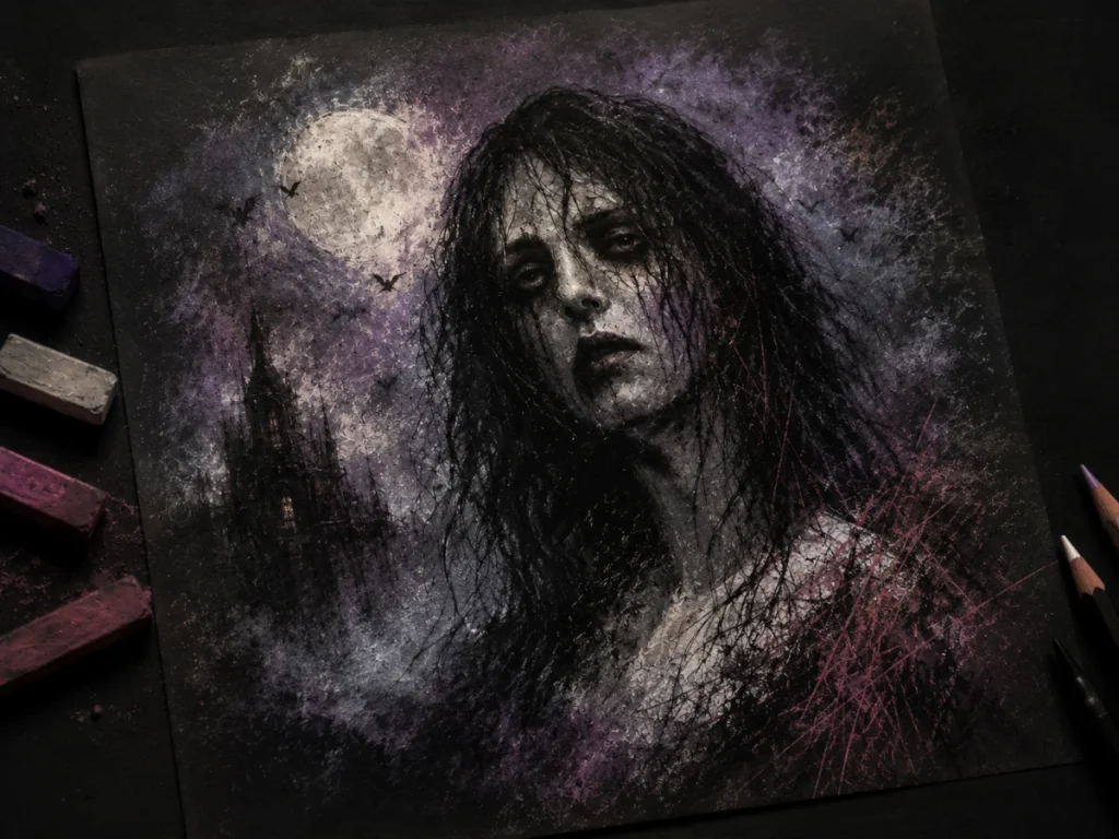
Pastels for Horror Art
Use pastels once, and your artwork starts developing its own ghost story.
Pastels might look soft and harmless at first glance, but don’t let them fool you – they’re incredible tools for creating eerie atmosphere in horror art. Whether you want drifting fog, ghostly glows, dusty abandoned textures, or soft shadows that feel slightly wrong, pastels create them with surprising ease.
Unlike pencils or paint, pastels behave in a much looser, more atmospheric way. They spread quickly, blend effortlessly, and can cover large areas with soft colour and texture in seconds. That makes them perfect for horror artwork where atmosphere and emotion matter just as much as detail.
They can feel messy and unpredictable at first, but once you understand how each type behaves, pastels become one of the most expressive tools in your horror art toolkit. Think of them as the medium that sets the mood before you’ve even drawn the monster.
What You’ll Learn:
In this guide, you’ll learn which pastels work best for horror art, how to use them for atmosphere and eerie effects, and how to avoid common beginner mistakes.
- The differences between soft pastels, hard pastels, oil pastels, pastel pencils, and pan pastels
- Which pastel types work best for different horror effects and textures
- How to use pastels for fog, lighting, glow effects, grime, and atmosphere
- The best paper types and surfaces for pastel artwork
- Recommended paper weights for layering and blending
- How to stop pastels from smudging using fixative
- Ways to combine pastels with graphite, ink, and coloured pencil
- Common pastel problems and how to fix them
- How to make pastel artwork look more dramatic, moody, and effective for horror art
What Are Pastels?
Pastels are basically pure pigment mixed with a binder to form a solid stick. That means you’re holding concentrated colour in your hand – no brushes, no water, no palette.
Unlike pencils, which build up slowly through fine lines, pastels spread colour instantly across the surface. A single stroke can create soft fog, dusty shadows, glowing light, or smoky texture in seconds. That’s one of the reasons they work so well for horror art and atmospheric scenes.
Pastels also blend incredibly easily. You can smudge them with your fingers, blending tools, tissues, or soft cloths to create smooth transitions and hazy effects that would take much longer with other mediums. The downside? They can also get messy very quickly if you’re not careful. Horror art loves chaos though, so honestly… that works out nicely.
For horror art, they’re especially useful for creating:
- smoky atmospheres
- ghostly light glows
- dusty textures on old objects
- dreamlike or nightmarish backgrounds
- fog, smoke, and drifting shadows
- soft lighting that feels eerie or unnatural
What they aren’t great for is sharp, tiny detail work – unless you’re using pastel pencils (we’ll get to those little heroes in a moment).
Types of Pastels & How They Fit into Horror Art
Each pastel type has its own personality, strengths, and “chaos level.”
Here’s the breakdown:
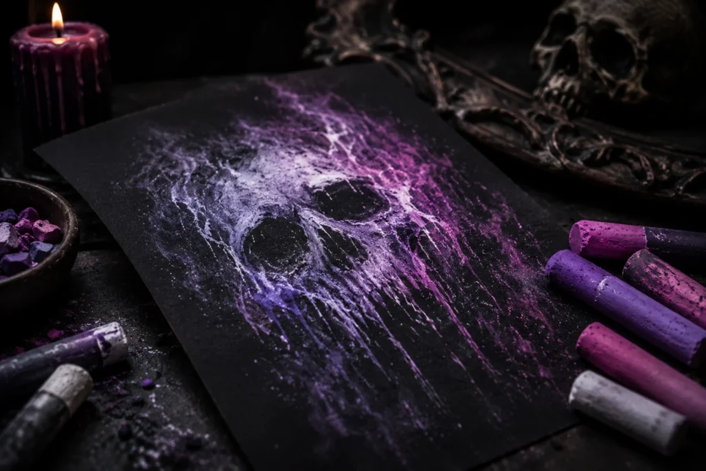
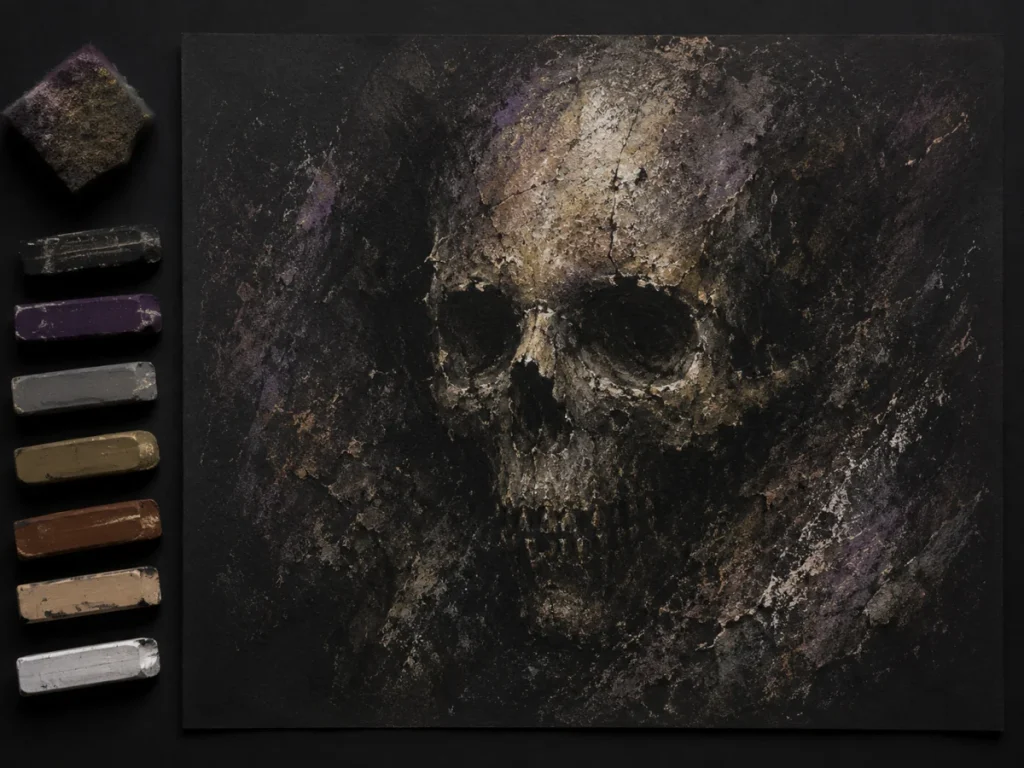
Soft Pastels – The Drama Queens
Soft pastels are made with a high concentration of pigment and only a small amount of binder. Translation: they’re intense, dusty, blendable, and absolutely gorgeous.
They’re the pastel equivalent of kicking open a haunted mansion door instead of politely knocking. The colour goes down fast, spreads easily, and creates atmosphere almost instantly. If your goal is eerie lighting, supernatural fog, glowing shadows, or backgrounds that feel like they’ve been cursed for several centuries, soft pastels are ridiculously effective.
Because they blend so easily, they’re one of the best tools for creating soft transitions and moody horror scenes. You can smudge colours together with your fingers, tissues, blending stumps, or soft cloths to build fog, smoke, mist, and ghostly lighting effects without harsh edges.
The downside is that soft pastels are also extremely messy. They shed pigment everywhere, smudge easily, and can turn your desk into what looks like the aftermath of a tiny colour explosion. They also struggle with very fine details unless combined with harder tools or pastel pencils.
Best Horror Uses:
- Thick cemetery fog
- Eerie, glowing light around supernatural objects
- Hazy dream/nightmare scenes
- General “this place feels haunted” atmospheres
Strengths:
- Vibrant, rich colour
- Effortless blending
- Brilliant for big atmospheric shapes
- Excellent for soft lighting and fog effects
Weaknesses:
- Dust explosions
- Tricky to get fine details
- Rubs off easily unless you seal it
- Can become muddy if over-blended
Hard Pastels – The Calm, Structured Ones
Hard pastels contain more binder than soft pastels, which makes them firmer, cleaner, and much easier to control. They don’t explode into colourful dust clouds every time you touch them, which immediately makes them less chaotic to work with.
Because they hold their shape better, hard pastels are great for sharper lines, sketching foundations, and adding structure before layering softer pastel effects over the top. Think of them as the artist in the horror movie who actually brought a flashlight and made a plan.
While soft pastels dominate when it comes to giant foggy atmosphere and dramatic blending, hard pastels are better for controlled textures and defined forms. They’re especially useful for haunted buildings, dead tree branches, cracked walls, silhouettes, and shadow shapes where you still want softness, but not total visual mayhem.
They also work really well as an underlayer. Many artists sketch out shapes and values with hard pastels first, then add soft pastels on top for glowing fog, mist, and atmospheric lighting.
The trade-off is that hard pastels usually aren’t as vibrant or buttery smooth as soft pastels. Blending takes more effort, and they won’t create those massive dreamy fog effects quite as effortlessly. Still, for horror art that needs both atmosphere and structure, they’re incredibly useful.
Best Horror Uses:
- Cracks in floors and walls
- Tree branches, silhouettes, sharp shadows
- Structural elements in haunted architecture
- Underlayers before adding softer pastels
Strengths:
- Better control of detail
- Less dust
- Good for sketching foundations
- Easier to handle for beginners
Weaknesses:
- Not as vibrant as soft pastels
- Blending is possible, but it takes more effort
- Less effective for huge atmospheric fog effects
- Can feel slightly scratchier on textured paper
Oil Pastels – The Greasy Goblins
Oil pastels are pigments mixed with wax and oil, which means they produce no dust and have a completely different feel from traditional soft or hard pastels.
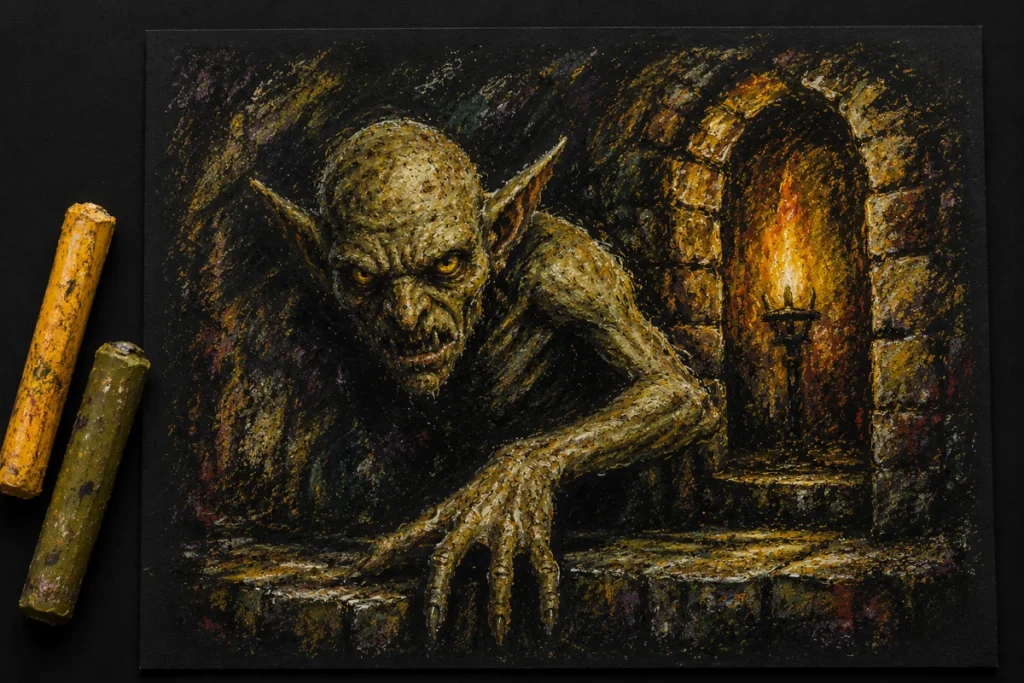
Instead of dry, powdery blending, oil pastels are thick, creamy, and almost paint-like. They glide across the page with a waxy texture that makes them brilliant for rough textures, expressive marks, and heavy, moody colour. If soft pastels are ghostly fog, oil pastels are the damp stain spreading across the haunted wallpaper.
Because they stay workable for a long time, you can smear, scrape, layer, and blend them directly on the page to create grimy surfaces, bruised skin tones, unsettling lighting, and chaotic painterly effects. They’re especially useful for horror art that needs texture and intensity rather than clean precision.
Oil pastels also tend to feel more immediate and aggressive to work with. You can throw colour down quickly, carve into layers, and build thick atmospheric backgrounds fast without dealing with pastel dust floating around your room like cursed glitter.
The downside is that they never fully dry and can stay smudgy for a very long time. Fine details are harder to control, layering can become muddy if overworked, and some cheaper oil pastels can feel extremely waxy rather than smooth.
Still, if you want horror art that feels raw, messy, grimy, and emotionally unwell in the best possible way, oil pastels are fantastic.
Best Horror Uses:
- Gritty, grimy walls
- Textured skin (zombies, stitched dolls, bruises)
- Smeared, painterly backgrounds
- Thick, moody colour fields behind characters
Strengths:
- Bold colour
- Great for expressive strokes
- No dust trying to enter your lungs uninvited
- Excellent texture potential
Weaknesses:
- Hard to get sharp detail
- Never fully “dries”
- Can become messy fast
- Colours can turn muddy if overworked
Pastel Pencils – The Detail Demons
These are pastels in pencil form; the same pigment, but easier to control.
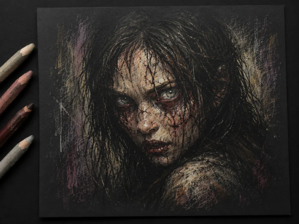
Pastel pencils combine the soft, atmospheric qualities of pastel with the precision of a drawing pencil, making them perfect for horror artists who want detail without completely losing that dusty, eerie texture.
They’re especially useful when your artwork needs sharp little touches that soft pastels struggle with. Think cracked teeth, bloodshot eyes, tangled hair, tiny scratches, splintered wood, or thin highlights catching on wet skin. Basically, all the unsettling little details that make viewers lean closer and immediately regret it.
Many artists use pastel pencils alongside soft pastels rather than instead of them. Soft pastels handle the large foggy atmosphere, while pastel pencils come in afterwards to sharpen edges, define textures, and add finishing touches that stop everything from looking too blurry.
Because they feel more familiar to pencil artists, they’re also a great transition tool if regular pastels seem intimidating at first. You still get the rich colour and blendability of pastel, but with more control and fewer accidental “I sneezed, and now the ghost has exploded” moments.
They do still create dust, and the leads can snap easily if sharpened too aggressively. They’re also slower for covering large areas, so they work best as a detail tool rather than your main weapon of artistic destruction.
Best Horror Uses:
- Eyes, teeth, cracks, and tiny details
- Hair on creatures
- Fine scratches on doors or windows
- Small highlights and finishing touches
Strengths:
- Precise lines
- Great for layering on top of soft pastel
- More familiar to artists used to pencils
- Excellent for texture and detail work
Weaknesses:
- Fragile leads
- Still dusty when sharpened
- Slower for covering large areas
- Can feel scratchy on rough paper
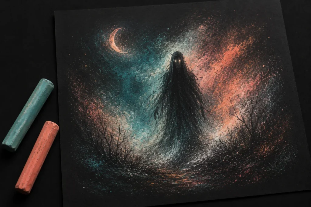
Pan Pastels – The Smooth Operators
Pan pastels come in pans and are applied with sponges or soft tools.
Instead of scratching colour onto the paper like a pencil or stick pastel, pan pastels let you float pigment across the surface in soft layers. They feel almost like a mix between pastel and airbrushing, which makes them incredible for building eerie atmosphere without harsh edges.
For horror art, they’re brilliant at creating fog, smoke, dim lighting, creepy shadows, and smooth glowing effects around characters or supernatural objects. If soft pastels are chaotic ghosts throwing pigment everywhere, pan pastels are the calm spirit quietly haunting the entire room.
They’re especially useful for backgrounds and subtle lighting transitions because they blend so smoothly. You can build gradual darkness around a creature, create moonlit skies, or add soft halos around glowing eyes without obvious streaks or scratch marks.
Because they create less dust than traditional soft pastels, they also feel a bit cleaner and easier to control. The trade-off is that they’re not ideal for tiny details or sharp line work on their own, so most artists pair them with pastel pencils or hard pastels for finishing touches.
Best Horror Uses:
- Smooth gradients in night skies
- Atmospheric shading around characters
- Soft light halos
- Gentle tonal transitions
Strengths:
- Low dust
- Incredibly smooth blending
- Excellent for backgrounds
- Fast atmospheric coverage
Weaknesses:
- Not suitable alone for line work
- Tools need cleaning to avoid colour transfer
- Less useful for tiny details
- Easy to overblend if you’re not careful
Paper & Surfaces for Pastels
Pastels require texture (tooth) so the pigment actually has something to grip onto. If the surface is too smooth, the pastel will slide around as if it’s trying to escape the artwork entirely.
Unlike graphite or markers, pastels sit on top of the surface rather than sinking deeply into it. That means the paper itself becomes part of the drawing experience. The more texture your surface has, the more layers, blending effects, and atmospheric depth you can build before the paper gives up and starts silently judging you.
For horror art, textured surfaces are especially useful because they naturally create rough, dusty, organic-looking marks. That gritty texture works beautifully for fog, cracked walls, rotten skin, old wood, smoke, and shadow-heavy environments.
Best Surfaces:
- textured drawing paper
- dedicated pastel paper
- sanded pastel boards
- toned papers (dark greys, browns, greens, purples – perfect for horror)
Recommended GSM (paper weight):
To keep your pastel layers stable and prevent buckling, aim for:
- 180 – 250 gsm → The sweet spot for most pastel artwork.
- 160 gsm → Bare minimum; okay for light practice.
- 300 gsm+ → Great for heavy layering, mixed media, and more intense horror pieces (strong, durable, and built for chaos).
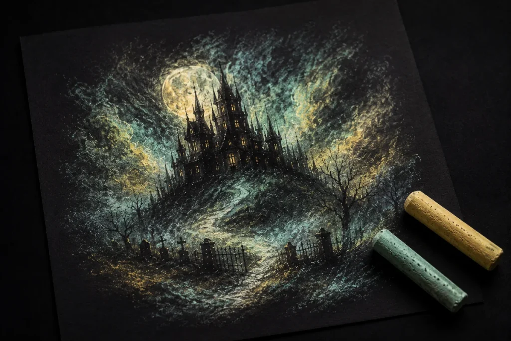
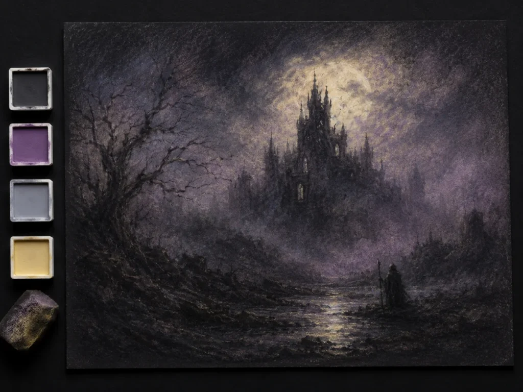
Why Toned and Dark Paper Works so Well
It instantly adds atmosphere before you even start drawing. Highlights, glows, and ghostly effects pop dramatically against darker backgrounds, making your horror art feel more alive (or undead).
Dark paper also helps unify the mood of a piece straight away. Instead of fighting against a bright white background, you’re already working inside shadow, which makes it much easier to create creepy lighting and cinematic contrast.
White pastel and pale colours become especially powerful on toned surfaces. A single soft highlight can suddenly look like moonlight, mist, glowing eyes, or a spirit appearing from darkness. Tiny marks feel brighter, moodier, and far more dramatic.
And honestly, horror art just looks happier on dark paper, in a deeply concerning way.
Fixative – The Necessary Evil
Fixative is a spray used to stop pastels from rubbing off. It doesn’t make them indestructible, but it helps them stay where they’re supposed to.
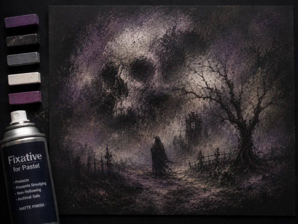
Because pastel sits loosely on the surface of the paper, it can smudge incredibly easily. One accidental sleeve swipe across your drawing and suddenly your carefully crafted haunted fog becomes an abstract weather event.
Fixative adds a protective layer over the pigment to reduce smudging and help preserve your artwork over time. It’s especially useful if you plan to store, frame, transport, or layer on top of your pastel work.
That said, fixative is a bit controversial among pastel artists because it can slightly change colours and reduce some of the soft, velvety look that makes pastels so beautiful in the first place. Think of it less like magical armour and more like controlled damage prevention.
Key Things to Know:
- apply in light layers, not heavy blasts
- spray from a distance
- colours may darken slightly
- always test on scrap paper first
Work in a Ventilated Area
Most fixatives produce strong fumes, so it’s best to spray outdoors or near an open window. Your artwork should survive the horror experience – your lungs should too.
When Should You Use Fixative?
Fixative is most helpful when:
- transporting artwork
- storing finished pastel pieces
- layering heavily with soft pastels
- working on detailed areas you don’t want to accidentally smear
- creating artwork with lots of atmospheric blending, soft transitions and loose pigment
Some artists use workable fixative between layers to build up more pastel on textured paper. Others only spray the final piece once it’s finished. There’s no single “correct” approach – a lot comes down to personal preference and experimentation.
Fixative works like a hostage negotiator: “Everybody stay exactly where you are, nobody move, and nobody gets smudged.”
Mixed Media: Pastels with Other Horror Tools
Pastels work surprisingly well alongside other art materials, especially in horror art where atmosphere and texture matter just as much as detail.
One of the biggest strengths of pastels is that they can soften, darken, glow, blur, or dirty up areas that might otherwise feel too clean or flat on their own. Mixing them with sharper tools gives you the best of both worlds: strong detail and creepy atmosphere.
Think of pastels as the fog machine of your art supplies. They set the mood while the other tools handle the sharp stabbier bits.
Pastels + Graphite
Graphite and pastels balance each other really well because graphite handles sharp detail while pastels create atmosphere, mood, and soft transitions.
- Use graphite for details
- Add soft pastel for atmospheric backgrounds
- Perfect for horror portraits and moody scenes
Graphite is especially useful for facial features, wrinkles, cracks, hair strands, and small textures. Then soft pastel can be layered around those details to create smoke, mist, shadows, glowing light, or eerie backgrounds.
This combination works brilliantly for ghost portraits, abandoned buildings, dark forests, and cinematic horror scenes where you want realism mixed with mood.
Pastels + Ink
Ink creates strong dark shapes and sharp contrast, while pastels soften everything around them.
- Ink gives crisp silhouettes
- Pastel adds glow, fog, atmospheric haze or stormy skies
- Great for dramatic lighting effects
This combo is excellent for horror illustrations with heavy shadows or supernatural lighting. For example, you could ink a haunted house silhouette first, then use soft pastel to build glowing moonlight or rolling fog behind it.
The contrast between sharp ink and soft pastel haze can look incredibly dramatic.
Pastels + Coloured Pencil
Coloured pencils are fantastic for refining pastel artwork because they give you much more control over smaller areas.
- Use pastel for soft areas
- Coloured pencil adds the sharp finishing details and textures
- Great for skin textures, eyes, and fine details
A common approach is to block in large soft colours with pastel first, then use coloured pencil over the top for scratches, veins, wrinkles, stitches, teeth, or tiny highlights.
This works especially well in horror character art where you want both soft atmosphere and disturbing little details hiding inside it.
Layering Tips
When mixing media with pastels, it usually works best to:
- apply cleaner, sharper materials first
- add soft pastel afterwards for atmosphere
- use pastel pencils at the end for details
- avoid over-layering or the paper can become clogged
Pastels can fill the tooth of the paper fairly quickly, especially soft pastels, so working in lighter layers gives you more control.
Some combinations take a little experimentation, but that’s part of the fun. Horror art usually benefits from a little controlled chaos anyway.
Common Pastel Problems (And Easy Fixes)
Pastels can create gorgeous horror artwork, but they also come with a few frustrations – especially when you’re first learning. The good news is that most problems are surprisingly easy to fix once you know what’s causing them.
1. “Everything Looks Muddy.”
This usually happens when too many colours get blended together or when the pastel is overworked.
- You’re over-blending
- Use fewer colours at once
- Let some strokes stay visible
Pastels often look better when they retain a little texture and roughness. Horror art especially benefits from uneven marks, scratchy textures, and visible strokes because they add atmosphere and character.
Trying to blend everything perfectly smooth can accidentally kill the mood.
2. “Where Did My Details Go?”
Soft pastels can easily swallow tiny details if they’re applied too heavily or too early.
- Add details last
- Use hard pastels or pastel pencils for edges
A good approach is to build your soft foggy areas first, then return at the end with sharper tools to add eyes, cracks, wrinkles, stitches, branches, or other fine horror details.
Think of details as the final creepy whisper, not the opening scream.
3. “It Keeps Wiping Off.”
Pastels naturally sit loosely on the paper surface, particularly soft pastels.
- The surface may not have enough tooth
- Apply in thin layers
- Add light fixative between stages
Trying to force thick pastel onto smooth paper usually ends with pigment dust everywhere except where you actually wanted it.
Using textured paper and building layers gradually gives the pastel more grip and control.
4. “My Piece Looks Flat.”
This is usually a contrast problem rather than a colour problem.
- Increase contrast
- Push your shadows and highlights further apart
Horror art thrives on dramatic lighting. If your shadows are too light or your highlights are too timid, the artwork can lose depth and atmosphere.
Don’t be afraid to make your darks really dark and your highlights noticeably brighter. Pastels are excellent for rich shadows and glowing highlights when you fully commit to the values.
5. “My Colours Keep Turning Grey.”
This often happens when complementary colours are blended too aggressively together.
- Avoid blending every colour into every other colour
- Layer colours gently instead of aggressively blending everything together
- Clean your fingers or blending tools regularly
Dirty blending tools can spread pigment everywhere and accidentally dull your colours. Sometimes your finger becomes an unintentional agent of chaos.
6. “The Paper Stopped Accepting Pastel.”
This means the paper tooth is getting clogged with pigment.
- Use lighter layers earlier on
- Add a workable fixative if needed
- Save the strongest highlights for the end
Once the paper tooth fills up with pigment, adding more pastel becomes much harder. Working gradually helps preserve the surface longer.
Conclusion – Are Pastels Worth Using in Horror Art?
Absolutely.
Pastels bring atmosphere, mood, and drama faster than almost any other medium. They’re fantastic for fog, haunting backgrounds, glowing effects, and the unsettling softness often seen in dreamlike or nightmare-inspired horror scenes.
They do require a bit of patience – the dust, the blending, the occasional sneeze that sends everything into orbit – but the results are incredibly rewarding. You get rich colour intensity, expressive textures, soft gradients, and eerie haze effects that work beautifully in horror artwork.
Different types of pastels bring their own strengths to horror artwork:
- Soft pastels are incredible for fog, smoke, glowing light, and atmospheric backgrounds.
- Hard pastels offer more control for edges and layered details.
- Pastel pencils are perfect for sharp creepy details like eyes, cracks, wrinkles, stitches, and fine textures.
- Pan pastels create smooth cinematic shading and soft lighting effects.
Whether you stick with pastel pencils for precise creepy details or dive headfirst into soft pastel chaos, pastels can add a whole new dimension to your horror art toolbox.
Sometimes the messiest art supplies create the most haunting results.
What You Learned:
- Soft pastels create rich atmospheric shading, foggy backgrounds, and dramatic horror lighting thanks to their high pigment and blendability.
- Hard pastels offer more control and sharper edges, making them useful for structured shapes, rough textures, and layered details.
- Oil pastels use wax and oil instead of dry pigment, creating bold painterly effects without clouds of pastel dust invading your lungs like an ancient curse.
- Pastel pencils combine the softness of pastel with the precision of a pencil, making them ideal for eyes, teeth, cracks, hair, and other fine horror details.
- Pan pastels behave almost like soft paint or airbrushed pigment, allowing you to build incredibly smooth gradients, glowing skies, mist, and subtle atmospheric shading.
- Pastels work best on textured paper because the surface tooth grips the pigment and helps layers build properly.
- Toned and dark paper instantly add mood and make highlights, glowing effects, and ghostly lighting stand out more dramatically.
- Heavier paper weights (GSM) help prevent buckling and hold multiple pastel layers more effectively during blending and reworking.
- Fixative spray helps reduce smudging and pigment loss, although it should always be applied lightly to avoid darkening colours too much.
- Combining pastels with graphite, ink, and coloured pencil allows you to mix soft atmosphere with sharp detail and stronger contrast.
- Layering carefully, avoiding over-blending, and controlling contrast help prevent muddy colours and flat-looking artwork.
- Pastels are one of the strongest traditional tools for creating mood, texture, lighting, and atmosphere in horror art.
Explore More Horror Art Tools
If you enjoyed learning about pastels and want to build up the rest of your horror art toolkit, you might like these other guides:
- Best Sketchbooks and Paper Types for Horror Art (Complete Guide)
Your masterpiece needs a proper home. This guide helps you choose the right sketchbooks, textured paper, toned paper, and surfaces for atmospheric shading and sharp horror details. - Liquid Chalk Markers for Horror Art
Perfect for bold chalky strokes, foggy effects, creepy handwritten symbols, and grimy textures. If you want artwork that looks like it crawled straight off a cursed blackboard, this guide is for you. - Pencil Sharpeners for Horror Artists
A dull pencil is scarier than any monster – just not in a fun way. Learn the pros and cons of manual sharpeners, electric sharpeners, and craft knife sharpening so your tools stay razor-ready for every sketch.