How to Combine Graphite, Carbon and Charcoal in Drawing
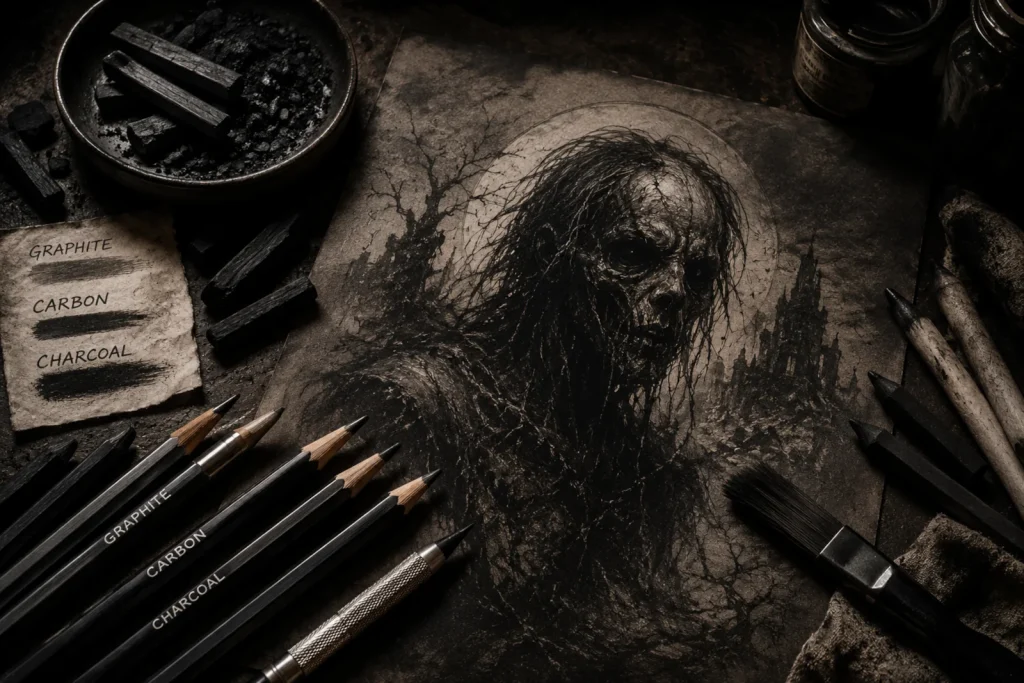
When graphite, carbon, and charcoal team up, your artwork stops behaving and starts growling.
Graphite, carbon, and charcoal might sound like they should play nicely together… but in reality, they’re more like a chaotic trio in a horror movie. One’s polite, one’s brooding and dramatic, and one just shows up to cause absolute carnage. (Seriously, if graphite were a dinner guest, it would politely stack the plates. Charcoal? It would set the table on fire and call it “art.”)
But when you learn how to combine them properly, you get the best of all worlds: smooth detail, rich mid-tones, and deep, jet-black shadows that feel like they’re creeping off the page. Perfect for horror art, and for pushing your drawings beyond the safe sketch stage and into something far more striking.
If you’re still learning the basics of shading and how light and shadow work, it’s worth getting comfortable with them first. I break this down in my Introduction to Light and Shadow Effects in Horror Art guide.
What You’ll Learn:
By the end of this guide, you’ll know how to combine graphite, carbon, and charcoal to create deeper, darker, and more atmospheric drawings.
- How each material behaves and what it’s best used for in your drawings
- How to layer graphite → carbon → charcoal for better depth and control
- How to build shadows gradually without losing your highlights
- How to blend effectively while keeping textures sharp and intentional
- How paper choice affects your results and when to use different surfaces
- How to use these materials together to create richer contrast and mood in horror art
The Materials in Depth
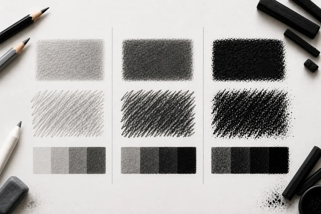
Each of these materials behaves very differently, and knowing what they’re best at is the key to using them together without fighting your drawing.
Graphite:
- Smooth, silvery, and highly blendable.
- Excellent for fine details, underdrawings, and smooth gradients.
- Downside:
It can become shiny in heavy layers, which flattens dark areas.
Carbon:
- Darker than graphite, with less shine and a sharper finish.
- Feels similar to graphite, making it an easy transition before charcoal.
- Great for deep shadows and crisp details without reflective glare.
- Works beautifully for eerie features like hollow eyes, tangled hair, and shadowed fabric folds.
Charcoal:
- Creates the deepest, richest blacks of the three.
- Perfect for bold backgrounds, dramatic lighting, and expressive textures.
- Downside: Messy, smudgy, and harder to control.
Why Combine Them?
On their own, each medium has limitations. Together, they cover each other’s weaknesses and create an unholy alliance of texture, tone, and depth.
- Contrast & Depth:
Graphite struggles to reach true black. Charcoal delivers, but it’s hard to control. Carbon bridges the gap, giving you darkness without chaos.
- Texture Variety:
Graphite is smooth, carbon is matte and sharp, charcoal is rough and expressive. Mix them, and you can make surfaces look alive (or undead).
- Shadows & Highlights:
Graphite for smooth skin tones, carbon for solid shadows, charcoal for deep, murky blacks. White charcoal can even add eerie, ghostly highlights.
How To Combine Them (Step-By-Step Guide)
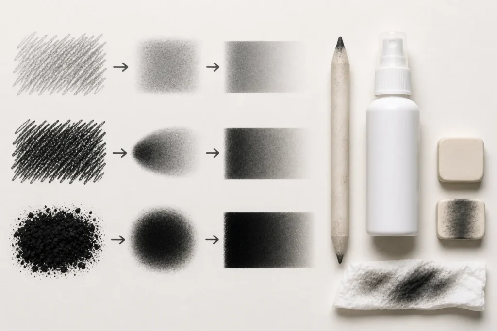
Materials Needed:
- HB pencil – for the light graphite base.
- Carbon pencil – for stronger mid-to-dark tones.
- Charcoal pencil or stick – for the deepest shadows.
- Blending stump or tissue – to smooth transitions.
- Eraser (kneaded or standard) – to lift highlights and tidy edges.
- Paper (medium texture, at least 120gsm) – for better layering.
Optional: Nerves of steel – for when charcoal inevitably smudges where you don’t want it.
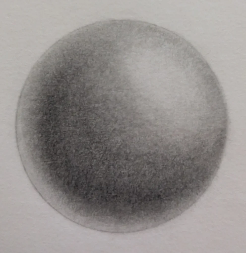
1. Lay Down the Graphite Base
- Lightly shade the sphere using an HB pencil.
- Keep your strokes even and smooth, leaving a clear, bright spot for the highlight.
- This builds your mid-tone base and establishes the overall form.
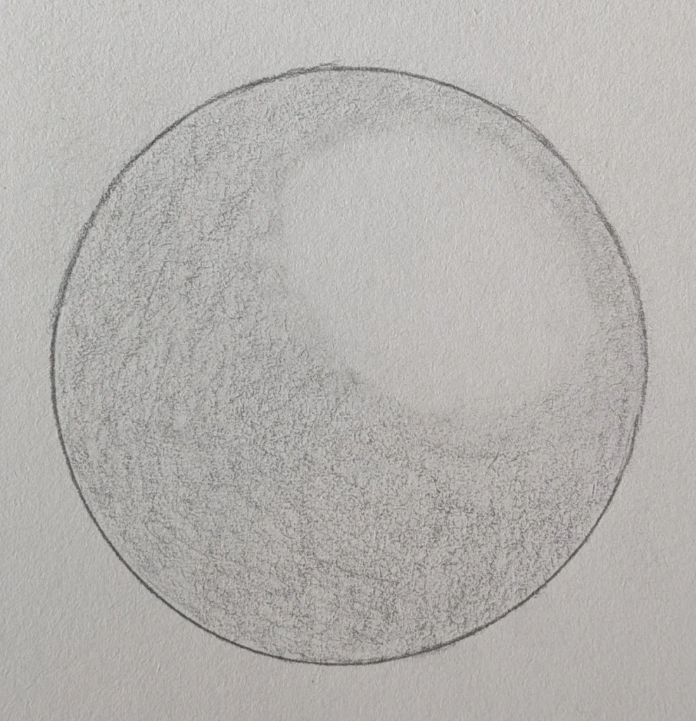
2. Add Carbon for Depth
- Use a carbon pencil to darken the shadow side of the sphere.
- Build up gradually, layering strokes instead of pressing hard.
- Keep the highlight area clean and untouched.
- Think of this as “sculpting” the roundness of the sphere.
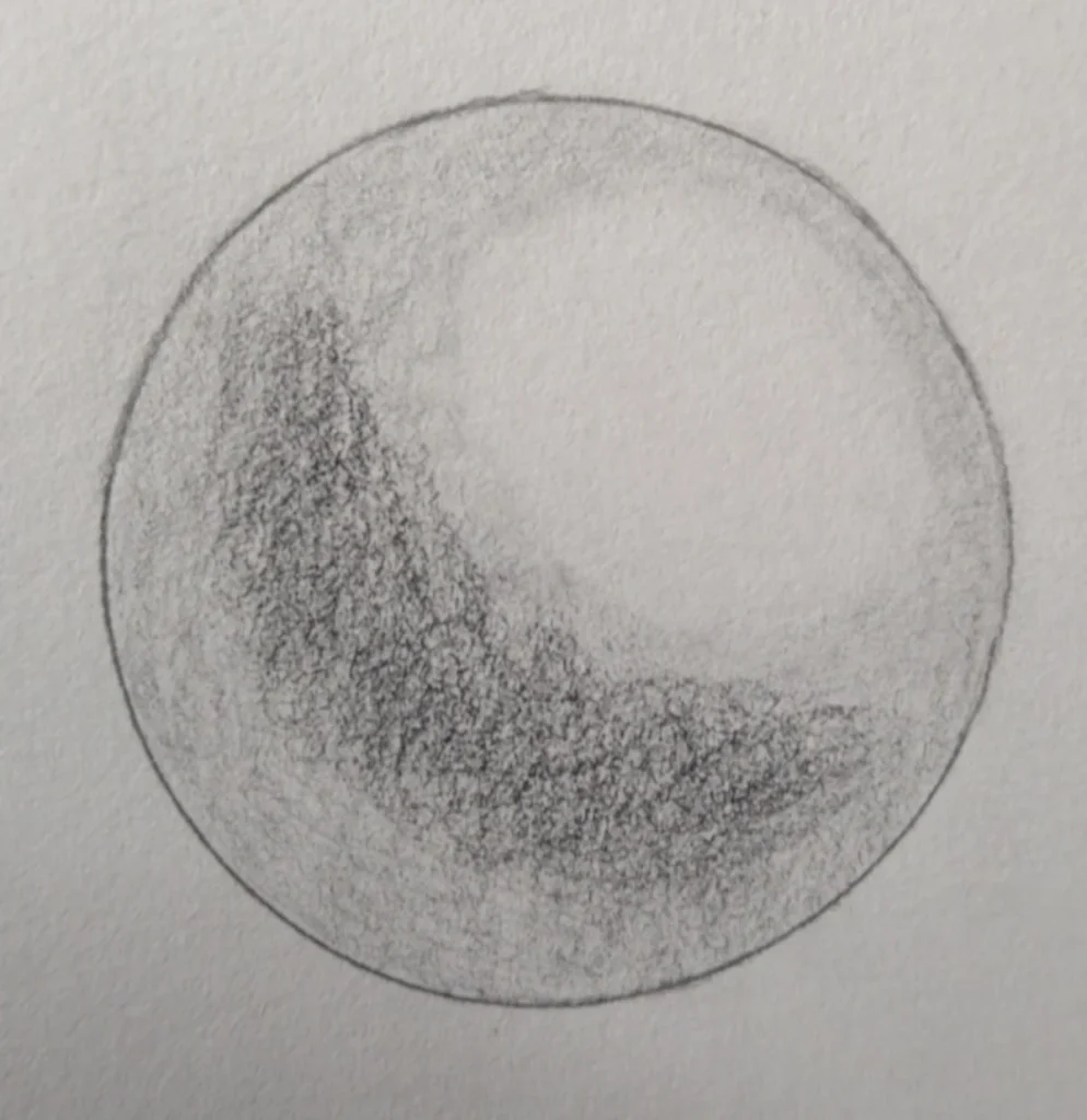
3. Deepen With Charcoal
- Add charcoal to the darkest curve of the shadow to bring bold contrast.
- Focus on the lower edge and the side opposite the highlight.
- Use charcoal sparingly – it’s powerful and should sit mainly in the deepest shadows.
4. Blend For a Smooth Finish
- Use a blending stump or tissue to soften the transitions.
- Blend from dark to light, letting the tones fade smoothly into the highlight.
- Use a light touch – overblending can flatten your shading and remove contrast.
- This final step ties the layers together, making the sphere look realistic and three-dimensional.
Tips & Tricks (Avoiding Art Crimes)
A few simple habits can make the difference between smooth, controlled shading and a muddy mess that’s hard to fix.
- Work light to dark. If you dump charcoal first, you’ll be chasing smudges forever, like trying to clean glitter after a kid’s craft party.
- Use blending stumps or tissue sparingly – overblending kills texture.
- Spray a light fixative to set charcoal and carbon, but don’t overdo it (too much will flatten values). Remember, fixative also slightly darkens your tones, so highlights may look less crisp afterwards.
- Keep your tools clean – a graphite eraser contaminated with charcoal is basically a crime scene waiting to happen.
Paper & Tools Matter
The surface you choose can make or break the combo:
- Smooth paper (Bristol, hot press): Perfect for fine graphite details and controlled shading.
- Textured paper (cold press, toned, rough): Gives charcoal something to grip onto and makes shadows richer.
- Toned paper: Ideal for horror art – a mid-tone base with graphite for light, charcoal for dark, and white charcoal for highlights = instant eerie atmosphere.
Carbon pencils are pretty versatile when it comes to paper, working well on both smooth surfaces for crisp details and lightly textured paper for deeper, more atmospheric shadows.
If you’re unsure which surface suits each material best, I break down the best paper types for graphite, carbon, and charcoal in more detail in my Best Sketchbooks and Paper Types for Horror Art (Complete Guide).
Extra helpers worth trying:
- Brushes (soft paintbrush or makeup brush): Great for subtle, soft blends.
- Powdered graphite or charcoal: Perfect for foggy effects, smoky skies, or that “something’s lurking” atmosphere.
Horror Art Applications
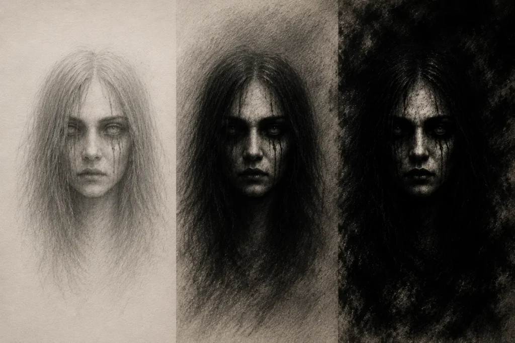
Here’s where this combo really comes to life in your horror art:
- Graphite: Pale skin tones, delicate textures, and subtle details (think cracked porcelain doll vibes).
- Carbon: Cursed runes, sharp shadows, and deep voids in eyes or mouths.
- Charcoal: Foggy backgrounds, dramatic lighting, and the kind of darkness that makes viewers lean closer to see what’s hiding inside.
Conclusion: Embrace the Chaos
Graphite, carbon, and charcoal each have their quirks, but when you bring them together, you unlock a powerful mix of depth, contrast, and eerie atmosphere. Think of them less as rivals and more as a slightly unhinged trio: graphite keeps things controlled, carbon sharpens the shadows, and charcoal brings the drama.
Once you learn how to balance them, your horror art won’t just look creepy, it’ll feel like it’s crawling off the page.
What You Learned:
- Graphite, carbon, and charcoal each behave differently: graphite is smooth and controlled, carbon adds depth, and charcoal creates the darkest, most dramatic shadows.
- Using them in the right order (graphite → carbon → charcoal) builds stronger contrast while keeping your drawing under control.
- Careful layering and blending help create smooth transitions without muddying your tones.
- Paper texture changes your results: smooth paper for detail, textured paper for richer shadows, and toned paper for instant atmosphere.
- Combining all three mediums lets you create deeper shadows, clearer highlights, and more atmospheric horror effects.
Keep Exploring
If you enjoyed this guide and want to sharpen your horror art toolkit, check out these posts:
- How to Use Erasers in Horror Art (Types, Techniques and Effects)
Because sometimes the scariest part of drawing is fixing mistakes. - Blending Tools for Graphite and Charcoal: A Horror Artist’s Guide
Learn how to control your shadows without turning your page into a crime scene. - Coloured Gel Pens in Horror Art
Add eerie highlights and ghostly details with just the right touch of chaos.